Griflan

741 posts

Griflan banner
Griflan

Griflan

@Griflan

Helping our partners build original brands that shine.

Philadelphia, PA Katılım Mart 2014
273 Takip Edilen746 Takipçiler
Griflan
Griflan@Griflan·
The supplement space is loud. Every brand is competing for the same attention with the same playbook. Bold colors. Hard bodies. Big claims. ProSupps had all of that. What they didn't have was a digital experience that matched the intensity of what they were selling. So that's where we started. We built something immersive from the ground up. 3D product visuals that made their supplements feel alive on screen. Embedded video featuring their brand ambassadors, woven directly into the product experience rather than dropped in as an afterthought. And a completely restructured sales flow — simplified navigation, guided product discovery, and refined calls to action that made exploring and buying feel as powerful as the brand itself. Then we did something a lot of studios wouldn't bother with. Every piece of nutritional information — all of it — was built in searchable HTML through the CMS. Not as images. Not locked away where search engines couldn't find it. Done right, from the inside out. ProSupps came to us wanting to do something no other supplement brand was doing. We think we got there. No excuses. Just results.
English
0
0
1
70
Griflan
Griflan@Griflan·
Nobody gets into retirement plan administration because they love paperwork. But for decades that's exactly what the industry handed people. Stacks of it. Disconnected tools. Clunky processes that turned what should be straightforward work into something that felt like navigating a maze every single day. Stax.Ai came to us with a vision to change all of that. One AI-powered system that could replace the chaos with something that actually worked. And they needed a brand that could walk into a traditionally slow moving industry and make the right people stop and pay attention. We loved this challenge. We built a comprehensive brand system from the ground up. Informative animations that made complex automation feel accessible rather than overwhelming. Custom illustrations and striking 3D assets that added real depth and credibility to their story. A website designed to do two things at once, build immediate trust with the TPAs ready for something better and make absolutely clear that Stax.Ai is the team to deliver it. Every design choice lived in the same intentional space. Modern but approachable. Authoritative but never intimidating. Because the people they're speaking to have seen a lot of promises from a lot of vendors. The brand needed to feel different from the first second. It does. Stax.Ai now has a visual and strategic foundation that matches the boldness of their mission. And an industry ready for change finally has somewhere to look. Full case study → link in comments.
English
1
0
1
60
Tushar Pandey
Tushar Pandey@TUSHARPAND0848·
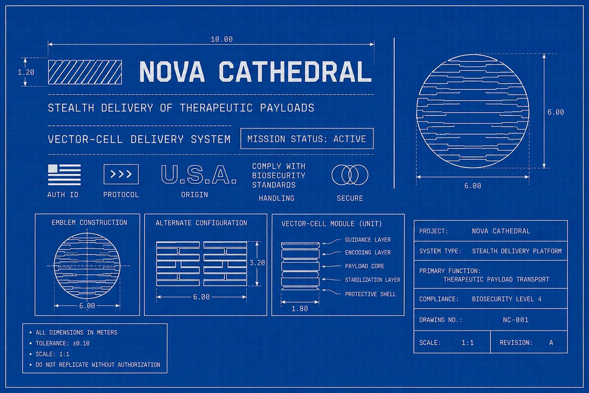
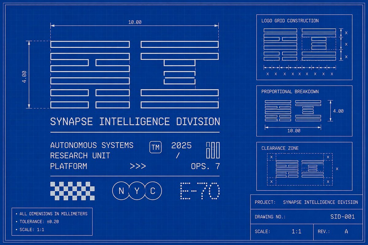
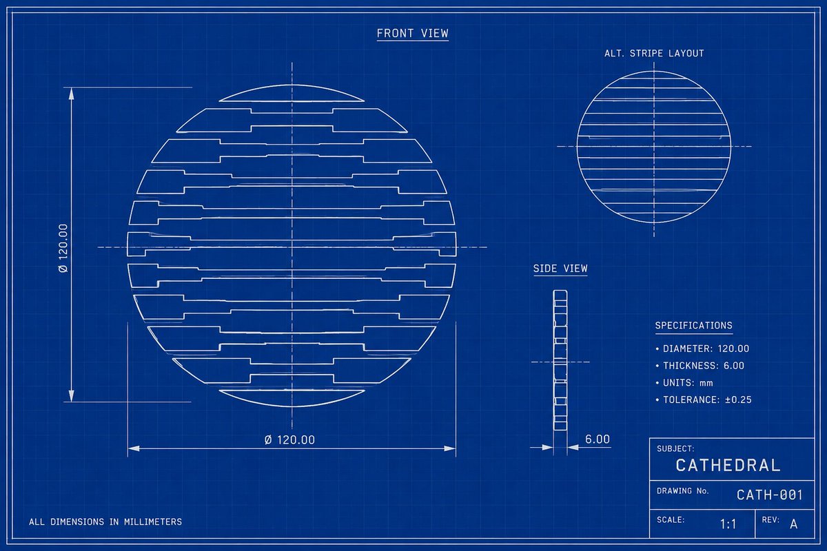
Sci-fi blueprint aesthetics will dominate 2026 design trends.
Tushar Pandey tweet mediaTushar Pandey tweet mediaTushar Pandey tweet mediaTushar Pandey tweet media
English
59
26
619
178.8K
Griflan
Griflan@Griflan·
Just saying…
Griflan tweet media
English
0
0
6
145
Griflan
Griflan@Griflan·
This site has been live for over a decade. And it still looks great. We think about that a lot with Handwrytten. Because in an industry where everything gets redesigned every two years, building something with real staying power is one of the things we're most proud of. Great design doesn't have an expiration date. It just keeps working. But let's talk about the project itself. Because this one still makes us smile. Handwrytten does something remarkable. They use robots with real pens to send personalized handwritten cards at scale. One card or 25,000, every single one looks like a real person sat down and wrote it. The technology is incredible. Their original brand just wasn't showing it off the right way. So we reimagined everything, starting with the robot. Playful animated robot arms that appear throughout the site, charming and polished and impossible not to smile at. A visual identity that made the whole thing feel warm and trustworthy rather than cold and mechanical. Then they asked us to redesign the entire application too. So we did. Around 50 screens across desktop and mobile. Card selection. Message customization. Handwriting style font choices so your message actually looks like you. Photo uploads. Bulk sending for organizations reaching thousands of people at once. And a flexible design system built to grow with them, which it has, now including AI generated messages for anyone who needs a little help finding the right words. They loved what we built so much they kept coming back. Ten years later they're still going strong. That's the kind of work we set out to do every single time. handwrytten.com
English
0
0
4
116
Gil Huybrecht
Gil Huybrecht@gilhuybrecht·
Can we just shut the fuck up about AI already my god lmao 😅
English
13
5
62
3.5K