@FaithoskiDesign Honestly... You already understand what their capabilities are
English
Innocent
191 posts
@Innocent617181
Learning product design in public. Designing mobile experiences.


Get used to the name. Solvyn Site coming soon⬇️


Got some inspiration from this AI icon Let me go try out some shape manipulations for my own AI icon🙂↔️🙂↔️🙂↔️ Fingers crossed 🤞


⚡️ UI design tip - Decrease letter spacing for large text A small trick to make large headings look better is to decrease their letter spacing (space between letters). How much you decrease letter spacing depends on the typeface and size, but generally, you should decrease letter spacing more as text gets bigger. This is because many typefaces were designed to be read at small sizes in long body text. They’re known as “text type” typefaces and have wide letter spacing to make them more legible at small sizes. You probably won’t need to decrease letter spacing for “display type” typefaces, as they were designed to be used at large sizes and generally have closer letter spacing. PS This is just 1 of 100+ design guidelines from my @PracticalUI design book 📘


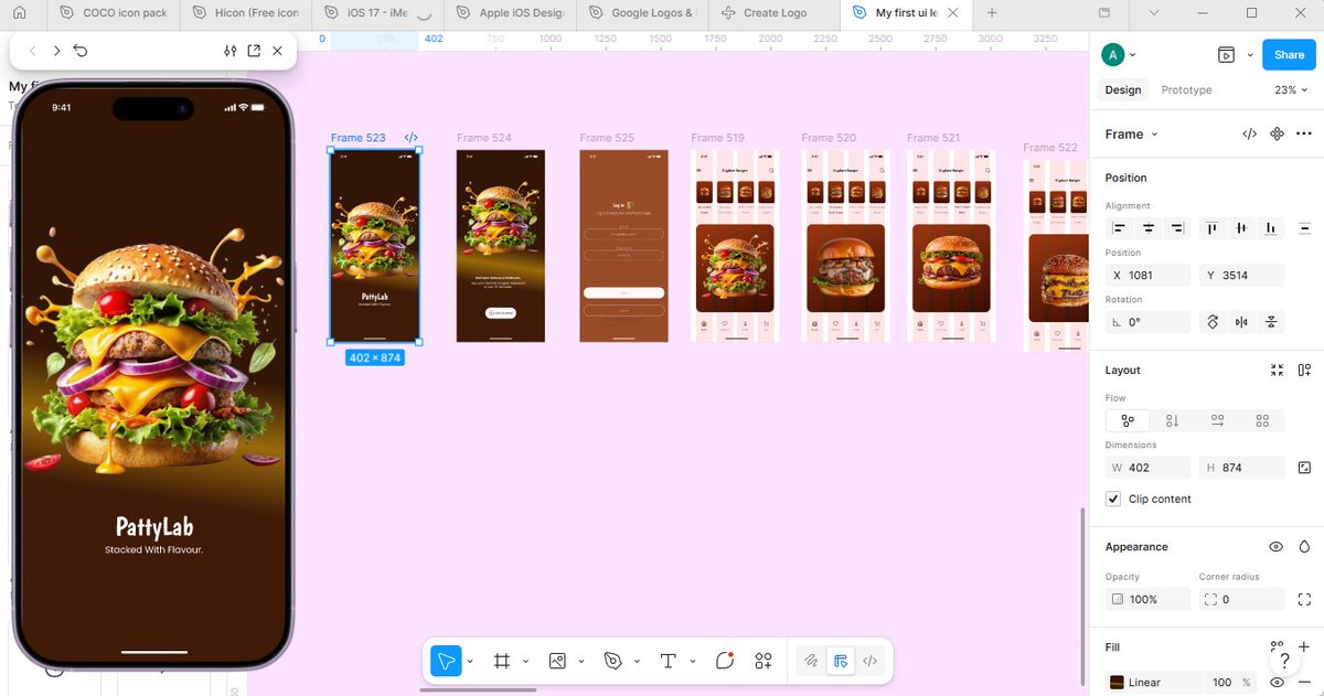
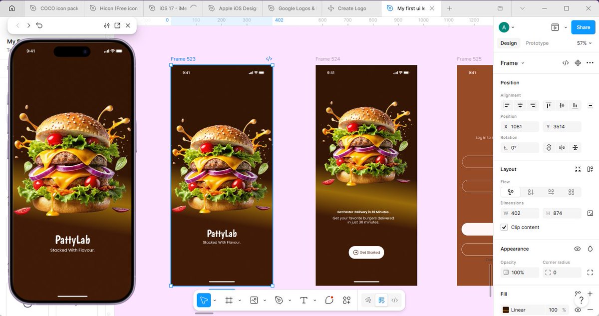


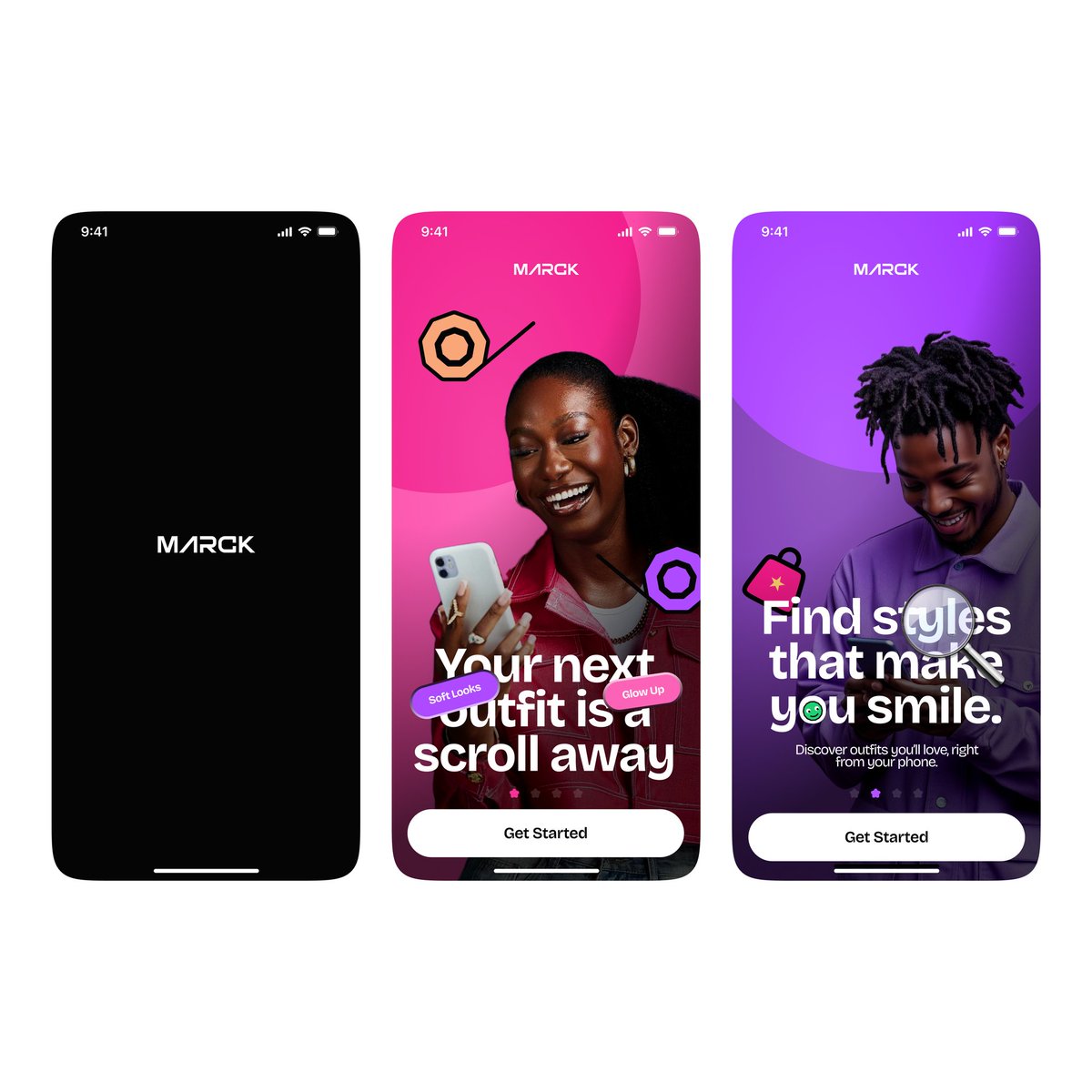
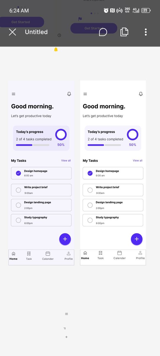
Why wouldn't users want to invite their friends? With a screen as beautiful as this?