
ItsIrene
126 posts

@_NitindeepSingh Nice! Real-time stuff is super fun to work with. Curious to see what you end up building
English

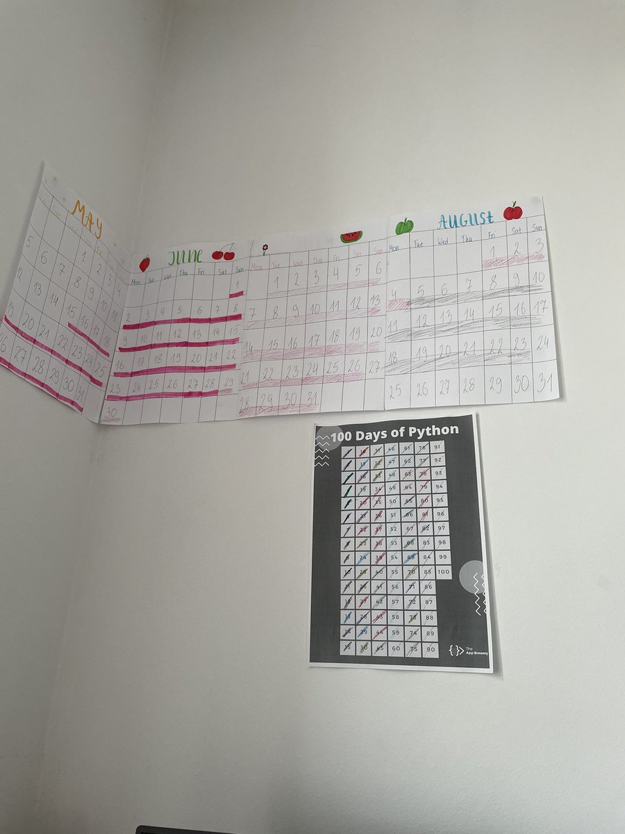
Day 8/100 of #100DaysOfCode
Started diving into Socket.IO today 🧠⚡
Real-time communication feels like magic from chat apps to live dashboards, it’s all making sense now.
Excited to build something real-time 🚀
#WebSockets #NodeJS #JavaScript #DevJourney

English
@KrishPuri584446 That moment when your data says 'I'm not linear' and poly regression says 'I got you!' Definitely a game-changer for complex trends. Keep it up!
English

Learned Polynomial Regression today!
It extends linear regression by adding higher-degree terms (x², x³…) to model non-linear patterns.
Great for curved data like real estate pricing!
When a straight line just won’t cut it ✅
#ML #AI #DataScience #100DaysOfCode #BuildInPublic
English
Day 81/100
How to quickly spot relationships in a dataset using Seaborn's .pairplot().
How to split the data into a training and testing dataset to better evaluate a model's performance.
How to run a multivariable regression.
How to evaluate that regression-based..
#100daysofcode
English
Day 80/100
How to use histograms to visualise distributions
How to superimpose histograms on top of each other even when the data series have different length
How to use a to smooth out kinks in a histogram and visualise a distribution with Kernel Density Estimate (KDE)
#python
English
Day 79/100
how to:
Create a Choropleth to display data on a map.
Create charts showing different segments of the data with plotly.
Create Sunburst charts with #plotly.
Use Seaborn's .lmplot() and show best-fit lines across multiple categories using the row, hue. #100DaysOfCode
English
Day 78/100
Use nested loops to remove unwanted characters from multiple col
Create bubble charts using the #Seaborn Library
Use Seaborn to superimpose a #linear_regression
How well the model fits thedata and the r-sq. metric
#scikit_learn and calculate the coefficients. #Python
English
Day 77/100 😃
I looked at how to:
Create arrays with np.array()
Generate arrays using .arange(), .random(), and .linspace()
Analyse the shape and dim. of a ndarray
Slice and subset a ndarray based on its indices
Do linear algebra like operations with scalars and matrix mult.
English
Day 76/100 #pythonfest
Pull a random sample from a DataFrame using .sample()
How to find duplicate entries with .duplicated() and .drop_duplicates()
How to convert string and object data types into numbers with .to_numeric()
How to use plotly to generate beautiful pie, donut
English
Day 75/100:
How to use .describe() to quickly see descriptive statistics at a glance.
How to use .resample() to make a time-series data comparable to another by changing the periodicity.
How to work with .dates Locators
.isna().values.sum()
.grid() #100DaysOfCode #Python
English
Day 74/100 is completed:
How to combine a Notebook with HTML Markup.
How to aggregate data using the .agg() function.
How to create scatter plots, bar charts, and line charts with two axes in Matplotlib.
Understand database schemas
#100DaysOfCode #python #followback
English

@tech_nishan001 @cobrasec1337 @devxshubh @Horton_A7 @ItsIreneBio @kanavwastaken @Sigmabond01 @Priyanshh_9 @Pratikwebtech @kushalsharma33 great job keep going
English

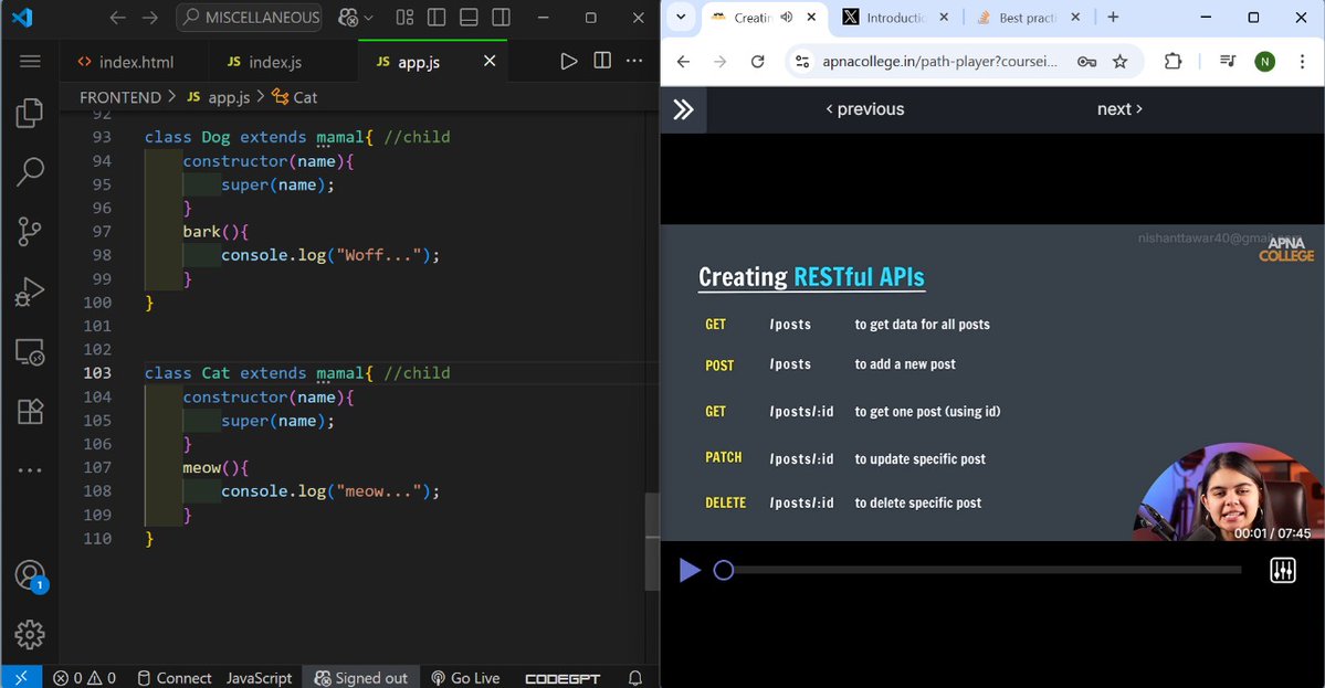
💻 Backend Dev — Day 11
Diving deep into the API world! 🌐
✅ Mastered REST API routes (GET, POST, PATCH, DELETE)
✅ Explored X (Twitter) API v2 🔍
✅ Learned top API design practices
Building clean, scalable backends one day at a time. 🚀


English
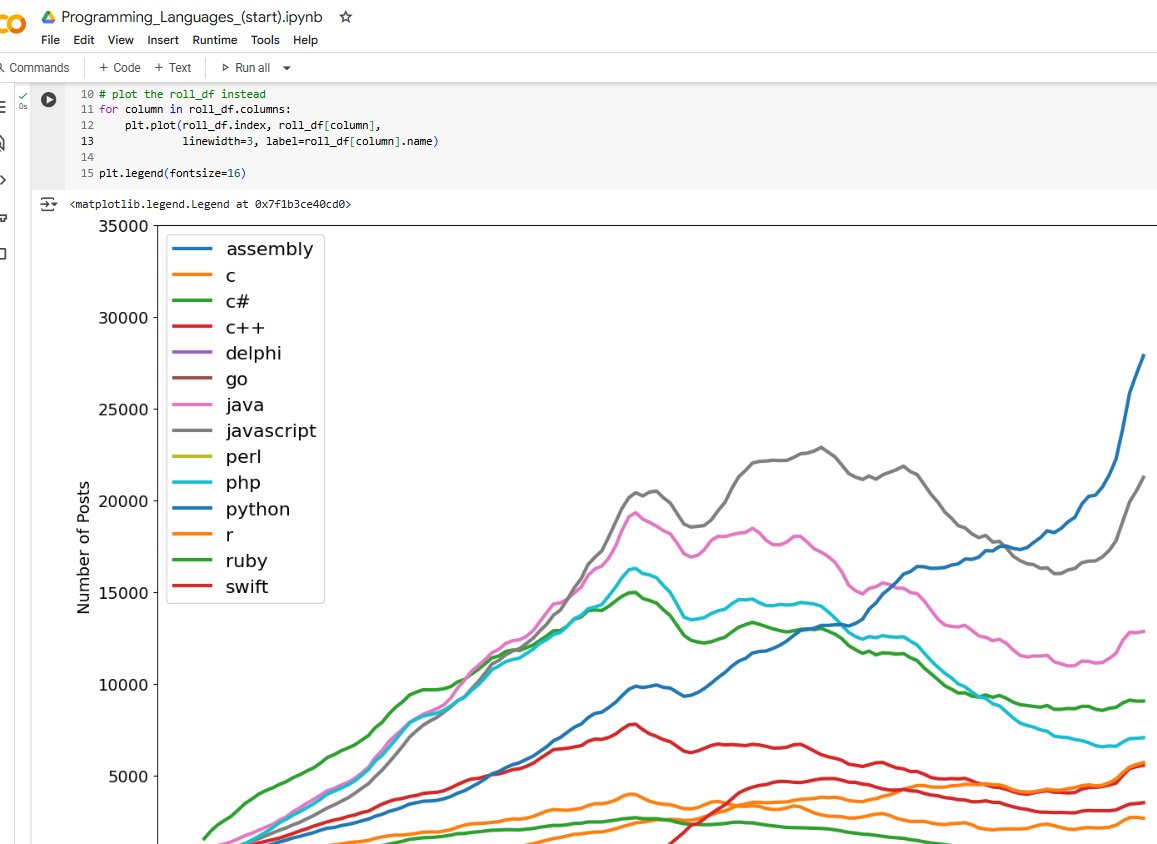
Day 73/100 📈📉📊
- Data Visualization with Matplotlib
- Data Cleaning: Working with Time Stamps
- Data Manipulation: Pivoting DataFrames
- Data Visualisation with Matplotlib
- Smoothing out Time-Series Data
#100DaysOfCode #python #matplotlib #pythonprogramming
English
Day 72/100 🐼🐼🐼
- Data exploration with Pandas
- Getting Set Up for Data Science
- Preliminary Data Exploration and Data Cleaning with Pandas
- Sorting Values & Adding Columns: Majors with the Most Potential vs Lowest Risk
- Grouping and Pivoting Data
#100daysofcode #python
English


