Sabitlenmiş Tweet
floss.social/@LabPlot | youtube.com/@LabPlot
243 posts


floss.social/@LabPlot | youtube.com/@LabPlot
@LabPlot
LabPlot is a FREE, secure, open source and cross-platform data visualization and analysis software accessible to everyone and trusted by professionals.
Worldwide Katılım Ocak 2020
0 Takip Edilen636 Takipçiler

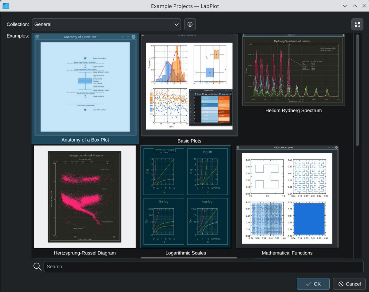
Did you know that #LabPlot (#free, #OpenSource) includes a built-in #library of #DataAnalysis and #DataVisualization example #projects?
Try it now:
1️⃣ Download #LabPlot: labplot.org/download.
2️⃣ File > Open Example.
#Chemistry #Physics #Science #Research #Engineering
English
We completed our @NGIZero Core funded project!
👉labplot.org/2025/10/04/an-…
Coming soon to #LabPlot: Python scripting, live data analysis, and a suite of 13 statistical hypothesis tests like t-Tests, ANOVA or Chi-Square.
#OpenSource #Statistics #Python #NGIZero #DataAnalysis

English
floss.social/@LabPlot | youtube.com/@LabPlot retweetledi

floss.social/@LabPlot | youtube.com/@LabPlot retweetledi

LabPlot Tutorial: Professional Data Analysis Made Simple youtu.be/4mCvuO9DYyE?si… via @YouTube

YouTube
Română
floss.social/@LabPlot | youtube.com/@LabPlot retweetledi

@StefJamieSan Yes. But I don't want an area chart, I want an XY chart.
And I want three XY plots. 2 with fills.
I want control of the X-axis and X-data. Excel doesn't let you do this. I'm using LabPlot now.
English
floss.social/@LabPlot | youtube.com/@LabPlot retweetledi

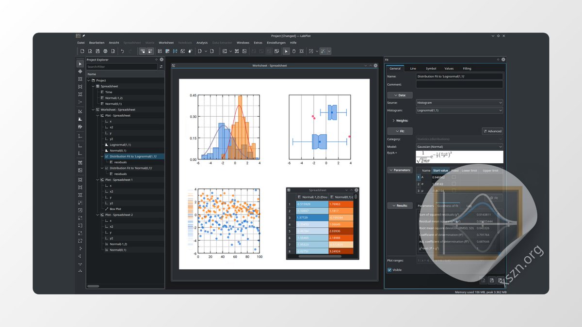
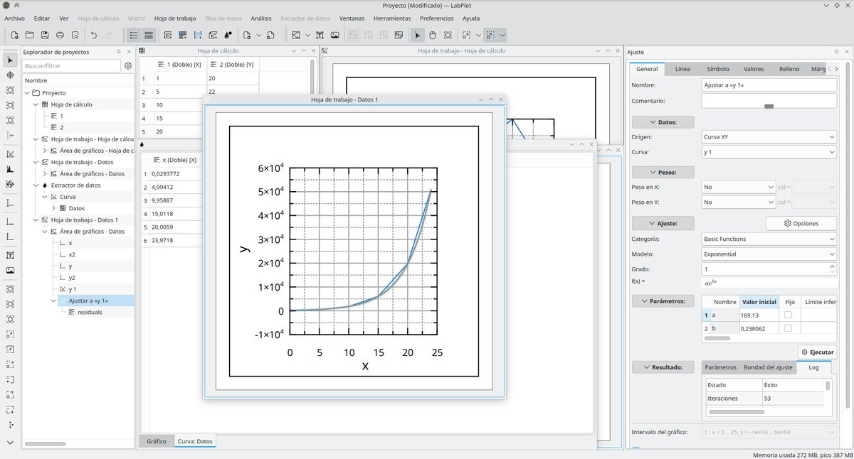
The (Data) Plot Thickens:
You’ve generated a ton of data. How do you analyze it and present it? Sure, you can use a spreadsheet. Or break out some programming tools. Or try LabPlot. Sure, it is sort of like a spreadsheet. But it does more. It has objec… ift.tt/Y7ZnSNG
English
We’re announcing the 2.12.1 minor patch release of #LabPlot with improvements and bug fixes.
labplot.org/2025/08/18/lab…
We recommend everybody update to this patch release which is available here:
➡️labplot.org/download
#FOSS #OpenSource #Statistics #DataViz #DataAnalysis

English
floss.social/@LabPlot | youtube.com/@LabPlot retweetledi

floss.social/@LabPlot | youtube.com/@LabPlot retweetledi


@Jakub_Kubajek @Jakub_Kubajek
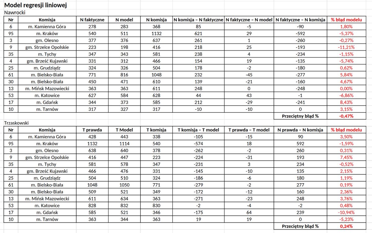
Zakładając, że nie umknęła nam np. miejscowość turystyczna, to wg naszego modelu komisja nr 4 w gm. Brześć Kujawski zajmuje dopiero 17 pozycję (ze 117 zidentyfikowanych). Przeciętny % błąd prognozy to -0,11% (dla 13 znanych komisji). To tylko model.

Polski

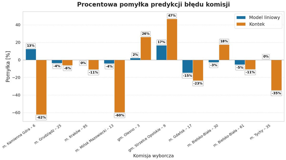
🙃Krzysztof Kontek, którego metoda nie była w stanie wykryć anomalii w Brześciu Kujawskim, pisze, że modele liniowe nie są w stanie wykryć "oszustwa".
🔎Według prostego modelu liniowego była to 9. komisja pod względem anomalii.
📊Zawyżono tam wynik Nawrockiego o 135 głosów.

Polski
@Jakub_Kubajek @Jakub_Kubajek
Wyniki dla 13 komisji oparte na prostym modelu regresji liniowej. Model nie był kalibrowany pod dotychczas zbadane komisje. Przeciętny błąd % łącznie dla N i T wynosi -0,11% (dla tych 13 komisji).
Polski
🙄Model Kontka ma rozrzut jak sowiecka katiusza.
❌Manipulacją jest mówienie, że jego model nie doszacowuje skali błędów w zbadanych komisjach.
✅Prawdą jest, że on przeszacowuje, jak i nie doszacowuje błędów, czyli ma niską precyzję.
🔎Jego przeciętna procentowa pomyłka absolutna to aż 30%, podczas gdy w przypadku modelu liniowego jest to tylko 6%.
🧐Oznacza to, że model Kontka szacuje błędy komisji aż 5 razy mniej dokładnie niż regresja liniowa.
1/4
Polski
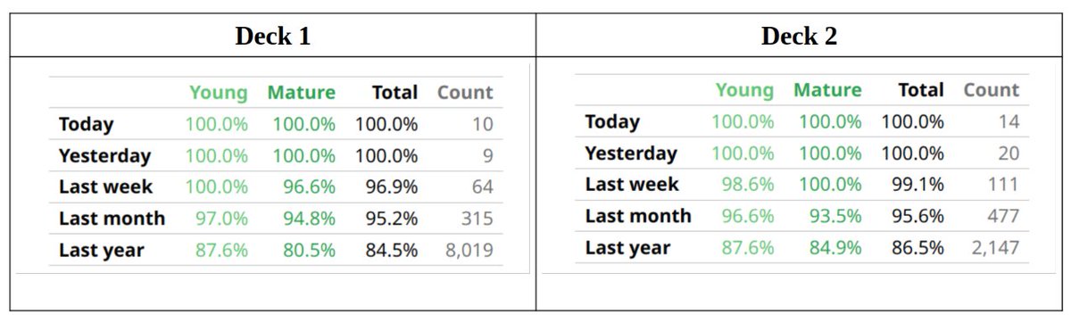
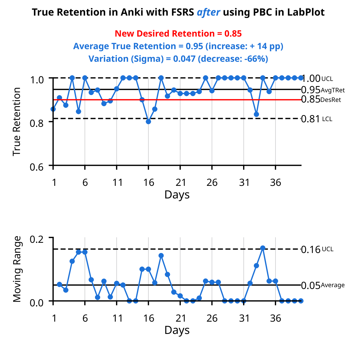
@JSchoreels @JarrettYe No filtered decks were used. All the reviews have been scheduled by the optimized FSRS. Two different decks were tested for improvement (average retention _and_ variation) with the PBC made in LabPlot. Both show similar level of improvement.
English

@LabPlot @JarrettYe 15-20 reviews by days ? I mean, one fail review is 5-6.66% retention lost.
Also, have you isolated only reviews with prop:r<DR, or do those reviews have been scheduled by Anki without any kind of correction (Filtered Decks, etc) ?
English
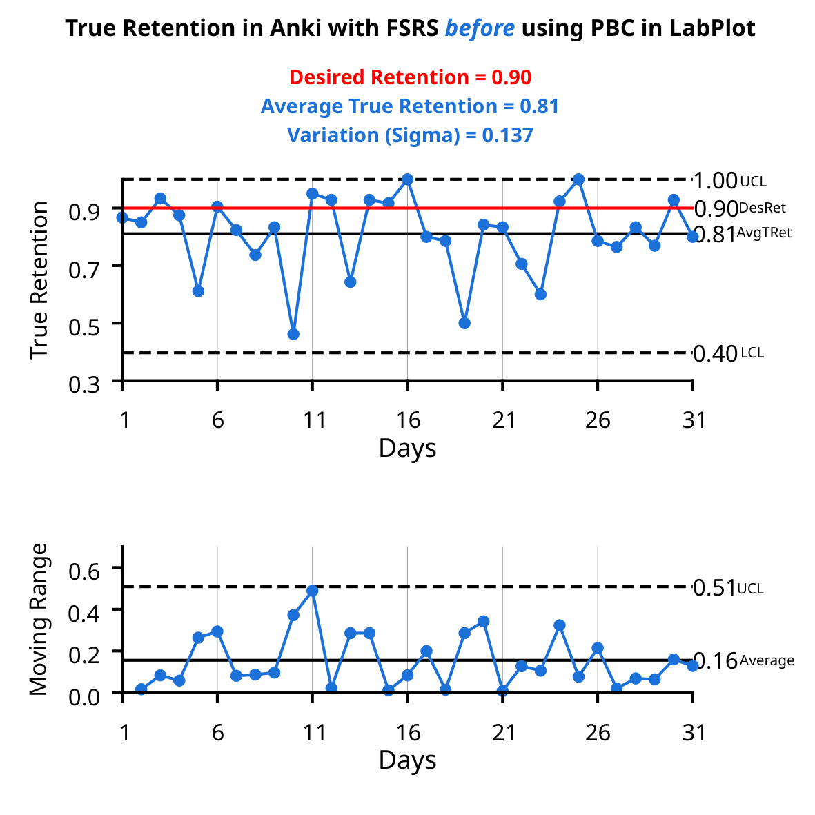
A food for thought: The same algorithm used in #Anki (#FSRS), but two radically different processes. Two #XmR charts made in #LabPlot demonstrate the value of an interaction between Process Behavior Charts and a human mind.
@JarrettYe
#study #learning #SpacedRepetition #SRS
English
@JarrettYe The desired retention was set to 90%, but the FSRS couldn’t reach this target. Process Behavior Charts signal when an action on your part is needed to improve the process, so you need to interact with them daily. No scheduling algorithm that I'm aware of will tell you that.

English

@LabPlot FSRS needs data to learn the memory patterns. If you didn’t optimize it with lot of data, it would be inaccurate.
English
@JarrettYe If you are interested, have a look e.g. at two papers by Donald J. Wheeler "Can We Adjust Our Way to Quality" Part 1 and Part 2. He explains the power of PBC by comparing them to a simple PID controller.
English
@LabPlot Btw, it’s weird that the retention reached 100%. I guess the sample size is small, right?
English
@JarrettYe By interacting with the PBC in LabPlot, I eliminated the so called special cause variation. That led to the significant gain in true retention and reduction of variation. This is beyond the power of any algorithm, because it lacks the context. We can't hide behind an algorithm.
English
@JarrettYe Thanks for your quick feedback. A question worth answering: why did the “before” state (large variation, significantly lower true retention) last from at least the beginning of the introduction of the FSRS? In the chart only a short period is included.
English
@LabPlot If you keep using PBC for weeks and re-optimize FSRS, the true retention will align with the desired retention.
English
These gains were achieved despite, not thanks to, the FSRS's operation in Anki. The desired retention was changed to 0.85, and the algorithm was optimized for that target, but True Retention was increased to 0.95.
Any thoughts?
English
2/ The first XmR chart shows metrics BEFORE a process change (values typical for this process). The second XmR chart shows metrics AFTER the process change. True Retention increased by 14 p.p. (despite reducing Desired Retention to 0.85), and process variation decreased by 66%.
English