Sabitlenmiş Tweet

Do you love games?
Do you want to be a king ?
Do you want to earn #MEFAI ?
⬇️
Join me for the kingforever 👑 kingforever.io/?ref=E68E02FFA7
@MetaFinancialAI
English
MA
1.7K posts

@Limrmd1
AI - Powered Crypto Trading | Real Signals, On-Chain Proof & Security Tools | $MEFAI on BNB & SOL Chain | Earn first, trust the data .


Heidi Klum at the Met Gala dressed as a slightly haunted Greek statue? If a museum reported a missing exhibit tonight, the NYPD knows where to look...
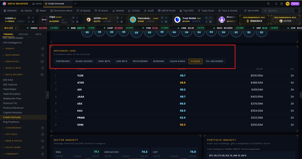
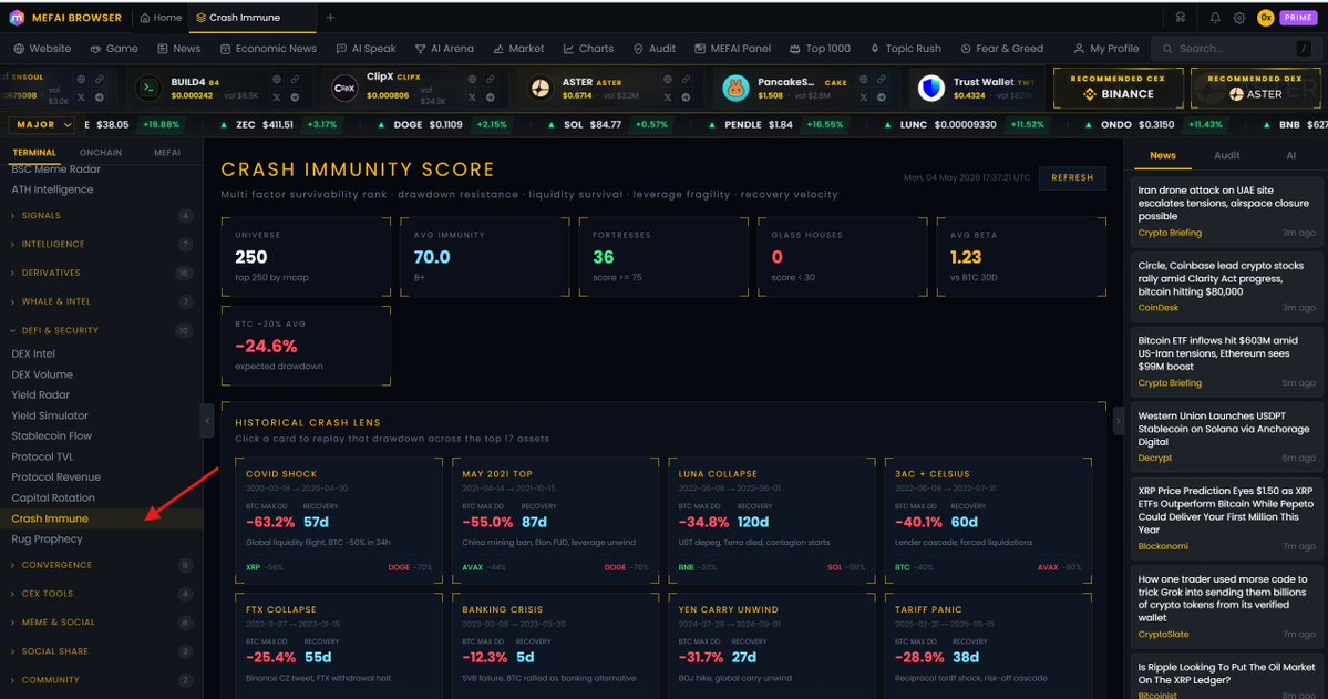
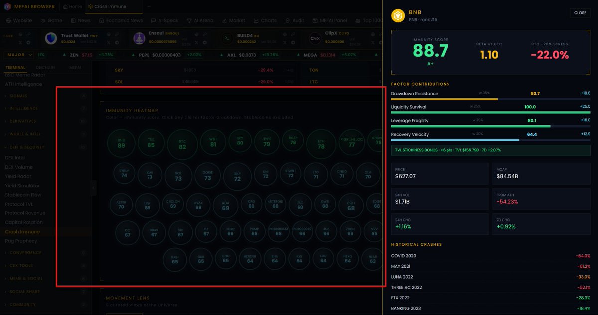
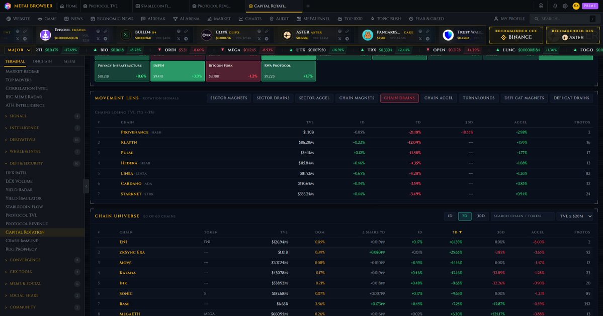
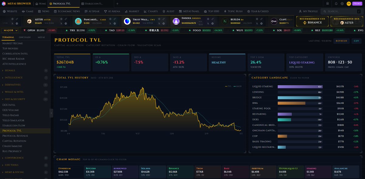
This is the reality of mathematics. Even if you combined everything on the list except for $BNB, it wouldn't even come close to BNB. When BNB shows $84B mcap with $156B TVL, the locked capital in #BSC Chain protocols exceeds the oken's own market value. That is not speculative positioning. That is infrastructure dependency. Protocols, liquidity pools, lending markets, bridges, all relying on BNB Chain to function. This capital does not rotate out in a panic because it is deployed in smart contracts with lock periods, LP positions, and collateral obligations. TVL anchored assets have a structural floor that speculative tokens do not. #BNB ranks first because no other token has this ratio of deployed capital to market cap.