LogoArchive

10.3K posts

LogoArchive banner
LogoArchive

LogoArchive

@LogoArchive

Modernist logo archive, international research initiative & zine series. A project by @richbaird

London, England Katılım Ekim 2015
158 Takip Edilen106K Takipçiler
Sabitlenmiş Tweet
LogoArchive
LogoArchive@LogoArchive·
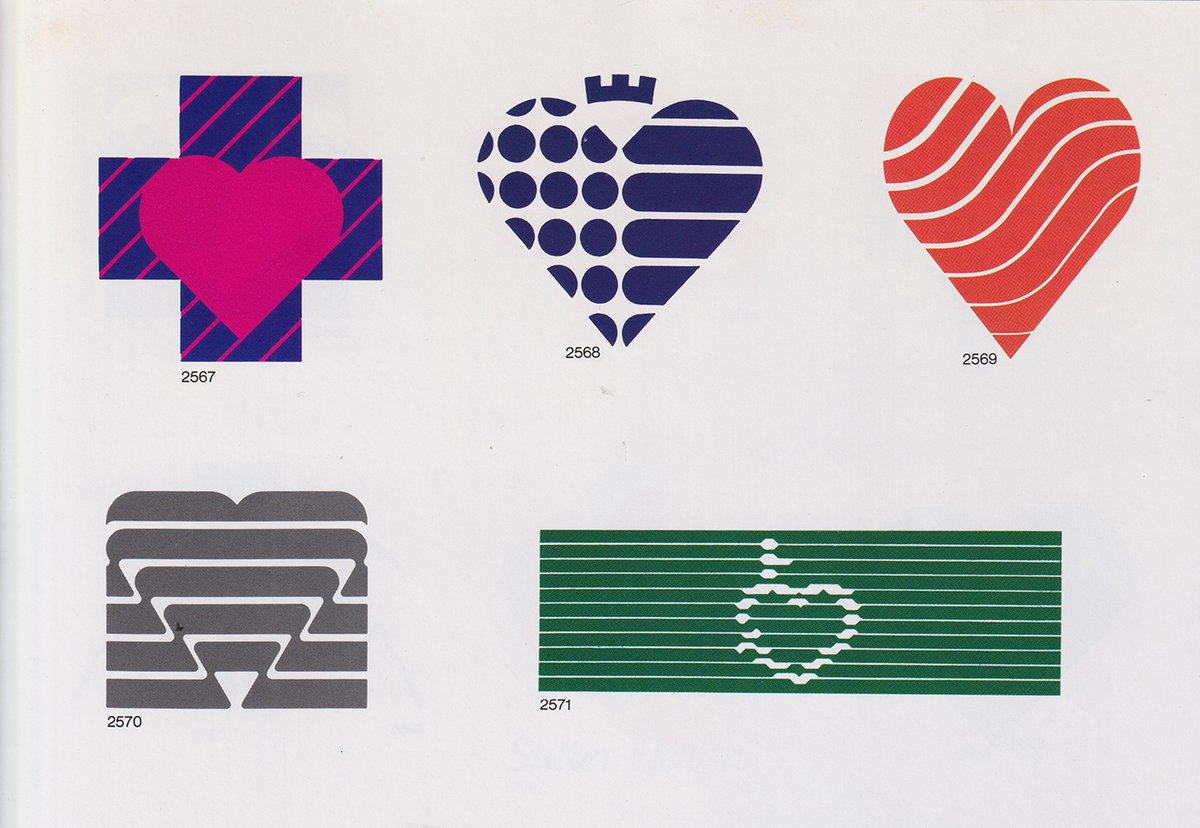
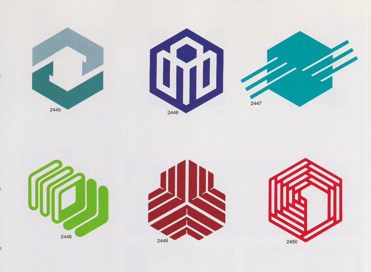
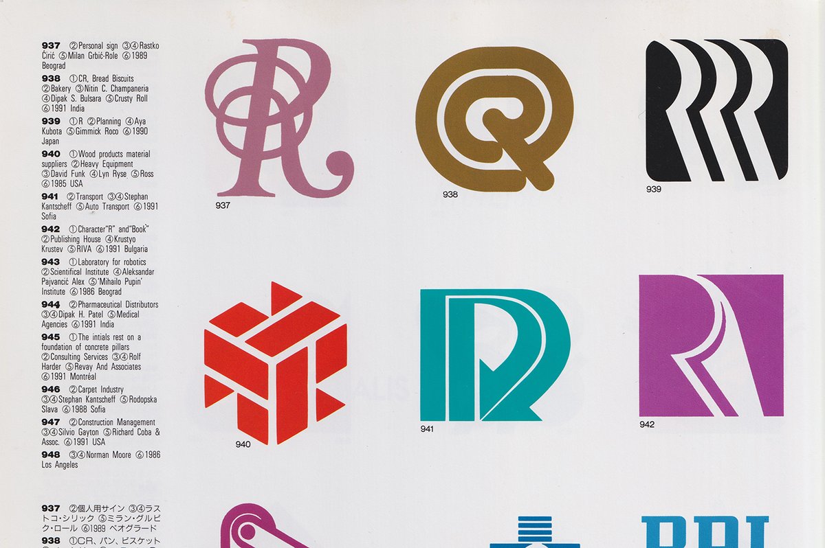
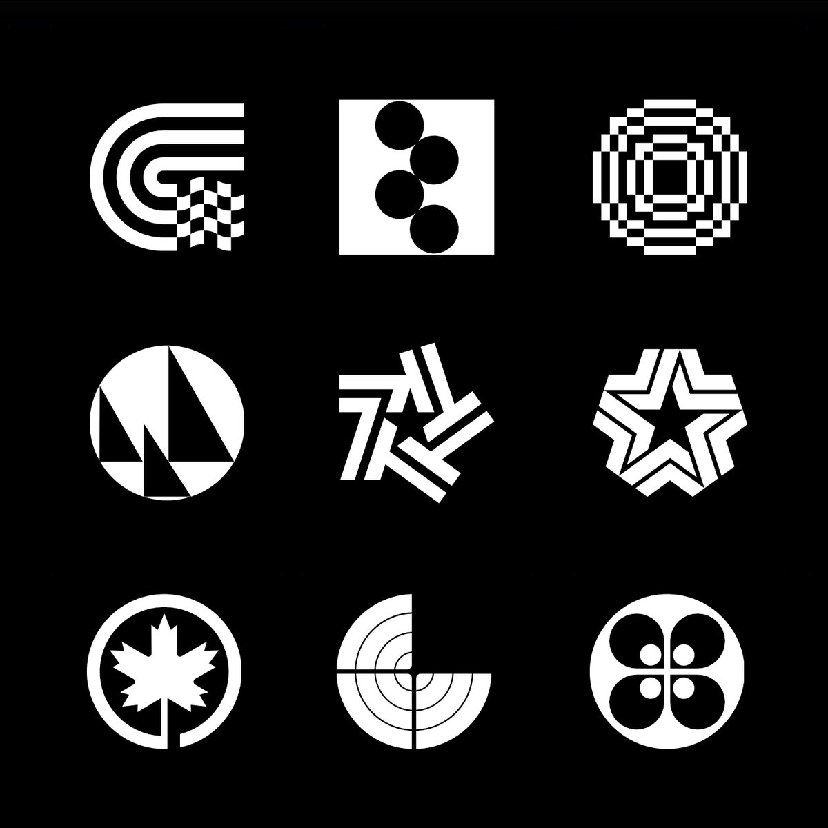
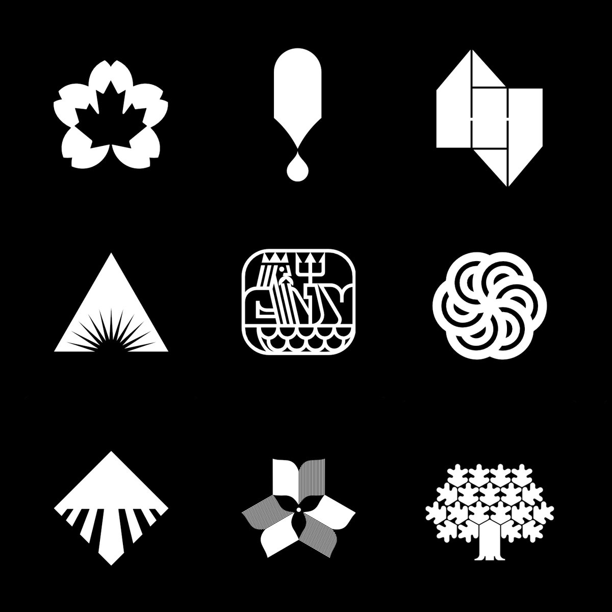
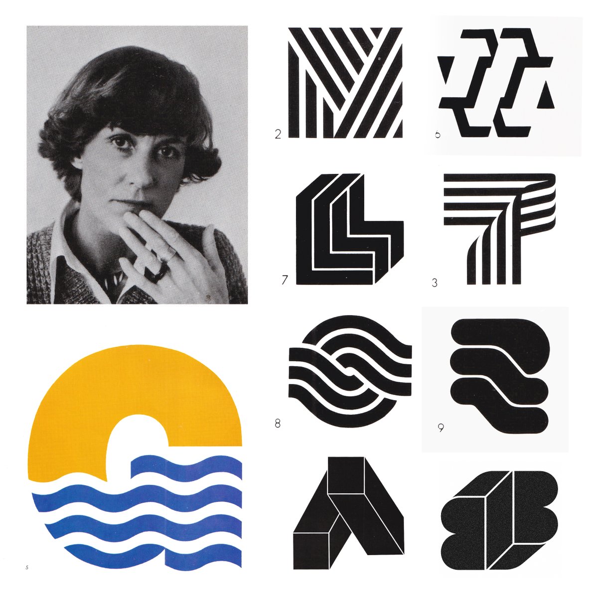
Become a better logo designer faster. Learn from history’s greatest. Discover 3000+ logos, carefully digitised and added to the latest library of its kind online. Updated daily. Start here 👉 logo-archive.org
LogoArchive tweet mediaLogoArchive tweet mediaLogoArchive tweet mediaLogoArchive tweet media
English
34
25
181
59.8K
LogoArchive
LogoArchive@LogoArchive·
Become a better logo designer faster. Learn from history’s greatest. Discover a growing library of over 3000 logos. Start here 👉 logo-archive.org
LogoArchive tweet mediaLogoArchive tweet mediaLogoArchive tweet mediaLogoArchive tweet media
English
1
10
95
6.2K
LogoArchive retweetledi
LogoArchive
LogoArchive@LogoArchive·
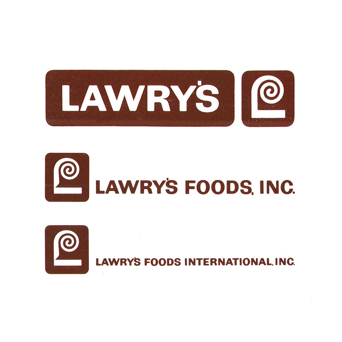
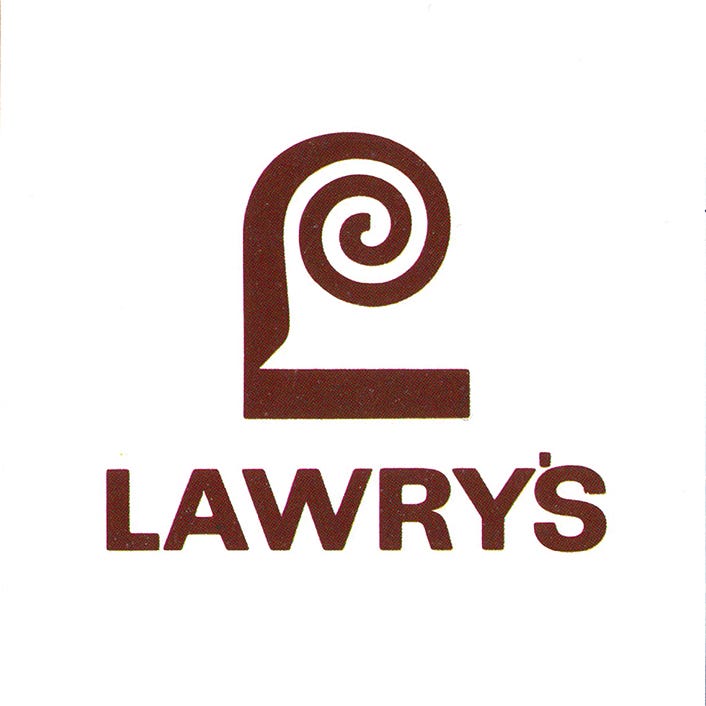
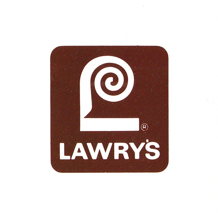
With the need to compete on supermarket shelves against ‘well-entrenched’ and heavily-advertised major brands a new Lawry’s logo would be required to have a ‘visual boldness’ and ‘singularity’, and convey a sense of quality on a ‘gourmet level’. Further, the ‘memory-recall’ attributes of the logo would need to be maximised so that it would instantly identify and endorse future Lawry's products that would use a diverse range of physical containers. Saul Bass, in 1959, would take on the challenge of devising the new logo and corporate identity. The initial ‘L’ surfaced as a strong initial candidate. Hundreds of variations of this were explored. These ranged from slight modifications of the ‘Old English’ swash capital from the previous logotype to completely modern letterforms. Concepts were tested in various simulated use-cases, which included shop aisle mock-ups. From this, the strongest most versatile logo began to take form. Additional refinements eventually produced the final spiral top design. The result was a simple yet bold for the time, which stood out from the competition. What later be called the ‘fanciful L’ retained some of the traditional chisel-edge calligraphic qualities of the earlier logotype in the diagonal ending of the descender as it met the bold squared-off bottom of the horizontal stroke. The near-even weighted spiral serif brought the viewer back to twentieth century, creating a continuity between old and new, adding an elegant gourmet flourish. In application, the logo and logotype worked together in a variety of modular arrangements to afford a flexibility, interest and continuity across packaging, signage and other areas of corporate activities.
LogoArchive tweet mediaLogoArchive tweet mediaLogoArchive tweet mediaLogoArchive tweet media
English
2
8
88
9.4K
LogoArchive
LogoArchive@LogoArchive·
Studio Armando e Maurizio Milani, Bruno Oldani, Atelier Korten & Ove Engstrom. Discover thousands more logos at logo-archive.org
LogoArchive tweet mediaLogoArchive tweet mediaLogoArchive tweet mediaLogoArchive tweet media
Italiano
0
8
133
6.9K
LogoArchive
LogoArchive@LogoArchive·
Othmar Motter, Atelier P.G. Ulmer, Richard Rey Studio Inc. & Bror B. Zetterborg. Discover thousands more logos at logo-archive.org
LogoArchive tweet mediaLogoArchive tweet mediaLogoArchive tweet mediaLogoArchive tweet media
English
0
12
109
5.7K
LogoArchive retweetledi
LogoArchive
LogoArchive@LogoArchive·
Pages of historical logos. 6534 is barmy. Discover over 5000 more historical logos at logo-archive.org
LogoArchive tweet mediaLogoArchive tweet mediaLogoArchive tweet mediaLogoArchive tweet media
English
0
12
170
8.6K