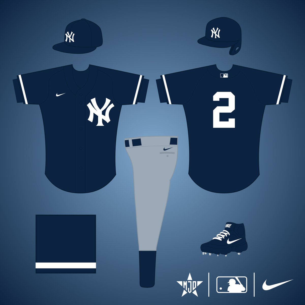
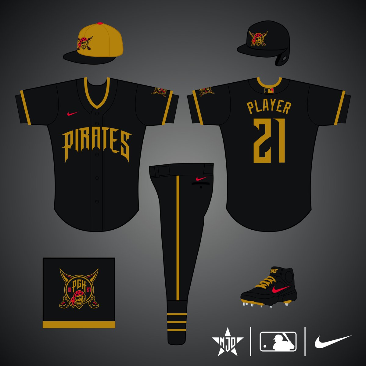
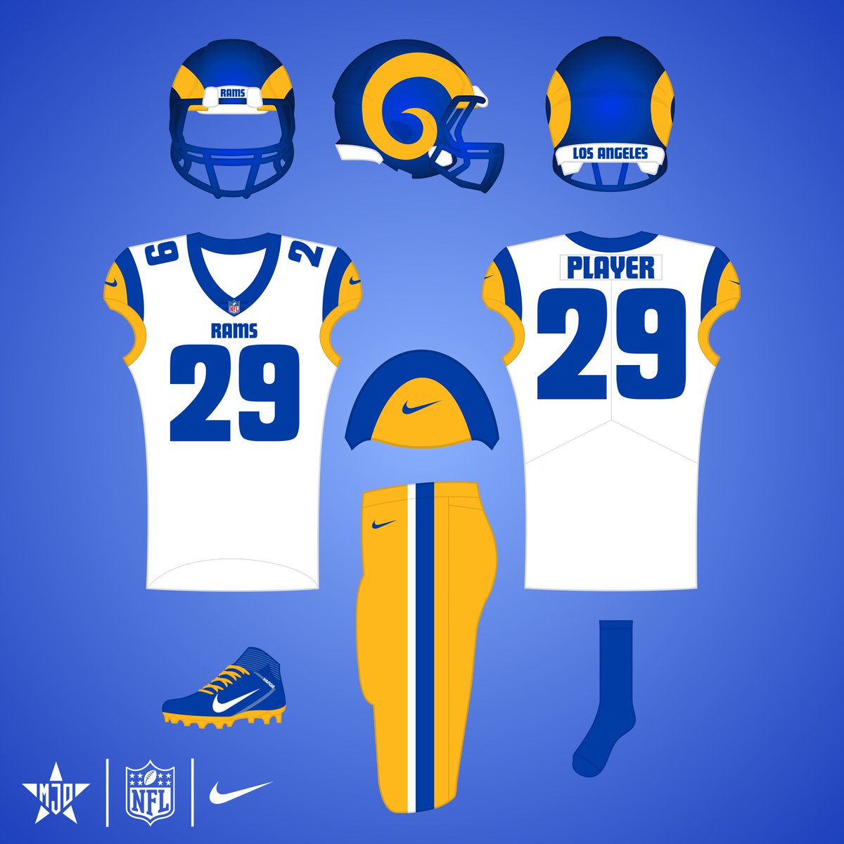
Sabitlenmiş Tweet
Matthew Drake
2.2K posts


@Twins_Uniforms I've been saying this since the uniforms were unveiled, I hope it happens at some point
English


@Issac_Starr2 Thanks! It’s obviously based on their secondary logo, & the block “M” harkens back to the ‘50s American Association Brewers, just like the script & barrelman do
English

@MJD7Design fair enough. i do like that logo you made on the hat
English

@Issac_Starr2 The barrelman patch is great, I just think it’s too busy to work well on a cap. Caps usually work better with simpler logos, which is why the majority of MLB uses simple letters
English

@MJD7Design would’ve loved to have the barrel man on the hat but other the that it’s what i would’ve wanted to see
English

@bald30something I like the all-light crown, I think that style needs to make a comeback in MLB
English

@MJD7Design A cap like their helmet is the only change I can think of. It has the white front panel with navy brim and cap
English

@the_matt_daddy You can’t really do the patterning, then. I think the ghost letters work fine here
English

@MJD7Design Why not make contrasting letters and numbers? I would ban ghost lettering.
English

@josh305323 I wouldn't want to do royal & white, as I think that would look too much like the Colts
English

@MJD7Design The yellow over white is great. I think the blue and white might look better as all white or at least white pants. I think the blue in the 60s was more Royal.
English

@ChuckyyLarms I liked the drop-shadow too, that was a difficult element to get rid of. I appreciate it!
English

@MJD7Design I like what the Ravens did but this is a big improvement. I also am a big fan of the drop shadow staying. Nice job man🔥🔥
English

Here's an update to my design for the Ravens based on the redesign they just unveiled:
I kept the spread wings on the collar, but flipped the colors to make it be more clear. I kept the pants striping inspired by the Maryland flag, but altered it to make it more balanced.


Matthew Drake@MJD7Design
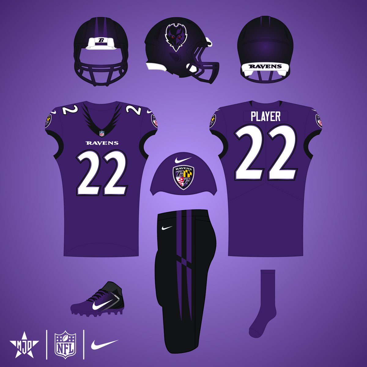
Baltimore Ravens: I originally had a redesign planned for the Ravens, but their set has grown on me. I just removed gold because I've never liked its inclusion. The helmet is intended to be black with purple flakes, sort of like the Jags' early 2010's helmet. #RavensFlock
English

@c1ov2r_ Ah gotcha, yeah I’ve never been a fan of the gold for them, I think the black & purple on it’s own looks more dark & menacing
English

@bmore_ray52 Thanks! I think wings on the helmet would be too similar to Oregon & the Eagles, despite how cool it could look. I don’t love the front-facing logo either but I think it works better than the main one, especially because of the menacing red eyes
English

@MJD7Design Your Ravens wing neck looks way better than theirs. I was hoping they would put some sort of wings on the helmet(this example is just a jumping off point). I’m not a fan of the front facing logo at all.

English

@MJD7Design I like the new unis but I actually like your tweaks better!
English

@c1ov2r_ I’m not sure what you mean, where is there less purple?
English

@MJD7Design i like your design but the last thing they need is less purple in the uni.
English


