Winifred

1.4K posts

Winifred banner
Winifred

Winifred

@MissAmase

Data visualization designer | Bringing numbers to life through visuals | Watch my process unfold on YouTube.

Lagos Katılım Mart 2013
355 Takip Edilen1.3K Takipçiler
Sabitlenmiş Tweet
Winifred
Winifred@MissAmase·
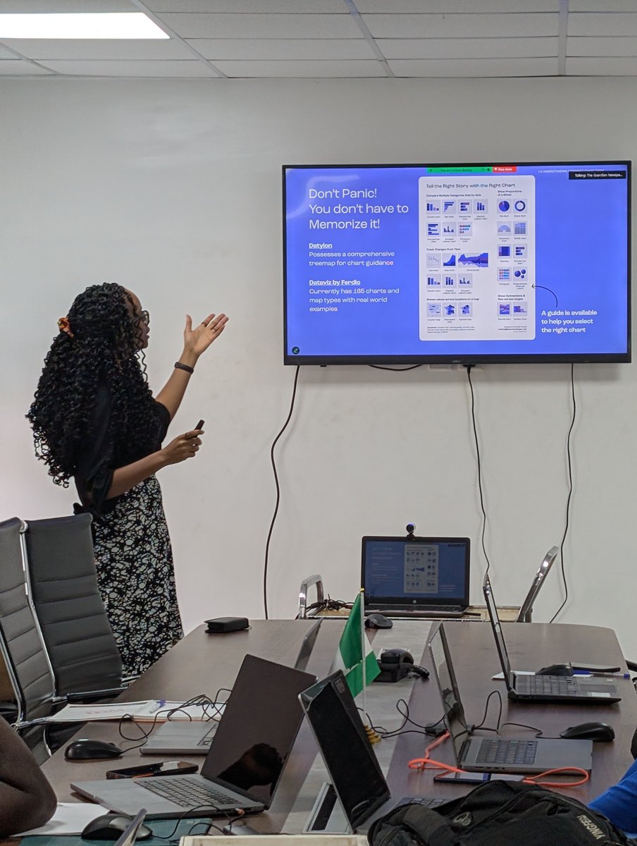
Just wrapped a masterclass with @GuardianNigeria graphics team. It felt like a full-circle moment, sharing what I’ve learned about using data to tell visual stories. Grateful for the chance to teach, reflect, and grow. Hoping this is the start of something even bigger ❤️
Winifred tweet mediaWinifred tweet mediaWinifred tweet mediaWinifred tweet media
English
5
39
415
20.3K
Winifred
Winifred@MissAmase·
I used to think choosing a niche meant picking & sticking to one thing. It didn’t happen like that for me. I paid attention to what I kept coming back to: data, research, and storytelling. A niche isn’t something you pick. It’s something you grow into. Are you growing into yours?
English
0
0
1
16
Winifred
Winifred@MissAmase·
@davidetiosa Exactly! And it's so sad to see that’s the present reality of many people. It's much less about excess and more about how the cost of essentials keeps increasing.
English
0
0
1
36
Ẹ̀tíósá 💛⚡
Ẹ̀tíósá 💛⚡@davidetiosa·
@MissAmase @Risevest This is really cool to see visually. On average, Nigerians are spending more than they earn, and it’s not necessarily even that they’re spending frivolously, it’s just inflation doing them dirty.
English
1
0
2
60
Winifred
Winifred@MissAmase·
I once saw an infographic on how Americans spend their money and got curious about Nigeria. Found a report from @Risevest and explored it visually. Does this breakdown reflect your own monthly reality? Explore the full report: risevest.com/report
Winifred tweet media
English
2
6
11
901
Winifred
Winifred@MissAmase·
@Risevest Thank you! Really appreciate the work you put into the report💚
English
0
0
0
42
Winifred
Winifred@MissAmase·
I recently attended a session by @DataVizSociety led by Kinga Stryszowska on mapping with art + science. She showed a project where she explored using charts as legends, and I decided to revisit a past project and do the same. Which version tells the data story better?
Winifred tweet mediaWinifred tweet mediaWinifred tweet media
English
1
0
0
40
Winifred
Winifred@MissAmase·
Nigeria’s economy has moved in waves, shaped by oil, policy shifts, and external shocks. From rapid booms to sharp drops (like the early 1980s and the recent ~50% fall driven by naira devaluation), the pattern tells a deeper story. Visit macrostrat.ng/thinking for more insights
Winifred tweet media
English
1
6
13
1.6K
Winifred
Winifred@MissAmase·
Three months ago I shared an Annual Reflection template. Now that Q1 of 2026 is over, I’m doing my own check-in. If you downloaded it earlier, check your inbox for my Q1 reflection. If not, theamasedesigns.gumroad.com/l/annualreflec… Pause. Reflect. Adjust.
Winifred tweet media
English
0
0
0
87
Winifred
Winifred@MissAmase·
Food doesn’t just carry nutrients. It also carries a footprint. We often focus on what we eat. But this is a look at everything that happens before it gets to the plate. Explore the full breakdown: yourfoodindata.cafri.org
English
0
1
4
92
Winifred
Winifred@MissAmase·
A dollar doesn’t buy the same thing everywhere. Using Purchasing Power Parity (PPP), this visualization estimates what minimum wages across Africa would look like at U.S. purchasing power. Which result stands out to you? Collab with @onepageforum
Winifred tweet media
English
0
2
3
63
Winifred
Winifred@MissAmase·
When I designed this infographic about the scale behind the world’s largest pot of jollof rice, I kept thinking about the cooking magazines I grew up with. The kind that made food feel almost touchable. That memory shaped how this piece came together.
Winifred tweet media
English
0
0
9
119
Winifred
Winifred@MissAmase·
What the data says about dodo... This is part of Your Food in Data, a series where we examine everyday meals through numbers. If you’re curious about the full breakdown, the complete project is worth a closer look: yourfoodindata.cafri.org
English
0
1
1
66
Winifred
Winifred@MissAmase·
When @hildabacicooks cooked the world’s largest pot of jollof rice, it wasn’t just a record, it was a moment defined by scale, endurance, and teamwork. Some achievements are easier to understand when you can see what they required. This visual breaks it down.
Winifred tweet mediaWinifred tweet mediaWinifred tweet media
English
6
129
658
21.2K
Winifred
Winifred@MissAmase·
Everyone loves dodo. (Yes, I’m ignoring all those who don't😌) Working on this piece with @thecafri reminded me how rarely we stop to ask what actually goes into the foods we eat every day. This is the 2nd food in this series. View the full series here: bit.ly/4qy00GN
Winifred tweet media
English
0
1
5
161
Winifred
Winifred@MissAmase·
I'm working on the next infographic in the Your Food in Data series with @thecafri What food do you think we’re covering next?
English
0
0
0
84
Winifred
Winifred@MissAmase·
Merry Christmas from me to you! ❤️ As we celebrate the birth of our Saviour, Jesus Christ, the greatest gift of all, may your heart and home be filled with His joy, peace, and unshakable hope. Have a truly blessed Christmas.
Winifred tweet media
English
0
0
1
144