Sabitlenmiş Tweet
MyFonts
15K posts

MyFonts
@MyFonts
Myfonts x @Monotype. The world’s largest collection of fonts for print, products & screens. Looking for customer support? Email [email protected].
Massachusetts Katılım Mart 2009
952 Takip Edilen61.4K Takipçiler
Hello @ATXCarrie777, Thank you for reaching out.
We’re sorry to hear about the experience.
Troubleshooting or resolving the font issue over social media can be challenging. Please contact our support team at help@myfonts.com, and include screenshots of the issue along with your order number so we can assist you more effectively.
English
Sometimes, fonts don't measure up to your expectations, and it shouldn’t fall on purchasing designers to take the hit. At MyFonts, we’re serious about customer service and ensuring you’re happy with well-designed, functional fonts.
Recently, a customer had an issue with a font not performing the way that it should have. While it supposedly provided support for various scripts, one of the scripts was found to not perform when applied in design applications. For this customer, they had wanted to use the same typeface across different scripts for a multilingual project, and selecting a different font for one language would not be ideal.
Our support team handled every step of the process smoothly: the refund was processed promptly, a confirmation email arrived without delay, and clear guidance was provided throughout.
In the customer’s own words, the process was a textbook example of turning a difficult situation into a positive experience.
Our team is always happy to help!
English
An iconic font, an exciting update for modern design.
Gotham made its debut 25 years ago on the cover of GQ, and over the years, became ubiquitous for big brands, media, politics, and appreciated by designers worldwide for its straightforward, yet warm quality.
Gotham Variable is the latest step in this typeface's evolution. Various weights, widths, and styles are available in a single, compressed file, making it easier to work with in design tools, faster-loading for digital audiences, and fantastic for designers who want more control and flexibility when working with their fonts. Gotham Variable also further extends Gotham's global language support by adding fresh stacked accents for Vietnamese.
Explore Gotham Variable here: bit.ly/4feWezV
English
@Sirkhalid16 Hi, thank you for reaching out.
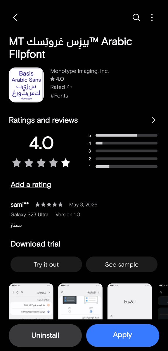
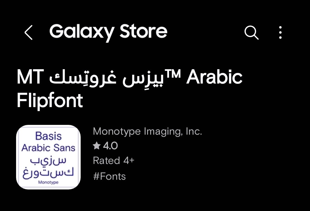
Monotype offers a number of Arabic FlipFonts that are modern and well-designed. Please take a look here: galaxystore.samsung.com/search?q=arabi…
We also plan to release further Arabic FlipFonts in the near future.
English

@MyFonts Arabic fonts are pretty average, give me some good ones and support symbols like the Saudi Riyal.
English
@___mouad00 Hi, thank you for reaching out.
We understand this has been frustrating, and we appreciate your patience. We have shared it with the appropriate team.
Thank you for your understanding.
English

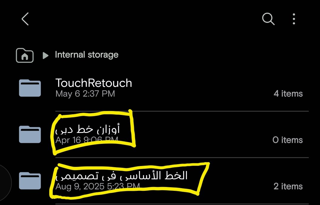


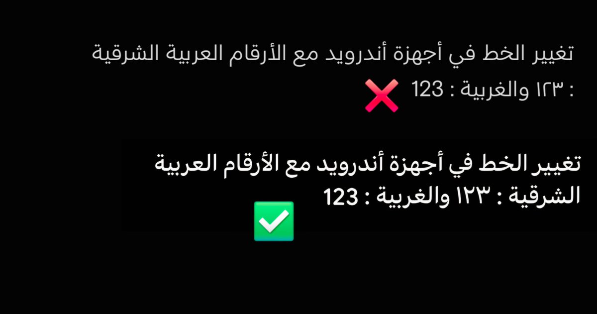
@MyFonts 1 - يجب تحسين التنسيق في خطكم العربي الذي بأسم بيزس غروتسك الذي يوجد في متجر قالكسي.
2 - دعم الرموز في الخط (الذي كذبتهم بشأنها).
3 - التخفيف من حدة الخط، أجعلوا مثل الذي بالصورة.
x.com/i/status/20520…
ريان RYN@ra7y7an
@NA1XF1 مازال يحتاج تحسين وتطوير فيه أخطاء أيضا من الناحية الجمالية هو جيد بس نطمح للأفضل أتمنى تطويره وتحسينه للأفضل صورة ممكنة
العربية
@BuHameD0082 Hi, thank you for reaching out.
Monotype offers a number of Arabic FlipFonts that are modern and well-designed. Please take a look here: galaxystore.samsung.com/search?q=arabi…
We also plan to release further Arabic FlipFonts in the near future.
English

@MyFonts نريد خطوط عربية ذات جودة ووضوح مع محاذاة ممتازة
ان يكون الخط واضح
الحروف تكون متناسقة
امكانية تنزيلها بخيارات الخط الرفيع والمتوسط والعريض
وزن الحروف مع الكلمات لابد ان يكون متزن
نحتاج الى خط مميز
الخطوط الموجودة خطوط غير متناسقة في الاوزان ورفيعة جدا
العربية
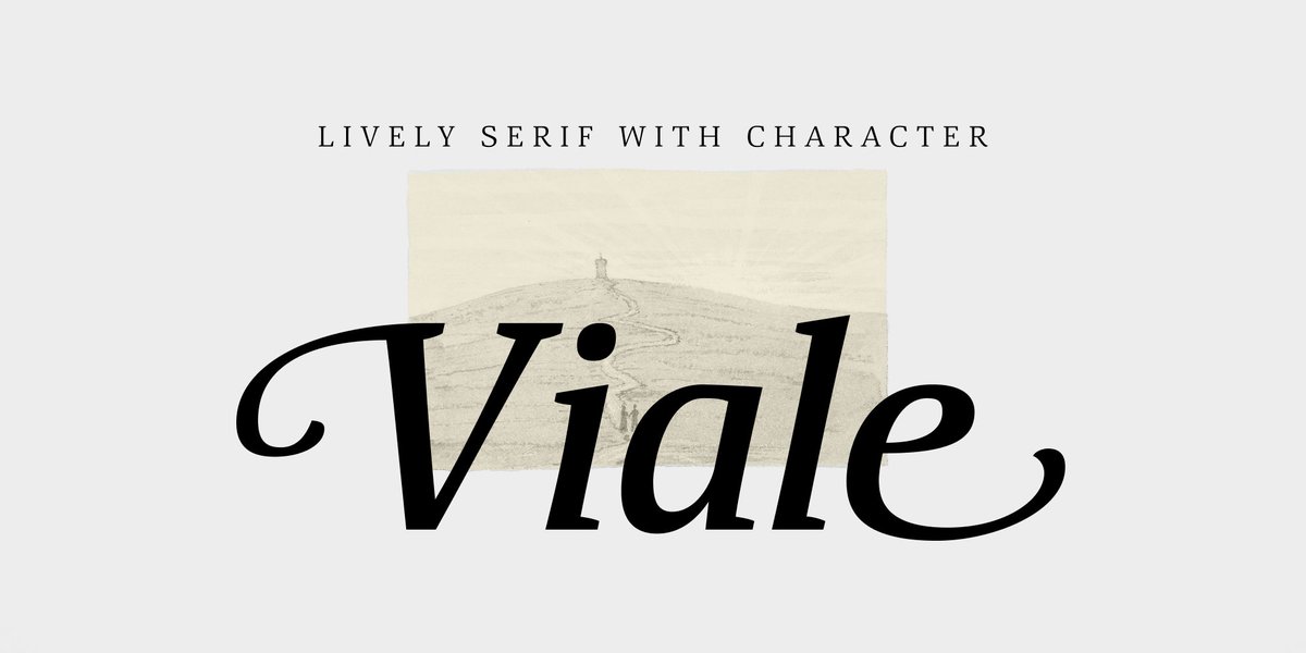
Serif Saturdays: Viale by ParaType
A fresh, new serif font each Saturday to appreciate as you slow down.
Paratype's Viale is a gorgeously approachable serif option that gives designers the ability to add extra flourish. Across different weights, the typeface includes a rich set of OpenType features — some of which can significantly transform its visual appearance. Depending on the style, you can switch initial and final forms, enable ligatures or small caps, use oldstyle figures, or activate a slashed zero.
Explore Viale here:
myfonts.com/collections/vi…
English
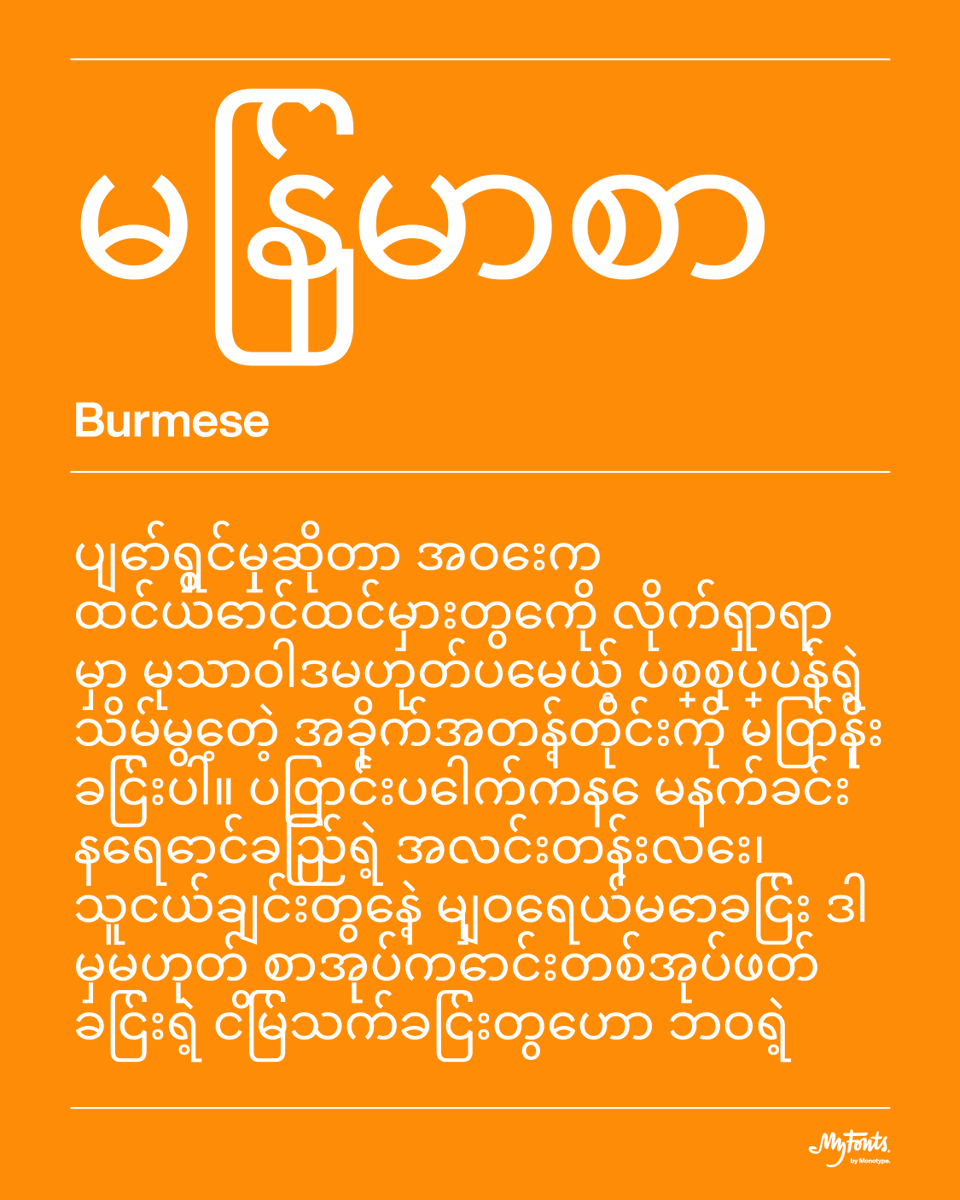
Non-Latin Script: Burmese
Burmese-Mon script is the primary writing system for Burmese, Mon, Shan, Rakhine, Jingpho, and several Karen languages.
This distinct script flows in continuous circles with a playful elegance. Defined by rounded, bubble-like characters which stack and connect, it's some of the most visually distinctive typography in Southeast Asia.
English
Did you know...
In Western societies, Johannes Gutenberg is celebrated as the creator of the printing press, but earlier movable type systems existed in the East.
Bi Sheng invented a movable type system using fired clay tiles in China some time between 1039 and 1048. Over the following centuries, ceramic, wooden movable type and bronze movable type iterations were also used in Chinese printing.
English
Solve font mysteries with a few clicks.
Fonts do the heavy lifting in design, but unless they're recognizable powerhouses like Helvetica or Avenir, it's almost impossible to guess that font. After all, we have nearly 300,000 fonts available on MyFonts!
WhatTheFont font finder is an easy-to-use, powerful tool that cross-references images of type to thousands of font files. Whether you're snapping or screen-grabbing, you can enter images to identify fonts in use.
Try it out here: myfonts.com/pages/whatthef…

English
Hot New Fonts alert!
April font choices bring May designs in full bloom. Here are the top ten hot new fonts on MyFonts for mid-April:
1. Pants of Fire by Hanoded
2. Autêntica Sans by Sofia Mohr
3. Nowstalgic by Font Catalogue
4. Olivia Jenisen by Arterfat Project
5. Galdertin Charetam by IM Studio
6. Foliant Sans by Identity Letters
7. Polyguard by W Type Foundry
8. RCL Arviel by Jafar07
9. Cluster by Kobuzan
10. Cluster Edge by Kobuzan
To see the full (and auto-updating!) list, click here:
myfonts.com/collections/ho…
(Fonts featured here: Pants on Fire, Autêntica Sans, Foliant Sans, and Olivia Jenisen)


English
Paid Fonts: Getting What You Pay For, Quality-wise
There are many free fonts available out there, and some are made available by incredibly talented and detail-oriented type designers.
However, many free fonts are simply not crafted to the same standard as professionally made fonts, which are carefully engineered for consistency, readability, and performance. From spacing and kerning to cross-platform reliability, professional fonts are built to withstand real-world demands, not just look good at first glance.
When you choose paid fonts over free fonts, you're typically getting a higher quality product and supporting skilled type designers and foundries.
English
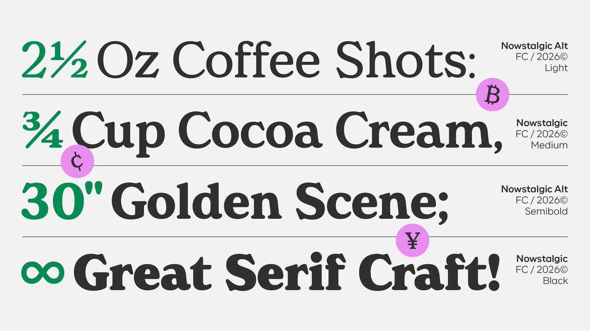
New font alert: Nowstalgic from Font Catalogue.
With soft geometry, humanist details, and a beautifully consistent typographic rhythm, Nowstalgic is designed to perform seamlessly across branding, packaging, editorial, and digital.
What makes it special?
A versatile system of alternates — from a Benguiat-inspired two-story "g" to expressive terminal details — giving you not just one voice, but two distinct tones to design with.
The result: a typeface that feels both timeless and fresh.
myfonts.com/collections/no…


English
Do you have an old font font purchase, but now have a new device?
Happy to help!
Recently, a customer reached out to our team. They had purchased some fonts several years earlier, and recently upgraded to a new computer. Unable to locate the original download files, they were worried they would need to go through the purchasing process all over again.
They reached out to us, and our team tracked down the original order, confirmed the customer's entitlement, and reissued the download links promptly. No repurchase necessary, just a smooth transition and more reasons to enjoy a new computer.

English
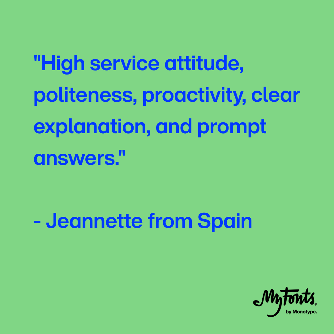
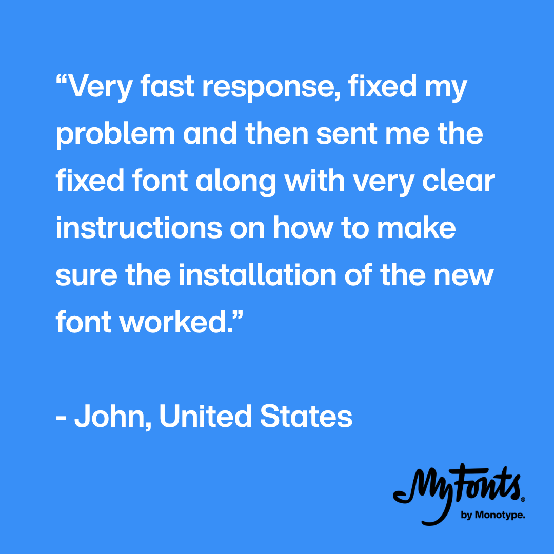
If you ever have an issue with a MyFonts purchase, our wonderful support team is here to help and resolve the issue as fast as possible.
"Very fast response, fixed my problem and then sent me the fixed font along with very clear instructions on how to make sure the installation of the new font worked." - John from the United States
English
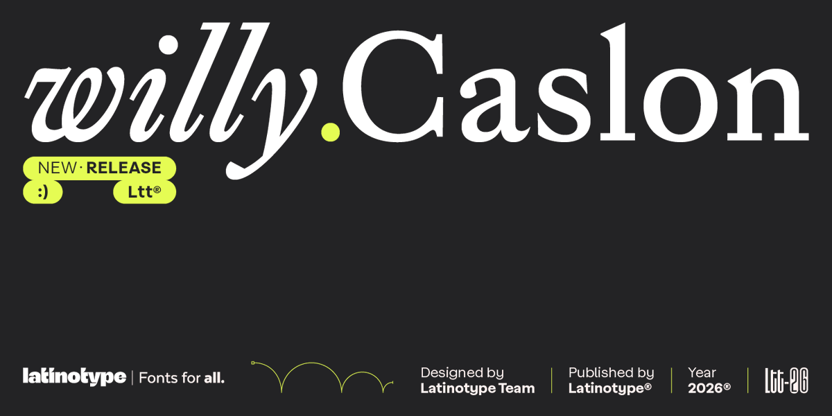
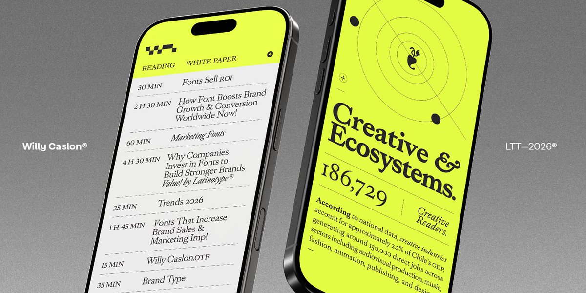
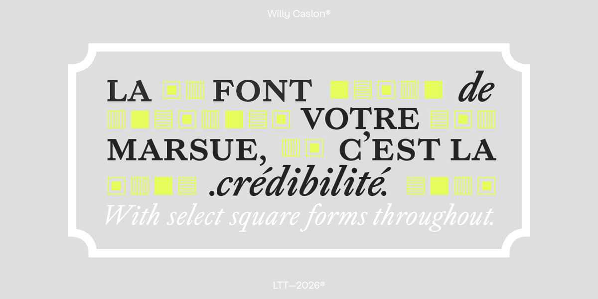
Superstar Font Alert: Willy Caslon from @Latinotype has been #1 on our Hot New Fonts list for over a month!
Willy Caslon retains a clear connection to Caslon's classic spirit but translates it into contemporary use, where legibility, rhythm, and character are central criteria. It is a typeface designed for editorial identities, digital projects, and applications where a serif with typographic presence plays an active role in content development.
You can check it out here: myfonts.com/collections/wi…

English