Alex Nuzhnyi

624 posts

Alex Nuzhnyi banner
Alex Nuzhnyi

Alex Nuzhnyi

@Nekto_Designer

Designer who codes, with a passion in AR, typography, and motion design.

Kyiv, Ukraine Katılım Aralık 2014
51 Takip Edilen54 Takipçiler
Alex Nuzhnyi
Alex Nuzhnyi@Nekto_Designer·
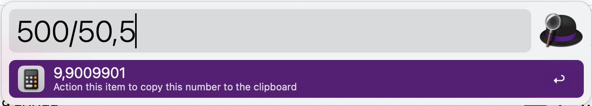
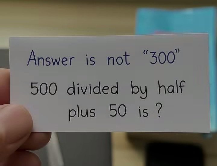
@LeaVerou @Mishi_2210 👏 Bravo Lea! However, the Alfred app thinks that a couple of digits still have been lost :)
Alex Nuzhnyi tweet media
English
0
0
0
84
Mishi Vibes 🇺🇲
Mishi Vibes 🇺🇲@Mishi_2210_·
Answer is not "300" Tell me the answer and win $1000
Mishi Vibes 🇺🇲 tweet media
English
52.2K
589
20.8K
9.3M
Alex Nuzhnyi
Alex Nuzhnyi@Nekto_Designer·
@jh3yy @CodePen @jh3yy Another awesome concept! 😎Thanks a lot, Jhey! In my opinion, from the UX point of view it would be better to have the Close button at the same place as the Menu button on mobile: codepen.io/Nekto/full/vEL…. Just to save that extra movement necessary to close the popover 😉
English
0
0
0
12
jhey ʕ•ᴥ•ʔ
jhey ʕ•ᴥ•ʔ@jh3yy·
responsive CSS pinned sidebar transition 📌 .layout:has(:popover-open) { grid-template-columns: var(--sidebar-width) 1fr; } aside:popover-open { translate: 0 var(--ctrl); height: var(--extend); } actual zero JS for the layout transition here so many details to play with! 🧑‍🍳
jhey ʕ•ᴥ•ʔ@jh3yy

tag him and he will come 🏷️ can take it a step further without needing JS to toggle the sidebar persistent state too (useState is being used in this demo to persist open/closed 👇) feel obliged as soon as I’m tagged 😅

English
20
66
1.5K
386.3K
Alex Nuzhnyi retweetledi
Codrops
Codrops@codrops·
Creativity isn't magic... it's feelings, little tweaks, and a lot of heart. 💜 In the first part of his new series "Creating Emotionally Meaningful Experiences with AI, Three.js, and Blender", @andrewwoan shows us how to find meaning in what we make. 🐼 Set aside a little time, it's so worth it: tympanus.net/codrops/2025/1…
English
0
2
30
3.7K
Alex Nuzhnyi retweetledi
Manoela Ilic
Manoela Ilic@crnacura·
AI can generate. But it can't care. It can't feel. The meaning behind what we make, that's something only we bring. @andrewwoan new series is a powerful reminder: creativity isn't about talent, it's about emotion, persistence, and finding joy in the process: tympanus.net/codrops/?p=960… Thank you, Andrew 💙🙏
English
1
1
23
1.4K
Alex Nuzhnyi retweetledi
Sara Soueidan is on Bluesky
Sara Soueidan is on Bluesky@SaraSoueidan·
🎥 New (Video) Podcast: "Navigating the World of Web Accessibility with Sara Soueidan", with Kevin Powell youtube.com/watch?v=ndGKjh… I finally sat down with Kevin for a long-overdue, in-depth conversation about web accessibility, and we had a blast!
YouTube video
YouTube
English
2
5
34
9.7K
Alex Nuzhnyi retweetledi
Devhumor
Devhumor@dev_humor·
LLM slot machine
Devhumor tweet media
English
0
4
15
1.7K
Lea Verou, PhD
Lea Verou, PhD@LeaVerou·
It’s not new but I just discovered this @oatmeal post and I think it may well be my favorite of his. “Sometimes going down the wrong path isn’t a mistake — it’s a construction line” Amen to that! theoatmeal.com/comics/creativ…
English
1
1
16
1.7K
Alex Nuzhnyi retweetledi
DANN©
DANN©@DannPetty·
Trying to design a standout website? Check out these quick tips, inspired by the new @jittervideo site.
English
23
48
679
369.2K
Alex Nuzhnyi
Alex Nuzhnyi@Nekto_Designer·
It's one of the best 5 minutes I've spent online! 🤩 The History of Typography by Ben Barrett-Forrest 👉 vimeo.com/65899856. Incredibly informative and beautifully orchestrated 👏 Must watch for any designer or typography enthusiast.
English
0
0
0
53
Alex Nuzhnyi
Alex Nuzhnyi@Nekto_Designer·
Are you new to accessibility or looking to level up your skills? Then dive into the Practical Accessibility course by @SaraSoueidan. 🔥 practical-accessibility.today Get 25% off the course’s full price using the code ANNIVERSARY, til Monday, October 20th (UTC). Learn from the best! 😎
Alex Nuzhnyi tweet media
English
1
4
13
815
Alex Nuzhnyi retweetledi
Matthias Cordes
Matthias Cordes@MatthiasCordes·
How to make extremely long words fit mobile screens 1. Copy a soft hyphen. 2. Select a location for an optional word break. 3. Paste the soft hyphen. Especially useful for improving responsiveness and reducing risks of unwanted content overflows.
English
24
36
366
33.7K
Alex Nuzhnyi retweetledi
Yi Shen
Yi Shen@pissang1·
A new light editor is introduced in the latest version of Vector to 3D #figma
English
17
82
1K
122.7K
Alex Nuzhnyi retweetledi
jhey ʕ•ᴥ•ʔ
jhey ʕ•ᴥ•ʔ@jh3yy·
UI && CSS Tip! 🔥 You can create these dynamic glowing card effects with a single JavaScript event listener, some CSS tricks, and an HTML attribute 🤙
Here's how! 👇 You can use a combination of tricks from previous posts. Let's start with the JavaScript 📜 Use a function like this to send the pointer position via custom properties to the glows ✨ Attach this to the pointermove event 👆 const onPointermove = ({ x, y }) => { document​.documentElemen​t​.style.setProperty('--x', x) document.documentElement​.style.setProperty('--xp', x / innerWidth) document.documentElement​.style.setProperty('--y', y) document.documentElement​.style.setProperty('--yp', y / innerHeight) } Now for the styles 🎨 These custom properties define the border and spotlight size. The first trick is how you can change the color(--hue) based on the pointer position with calc 😎 [data-glow] { --border-size: 2px; --spotlight-size: 150px; --hue: calc(var(--base) + (var(--xp) * var(--spread))); } The magic is using the pointer position in a radial-gradient combined with background-attachment: fixed ✨ (Check the video for an exploding view 🎞️) [data-glow] { background-image: radial-gradient( var(--spotlight-size) var(--spotlight-size) at calc(var(--x, 0) * 1px) calc(var(--y, 0) * 1px), hsl(var(--hue) 100% 70% / 0.25), transparent ); background-attachment: fixed; } The last major piece is using mask-composite on the pseudoelements of the [data-glow] element and the same background-attachment: fixed trick 🫶 [data-glow]::before, [data-glow]::after { pointer-events: none; content: ""; position: absolute; inset: calc(var(--border-size) * -1); border: var(--border-size) solid transparent; background-attachment: fixed; background-size: calc(100% + (2 * var(--border-size))); background-position: 50% 50%; mask: linear-gradient(transparent, transparent), linear-gradient(white, white); mask-clip: padding-box, border-box; mask-composite: intersect; } This masks the elements so only a fake border is shown. That border is actually the spotlight background that moves around 👀 But now it's clipped to the border width 😎 Then it's a case of switching out the background-image for each pseudoelement based on purpose 🧐 For example, to get the white light, use your custom properties, make the light a little smaller and the color bright! [data-glow]::after { background-image: radial-gradient( calc(var(--spotlight-size) * 0.5) calc(var(--spotlight-size) * 0.5) at calc(var(--x, 0) * 1px) calc(var(--y, 0) * 1px), hsl(0 100% 100% / 1), transparent ); } These are the major pieces you need to get it done. Extras? Want the outer glow? Nest a glow!
Give the inner glow a blur to create the outer glow 😅 [data-glow] > [data-glow] { filter: blur(10px); } It's worth digging in with this one. Have a play around with the demo and the custom properties. The code isn't perfect after introducing all the configuration pieces 😅 Will put together a reduced example for you! 🙏 Any questions, let me know! 💙 @CodePen link below! 👇
jhey ʕ•ᴥ•ʔ@jh3yy

– One HTML attribute – One JavaScript event listener – Configurable via CSS custom properties Let's get this explodin' 🤙

English
21
133
1.3K
381.6K
Alex Nuzhnyi retweetledi
gaut
gaut@0xgaut·
ok this is absolutely *wild* using AI to live translate and sync your lips
English
1K
5.2K
32.6K
8.1M