Sabitlenmiş Tweet

Since I've been posting more art to Twitter and it keeps getting crunched here's a link to a Google photos album with all the art I upload in better quality.
photos.app.goo.gl/8dQTSLdeXHUQaL…
English
Pip
3.8K posts

@Pip9766
What you see is what you get! ¯\_(ツ)_/¯
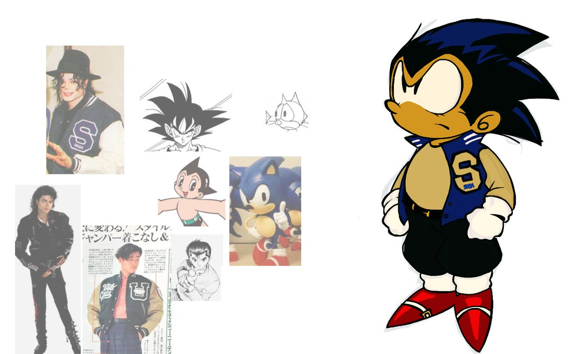
You know something I wanted to do for the longest time now? Give my series, Hues of Metal, a full intro. And lo and behold, I did. It'd only make sense to make one since it's gonna be a full series eventually.


Today is National Puppy Day.


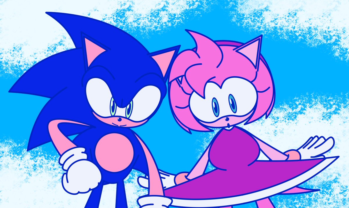
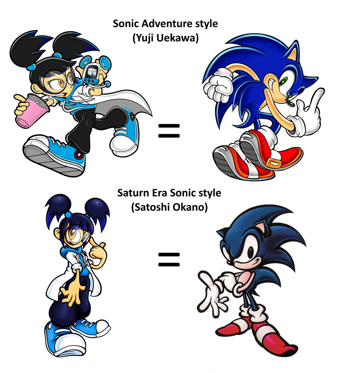
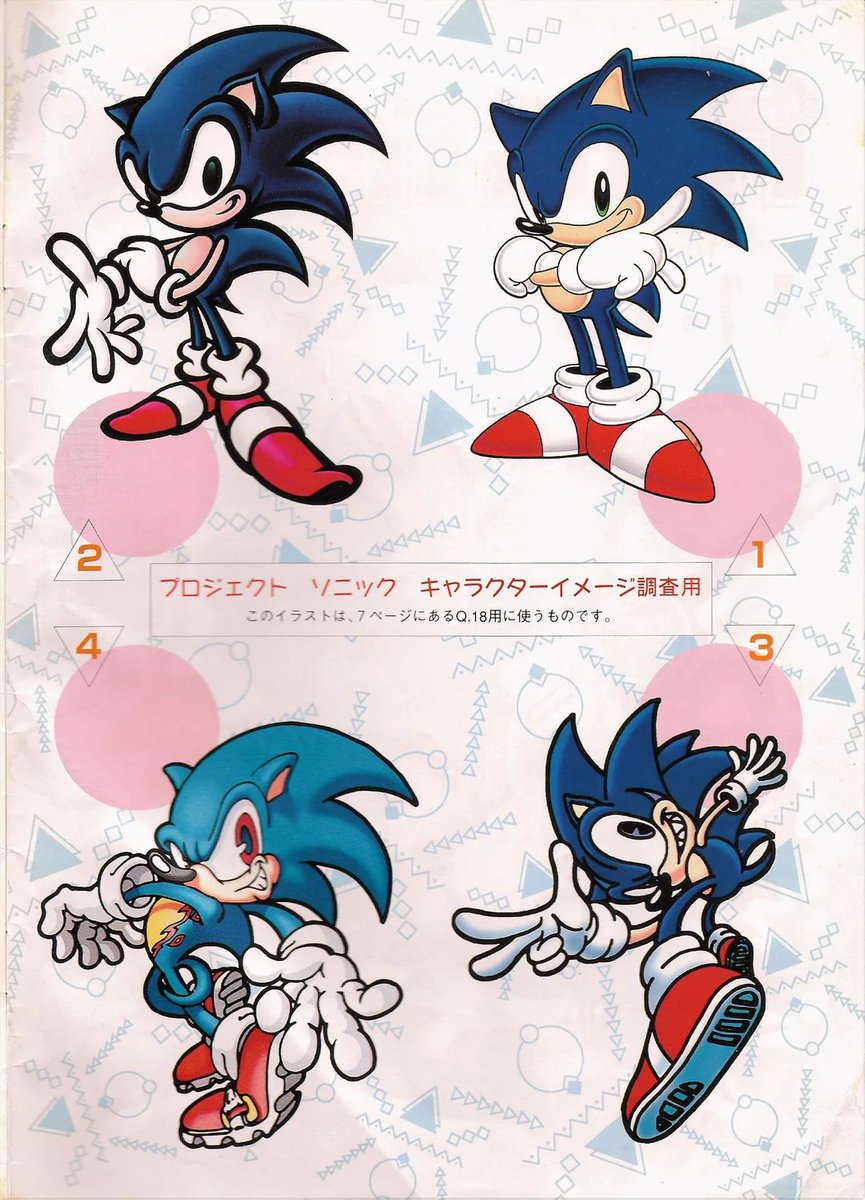
I could use more feedback. I'm trying to do a sorta' character study/ideal design thing with Sonic but I'm not sure if it's working. Is there anything you think I should change/could do better?
I could use more feedback. I'm trying to do a sorta' character study/ideal design thing with Sonic but I'm not sure if it's working. Is there anything you think I should change/could do better?