Pouya⚡️

35K posts

Pouya⚡️ banner
Pouya⚡️

Pouya⚡️

@PouyaGraphics

Designer & creator. Thumbnails, branding, and visuals.

Katılım Mayıs 2020
440 Takip Edilen4.6K Takipçiler
Sabitlenmiş Tweet
Pouya⚡️
Pouya⚡️@PouyaGraphics·
I’m Pouya — the designer behind Pouya Graphics. I’ve worked across gaming, creators, and even the early web3 era, building visuals, websites, and brand systems for teams that needed clarity and intention.
English
1
1
2
166
Pouya⚡️
Pouya⚡️@PouyaGraphics·
Most thumbnails fail because they try to communicate five ideas at once. The viewer only has room for one. If you can’t describe your thumbnail’s idea in a single sentence, the viewer won’t understand it in a single glance.
English
0
0
2
33
Pouya⚡️
Pouya⚡️@PouyaGraphics·
Visual weight matters more than detail. A simple shape with strong contrast will always pull the eye faster than a detailed object with weak contrast. That’s why good thumbnails feel “clean” even when they’re full of information.
English
0
0
2
24
Pouya⚡️
Pouya⚡️@PouyaGraphics·
A creator’s visual identity isn’t built from a logo or a banner. It’s built from consistency — the same shapes, the same colors, the same emotional tone repeated across every thumbnail. Consistency is what makes a channel feel intentional.
English
0
0
2
21
Pouya⚡️
Pouya⚡️@PouyaGraphics·
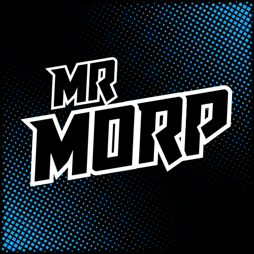
Full branding package for Mr Morp. The goal was clarity, personality, and a visual identity that works across thumbnails, banners, and stream assets. A strong brand makes every thumbnail easier. Here's a link to his channel: @MrMorpYT" target="_blank" rel="nofollow noopener">youtube.com/@MrMorpYT
Pouya⚡️ tweet mediaPouya⚡️ tweet media
English
0
0
2
81
Pouya⚡️
Pouya⚡️@PouyaGraphics·
My approach to creator branding: • find the core emotion • reduce it to a shape • build a system around it
English
0
0
2
16
Pouya⚡️
Pouya⚡️@PouyaGraphics·
A good logo doesn’t need to be clever. It needs to be recognizable at every size. That’s the real test of creator branding.
English
0
0
2
31
Pouya⚡️
Pouya⚡️@PouyaGraphics·
Creator branding isn’t just a logo — it’s a system. This set works because: • consistent shapes • clean color hierarchy • a recognizable silhouette • a banner that reinforces the identity Cohesion is what makes a channel feel intentional. @MictyanEXE - My own gaming channel
Pouya⚡️ tweet mediaPouya⚡️ tweet media
English
0
0
2
21
Pouya⚡️
Pouya⚡️@PouyaGraphics·
Design is a language. Most people try to speak it with decoration. But the real fluency comes from hierarchy, contrast, and intention. That’s what makes visuals feel premium.
English
0
0
2
14
Pouya⚡️
Pouya⚡️@PouyaGraphics·
Warm colors = emotion. Cool colors = tension. Most great thumbnails use both — but one always dominates. Pick a temperature and commit to it.
English
0
0
2
18
Pouya⚡️
Pouya⚡️@PouyaGraphics·
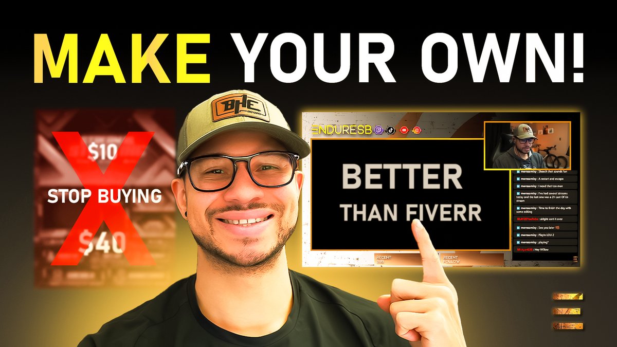
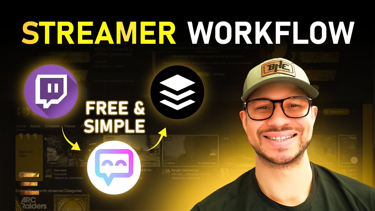
Creator thumbnails don’t need to be complex — they need to be clear. This one works because: • strong icon hierarchy • clean left‑to‑right flow • one simple idea (“free & simple workflow”) • bold shapes that read instantly Clarity is what makes a thumbnail feel premium.
Pouya⚡️ tweet media
English
0
0
2
32
Pouya⚡️
Pouya⚡️@PouyaGraphics·
I used to design websites in the early web3 era. It taught me a lot — but it wasn’t the work that made me feel anything. Thumbnails and branding do. They’re fast, emotional, and brutally honest. You know instantly if they work.
English
0
0
2
20
Pouya⚡️
Pouya⚡️@PouyaGraphics·
Quick design tip: Depth makes thumbnails feel cinematic. You can create depth with: • foreground elements • mid‑ground characters • soft background gradients • atmospheric haze Simple trick, huge impact.
English
0
0
2
33
Pouya⚡️
Pouya⚡️@PouyaGraphics·
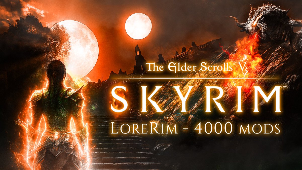
Cinematic thumbnails rely on atmosphere as much as composition This one hits because: • strong foreground silhouette • atmospheric depth • warm vs cool contrast • a sense of scale that feels like a movie poster When the atmosphere tells a story, the click becomes instinctive
Pouya⚡️ tweet media
English
0
0
2
21
Pouya⚡️
Pouya⚡️@PouyaGraphics·
The 3‑second rule is dead. On YouTube, you don’t get 3 seconds — you get 0.3. That’s why thumbnails need emotion, contrast, and a single idea. Anything more is noise.
English
0
0
2
18
Pouya⚡️
Pouya⚡️@PouyaGraphics·
Designing thumbnails teaches you to think like a viewer, not a creator. And that mindset shift changes everything.
English
0
0
2
22
Pouya⚡️
Pouya⚡️@PouyaGraphics·
If your text isn’t readable at 5% size, it’s not readable on YouTube. Scale it down. If it dies, fix it.
English
0
0
2
20
Pouya⚡️
Pouya⚡️@PouyaGraphics·
The more I design, the more I realize: Clarity is a superpower. Most visuals don’t need more detail — they need more intention.
English
0
0
2
14
Pouya⚡️
Pouya⚡️@PouyaGraphics·
Creator thumbnails don’t need to be loud — they need to be clear. This one works because: • Strong message hierarchy • Clean left–right structure • High‑contrast focal point • A single, memorable idea Clarity beats clutter every time.
Pouya⚡️ tweet media
English
0
0
2
27
Pouya⚡️
Pouya⚡️@PouyaGraphics·
Quick design tip: If everything in your thumbnail is bright, nothing is bright. Color hierarchy is what tells the viewer where to look first.
English
0
0
2
21
Pouya⚡️
Pouya⚡️@PouyaGraphics·
Most creators think thumbnails are about “standing out.” They’re actually about being understood instantly.
English
0
0
2
20