
Prins
617 posts

Prins
@PrinsEdit
got to work with @Rubiu5, @HiperOP, @EpicGamesES, Julian Petroulas, Sadia Khan and others but got tired of this shi
Katılım Ekim 2024
211 Takip Edilen75 Takipçiler

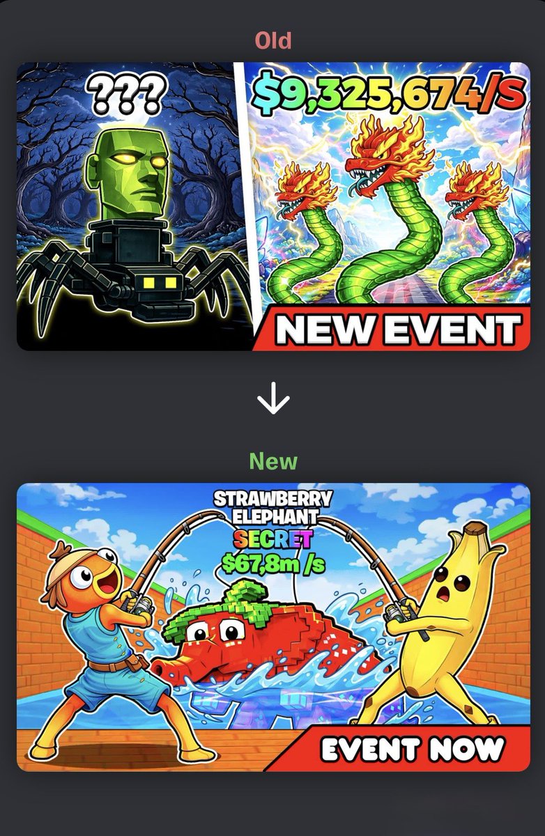
Today I wanted to talk about this thumbnail change for @/AnthrotJP’s map.
As always, I like to start by analyzing the current thumbnail and what the map is about.
After going through it, we realized the map is original enough to go for a completely different thumbnail idea.
The current thumbnail was very generic and quite similar to maps like Steal The Brainrot, and with how popular that is right now, it’s very hard to compete with something similar.
So we came up with a thumbnail that clearly explains the game at a glance and, more importantly, can be easily adapted for future events.
Because in these types of maps, being able to update the thumbnail consistently is key.
If you want to try it: 1760-1583-8879
English


@PrinsEdit At the beginning, it’s hard. Many people think they must innovate, but often it’s better to follow the trend and do it better.
English
Prins retweetledi
I’ve had the chance to work on many thumbnail updates for big maps, and I noticed something interesting.
Why do they change their thumbnail almost every week if they already have loyal players?
Because they don’t settle.
Even when the map is doing well, they try to improve every small percentage.
They want to keep the hype alive.
They want to stay visible in Discovery.
They want to keep growing even when they are already successful.
And here’s the important part:
I’ve seen many maps with real potential launch, not do well at first… and then get abandoned.
Time and money wasted.
The key is not making one good thumbnail.
The key is improving it until it works.
Sometimes the CTR doesn’t grow because it’s not the right audience at that moment.
Sometimes other things affect the results.
But the thumbnail is still a very important part of the system.
In almost every business, it works the same way:
First you invest.
Then you improve.
You adjust.
And after that, the results come.
Most people quit too early.
So here’s the message:
If you know your map has potential, don’t let it die because of the first version.
Keep working on it. Keep testing. Keep improving.
English
Prins retweetledi
I’m really glad to start seeing thumbnails of this level in Discovery.
You can tell when a thumbnail is thought through detail by detail. It’s not just about “looking good.” Each one has a clear function.
The two on top use POV (point of view), which is still uncommon in UEFN.
That makes the viewer feel inside the game. They’re not just watching it… they’re experiencing it.
The two on the bottom rely more on action and tension:
danger, exploration, urgency, survival.
A great thumbnail doesn’t just show the map.
It creates emotion and curiosity in less than 3 seconds
The key isn’t adding more elements.
It’s having a clear idea and designing every detail around that idea.


English
It’s been a pleasure working on the UI card design!❤️🃏
Coremaps@coremaps
Mafia Cards is finally live in Fortnite! Start playing and collecting new abilities in Mafia Heist 2. A brand new system in fortnite roguelikes. @FNCreate
English
Prins retweetledi
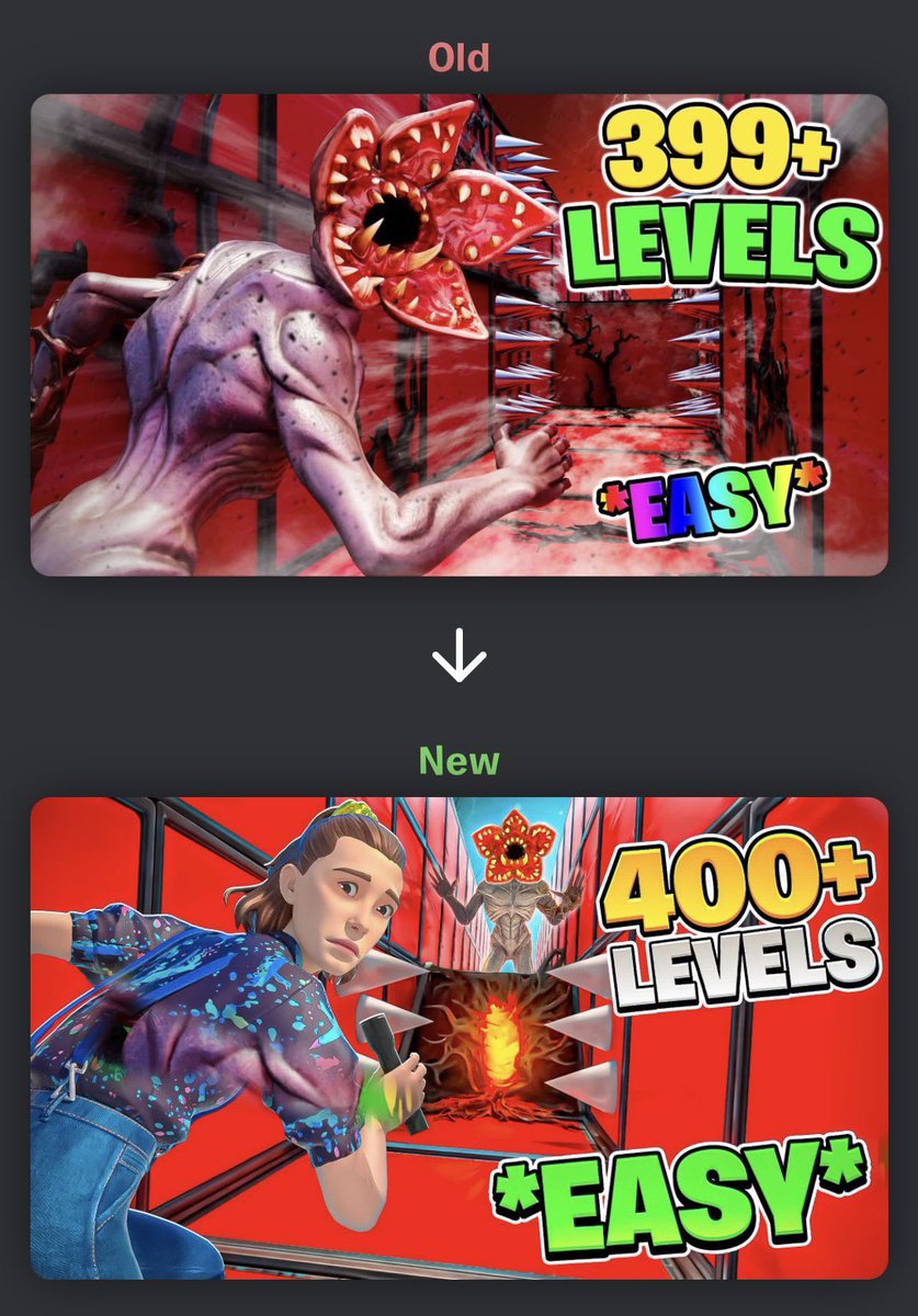
This is how it’s possible to drive growth from 0 to 300+ CCU with a single thumbnail change.
First, I analyzed the old thumbnail:
Too many effects, too much detail, and an almost fully red color palette.
The issue is that on Fortnite Discover, thumbnails are shown very small, so all that detail gets lost. On top of that, having everything red meant no contrast, nothing stood out.
For the remake, I completely changed the approach.
Instead of adding more elements, I focused on simplicity and emotion.
A good thumbnail isn’t about looking “pretty” it’s about communicating a clear message in under a second and creating a feeling that makes people click.
The final thumbnail was much simpler than the original, but:
•The message is instantly clear
•It has strong contrast
•It creates clear sensations
That’s what made the difference and allowed the map to go from 0 CCU to over 300 CCU.
English
Recent Creative Map thumbnails(UEFN)!🎨🏐
The support is greatly appreciated ♻❤
#UEFN #FortniteCreative #FortniteArt

English