
Robert Inklaar
1.3K posts

Robert Inklaar
@RobertInklaar
Professor on Productivity and Welfare @UniGroningenFEB, director Groningen Growth and Development Centre (GGDC), developer @PennWorldTable, editor @ROIWeditors
Groningen, Netherlands Katılım Ocak 2013
369 Takip Edilen958 Takipçiler

@erinhengel This is the best/easiest place to get answers on your questions: ourworldindata.org/grapher/work-h…
English

When people state that work weeks are shorter now vs a century ago, how do they measure the length of a work week 100 years ago? Is it the average work week of *all* people in an economy (including, say, the idle upper class)? Or just working class? Men & women alike? Children?
English
@LukaszRachel Exactly, that was a good thread! It's only when people start shooting from the hip...
English

great to highlight, explain and debate these improvements, as well as the underlying data and the judgments that they reflect. Exactly as were doing in this exchange. 🤓
English
Robert Inklaar retweetledi
Very thoughtful and incredibly *useful* thread from @RobertInklaar - thank you for that. I'd just add that it would be ridiculous and bad for science if improvements did not happen in equilibrium bc of concerns that big changes superficially "look bad". At the same time, it is..
Robert Inklaar@RobertInklaar
Some recent new discussions about total factor productivity (TFP) numbers in @PennWorldTable, with the notably reductive post by @Noahpinion as a low point: x.com/Noahpinion/sta… (1/)
English
If you think the result is 'complete nonsense', by all means move on, but do take that same attitude to a lot more of the data you use (12/12)
English
So where does that leave @PennWorldTable? For the ±15 years that we have worked on it, a key aim has been to be transparent and reproducible in our data construction. To limit judgmental adjustments and give users the numbers straight. (11/)
English
Some recent new discussions about total factor productivity (TFP) numbers in @PennWorldTable, with the notably reductive post by @Noahpinion as a low point: x.com/Noahpinion/sta… (1/)
Noah Smith 🐇🇺🇸🇺🇦🇹🇼@Noahpinion
Penn World Tables TFP numbers are basically complete nonsense
English
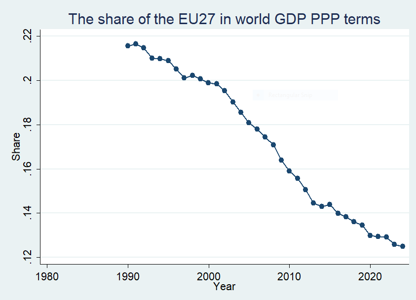
@BrankoMilan But the decline in the US world GDP share is even more pronounced than the EU-27's share

English

I was curious: here is the share of the current 27 European Union members in global GDP (in purchasing power terms) since 1990.
(China's current share is just short of 20%, US around 16%)
Source: World Bank World Development Indicators 2025
English
@ajpirzada @JesusFerna7026 Indeed, thanks for linking that in. As a result of that change, I would agree that 'true' TFP growth in China is probably lower than PWT's number, though by how much is harder to say.
English

@JesusFerna7026 China TFP estimates have also seen a big change between this and previous PWT versions. Explained by @RobertInklaar here x.com/i/status/19774…
Robert Inklaar@RobertInklaar
@ajpirzada @JonSteinsson We switched to the official data for China, as we explain here: dataverse.nl/api/access/dat…. There is a bigger debate about statistics quality, but not one we address if we only adjust Chinese data.
English

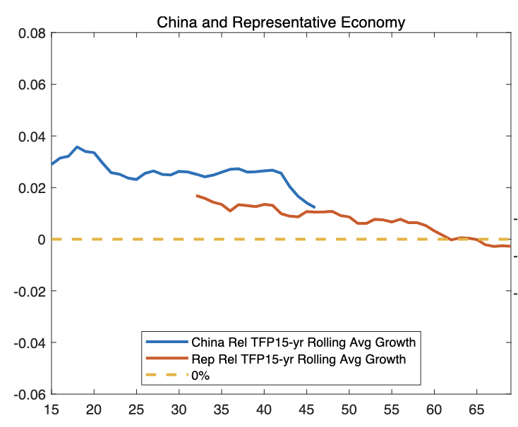
Thanks to the comments on my post yesterday on China’s relative TFP growth:
x.com/JesusFerna7026…
I found a cleaner way to plot the same information.
In the figure, the blue line is a 15-year moving average of China’s TFP growth relative to the U.S. Since China’s reforms began in 1979, the first year I can plot is 1994 (once I have 15 years of growth observations).
The orange line is the 15-year moving average of the representative East Asian economy’s TFP growth relative to the U.S., evaluated when the representative economy has the same income per capita as China. So, if you look at “year 40” on the x-axis, that is 2019 for China, and whatever calendar year it was for the other economies when they had the same income per capita as China in 2019.
Main lesson: China is basically on par with these economies right now, perhaps a bit higher, but not much higher.
Now push the comparison forward. Once the representative East Asian economy reached China’s 2023 income per capita (the last year in PWT 11.0), it took about 18 years to match the U.S.'s TFP growth rate.
If China follows that pattern (and the data suggest it is not far off), China will complete its TFP-growth convergence by around 2040. Add one more fact: China’s demographics are worse than the U.S.’ Put the two mechanisms together, and the U.S. should start growing faster than China in the early 2030s.
Of course, this is an extrapolation from the past. Many forces are at work, and reality may look different. But betting on “this time is different” (i.e., China’s TFP growth will not follow the same pattern as other East Asian economies) is always tricky.
Jesús Fernández-Villaverde@JesusFerna7026
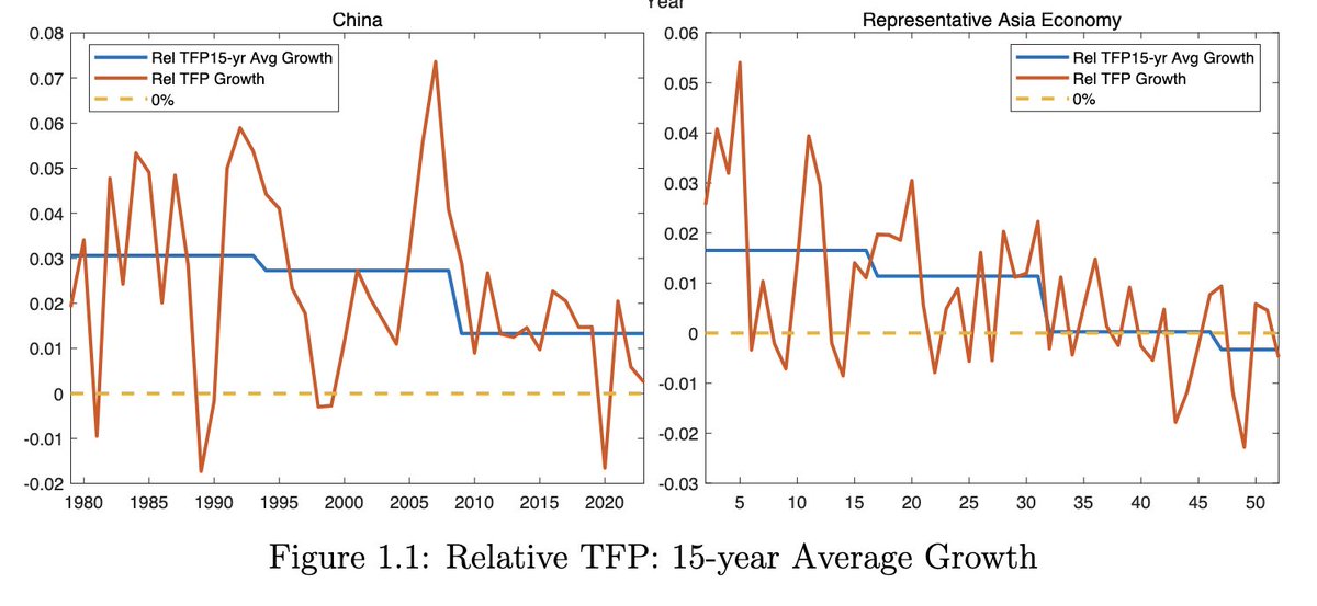
I have spent the last couple of days looking at convergence in East Asian economies (Japan, South Korea, China, etc.) toward the U.S. The figure below uses the recently released Penn World Table (PWT) release 11.0: rug.nl/ggdc/productiv… In orange, it plots TFP growth in China and in a representative East Asian economy (an average across these economies), always relative to the U.S. A value of 2% in 2016 in the left panel means that China’s TFP grew 2 percentage points faster than U.S. TFP in that year. In blue, I plot average relative TFP growth over 15-year windows. For China, the series starts in 1979, with the beginning of economic reforms. For the representative East Asian economy, each country enters when its per capita income reaches Japan’s 1950 level, the first observation available in the dataset, and roughly the threshold the World Bank uses to define middle-income status. Thus, an x-axis value of 25 in the right panel means relative TFP growth 25 years after reaching Japan’s 1950 income per capita. Start with the right panel. The representative East Asian economy follows a standard TFP catch-up process: adoption of foreign technology and managerial practices, and the reallocation of labor from agriculture to manufacturing and services. This process lasts about 45 years. After year 45, catch-up to the U.S. stops. If anything, there is mild divergence. This pattern closely mirrors Western Europe between 1945 and 1990: rapid convergence that lost momentum after roughly 45 years, followed by small divergence. In both cases, convergence stalls at about 70–80% of U.S. TFP. There appears to be a remaining 20–30% gap that most economies do not manage to close. Now look at the left panel. China seems to be following a similar path. China’s income per capita reached Japan’s 1950 level around 1995 (in 1979, it was extremely low). Although China’s relative TFP growth has been somewhat faster than that of the representative East Asian economy, the slowdown is clear. By the end of the sample, China’s TFP growth is only about 0.5% higher than that of the U.S., and its absolute TFP level remains well below that of other East Asian economies. This reading is consistent with other data coming out of China and, more anecdotally, with my own impressions from a long trip there this summer. Combined with China’s demographics, this suggests grounds for being less than sanguine about the state of the Chinese economy 10 to 20 years from now. Final disclaimer: I am not a big fan of the PWT. I use it here to speak to the profession at large, which would find it odd if I relied on other datasets. P.d. If you see me at ASSA this weekend, please say hi! I will be giving a talk on Saturday on deep learning and networks, and on Sunday on demographics. But we warned, as every time the ASSA meetings are in Philly, it is quite cold🥲
English
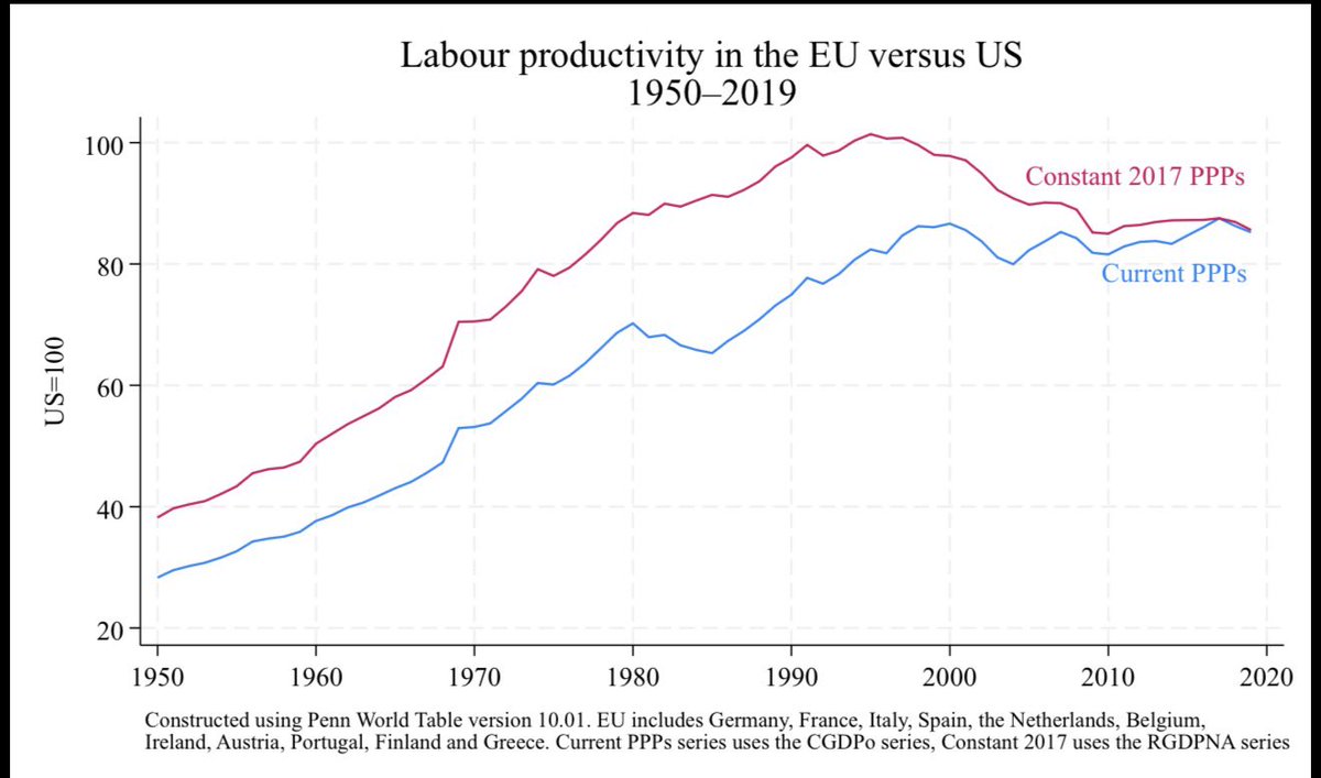
@ernietedeschi @JesusFerna7026 That's what we did, yeah. Mostly because we wanted to stay connected to the growth series. But there is some ambiguity given inconsistenties between PPPs and growth series, see, e.g., this figure for EU-US labour productivity.
English

Thanks Robert. My sense from reading your work with Fernald is that for global level comparisons of series like, say, real GDP per capita, you all recommend setting the initial levels to the PPP-adjusted values for a chosen base year, then benchmarking forward and backwards from that base level using NA growth rates. Is that accurate or is there a better way? (Obviously this approach is not relevant for comparisons of *growth* series)
English
I have spent the last couple of days looking at convergence in East Asian economies (Japan, South Korea, China, etc.) toward the U.S.
The figure below uses the recently released Penn World Table (PWT) release 11.0:
rug.nl/ggdc/productiv…
In orange, it plots TFP growth in China and in a representative East Asian economy (an average across these economies), always relative to the U.S. A value of 2% in 2016 in the left panel means that China’s TFP grew 2 percentage points faster than U.S. TFP in that year.
In blue, I plot average relative TFP growth over 15-year windows. For China, the series starts in 1979, with the beginning of economic reforms. For the representative East Asian economy, each country enters when its per capita income reaches Japan’s 1950 level, the first observation available in the dataset, and roughly the threshold the World Bank uses to define middle-income status. Thus, an x-axis value of 25 in the right panel means relative TFP growth 25 years after reaching Japan’s 1950 income per capita.
Start with the right panel. The representative East Asian economy follows a standard TFP catch-up process: adoption of foreign technology and managerial practices, and the reallocation of labor from agriculture to manufacturing and services. This process lasts about 45 years. After year 45, catch-up to the U.S. stops. If anything, there is mild divergence.
This pattern closely mirrors Western Europe between 1945 and 1990: rapid convergence that lost momentum after roughly 45 years, followed by small divergence.
In both cases, convergence stalls at about 70–80% of U.S. TFP. There appears to be a remaining 20–30% gap that most economies do not manage to close.
Now look at the left panel. China seems to be following a similar path. China’s income per capita reached Japan’s 1950 level around 1995 (in 1979, it was extremely low). Although China’s relative TFP growth has been somewhat faster than that of the representative East Asian economy, the slowdown is clear. By the end of the sample, China’s TFP growth is only about 0.5% higher than that of the U.S., and its absolute TFP level remains well below that of other East Asian economies.
This reading is consistent with other data coming out of China and, more anecdotally, with my own impressions from a long trip there this summer. Combined with China’s demographics, this suggests grounds for being less than sanguine about the state of the Chinese economy 10 to 20 years from now.
Final disclaimer: I am not a big fan of the PWT. I use it here to speak to the profession at large, which would find it odd if I relied on other datasets.
P.d. If you see me at ASSA this weekend, please say hi! I will be giving a talk on Saturday on deep learning and networks, and on Sunday on demographics. But we warned, as every time the ASSA meetings are in Philly, it is quite cold🥲
English
@MorenoMartinezI @JesusFerna7026 And some remarks from my end as a PWT developer:
Robert Inklaar@RobertInklaar
@JesusFerna7026 We conversed about PPP conversions in PWT some years ago)which was not satisfactory for anyone concerned). I still argue that one can use PWT series that match NA growth rates closely (as you seem to do here) or which (like Eurostat) are helpful for subsequent cross sections.
English

@JesusFerna7026 Very interesting, Jesus. Would you care to clarify what are the shortcomings for which you don't like PWT?
English