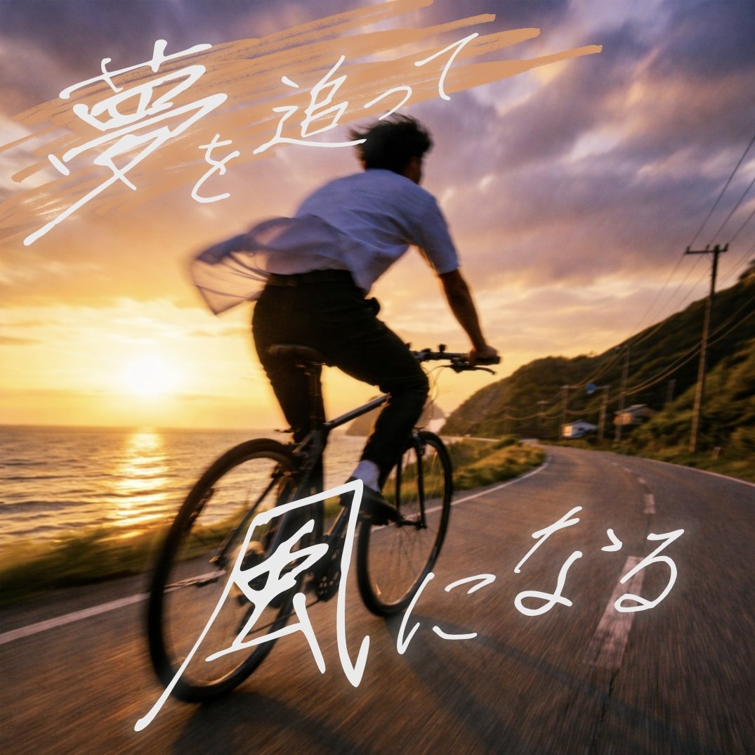
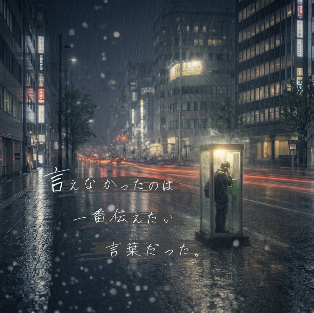
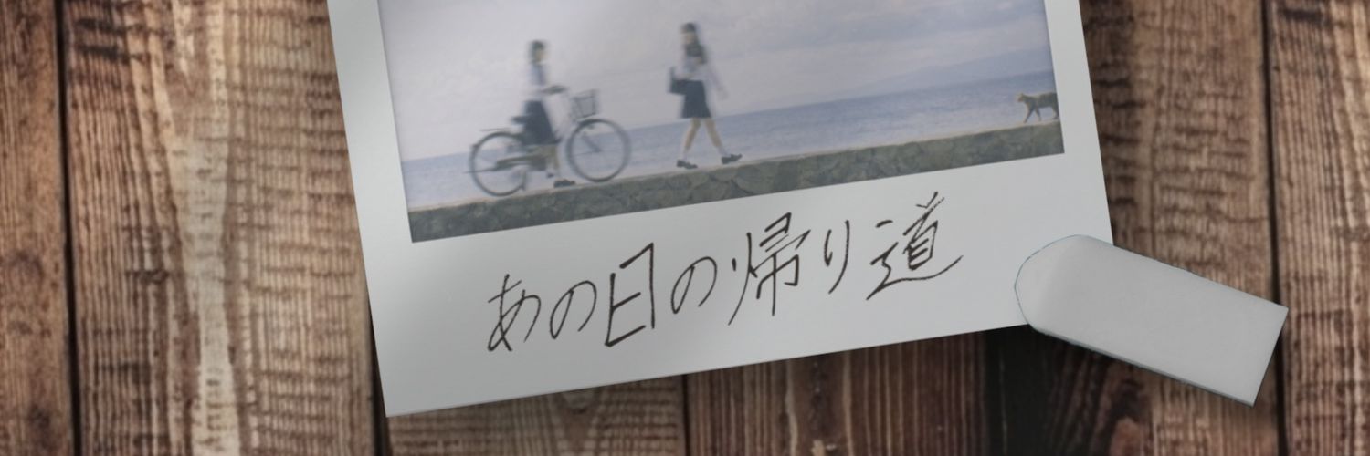
しゅん

44 posts

しゅん banner
しゅん

しゅん

@Shi36113

手書きフォント「瞬風(Shunpu)」を作っています。 ​不器用だけど、どこか真っ直ぐな男子学生の文字。JIS第2水準まで、コツコツと手書き✍️ 「かわいい」とは異なるフォントで作品のアクセントになれば幸いです。 https://t.co/gi3biyEP7R おかげ様で累計DL1,400超!
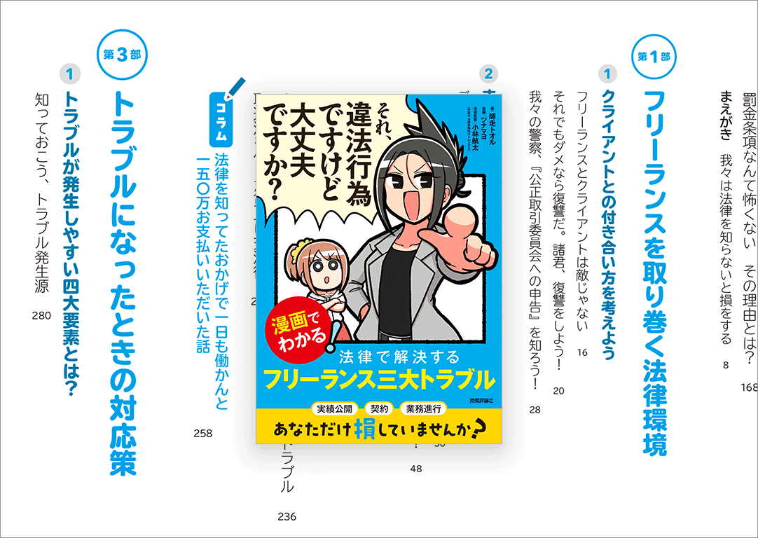
Katılım Mayıs 2025
56 Takip Edilen19 Takipçiler
Sabitlenmiş Tweet
しゅん
しゅん@Shi36113·
不器用な男子学生が書いたような、 少し粗くて勢いのある手書きフォント「瞬風」 ・いいフォント様で掲載 ・フロップデザイン様のXで紹介(23万imp) ・公開約2週間で有料DL100件突破 #いいフォント #デザイン goodfreefonts.com/9741/
日本語
1
1
4
436
しゅん retweetledi
Interesting Stuff
Interesting Stuff@interestingstf·
おはようございます、日本人の皆さん。 このデザインについてどう思われますか?
日本語
0
3
4
113
しゅん
しゅん@Shi36113·
これで計画案を作成、概算コストと工期をリンクして同時に出せると、設計期間は1/3位になる。人は発注者への説明、プレゼンのみに注力する事が役割かな。 waseda.jp/inst/research/…
日本語
0
0
1
24
しゅん retweetledi
コリス🍡🍭
コリス🍡🍭@colisscom·
クライアントから報酬が値引きされた、契約の途中キャンセル、フリーランスがトラブルに巻き込まれないための法律がよく分かる解説書 -それ、違法行為ですけど大丈夫ですか? coliss.com/articles/book-…
コリス🍡🍭 tweet media
日本語
0
29
53
31.2K
しゅん retweetledi
ムラケン@デザフェス63:B_356(西館)
【093.良いデザインは突然に】 #デザイナーあるある メモできない時に限って、良いデザイン案が思い浮かんだりする。洗面所、ベットにメモ用紙を忍ばせておく。 #デザイナーあるある毎日カレンダー
ムラケン@デザフェス63:B_356(西館) tweet media
日本語
2
16
280
9.3K
しゅん retweetledi
フロップデザイン⌘フォントデザイナー
日本語のフォントを1人で28年間作っています。後半の14年間の88書体を一気に見られるようにGIFアニメにしてみました。
GIF
日本語
2
70
358
18.1K
しゅん retweetledi
ロハさん | 動画編集スクール講師【PremierePro Tips】
【おすすめ文字フォント35選】 "商用利用OK"な フリーフォントを集めてみました😆 記事に一覧でまとめてます✨ note.com/roja3_/n/n2adf… 最後に『無料のプレゼント』もあるので ぜひ受け取ってください🎁 皆さんの"好きなフォント"も リプで教えてくれると嬉しいロハ~♪☺️ #動画編集 #動画編集者
ロハさん | 動画編集スクール講師【PremierePro Tips】 tweet media
日本語
2
166
1.1K
40.5K
しゅん retweetledi
ミヤマ
ミヤマ@mmmiyama_D·
prompt👇 Create a premium smartphone wallpaper in vertical 9:16 format, Japanese minimal editorial aesthetic, quiet and refined, inspired by modern notebook-grid design and clean infographic illustration. Background: warm off-white paper texture with a very subtle light gray square grid across the whole canvas, soft natural paper feel, elegant and minimal, bright but not stark white. Composition: very sparse layout with large breathing room for a phone wallpaper, asymmetric balance, main illustration placed slightly below center, top and upper-middle area kept relatively open and calm, include only two twin young boys in a warm, friendly composition, the boys should be clearly integrated with the central machine and actively operating it, overall look should feel sophisticated, mature, and uncluttered. Illustration: a single minimalist isometric line-art machine / creative device / abstract workflow object, drawn with thin dark gray to black outlines, soft cream and pale gray fills, tiny accent details in muted warm yellow, small geometric blocks or paper-like modules flowing through the device, include only two twin little boys placed naturally around the central object, interacting closely and affectionately, the twin boys should feel friendly, relaxed, and connected, show exactly two boys only, no adults, the boys should be clearly using and operating the machine, for example, one boy gently pressing or adjusting a control panel or button while the other boy is guiding or receiving paper-like modules coming from the machine, their hands and posture should visibly connect to the machine so the interaction feels intentional and functional, the machine and the boys should feel like one unified scene rather than separate elements, the illustration should feel intelligent, stylish, and poetic rather than technical, high-end Japanese design taste, simple, neat, and tasteful. Typography: include only one very short English phrase "MIYAMA" set in bold modern sans-serif typography, clean black text, medium size, not oversized, placed with strong alignment and generous spacing, the text should feel like part of the design, not like a poster headline. Color palette: off-white, soft gray, black, muted warm yellow only, low-saturation, elegant contrast, avoid loud neon colors. Style direction: minimal, premium, calm, smart, editorial, Japanese taste, beautiful negative space, clean geometry, subtle stationery mood, slightly futuristic but warm, suitable as a stylish wallpaper for adults. Output quality: ultra clean composition, high clarity, refined line work, balanced visual hierarchy, no busy details, no crowding, no extra text, no logos, no border, no mockup, no UI, no watermark. Aspect ratio: 9:16 vertical smartphone wallpaper
English
0
9
143
6.9K
しゅん retweetledi
日本語フリーフォント✒️
「漫画風日本語フリーフォント30選!セリフ・写植に使えるフォント完全ガイド」
日本語フリーフォント✒️ tweet media
日本語
1
549
2.8K
109K
しゅん
しゅん@Shi36113·
きれいすぎる文字じゃ、 伝わらないものがある。 #フリーフォント
日本語
1
0
3
60
しゅん
しゅん@Shi36113·
夢を追って、風になる。 何も考えず、真っ直ぐ。真っ直ぐ。 #デザイン  #手書きフォント
しゅん tweet media
日本語
1
1
2
64
しゅん
しゅん@Shi36113·
言えなかった言葉
しゅん tweet media
日本語
0
0
0
24
しゅん
しゅん@Shi36113·
言えなかったキモチ
しゅん tweet media
日本語
0
0
0
32
しゅん
しゅん@Shi36113·
雨夜の静寂。 街のノイズを、 冷たい雨が包み込む。 ​電話ボックスの柔らかな光が、 静かに、そこに。 ​「瞬風」が描く、 静かで、どこか懐かしい時間。 ​心に安らぎと ノスタルジーを。 ​ #癒やし ​ #フォント
しゅん tweet media
日本語
0
0
4
61