The Retro Shelf

80 posts

The Retro Shelf banner
The Retro Shelf

The Retro Shelf

@TheRetroShelf

Curating the history of the shelf, spanning 4 decades. Documenting regional box art battles, bizarre covers, and the era of physical media.

Katılım Mart 2026
28 Takip Edilen6 Takipçiler
The Retro Shelf
The Retro Shelf@TheRetroShelf·
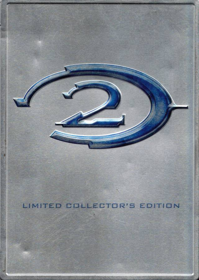
While Europe's Killzone technically did it first, Halo 2's aluminum SteelBook popularized the Collector's Edition trend. It elevated packaging to an artifact, but the metal was notoriously prone to denting and rusting. Did your copy survive the years? Halo 2 | Xbox | NA | 2004
The Retro Shelf tweet mediaThe Retro Shelf tweet media
English
0
0
0
10
The Retro Shelf
The Retro Shelf@TheRetroShelf·
To market Suikoden in the West, detailed Japanese character art was swapped for a muddy Western fantasy painting of armored warriors and a looming dragon. It completely ignored the game's aesthetic. Why did publishers fear anime styling? Suikoden | PS1 | JP vs NA | 1995
The Retro Shelf tweet mediaThe Retro Shelf tweet media
English
0
0
0
2
The Retro Shelf
The Retro Shelf@TheRetroShelf·
For Metal Gear Solid, NA and JP marketing took a striking minimalist approach, relying solely on the logo against a white background. Meanwhile, the PAL release utilized Yoji Shinkawa’s iconic ink illustration. Which philosophy wins? Metal Gear Solid | PS1 | JP vs. PAL | 1998
The Retro Shelf tweet mediaThe Retro Shelf tweet media
English
0
0
0
2
The Retro Shelf
The Retro Shelf@TheRetroShelf·
To sell the original Resident Evil, NA marketing approved a painting of a tense, oddly proportioned man with a shotgun, surrounded by spiders. It looks like a pulp action comic. Do you think it captures the game's claustrophobic horror tone? Resident Evil | PS1 | NA | 1996
The Retro Shelf tweet media
English
0
0
0
2
The Retro Shelf
The Retro Shelf@TheRetroShelf·
Silent Hill’s JP cover uses a blurred photo to evoke abstract dread. The NA cover uses a character collage to create a surreal, disjointed nightmare atmosphere. Which approach wins? Silent Hill | PS1 | JP vs. NA | 1999
The Retro Shelf tweet mediaThe Retro Shelf tweet media
English
0
0
0
4
The Retro Shelf
The Retro Shelf@TheRetroShelf·
For Majora's Mask, Nintendo utilized a custom lenticular hologram. Tilting the physical cartridge shifts the image from Link to the cursed mask. It is a rare example of hardware marketing perfectly matching a game's psychological dread. Zelda: Majora's Mask | N64 | NA | 2000
The Retro Shelf tweet mediaThe Retro Shelf tweet media
English
0
0
0
12
The Retro Shelf
The Retro Shelf@TheRetroShelf·
Nintendo famously sold EarthBound in an oversized retail box, to fit a packed-in a player's guide containing scratch-and-sniff stickers. It was an ambitious tactile marketing strategy that physical retail stores struggled to display. EarthBound | SNES | NA | 1995
The Retro Shelf tweet mediaThe Retro Shelf tweet mediaThe Retro Shelf tweet media
English
0
0
0
7
The Retro Shelf
The Retro Shelf@TheRetroShelf·
Lacking rights to Fist of the North Star, Sega rebranded the NA release. The detailed JP anime art was scrapped and replaced with a single, oddly drawn foot kicking a white grid. A bizarre licensing downgrade. Hokuto no Ken / Black Belt | Master System | JP vs. NA | 1986
The Retro Shelf tweet mediaThe Retro Shelf tweet media
English
0
0
0
113
The Retro Shelf
The Retro Shelf@TheRetroShelf·
Final Fantasy VII’s JP and PAL covers used a stark white background to highlight Yoshitaka Amano’s meteor logo. NA marketing opted for a 3D render facing Shinra HQ to push cinematic scale. Which approach wins? Final Fantasy VII | PS1 | JP vs. NA | 1997
The Retro Shelf tweet mediaThe Retro Shelf tweet media
English
0
0
0
5
The Retro Shelf
The Retro Shelf@TheRetroShelf·
To localize the Japanese fantasy shooter Gunbird, marketing erased its identity. Rebranded as Mobile Light Force, the cover uses a baffling action-movie painting of a trio fleeing an explosion, unrelated to the game. Gunbird/Mobile Light Force | PS1 | JP vs NA | 1995/2003
The Retro Shelf tweet mediaThe Retro Shelf tweet media
English
0
0
0
3
The Retro Shelf
The Retro Shelf@TheRetroShelf·
Due to European censorship, the PAL release of Contra removed its human combatants. Rebranded as Probotector, the new cover replaced the gritty commandos with sleek combat robots. Does this redesign improve the aesthetic? Probotector/Contra | NES | PAL vs. NA | 1990/1988
The Retro Shelf tweet mediaThe Retro Shelf tweet media
English
0
0
0
1
The Retro Shelf
The Retro Shelf@TheRetroShelf·
Nintendo used custom-colored plastic shells for the Game Boy cartridges of Pokémon Red and Blue. This simple, tactile hardware choice made the physical object feel intrinsically tied to the game's identity. Which color did you choose? Pokémon Red & Blue | Game Boy | NA | 1998
The Retro Shelf tweet mediaThe Retro Shelf tweet media
English
0
0
0
7
The Retro Shelf
The Retro Shelf@TheRetroShelf·
@OnThisDayGaming It’s so interesting to compare the character design interpretations in this artwork to the modern designs we have today. Check out Bowser, almost completely different.
English
0
0
0
122
OnThisDayInGaming
OnThisDayInGaming@OnThisDayGaming·
Super Mario Bros. for the NES was released on this day in Europe, 39 years ago (1987)
OnThisDayInGaming tweet media
English
6
76
499
16.1K
The Retro Shelf
The Retro Shelf@TheRetroShelf·
The Japanese release of SOTN featured detailed gothic art by Ayami Kojima. Fearing 2D platformers were dying, the NA team replaced this masterpiece with a generic lightning castle. Which visual direction represents the game best? Castlevania: SOTN | PS1 | JP vs. NA | 1997
The Retro Shelf tweet mediaThe Retro Shelf tweet media
English
0
0
0
5
The Retro Shelf
The Retro Shelf@TheRetroShelf·
@16bitnostalgia Simply beautiful box art. The color combinations work so well together, while bringing about a curiosity of the relationship between Link and the wolf.
English
0
0
3
285
Nostalgic Gamer
Nostalgic Gamer@16bitnostalgia·
The Legend of Zelda: Twilight Princess is 20 years old this year!
Nostalgic Gamer tweet media
English
34
150
1.4K
27.7K
The Retro Shelf
The Retro Shelf@TheRetroShelf·
A legendary physical media oversight. When Capcom printed the NA Wii cover for Okami, they accidentally pulled art directly from a gaming site. Look closely at the case: a faint IGN watermark is still visible near Amaterasu’s mouth. Okami | Wii | NA | 2008
The Retro Shelf tweet media
English
0
0
0
10
The Retro Shelf
The Retro Shelf@TheRetroShelf·
@GameStalgiaX Such great memories of this game. The fluidness of the controls, the great graphics, and a soundtrack that matched the aesthetic perfectly all came together for an amazing experience. One of the greats.
English
0
0
2
147
The Retro Shelf
The Retro Shelf@TheRetroShelf·
When marketing this absurd mashup, the art department took the concept literally. The box for Ninja Golf features a fully rendered painting of an ninja holding a sword on a golf green with clubs on his back. Was the intent ironic or serious? Ninja Golf | Atari 7800 | NA | 1990
The Retro Shelf tweet mediaThe Retro Shelf tweet media
English
0
0
1
10
The Retro Shelf
The Retro Shelf@TheRetroShelf·
Working Designs treated RPG localizations like premium cultural artifacts. Lunar shipped with a massive hard-bound manual, foil stickers, a cloth map, and intricately painted disc art. Did you ever own this massive physical release? Lunar: Silver Star Story | PS1 | NA | 1999
The Retro Shelf tweet mediaThe Retro Shelf tweet mediaThe Retro Shelf tweet mediaThe Retro Shelf tweet media
English
0
0
1
25