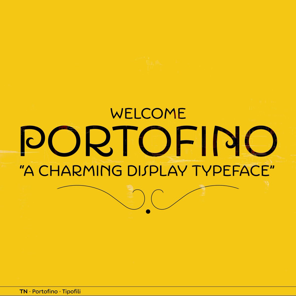
Influenced by Italian hand-lettered posters from the early twentieth century, #Portofino by @tipofili is a charming display typeface with expressive forms complementing its underlying geometric proportions.
👉 License Portofino on TN: buff.ly/3ZUuQxQ
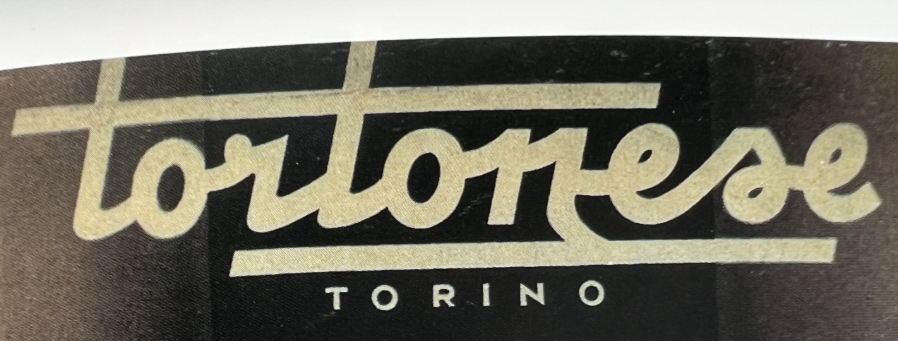
As a part of @louisefili’s rebrand of Triennes, we drew a custom script that was tailored to work at a fairly small size while still feeling at home with the logotype.
Influenced by Italian hand-lettered posters from the early twentieth century, #Portofino by @tipofili is a charming display typeface with expressive forms complementing its underlying geometric proportions.
👉 License Portofino on TN: buff.ly/3wB1WYK
Influenced by Italian hand-lettered posters from the early twentieth century, #Portofino by @tipofili is a charming display typeface with expressive forms complementing its underlying geometric proportions.
👉 License Portofino on TN: buff.ly/3PBFm7V
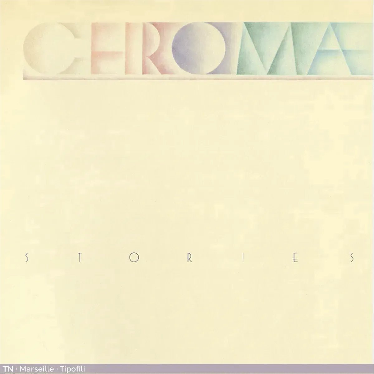
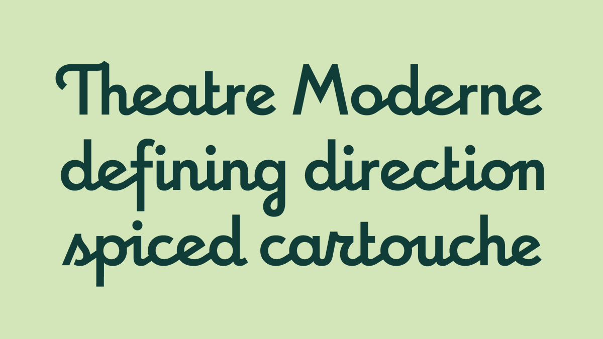
An Art Deco-inspired typeface based on Louise Fili’s iconic cover design for The Lover, @tipofili's #Marseille comes in six weights, giving it a variety of expressions while remaining timelessly elegant.
👉 License Marseille here: buff.ly/3YDQaGO
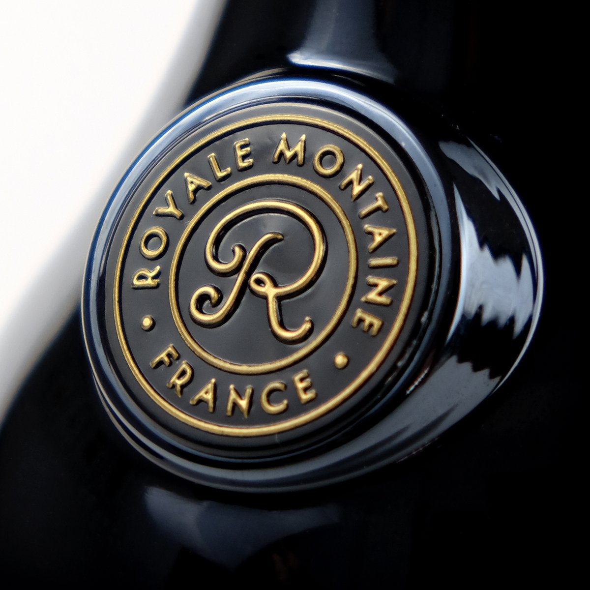
Here is a sneak peek of the redesigned packaging for Royale Montaine, a cognac and orange liqueur. The seal features Marseille from @Tipofili which we modified using its OpenType features. We’ll share the whole bottle and label once it hits the shelves later this spring.
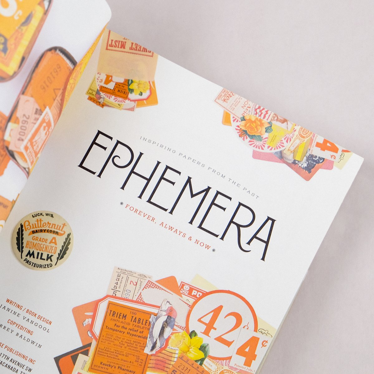
Some details from @uppercasemag’s book, Ephemera, featuring the original style of Montecatini Pro: Stretto Light.
See the whole family here: tipofili.com/fonts/montecat…
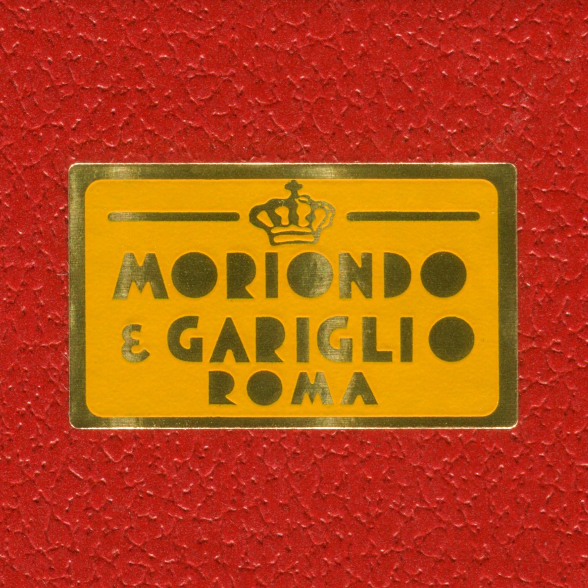
Louise just returned from Rome, so of course she brought back some chocolate! While they were tying the ribbon around the box, Louise specifically asked them to include this sticker. ❤️ #moriondoegariglio
Influenced by Italian hand-lettered posters from the early twentieth century, #Portofino by @tipofili is a charming display typeface with expressive forms complementing its underlying geometric proportions.
👉 License Portofino on TN: buff.ly/3Fuycxw
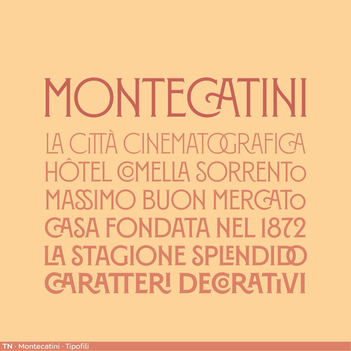
#Montecatini from @tipofili takes its cues from the elegant Stile Liberty travel posters of early 1900s Italy. The 24-style family spans six weights and four widths to create a vibrant typographic system.
👉 License Montecatini here: buff.ly/3W6TXui
An Art Deco-inspired typeface based on Louise Fili’s iconic cover design for The Lover, @tipofili's #Marseille comes in six weights, giving it a variety of expressions while remaining timelessly elegant.
👉 License Marseille here: buff.ly/3uXsWxB
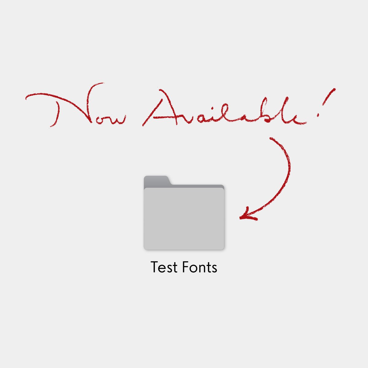
Montecatini’s distinctive ligatures span across all 6 weights and 4 widths. You can test them all directly on our site or by downloading our test fonts.
tipofili.com/fonts/montecat…
You can now download free test versions of all our fonts! Use these to test our fonts in your designs, mockups, or pitch documents for approval before licensing the full versions.
tipofili.com/test-fonts
@typegirl We actually have a Italian sans in the works that is a little reminiscent of Bernhardt Gothic (albeit a little simpler actually)!
Check the @ in Portofino for a small taste of a potential lowercase direction.
I’ll definitely sketch something up now!
@tipofili I understand that they are meant to be more display, more monumental so to speak. But I can see Portofino sort of as an Italian take on Berhardt Gothic.
@tipofili Do you think you might ever expand Portofino or Montecatini to include lowercase? Or maybe riff off of them to become more inclusive of the lowercase?
@typegirl I’m glad you mentioned it though because I think it has potential, and am curious if I can get Louise on board.
Montecatini is a much bigger question, and I must admit I don’t think we have really considered it.
—Matthew
@typegirl I had floated the idea of a lowercase for Portofino, but Louise had no interest at the time. However, I have been thinking about it a lot lately, and may bring the idea back up (before the font sells more and presents a huge legacy issue).