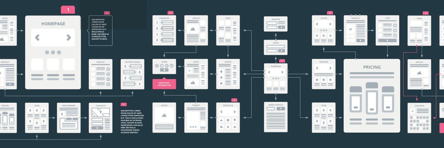

UX Flowcharts retweetledi

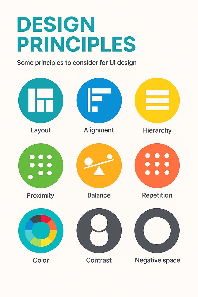
9 timeless design principles every UI designer should know 🙌
Overview:
1. LAYOUT
Layout is the arrangement of visual elements in a design to create balance, clarity, and visual appeal.
2. ALIGNMENT
Aligning elements in a design along a common axis to create order and visual consistency.
3. HIERARCHY
Organizing elements to establish a clear order of importance, guiding the viewer's attention.
4. PROXIMITY
Placing related elements close together to indicate their connection or importance.
5. BALANCE
Weighting or arranging the elements within the image to create visual, even distribution of shape and space.
6. REPETITION
Consistently using the same design elements (e.g., fonts, colors, shapes) to create unity and reinforce visual identity.
7. COLOUR
Utilising colours intentionally to convey mood, meaning, and visual impact in a design.
8. CONTRAST
Contrast can highlight differences or add a focal point by using opposing colour, shade or textures.
9. NEGATIVE SPACE
Also known as white space, it's the empty or unmarked area around or between design elements, used to enhance readability and create visual balance.
Original cheatsheet by Jaxon White
#UX #UI #UIDesign #UXDesign
English