Sabitlenmiş Tweet
Umar | Thumbnail Designer
333 posts

Umar | Thumbnail Designer
@UmarDesignz
Finance Thumbnail designer📈🚀. DM for collabs📧
Katılım Mart 2026
42 Takip Edilen21 Takipçiler

@fairyprxncess stay with me now, what if i said......MANGO-MELON
English

@JashanDeep85198 I've got to tag him this shii is so clean
@MrBeast
English

@ravikiran_dev7 There's no way, you're convincing me that guy doesn't need to go to to an asylum
English

@vibeonX69 Just close your eyes and imagine it's in perfect condition, boom problem solved
English

@peek_p33527 Adjust the text better, thanks my brother.I really appreciate it 🙏
English

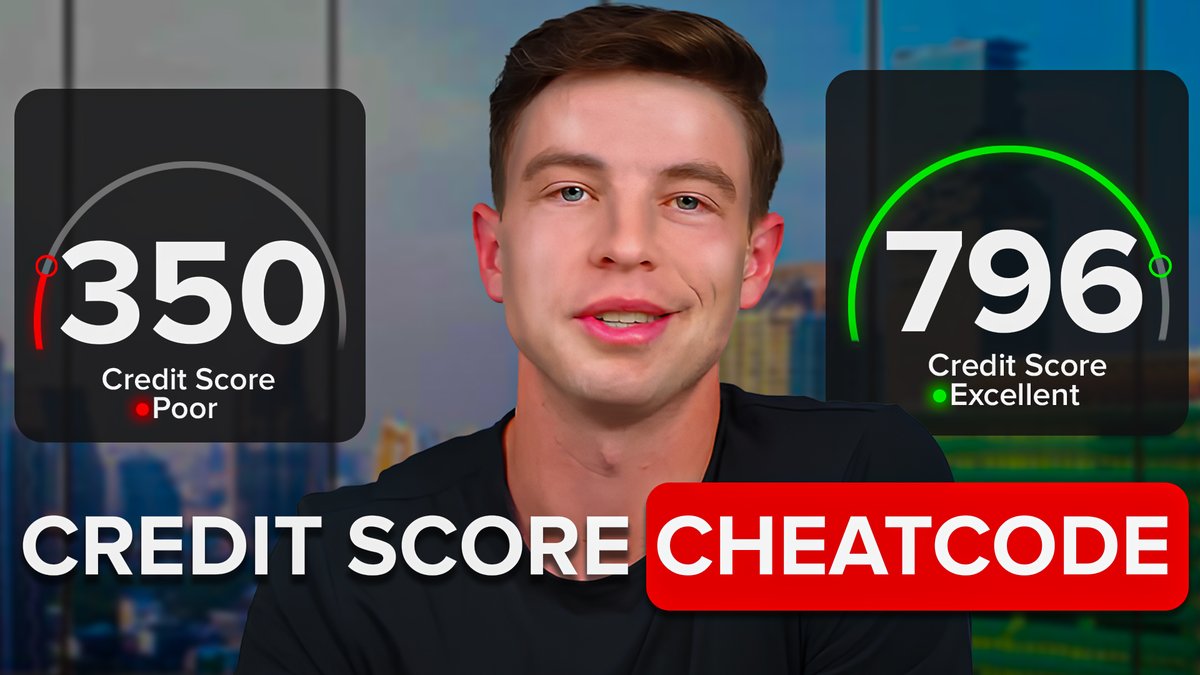
@UmarDesignz I think , if you replace the all texts little lower down .. then it looks really amazing.. because currently the texts are coming on his neck skin.. 🙂 btw thumbnail ideation is really good ❤️
English

@Iconimcreations Is that a question????
Ofc you cooked, goated game and goated thumbnail
English

@Aniketpxl That's a woman 😭, I must need new glasses
English


@Vadym_design Bookmarked!!!!...
Love the info from this, I'm slowly realizing that thumbnails should be simple, complexity kills alot more than people think
English

3 thumbnail formats that work in 2026:
1 - Size Contrast
Make the main subject massive while keeping everything else smaller.
Why it works: the viewer instantly understands where to look.
2 - Size Contrast: Large vs Small
Place a large object next to a smaller one to create visual tension.
Why it works: comparison makes the message simple and memorable.
3 - Character Big, Object Small
Show a huge character with a much smaller object.
Why it works: it creates power, scale, and a clear story in one second.
A good thumbnail stops the scroll before the title even gets read.
Your goal: make the viewer feel curiosity instantly.

English

@Aniketpxl Reduce the amount of elements in my thumbnail for a minimalistic look,Noted Bro...Thanks for the feedback
English

@UmarDesignz I would suggest you to keep that THE SECRET text box because credit score is already repeating in 2 UI element so need to clutter the Canvas keep it minimal
English

@Vadym_design Make the subject stand out more,noted ✅️
English

@UmarDesignz Very good work, but I think the man and the background could be a little brighter
English


@IndoliyaDesigns Thanks bro,I completely missed that out, I still have a lot of work to do on my color theory understanding
English

@UmarDesignz good work, but change red box with yellow one beucase red gives loss vibe instead of improvement
English

@Vadym_design Can't even pick, they all look so goated tbh.
English


