
Watnick Creative
22.5K posts

Watnick Creative
@WatnickCreative
Art Director | Designer | Creative. UF & @miamiadschool alum. DM for requests and inquiries.
Miami, FL Katılım Ağustos 2011
513 Takip Edilen4.5K Takipçiler
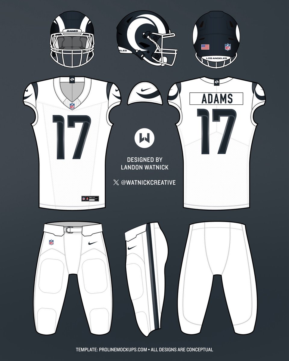
Testing out a one-color blue throughout for the modernized retro, as opposed to the mismatched blues look of the past, for a more cohesive colorway.
Which blue do you prefer on this version Rams fans: royal or midnight?


Watnick Creative@WatnickCreative
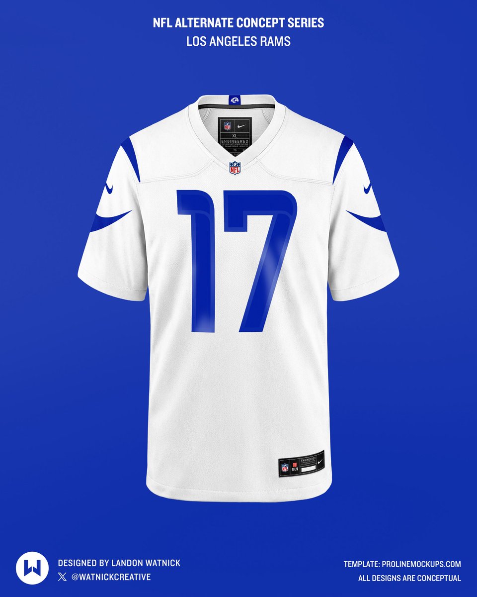
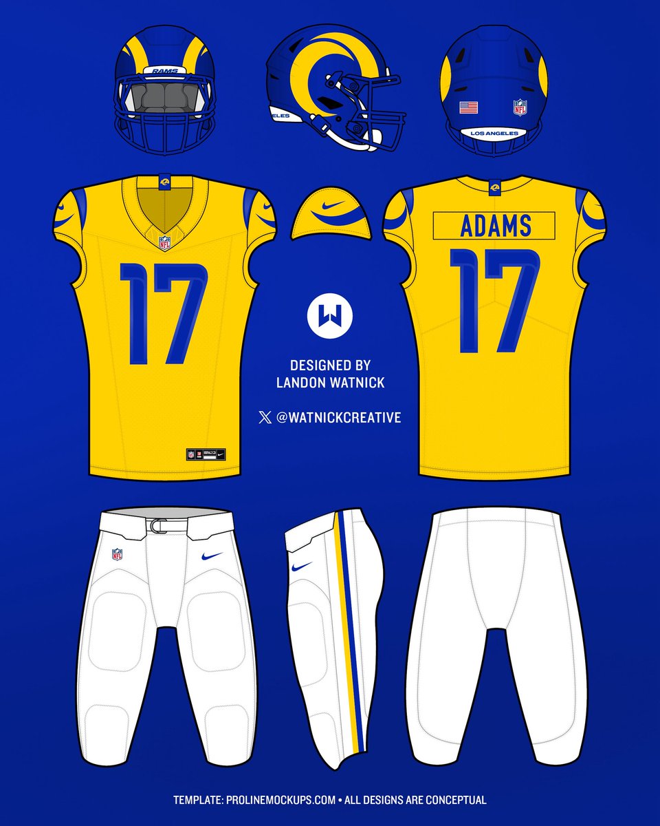
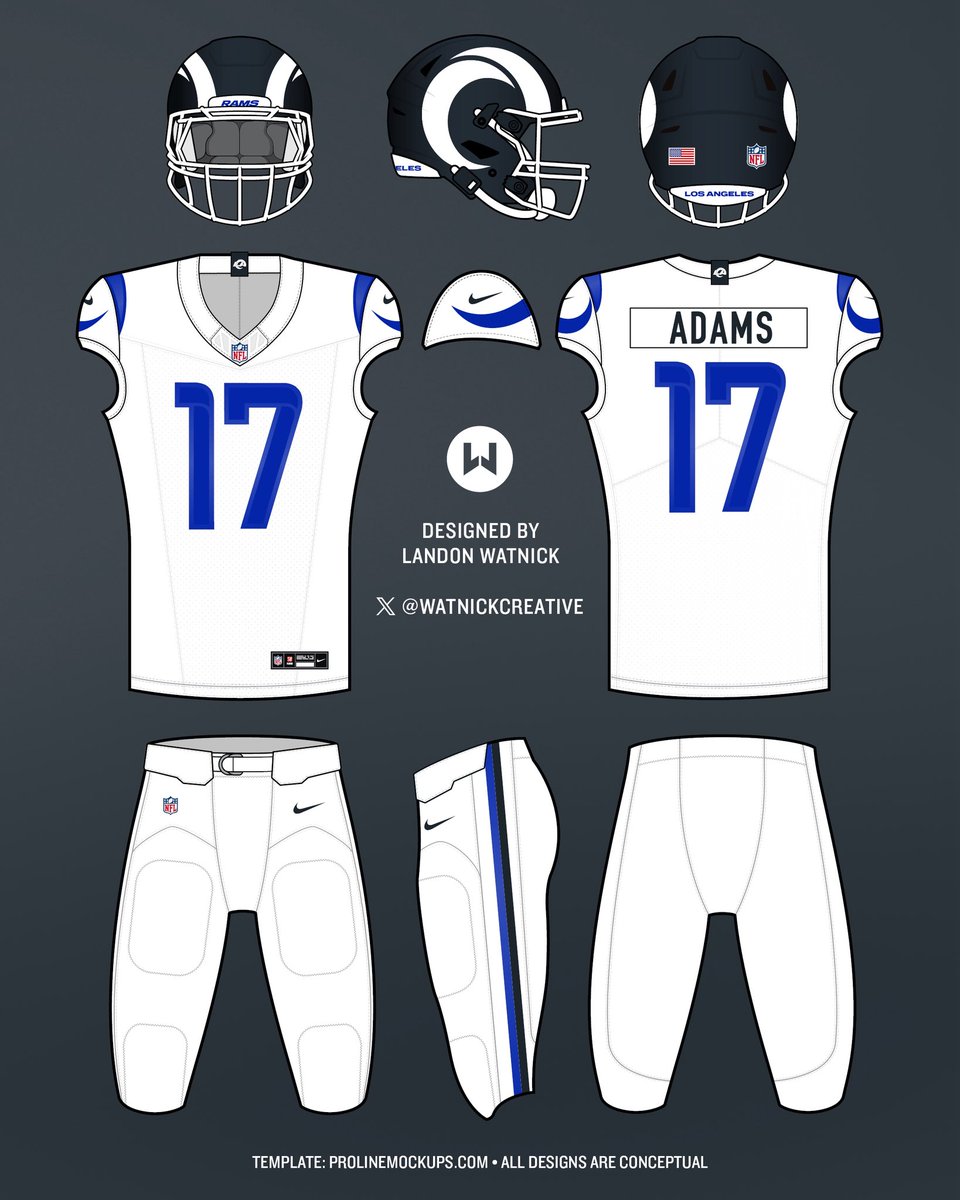
Imagining two alternates for the Los Angeles Rams’ uniform set, based on the newly released template. There’s the chance the Rams introduce a throwback as one of the options, but how would you feel if they adopted either of these? @ProLineMockups
English
Designed this set using @ProLineMockups 3-view uniform template for Illustrator — would love you see what designs you all can cook up by downloading below:
prolinemockups.com/templates/p/pr…
English
Imagining two alternates for the Los Angeles Rams’ uniform set, based on the newly released template.
There’s the chance the Rams introduce a throwback as one of the options, but how would you feel if they adopted either of these?
@ProLineMockups


English
@ZachCohenFB Drastic improvement but the yellow is still too highlighter for my personal taste. Switching to something like Pantone 1235 C (one a lot of NFL teams use) would have been better imo.
English

No surprises here from the Rams updated primary logo and jerseys
A big win in tweaking the uniforms, suddenly I think they’re one of the best looks in the NFL 🔥
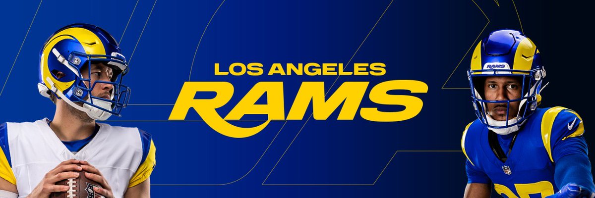
Los Angeles Rams@RamsNFL
Cleaner. Bolder. The first step in expanding our closet...
English

English

English
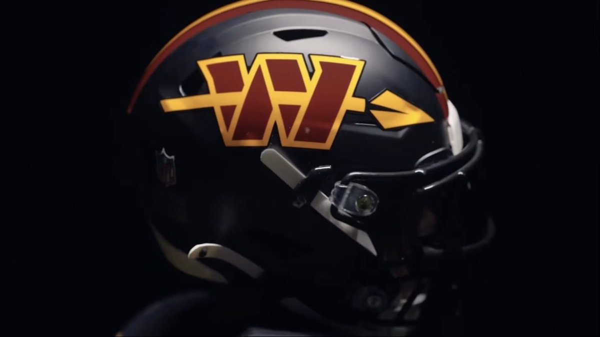
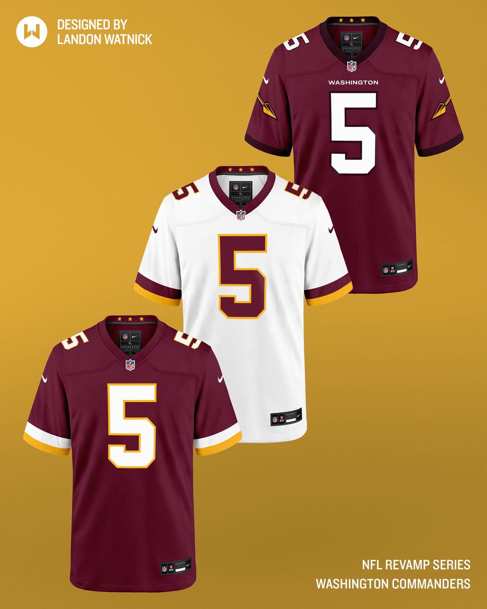
Making the new Washington Commanders logo physically possible with a more detailed spear.
@ProLineMockups

English
@ZachCohenFB Should have just thrown the spear on the burgundy helmet on the primaries. A little bland otherwise.
English
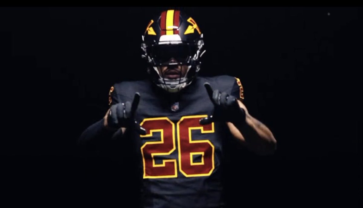
First look at the Commanders new black uniform with an updated spear logo on the helmet
Do I think it’s necessary? Not really.
Is it a drastic upgrade? Absolutely.
Zach Cohen@ZachCohenFB
I still think this Commanders black uniform is a hot mess… and now I’m told Washington plans to have a new black uniform for 2026 Do I think they should have a black uniform? Not really. Is there a way to improve this one? Absolutely.👇
English

@BraggingRtsSpts @WatnickCreative @ZachCohenFB @AndrewMLind @ProLineMockups @fashion_nfl @lockedonravens @LiveRavenNation Hey any idea where i can create my own
English
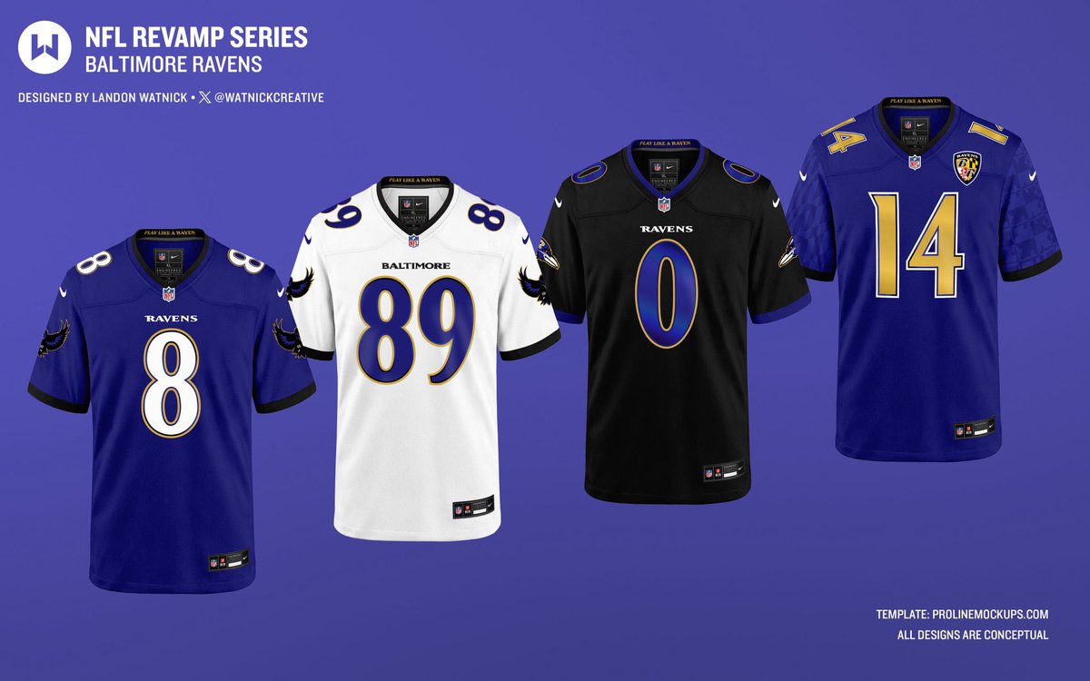
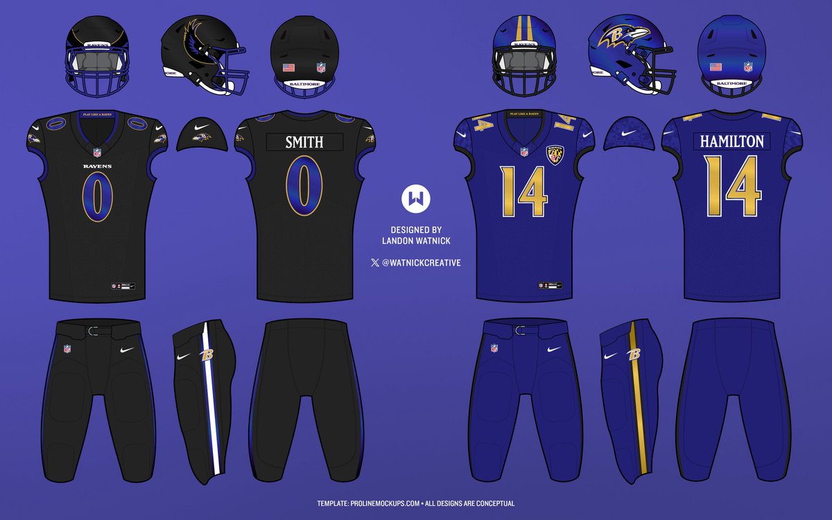
Experimenting with a Baltimore Ravens jersey revamp, inspired by the details of @ZachCohenFB and @AndrewMLind’s reporting.
What I’d like to see:
-Iridescent accents on the numbers and throughout
-Return of winged raven logo sleeves
-Two alternate helmets
-Updated nameplate font

English
Designed this set using @ProLineMockups 3-view uniform template for Illustrator, which can be downloaded here:
prolinemockups.com/templates/p/pr…
English
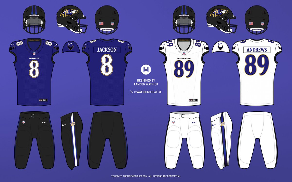
A couple more combinations for the home and away jerseys in this concept:
English

@OnlyTheRavens @WatnickCreative Is this the logo they got sued over and had to stop using, or was it the shield with wings logo?
English

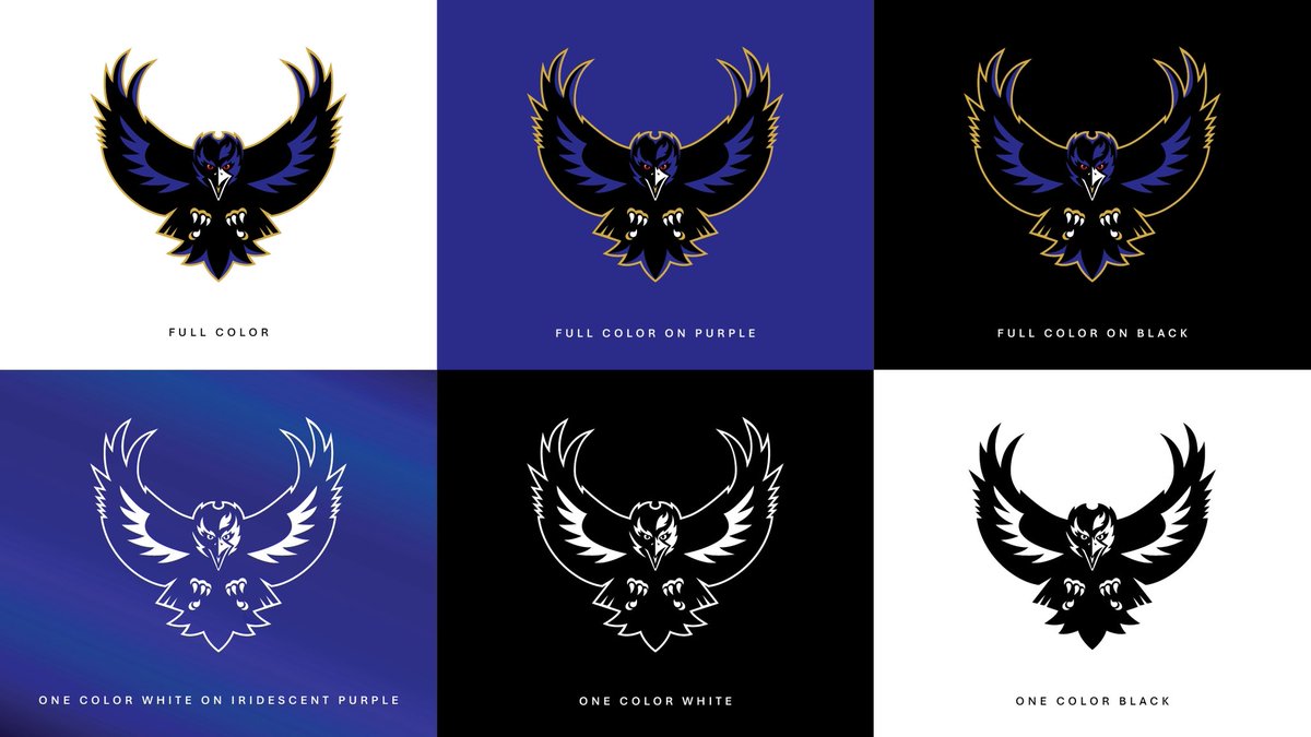
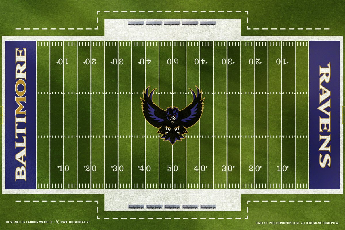
Concept: A new alternate logo option for the Baltimore Ravens. Imagining a winged, full-body raven that is a blend of the past and present eras.
Who else would love to see something like this on the sleeves when the Ravens reveal their new uniforms next week?
@ProLineMockups


English
Watnick Creative retweetledi

DAY 2 of posting new #Commanders uniform concepts until they get revealed
These are a classic update and a wonderful job by @WatnickCreative
Your thoughts? 👇#RaiseHail


English
@ZachCohenFB Iridescent on the gold accents or elsewhere?
English
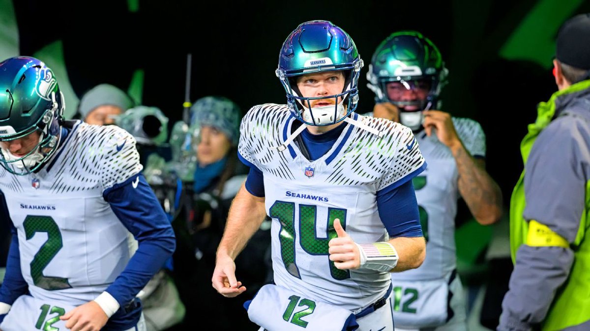
I think there’s room for iridescent accents to enhance the Ravens jersey and look good
I’m not expecting them to go as crazy as Seattle did, which I also still like
ADarkPuma47@ADarkPuma47
@ZachCohenFB First time i saw the Seahawks iridescent unis i was obsessed. Please let that part be true. Such an awesome aesthetic.
English
@Drenopolis @Esessions74 @ProLineMockups @atlantabirdgang @AtlFalconsNtion @ZachCohenFB @fashion_nfl Similar, yes. But different chest wordmark + numbers, different sleeve logo, different nameplate font, different wordmark inside the collar.
English

@Esessions74 @WatnickCreative @ProLineMockups @atlantabirdgang @AtlFalconsNtion @ZachCohenFB @fashion_nfl The number font and throwback logo are the only difference. I’d you looking at the jerseys from a small distance the fonts look similar. Not the same but identical in color scheme makes them very similar.


English
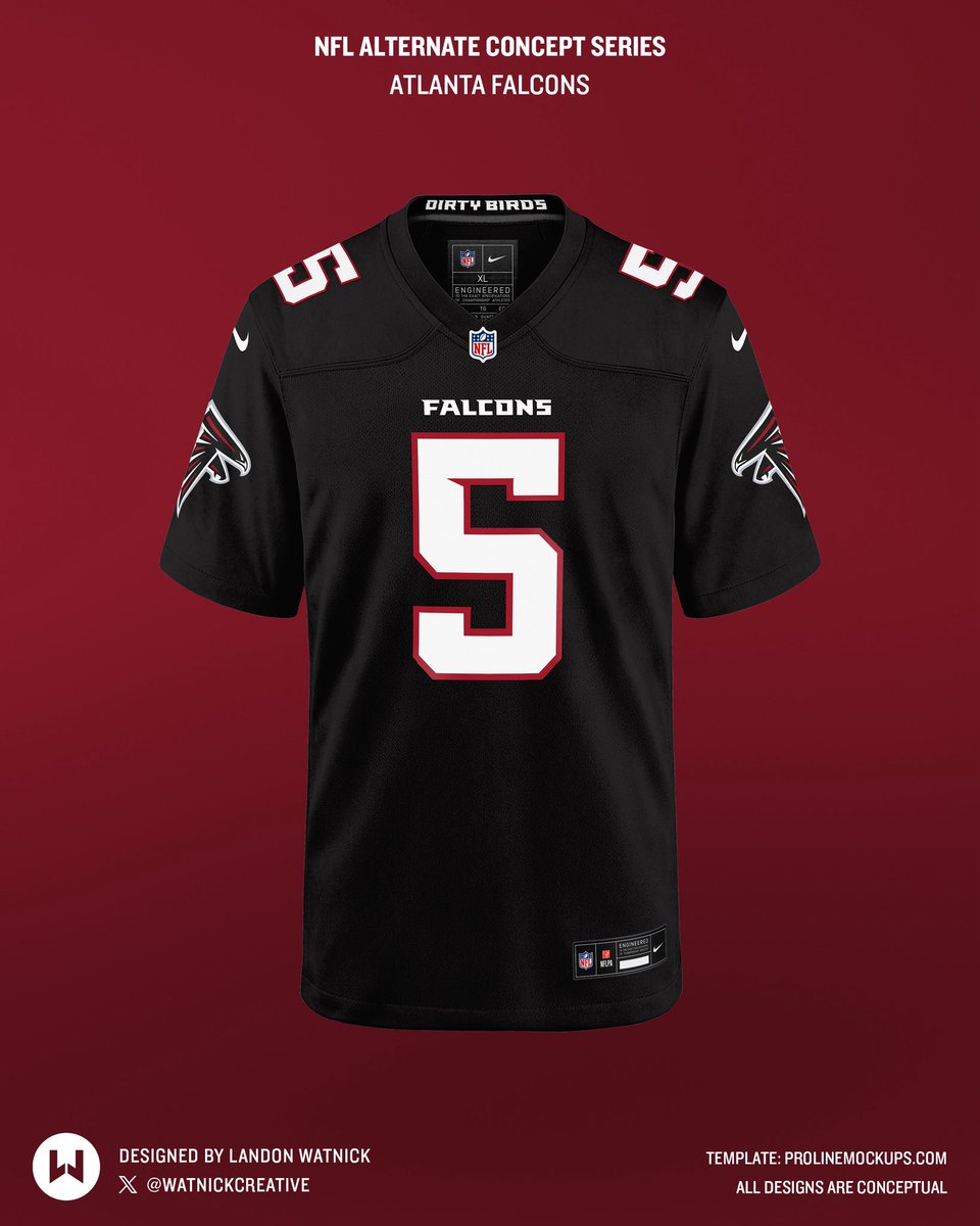
How would you feel if the Atlanta Falcons down the line adopted a black modern alternate following the current updated design template?
@ProLineMockups

English
@fashion_nfl @ProLineMockups @atlantabirdgang @AtlFalconsNtion @ZachCohenFB I think they nixed the silver pants because they couldn’t get the colors to match. But definitely a years down the road option, Falcons new design gave them a lot of long-term merch-expansion possibilities and flexibility.
English
@WatnickCreative @ProLineMockups @atlantabirdgang @AtlFalconsNtion @ZachCohenFB Big fan. Personally would work in silver pants.

English
@ZachCohenFB @ProLineMockups @atlantabirdgang @AtlFalconsNtion @fashion_nfl Oh, for sure. Always the option too they go this route and showcase a different throwback years down the line. Sell more new merch lol
English
@WatnickCreative @ProLineMockups @atlantabirdgang @AtlFalconsNtion @fashion_nfl I like that black jersey concept but kind of a moot point imo with the throwbacks and the NFL’s alternate jersey rules
English