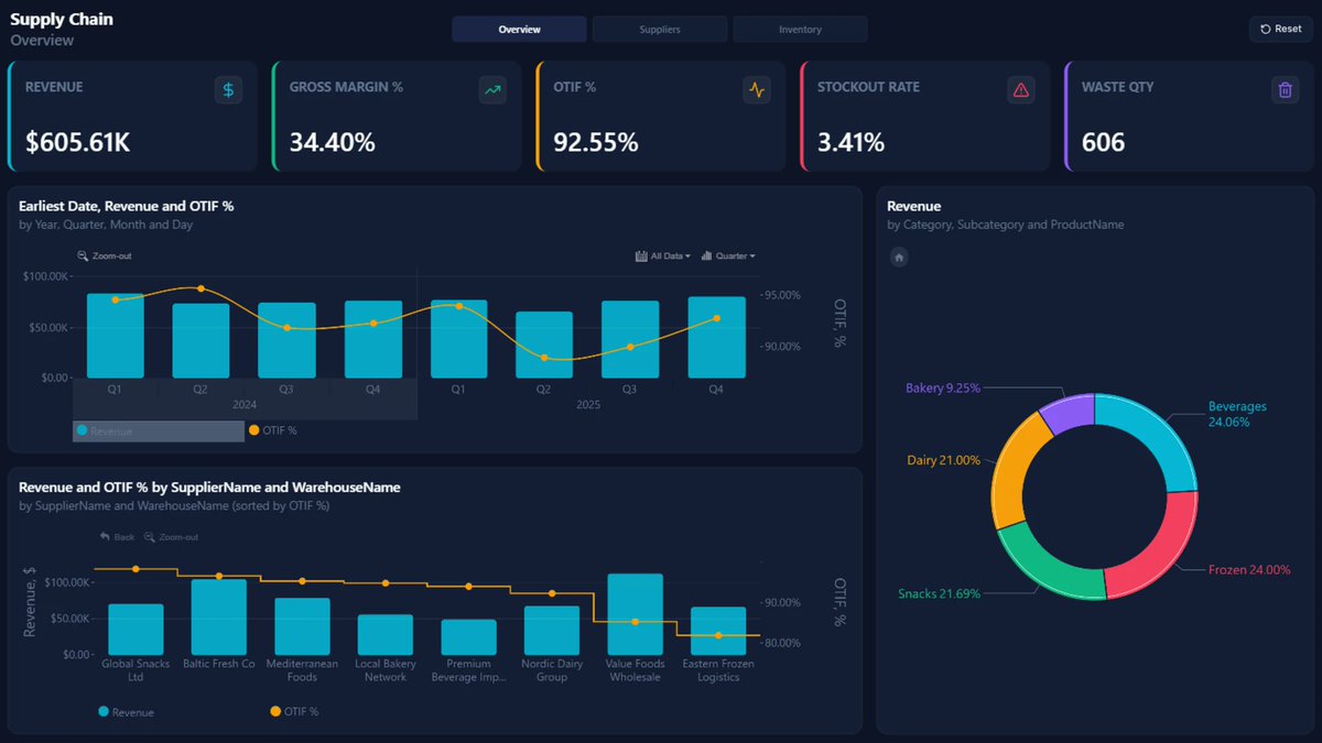
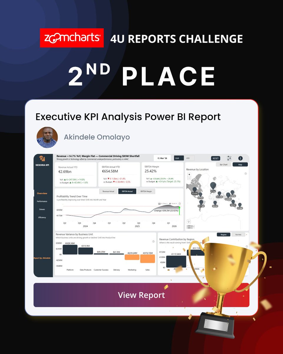
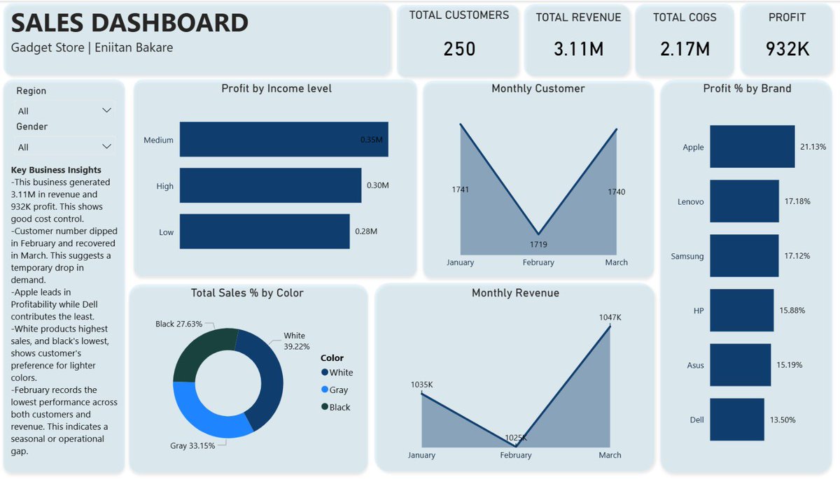
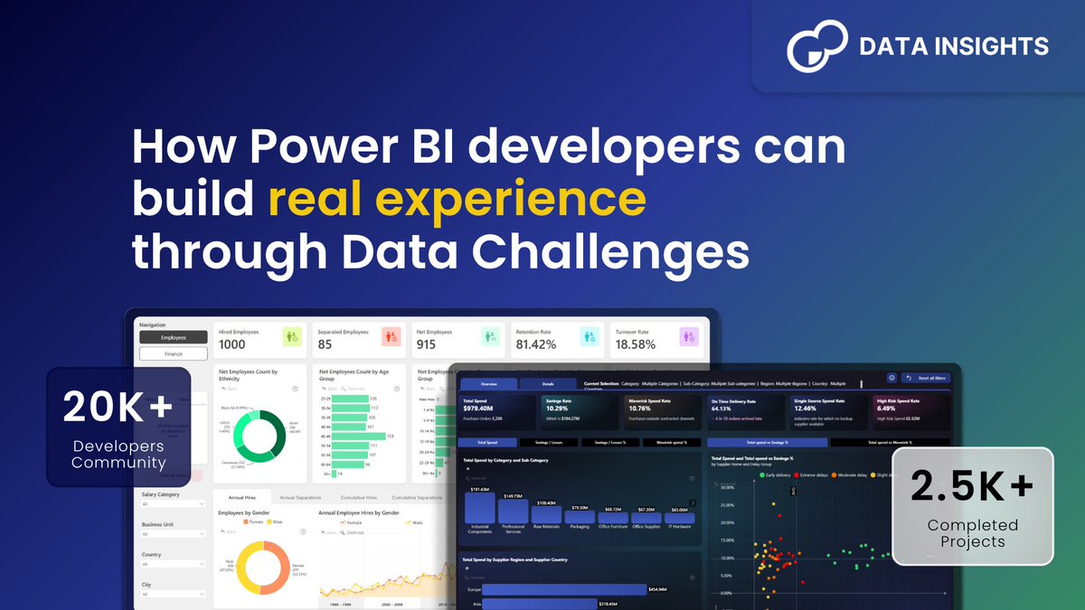

ZoomCharts
1.2K posts

@ZoomCharts
Drill Down Visuals for #PowerBI and JavaScript Charts Library for #DataExploration


What does your first Power Bi Dashboard look like ?

For the @ZoomCharts #4Ureport Challenge, I designed an Executive KPI report around four core principles: Unique, User-friendly, Uncovering, and Understandable. The goal was to create an executive-ready experience that not only presents data clearly, but also helps decision-makers quickly see insights, explore performance, and act with confidence. The home page of this report is the anchor, it presents a snap shot of all the KPIs and its progress against the business target. Report Link: shorturl.at/k4FMu #Datavisualization #builtwithzoomcharts #datafam #dataanalysis #ExecutiveKPI

What do you guys think?

10 KPIs. One question: are we on track? Built an Executive KPI Dashboard in @MSPowerBI Financials → Operations → Customers Budget vs Actual vs Forecast Custom DAX + HTML/SVG cards Check out Zefas BI @ZefasBi-Analytics" target="_blank" rel="nofollow noopener">youtube.com/@ZefasBi-Analy…
for more BI projects. #PowerBI @ZoomCharts


Just trying out the new @ZoomCharts breadcrumb feature. What I can say is; that was very thoughtful...Thank you. Zoomcharts - always looking for ways to improve data visualization and user experience.


