Pro tip. Buy a cheap plastic screen protector and cut it to put over the glyph matrix so it doesn't get scratched. You'll thank me later.
#nothing4apro#glyphmatrix#screenprotector
🐰 i finished watching all of hunter x hunter about a month ago…my favorite character is ikalgo 👍 i wish he was in the show more
🐰 the best thing about hunter x hunter is that there are no characters that you’ll hate…that was what i liked a lot about the show
@Mrwhosetheboss The fact that you need their confirmation instead of just testing it yourself (with your resources i believe you can) says everything about how irrelevant this spec actually is.
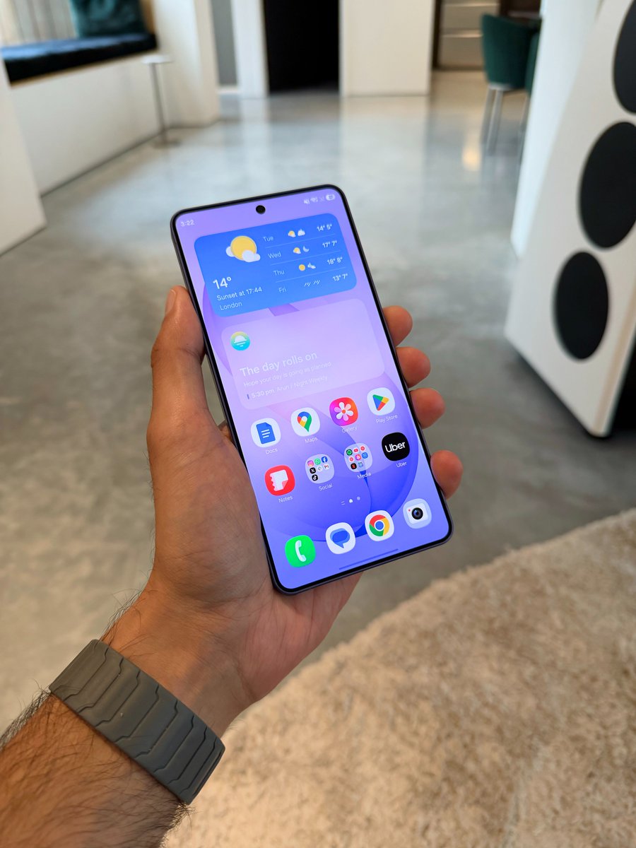
Just received confirmation from Samsung - S26 Ultra has an 8 bit display, not a 10 bit display as we were originally told.
That means it can only display 16 million colours instead of 1 billion, and just uses tech designed to "simulate 10 bit".
Not a problem that's easy to notice when you're using it, but nonetheless this does put Samsung's display behind most current flagship phones for colour reproduction
@tarunvats33 That app that doesn't have a blur is maybe an old app (no update) or it's still using the old android notification api (like YouTube) the 2nd screenshot is two blur background stacked that's why it looks different than the lockscreen one
@lushydesign@Samsung@SamsungMobile@SamsungTurkiye@tarunvats33@thatjoshguy69 "To prevent AMOLED screen burn-in, the status bar color should be black instead of gray.."
This statement is false.
Pure black icons on statusbar causing more burn in than the current one, and samsung never use "pure black" on its UI, even the ones you assume is black isn't.
What do we want from Samsung?
Beta 4 (ZZAL) has been released and there are no changes to the status bar yet.
In the stable version, the battery indicator numbers should not be gray; the background should be visible, as in One UI 8.
The data transfer arrows on the WiFi icon should be able to be turned on and off in the settings.
To prevent AMOLED screen burn-in, the status bar color should be black instead of gray. This way, the pixels turn off completely, preventing AMOLED screen burn-in.
Blur should be applied to the less transparent areas of icons and indicators. Of course, I used Frosted Glass as the blur type for my suggestion.
Share this suggestion with Samsung members and more people to get the attention of beta developers!
@TheGalox_ the only things preventing me from "downgrading" to an a series is 4k60 hdr10+, expert raw and no telephoto. and no telephoto i could live with if i could do smooth lens switching between main and uw on a series
Galaxy A57 - $499
• 6.6 inch FHD+ Dynamic Amoled
• 50mp 1/1.56” main
• 45w charging
• 6.9mm thin
Galaxy S26 - $799
• 6.3 inch FHD+ Dynamic Amoled
• 50mp 1/1.56” main
• 25w charging
• 7.2mm thin
These devices shouldn’t share ANY specs, let alone have the midranger be superior in some areas.