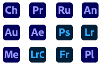
@1030 See also Apple’s Preview and Mail, those two little blue gradient rectangles at the same angle which without fail I confuse at least twice a week
Adobe: Please use graphic design to make the icons for your applications look different. You can vary the shape, colour, tone, texture, line, form, silhouette etc of each one to allow the user to quickly read what they are.
Design is communication.
FORTNIGHT FRINGE
In a time of disruption and deep reflection, how might independent designers be active participants in working towards a just and equitable future?
Join @jacojustice@EmilyMillichip and @EmlynFirth to explore >
tinyurl.com/yca2vao7
This is a brilliant - and urgent - emergency initiative. A growing network of 3D printers creating vital PPE for the NHS. Please support...
Big props to @SWG3glasgow for spearheading this...
bit.ly/EMERGENCYPPENHS
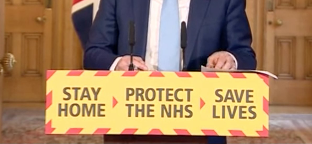
@KyleMcaslan@offfbrand It’s obviously supposed to signify the back of an ambulance. (as in ‘Your goin home in the...’). The weirdest thing is they seem to update these mundane graphics each day.
Graphic design folks. Does this look weird to you? Whats with the lack of symmetry in the bottom corners? The “stripes” don’t seem to line up? Can anyone work out how it would be made this way? @offfbrand