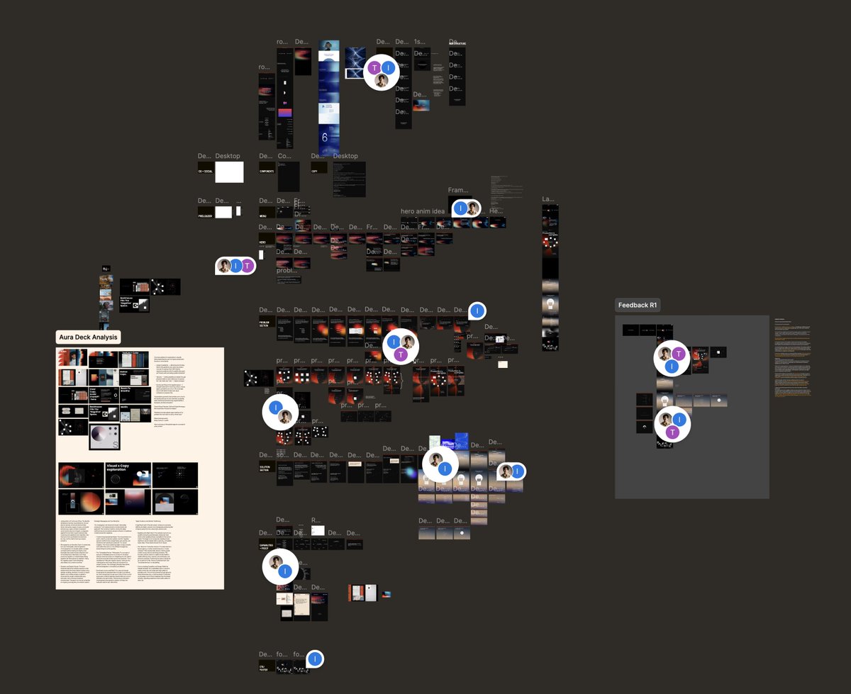
Sabitlenmiş Tweet
Ahmad Altaf
353 posts

Ahmad Altaf
@ahmdaltff
Visuals & Interactions Designer. @Framer expert.
Katılım Ağustos 2025
35 Takip Edilen76 Takipçiler

006/100 Buttons.
That one was a bit easier to craft.
We basically have the button and a duplicated part that appears on hover. The hover part is only shown when the button is hovered.
On mobile we would only have a tap animation, as there is no hover.
The hover part is clipped with a clip-path. On hover we see how it starts from the middle and reveals everything.
With a slight scaling on the text, it looks like the text in the front gets clipped as well. It also feels nicer when the second text gets scaled too.
I’m using
clip-path: polygon(0% 50%, 100% 50%, 100% 50%, 0% 50%);
as the starting point.
There are many more animations you can create with just clip-path. It’s super powerful. Only Safari has sometimes some weird quirks with it.
This animation is also done purely with CSS.
Crafting 100 Buttons with @osmosupply
⏳ Total time: 75h
English

003/100 Buttons.
On the Osmo page are a lot of those circular positioned lines. Used those around the icon on the button.
I also added a circular motion to the text, so it fits the overall style.
I’m using here a mask inside the SVG and animating this mask with stroke-dashoffset in CSS which reveals those lines. Important here is that the mask needs a unique ID which needs to be referenced by the SVG path, circle or group, the element you want to mask.
With that in mind I added a little JS function which handles the ID for the masking, so you can use this button everywhere.
Adding the variations. Here I got a few more, and it was quite complex as we can also change the animation direction from the text.
We can adjust the button with some CSS variables.
--button-color: # fff;
--button-color-background: # f84131;
--button-color-focus: # 201d1d;
--button-text-border-radius: 0.1875em;
--button-icon-border-radius: 2.5em;
--button-text-padding-top: 0.65625em;
--button-text-padding-bottom: 0.71875em;
--button-text-padding-x: 1em;
--button-flex-flow: row-reverse;
--button-transform-origin: center right;
--button-rotation-direction: 1;
--button-mirror-focus: 1;
There are quite a few variables that can be adjusted, more of it will be explained in the vault.
The icon box size is defined by the height of the text button. So we got here a padding top and bottom, as those two are mostly always different to set the text visually in the center.
With the flex-flow we can put the icon to the left. And with transform-origin, rotation-direction we can adjust the text animation so it’s animating from left.
Mirror-focus mirrors the focus state, as we can put the icon to the left, the focus can look wrong with different border radius on text and icon.
For the circle animation I’m using a mask inside the SVG and animate there the stroke-dashoffset to reveal the circle.
Crafting 100 Buttons with @osmosupply
⏳ Total time: 53h
English

Some More Micro Animations & Interactions.
Ahmad Altaf@ahmdaltff
Micro Animations & Interactions - About Page . Two slideshows, one for services using the built-in slideshow component in @framer. Other is custom designed using components. A draggable 8 ball that have moment using the drag effect. An infinitely looping testimonials card made with 4 variants. 🖼️ from visualjournal [ . ] it
English

Micro Animations & Interactions - About Page
.
Two slideshows, one for services using the built-in slideshow component in @framer. Other is custom designed using components.
A draggable 8 ball that have moment using the drag effect. An infinitely looping testimonials card made with 4 variants.
🖼️ from visualjournal [ . ] it
English

000/100 Buttons.
Building the zoom in/out button.
You can see at the top is this +/- button which lets you zoom the button in or out. It scrolls also sticky with you, so you can click it everywhere. Makes it for my local overview a bit easier.
It helps me on the development to quickly test if the button looks good on a smaller or bigger size. Behind that zoom is a parent div which gets a class and based on that the div with the button scales down to 0.6.
This button is basically a toggle. To make this accessible it needs to be a button with the type=”button” and the important part is the aria-pressed=”false” and aria-pressed=”true” after a click which shows the user if it’s activated or not.
Based on the aria attributes false and true I style the + and -. So on “false” the + part is highlighted, on “true” the - part is highlighted.
With that the environment is finished so far. I can start with the fun part, the buttons 🙂
Crafting 100 Buttons with @osmosupply
⏳ Total time: 25h
English

@colindmg @pacomepertant The spiral, sound effects and the click interaction on the logo, everything is 🔥
English

@eduardbodak @osmosupply Whatever medium you chose for inspiration, the buttons will be 🔥
Your "Tiny Mighty Button" project is a proof for that.
English

000/100 Buttons.
Crafting 100 Buttons with @osmosupply
Will be sharing daily from now on about how we craft this and how much time actually went into it.
Most important thing on crafting so many different Buttons.
The right Inspiration.
I could go on Awwwards or other sites, look there at some button animations and build something on that base. With that I would just do buttons like we can see everywhere else. That’s not the goal.
So the Inspiration should be more than just Websites with buttons.
Motion Videos.
Games.
Movies.
Anime.
Series.
And maybe more by just going outside.
It’s also something you can’t find in one or two days. It’s something you build up from time to time.
A topic like Circles, Water, Sport, Technic and so on can also help to do something in different directions., Looking at stuff there, how things move and somehow translate it in the animations.
Sometimes the animation on a button is the base on the overall motion system. It’s an important part of a site.
It can also have animation which can also be used on links.
Making that one feel right can enhance the complete experience.
One inspiration for example is the Osmo site itself. There is a lot of motion which can be translated to a button interaction in some ways. I recorded all the motion which can be somehow used maybe. So I start to build some Osmo based buttons 🤓
But first I need an environment.
⏳ Total time: 2h
English

Project Sliding Animation
.
🖼️ from haptic [ . ] studio, used for demonstration purpose.
Ahmad Altaf@ahmdaltff
Intro Animation
English

@by__huy Being stuck with the same layout and direction, even knowing that it might not be the right one, is certainly demotivating.
What do you do to break the cycle of similar designs?
English

We're wrapping up the landing page for Backhouse a production house behind work for Netflix, Apple, and Sony.
It's taken longer than we scoped. More feedback cycles, more iterations than a typical build.
There were moments where it genuinely started to feel demotivating.
It's an uncomfortable feeling when you've been submerged in the same problem for weeks, something goes stale in the creative process.
You stop seeing it fresh. You start questioning whether you're solving the right thing or just rearranging the same answer.
What kept us going wasn't motivation. It was commitment to getting it right with care.
The initial brief was never just make it look good. It was make someone feel the weight of broken production systems and then the relief when Backhouse solves it.
Even if we nailed it on the first try, there's always a version of me that looks at something and thinks:
"We could go further."
"It doesn't feel right yet."
Most projects settle when something looks good enough. The team at Backhouse kept pushing us to go above and beyond.
Beyond grateful for the partnership, more soon.

English

@Rhysatblueblox It was created in Jitter, although any animation software that supports key framing will work.
I'll be developing this in Framer.
English

Intro Animation
Ahmad Altaf@ahmdaltff
Homepage . Images from haptic [.] studio; used for demonstration purpose.
Français

@_zuji @contra @zocomputer It looks incredible 🔥
All the small details, bouncy animation on the bottom ruler, cursor reactive background mesh and the animated gradient border on cards; really shows of the personality you've added to the website 👏🏻
English

my submission for the @contra + @zocomputer challenge
i built a personal website that represents me, from the design language, to the attention to detail within the micro-interactions and animation.
this site was made within 10 days
live site → zzz-zuji.zocomputer.io
English


