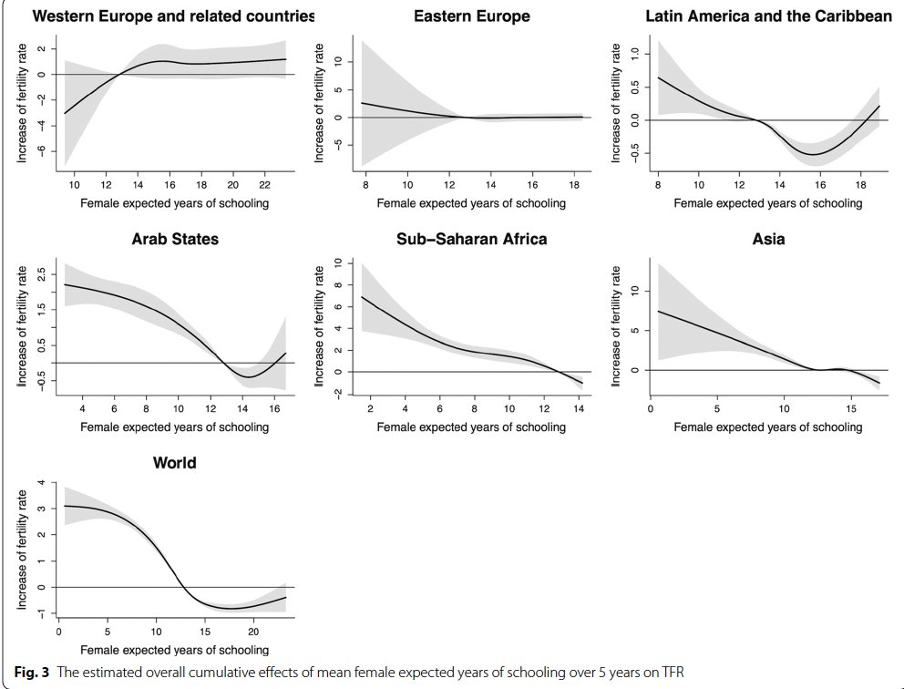
Alex Carrasco Martinez retweetledi
Acaba de salir la tercera edición de "Cómo Investigan Los Economistas". Está edición la hice con mi hijo Liu. Lo hicimos con mucho esmero para los estudiantes y profesores que necesiten hacer una investigación en el campo de la Economía. Gracias PUCP.
fondoeditorial.pucp.edu.pe/economia/163-c…
Español