Asif Ali

1.5K posts

Asif Ali banner
Asif Ali

Asif Ali

@as_if_so

Product designer building AI-native design systems in public. Brief → design → code. Sharing what I learn. DMs open.

Bengaluru Katılım Mayıs 2014
166 Takip Edilen154 Takipçiler
Sabitlenmiş Tweet
Asif Ali
Asif Ali@as_if_so·
Our buttons looked perfect in Figma. Then they hit code and every screen had a slightly different one. Padding off by a few px. A one-off colour here. A missing disabled state there. Here's the system that fixed it for good 👇
English
1
0
1
118
Asif Ali
Asif Ali@as_if_so·
Day 20/45 · Rating The stars fill in one sweep, left to right, and a partial star stops exactly where the number says. Most rating components can only draw halves, so 4.3 and 4.7 both become 4.5 and the picture quietly stops matching the number. One component a day, from an AI-native design system.
English
0
0
1
25
Asif Ali
Asif Ali@as_if_so·
Day 19/45 · Quick filter The two or three filters people actually use, one tap each, above the grid. Selected takes the maroon fill with a drawn check; the greyed pill means no matches, disabled but never hidden. One component a day, from an AI-native design system.
English
0
0
0
34
Asif Ali
Asif Ali@as_if_so·
Day 18/45 · Gold rate ticker New component for the system. The rate rolls like an odometer, digit by digit, in the direction it moved. Green or red follows the movement, the sparkline draws the week. One component a day, from an AI-native design system.
English
0
0
1
36
Asif Ali
Asif Ali@as_if_so·
Day 17/45 · Filter chips Every applied filter stays visible above the grid as a removable chip. Pull one off and the row closes the gap, no jump, and the listing answers immediately. One component a day, from an AI-native design system.
English
0
0
1
29
Asif Ali
Asif Ali@as_if_so·
Day 16/45 · Sort dropdown On desktop it is a panel. On mobile the same options rise as a bottom sheet in the thumb zone. Pick one and the real grid reorders, cards glide to their new places. One component a day, from an AI-native design system.
English
0
0
0
28
Asif Ali
Asif Ali@as_if_so·
Day 15/45 · Search autocomplete Type and the list answers: your exact letters marked in every suggestion, products with prices once the query gets specific, arrow keys the whole way. Search is the front door, it should feel like one. One component a day, from an AI-native design system.
English
0
0
0
31
Asif Ali
Asif Ali@as_if_so·
@n___vc @MaxStalker true. but i meant effortless from the users perspective to notice the depth.
English
0
0
0
13
nick
nick@n___vc·
💡design tip: if you are building a new dark mode, and you are using subtle shadows throughout the app, you might see, that inverting the shadow is not going to work. ➡️instead, use a 0.5px/1px inset shadow for the elements that still need some depth on the app.
English
10
4
287
19.1K
Max Starka
Max Starka@MaxStalker·
@n___vc Or you could, I don't know, not use pure black background and have some leeway with shadows 🤷‍♂️
Max Starka tweet media
English
2
0
5
317
Rayan
Rayan@rsStats_·
Pull-to-refresh, but the loader drips out of the Dynamic Island 💧 Built with @expo 57 + reanimated + skia. source code : rselmi.com/lab/island
English
21
35
778
38K
Asif Ali
Asif Ali@as_if_so·
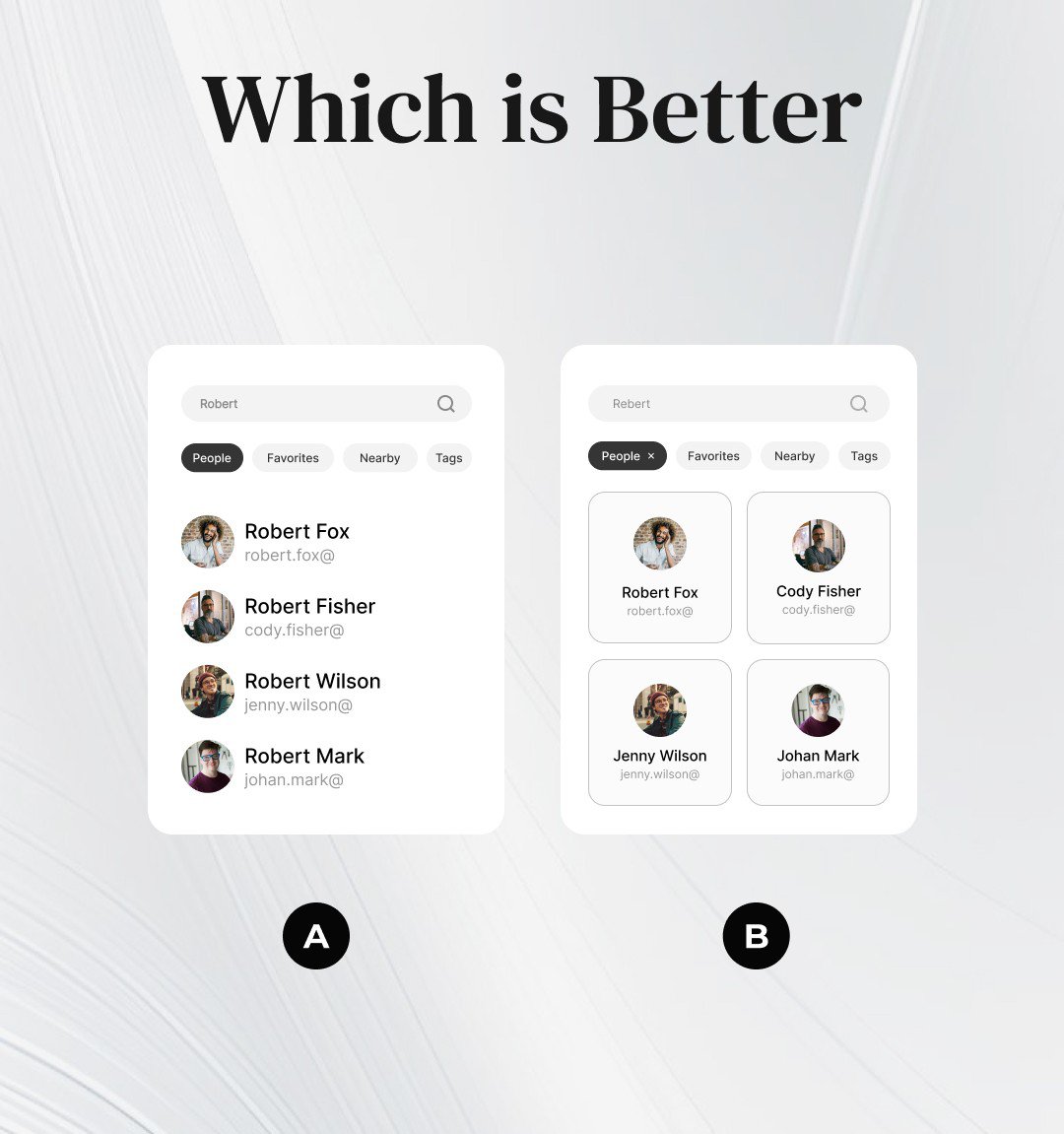
@sahariarsajibux since it's a sorting and will be scrollable, A. easier for the eyes to scan.
English
1
0
1
33
Sahariar Sajib
Sahariar Sajib@sahariarsajibux·
A/B testing.... Which is the better...???
Sahariar Sajib tweet media
English
7
2
22
605
Asif Ali
Asif Ali@as_if_so·
@nilseller love it! this will be a smooth interaction for apps. also, like adding products to cart!!
English
0
0
1
10
Nils
Nils@nilseller·
Let's make software fun again.
English
28
10
454
13.8K
Asif Ali
Asif Ali@as_if_so·
Day 14/45 · Tabs Watch the underline: it stretches toward the tab you picked, then settles under it. Position and width run on different curves, that is the whole trick. One component a day, from an AI-native design system.
English
0
0
1
33
Max Danilov
Max Danilov@Distroux·
@as_if_so the squash on hold is a tiny detail, but it changes the control from visual feedback into something you almost feel. smart to reserve maroon for the on-state too
English
1
0
1
15
Asif Ali
Asif Ali@as_if_so·
Day 13/45 · Toggle Small control, rebuilt properly: the knob rides a spring and squashes while you hold it, so the press has weight. Maroon is the system's one on-colour, nothing else gets it. One component a day, from an AI-native design system.
English
1
0
1
46
Kartik Bansal
Kartik Bansal@TheKartikBansal·
Footer Design
Kartik Bansal tweet media
English
42
41
1.6K
50.5K
David
David@david_visuals_·
Charts - Dark mode
David tweet media
English
21
3
168
5.4K
Asif Ali
Asif Ali@as_if_so·
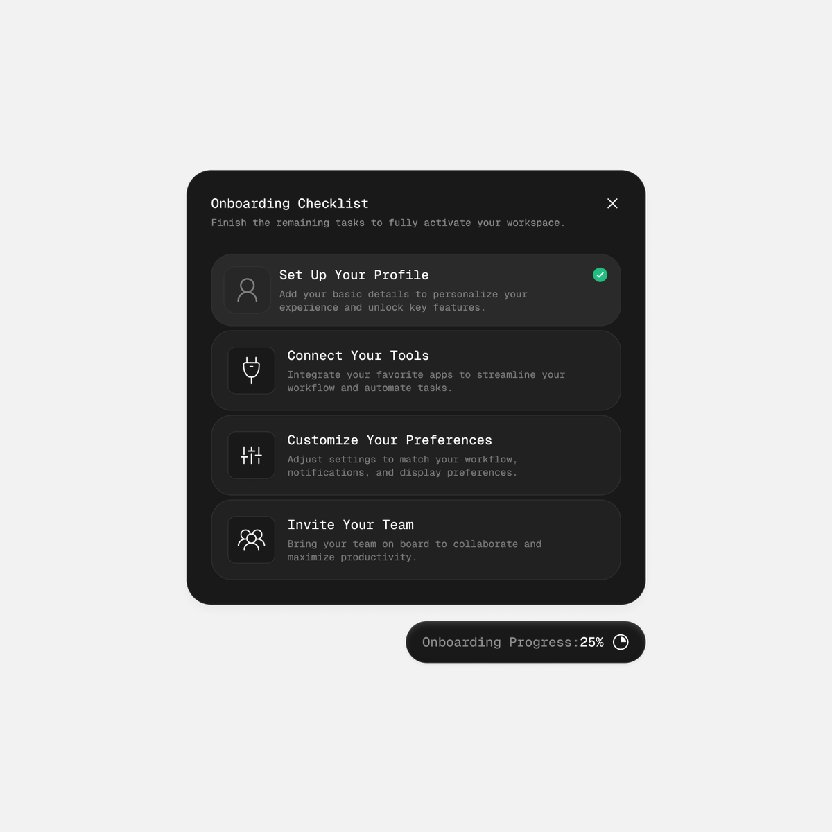
@AdityaSur11 super clean! i would also, give a icon/cta for the user to go and complete the remaining tasks. just to make it more intuitive.
English
0
0
2
21
Adi
Adi@AdityaSur11·
Clean Checklist UI
Adi tweet media
English
15
3
92
2.6K
Asif Ali
Asif Ali@as_if_so·
Day 12/45 · The form, assembled Days 7 to 11 were the parts. This is them composed: name, number, state, OTP, save, toast. One real checkout form, zero one-off styles. This is why you build a system. One component a day, from an AI-native design system.
English
0
0
1
35
Asif Ali
Asif Ali@as_if_so·
Day 11/45 · Select field Same anatomy as the input, so the form reads as one family. The label floats, the list opens on brand, not the browser default. One component a day, from an AI-native design system.
English
0
0
0
32