
Sumit Hegde | Beetle Beetle
1.6K posts

Sumit Hegde | Beetle Beetle
@beetlebeetle
Helping B2B SaaS and AI products 2x their MRR with crystal-clear messaging and high-performing websites
Katılım Haziran 2017
908 Takip Edilen1K Takipçiler

This is the type of visuals that work for a website selling to enterprises.
We see too many fake product visuals or just sloppy dashboards on SaaS websites still.
We like to zoom in on the important parts of the product and it's output, and make that digestible for a enterprise visitor.
English

Differentiation used to be about saying what made you different. Now everyone says the same things.
So the real challenge is showing the difference in a way people instantly understand.
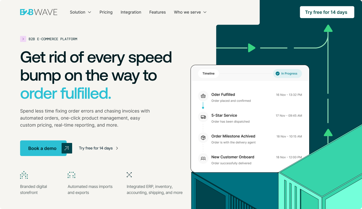
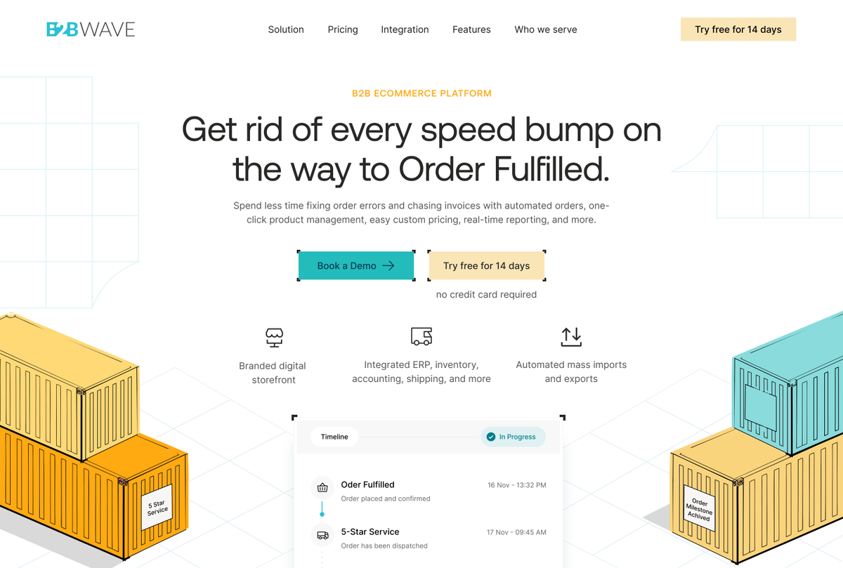
This is one attempt at that, an integration section that feels tangible, and a competitor comparison section we’re really happy with.

English
SWF's total users increased by 25% after we revamped their website.
This is some of the design work we did for them..
Testimonials, in different flavors.

English
In enterprise software website, think of use case sections as a tool.
It is there for the champion (the person tasked with finding the solution) to use and convince different stakeholders in their company of your value.
Most companies over complicate their use case sections and end up making the pitch more difficult for the champion.
Here's something simple that we designed that does the job.

English
This demo page saw a 20% uptick in sign-ups.
It wasn't just the demo page that we made, we revamped the whole website.. But I think this page deserves a mention. 🚙
English
The final CTA is obviously a make-or-break moment for a website.
While most are okay with a generic "Get started today" headline and a button (which work sometimes.. as you see we do it too.)
I like to change it up.. ask a question, give out numbers, go strong on a benefit.
This in general helps keep visitors on their toes, instead of mindlessly scrolling through another website on their checklist.
Here's some final CTAs we wrote and designed for our clients.


English
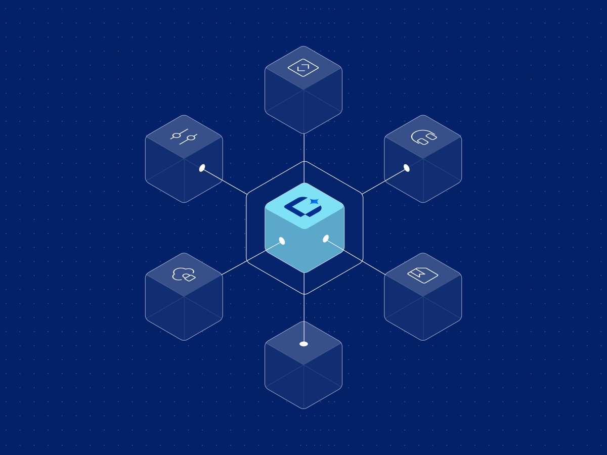
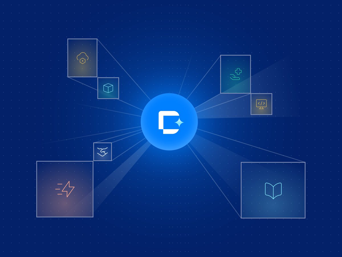
Integrations section we built for a recent client. 🕸️

English
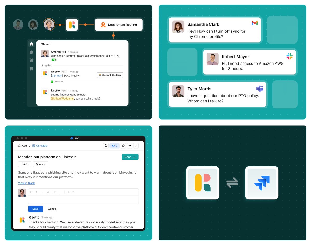
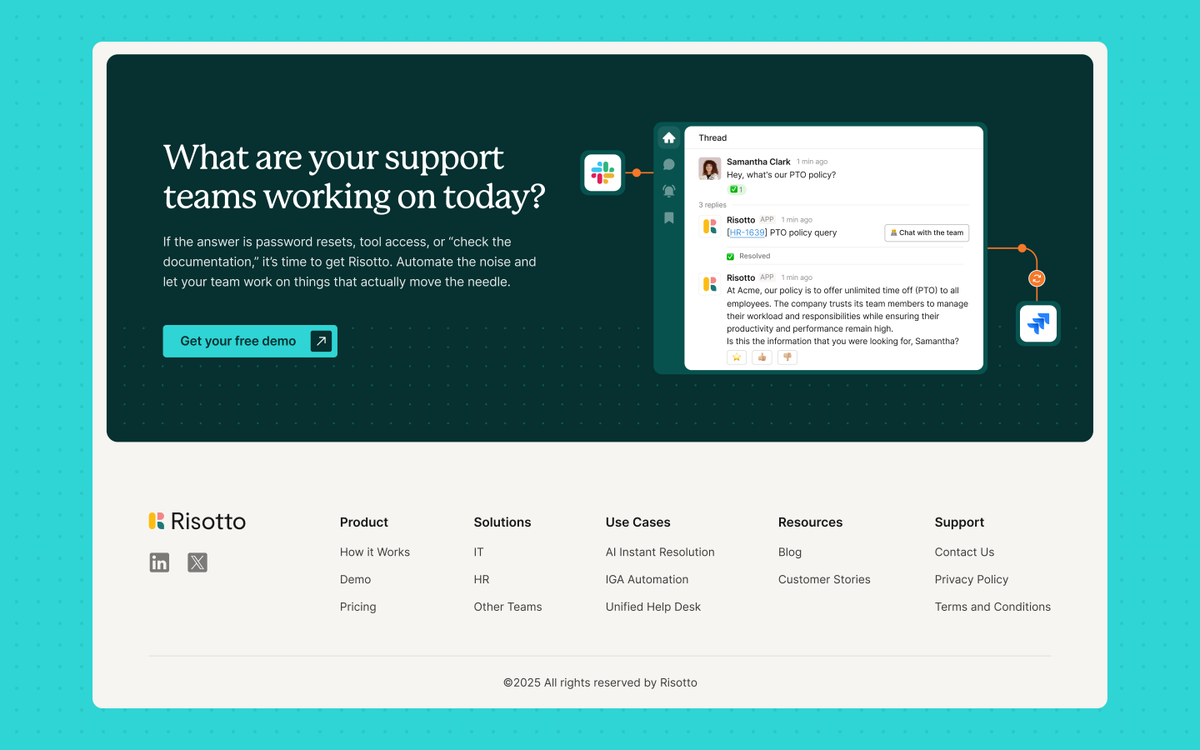
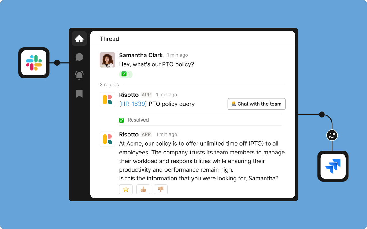
Risotto came to us for a standard website revamp.
Now we work with them month after month improving the site together.
New pages. Sharper positioning. Better UX. Faster launches.
That only happens when clients genuinely like working with you and can clearly see the impact of the work.
You can't keep retainers by upselling harder.
You keep them by consistently making good stuff people don’t want to lose access to.
Here’s some of the work we’ve done with Risotto so far.


English
Slides with Friends' best customers were non-tech managers.
They didn't need tons of copy to talk down at them. So we created simple visual-focused sections for them.
This is one of the feature set visuals we created for them. 🎴

English
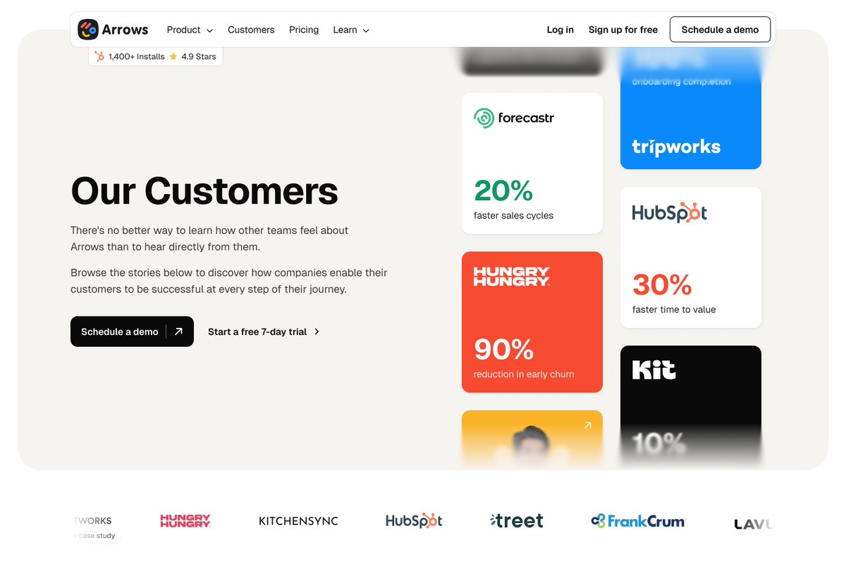
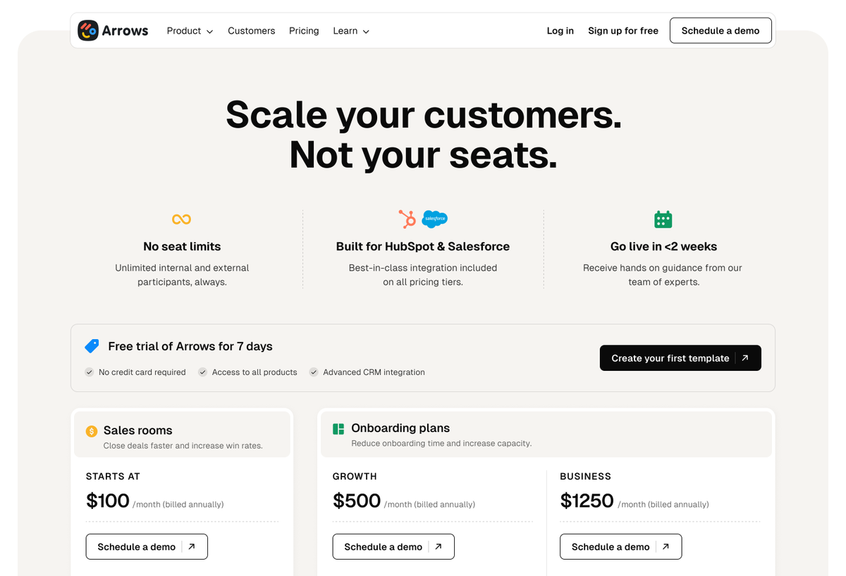
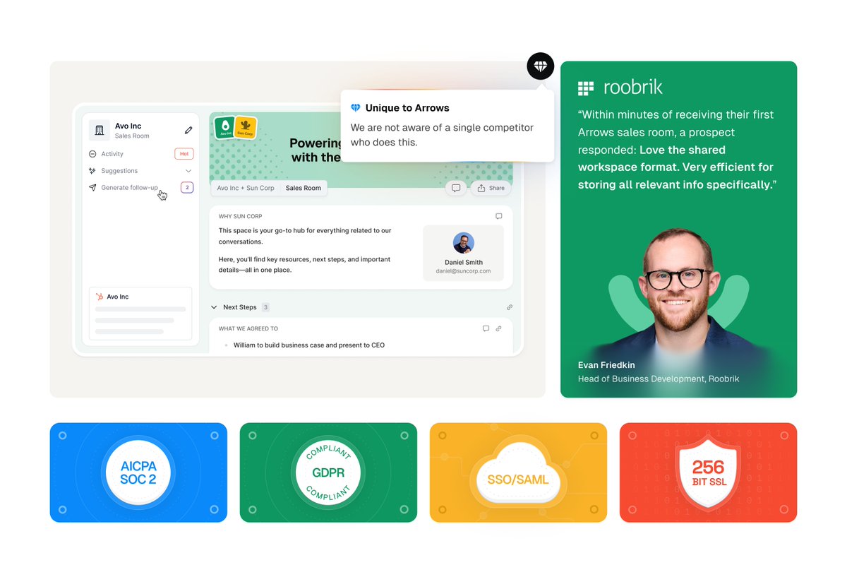
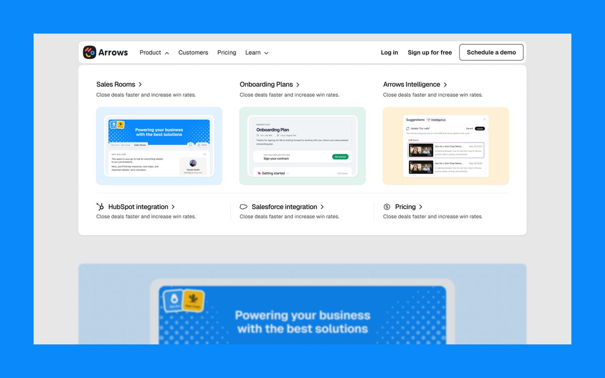
Arrows was another one of our clients working with Fortune 500 companies.
The product was already being used by enterprises.
But their site was Startup-y
So we rebuilt the whole thing in Webflow.
→ Sharper visual system
→ Better product branding
→ Modern UI visuals + motion
→ Modular CMS the team could use regularly
We gave them a site that finally caught up to where the company was.
English
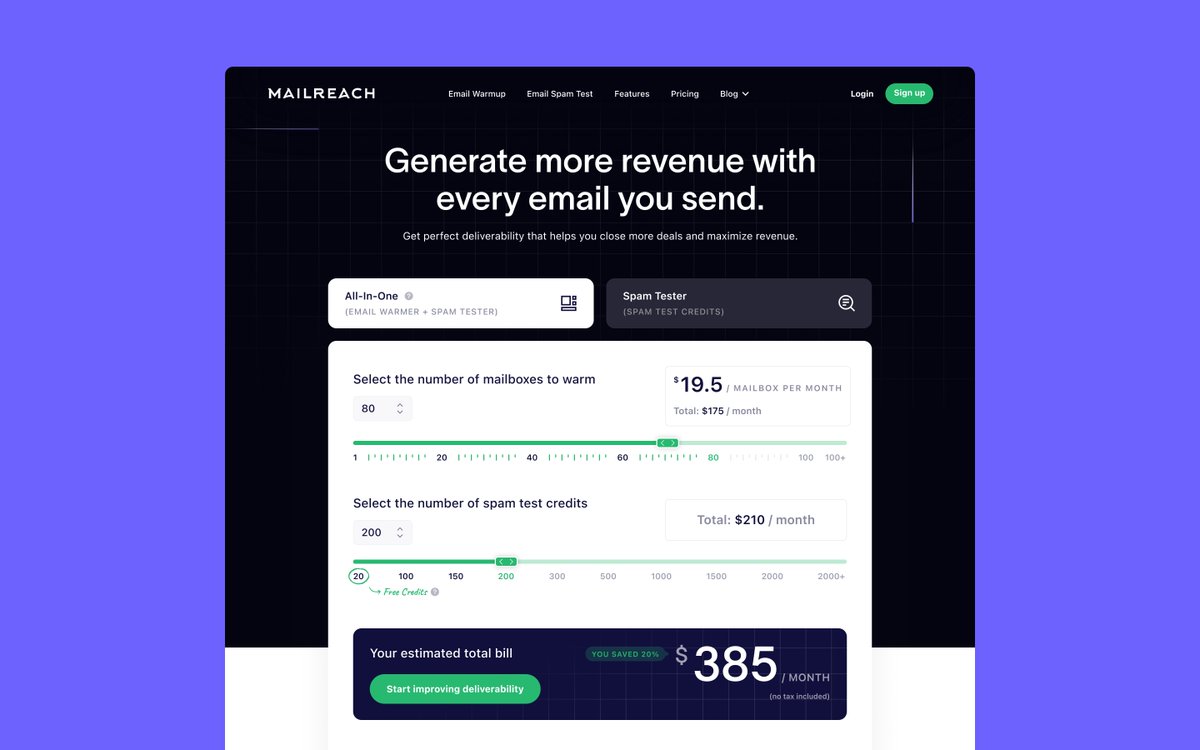
Some pricing pages need more than just clean tier-lists.
Here's a calculator we created for Mailreach's pricing page to make the stakes as clear as possible.
English
Feature grids are one of those sections that look simple, until you realize how much range they actually have.
Different spacing. Different hierarchy. Different card treatments. Different ways of introducing motion, screenshots, icons, or copy.
Same structure. Completely different feel.
Here are 4 feature grid directions we designed recently and how small design decisions completely change the personality of the page.


English
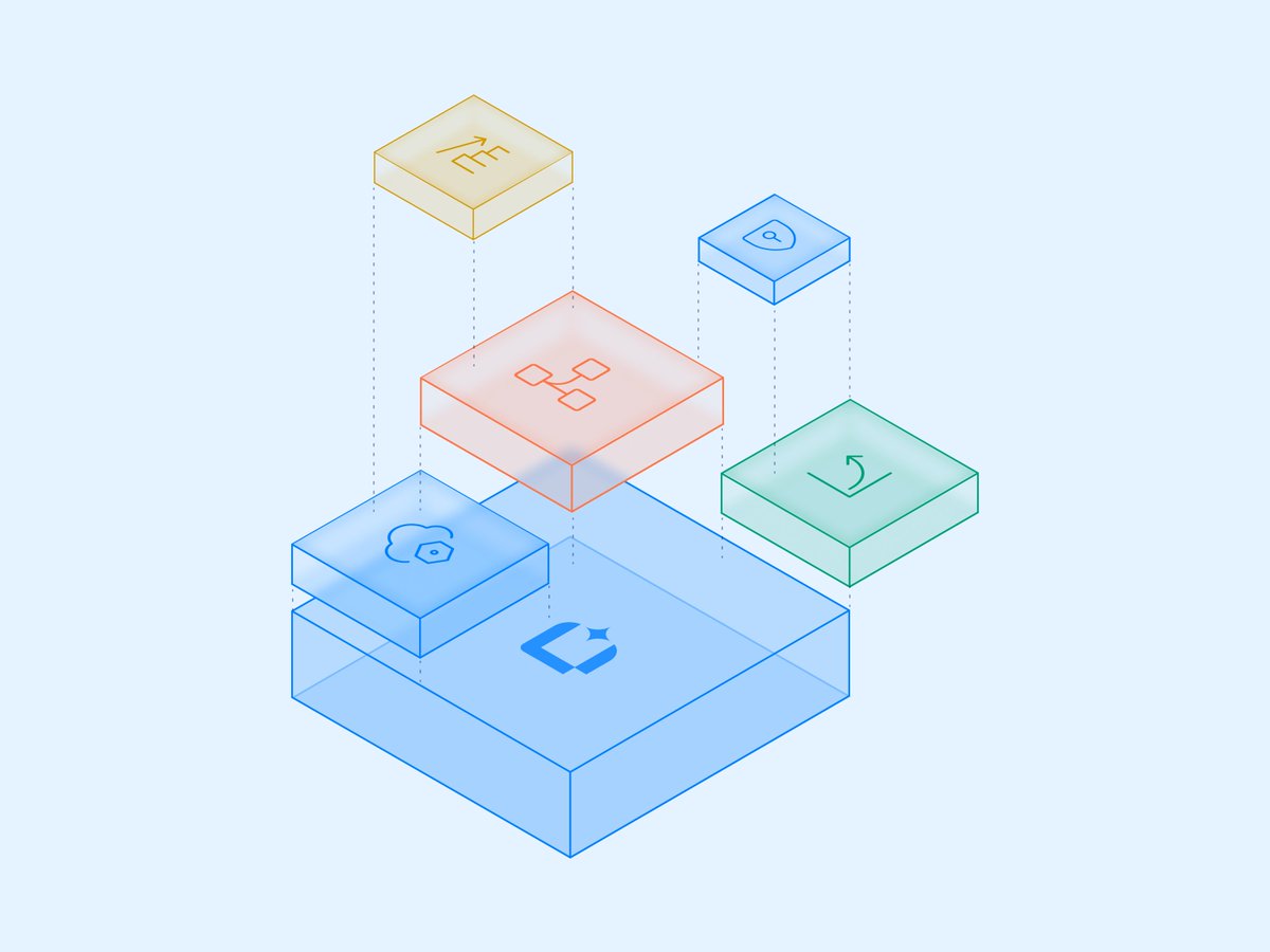
Nodes and links website designs we did for DAC. 💙

English
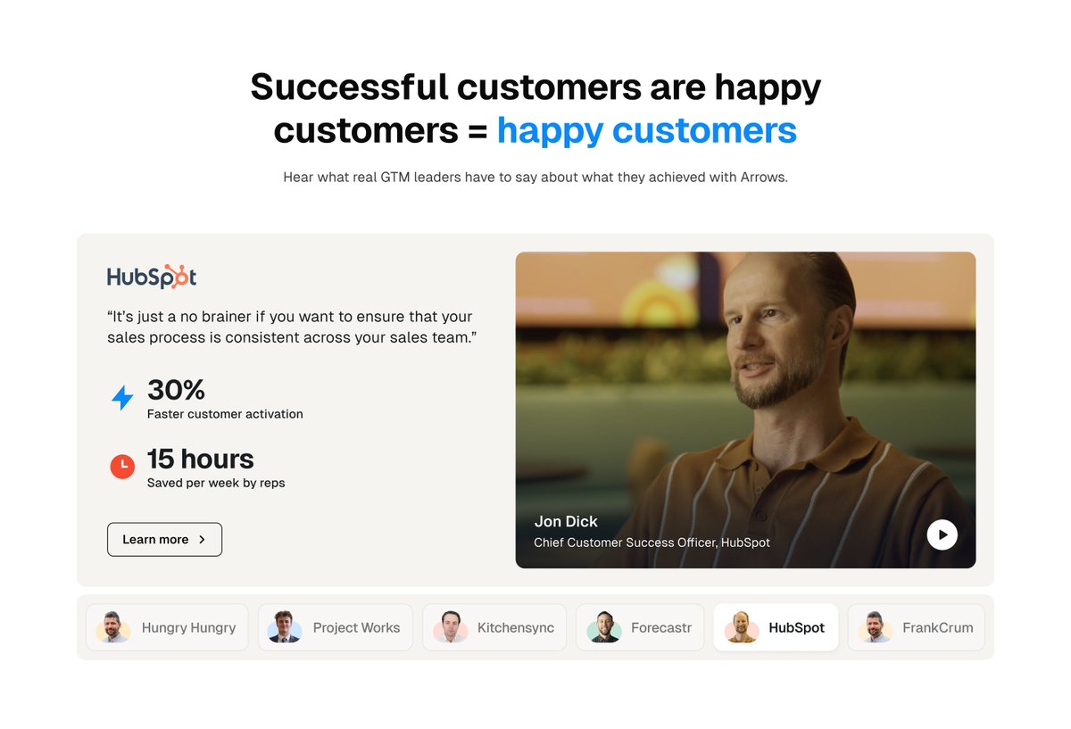
Most testimonial sections get ignored.
Because the section looks generic, or ignorable.
So when we design testimonial sections, we try to make the people behind them feel real immediately.
If we can, we use faces and video.
People trust people.
If we can’t, we lean hard into recognizable company branding, custom illustrations, strong visual hierarchy, anything that signals:
“These are real teams with real problems talking about a product they actually use.”
Social proof only works if people notice it first.


English
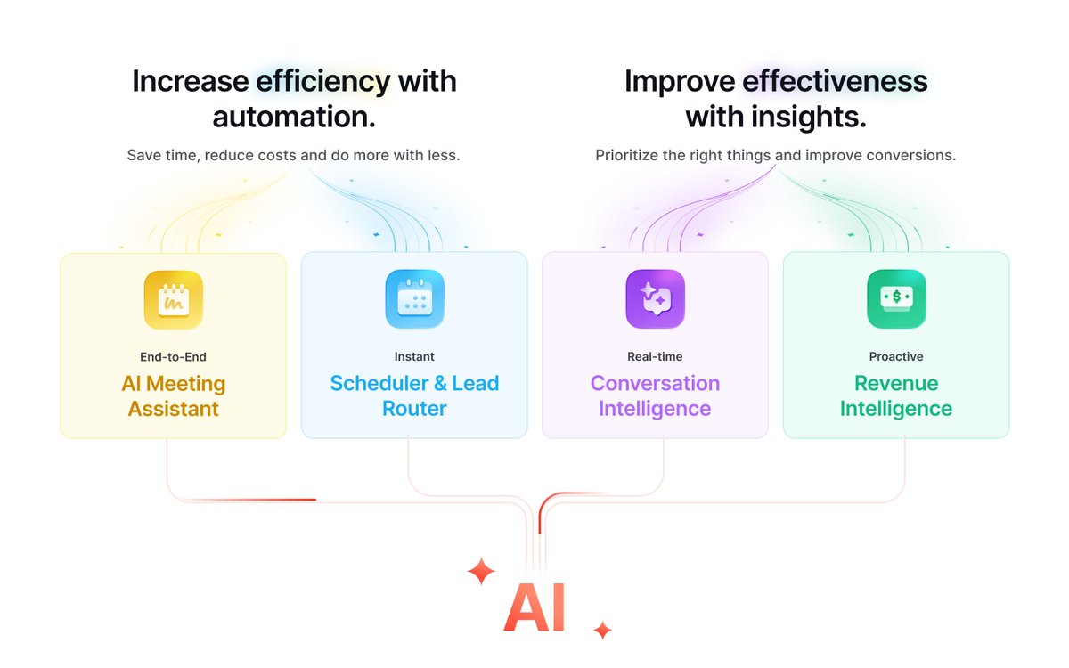
Product visuals we created for Scrut.
Zeroing in on the part of the dashboard your messaging is about makes product visuals so much more effective. 💻

English


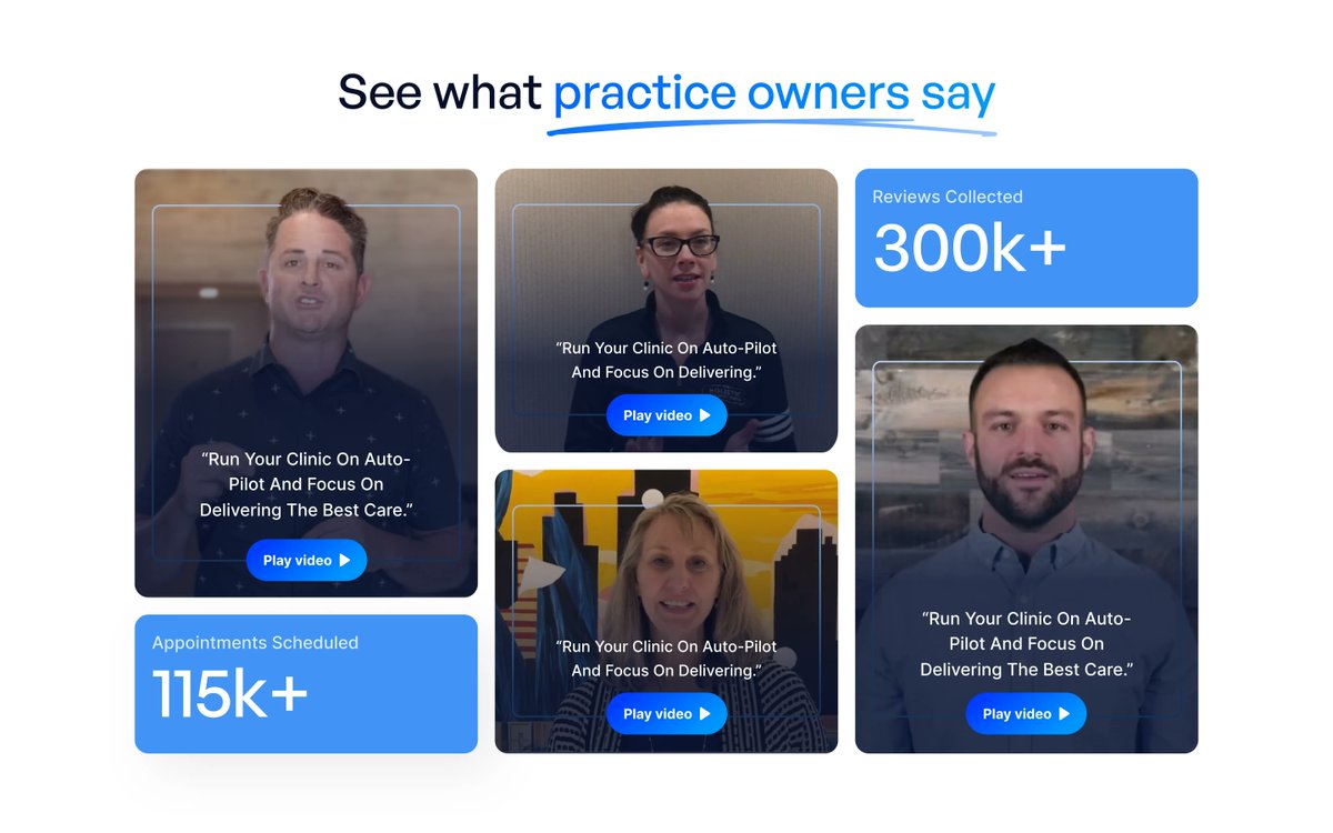
Video testimonials are some of the strongest social proof you can have.
But most websites either bury them, overload them, or make them awkward to actually watch.
This is how we designed a section that makes customer stories feel easy to browse, engaging, and impossible to miss.
English
8 years of fixing SaaS websites has given us this simple framework to nail nav bars for all SaaS websites.
What teams usually get wrong is:
They treat the nav bar like a storage unit.
Every new page gets added. Nothing gets removed.
Platform, Product, Solutions, Resources, Company, Blog, Pricing, Why us…
Dropdowns inside dropdowns.
Your nav sets the buying journey more than your homepage copy does.
This is a simple checklist we’ve developed after years of cleaning nav bars up:
• Your nav should work like a funnel, not a filing cabinet. It should guide decisions, not store pages.
• Prioritize by conversion value. Product, Solutions, Pricing > Blog, Careers, About.
• Every page needs a job. If it doesn’t move a deal forward, it doesn’t deserve prime nav space.
• Keep top-level items tight (4–7). Group the rest intelligently.
• Everything important within 2–3 clicks. If buyers have to dig, they won’t.
• Track what people actually click. Nav decisions without data are just opinions.
Founders sometimes worry this means hiding content. It doesn’t. It means telling a clearer story.


English