Louche has reached the finish line on @futurefonts . From now on available at domicilefoundry.com with plenty more licensing options (+free test fonts).
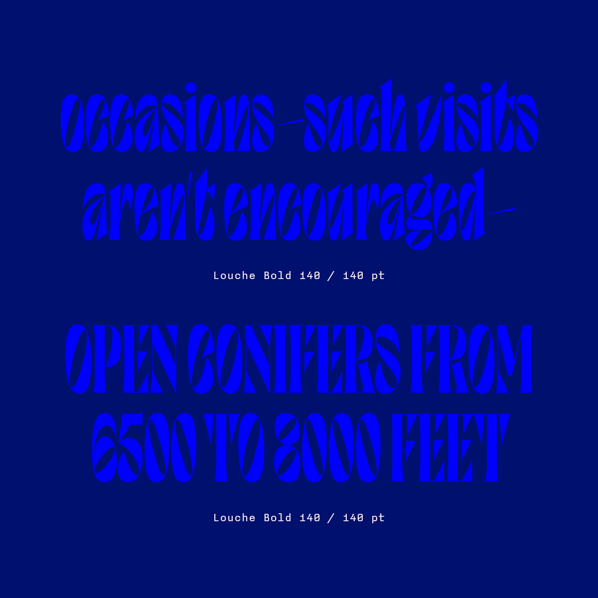
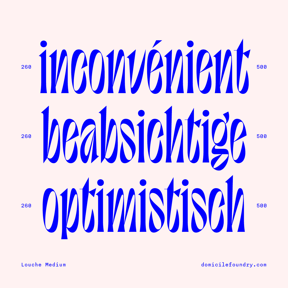
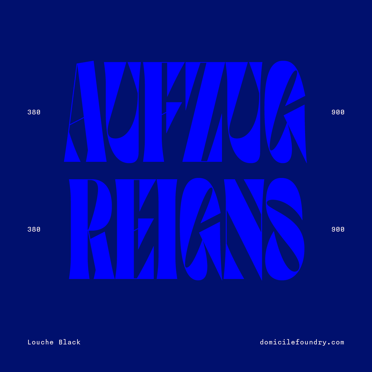
LOUCHE
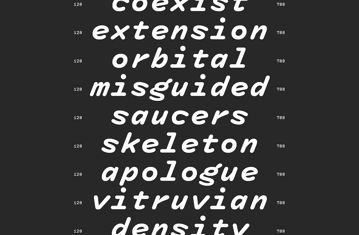
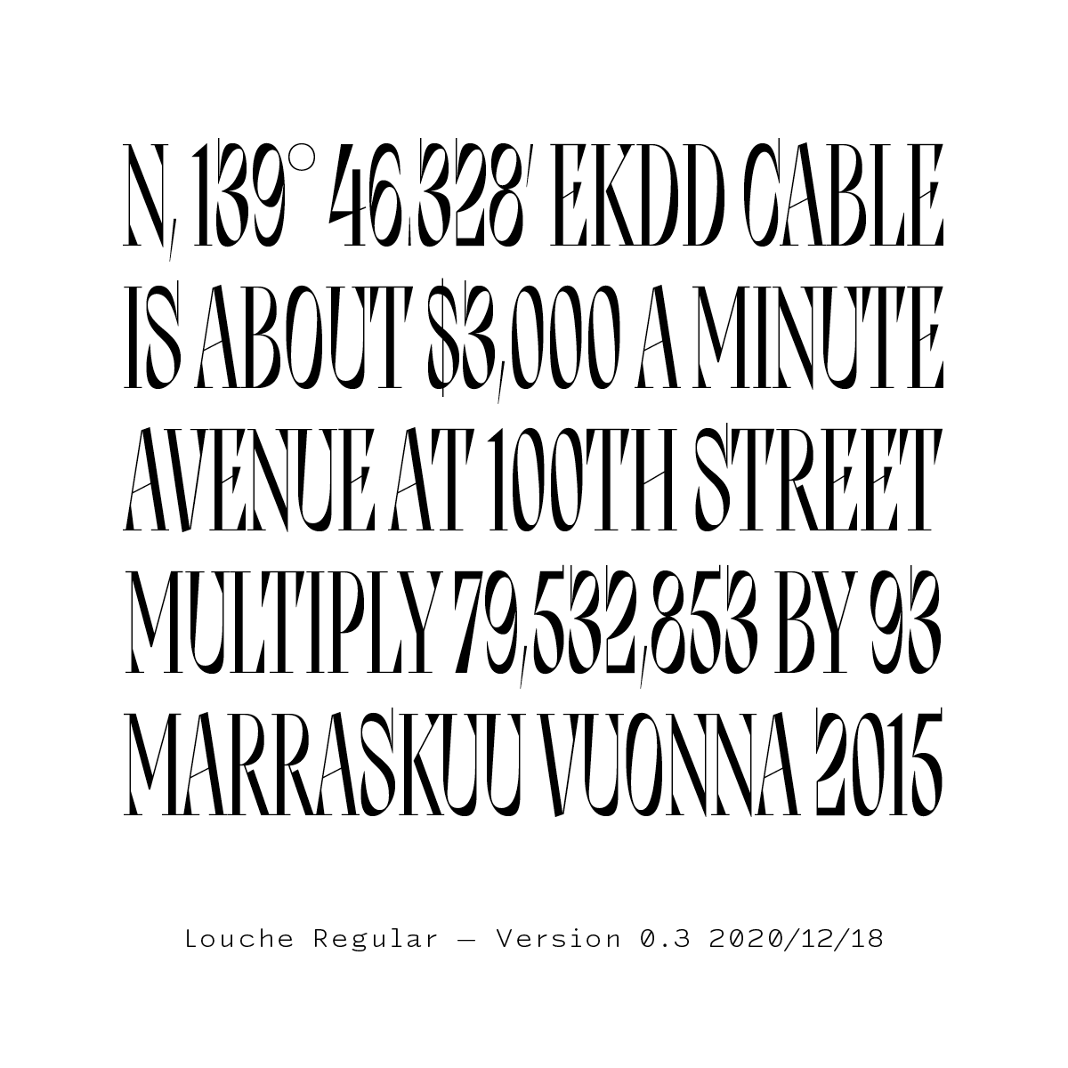
My favorite aspect of Louche by @joolouhi is the ‘italicization’ of the counters. The letters themselves remain upright, while the counters become sloped or italicized giving Louche its rather oddball or off-kilter appearance. I’m a huge fan! Favorite glyphs: g, &, and S.
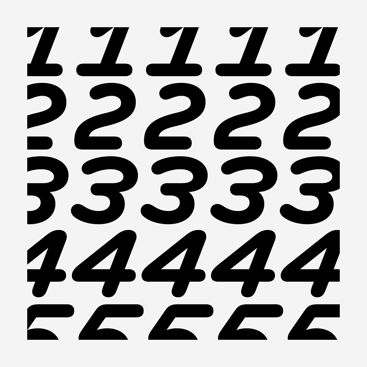
✨UPDATE✨ Louche v0.3 by @joolouhi adds lining figures, currency and math symbols, and more. This high contrast display font explores how to evoke a sense of italic without having an actual slope. futurefonts.xyz/joona-louhi/lo…