etherealist

2.3K posts

etherealist banner
etherealist

etherealist

@etherealist999

buying fear since yesterday. my telegram for cooperation: abclogic

new york Katılım Temmuz 2025
27 Takip Edilen979 Takipçiler
etherealist
etherealist@etherealist999·
$XPL is trading inside a prolonged accumulation range after a steep correction from its all-time high. Price has stabilized above a strong long-term support zone. Selling pressure has faded considerably compared to the initial downtrend. The market is beginning to print a healthier structure with higher lows. A breakout above the first resistance around $0.20 would be the first major bullish confirmation. That move could trigger fresh momentum as sidelined buyers return. Clearing the mid-range resistance would significantly improve the long-term market structure. If bullish momentum continues, the next major objective becomes the previous ATH region near $1.68. Reclaiming that level would place the asset back into price discovery. From current prices, the projected move toward that target represents roughly +2,050% upside.
etherealist tweet media
English
0
3
9
891
etherealist
etherealist@etherealist999·
$NEAR may be entering a completely new phase after years of consolidation. The long-term downtrend that capped every rally is finally breaking. That is the first major bullish signal on the weekly chart. Price has also reclaimed a strong historical support zone. Buyers are beginning to regain control of the market structure. If the breakout holds, momentum could accelerate quickly. Previous resistance levels may turn into new support during the move higher. The chart leaves plenty of room for trend continuation. The long-term target sits near $20. From current prices, that represents roughly +1,040% upside.
etherealist tweet media
English
1
5
38
1.5K
etherealist
etherealist@etherealist999·
$FET is trading at one of the strongest support zones on the entire chart. Price has spent months building a base here. This area also contains the highest historical trading volume. High-volume zones often become long-term accumulation areas. Sellers have repeatedly failed to push price lower. The first major resistance sits around $0.99. Reclaiming that level would be the first bullish confirmation. The next key level comes near $2.20. That area previously acted as major support before turning into resistance. Above it, the final obstacle is the ATH region around $3.46. Breaking the all-time high would put price discovery back into play. From current levels, that would represent a potential move of well over 2,000%.
etherealist tweet media
English
4
13
90
4.2K
etherealist
etherealist@etherealist999·
$LUNC is once again testing one of the strongest support zones in its history. Since the collapse, every major rally has started from this same accumulation area. After each impulsive move, sellers regained control, pushing price into another long period of consolidation. But one thing has remained consistent: Long-term demand continues to appear every time LUNC revisits this support. Price is now back at that exact level after another multi-year correction. This is where high-timeframe reversals become possible. The previous descending trend has already weakened significantly, while volatility continues to compress. Markets rarely stay compressed forever. When liquidity builds for months, expansion usually follows. If buyers successfully defend this support once again, the next phase could resemble the previous recovery cycle. A move back toward the major resistance around 0.00073 would represent roughly 1,300% upside from current prices. That doesn’t mean the move will happen overnight. Strong trends are built through higher highs, pullbacks, and periods of consolidation not in a straight line. But as long as LUNC continues holding this historical support zone, the long-term technical structure suggests that another expansion phase remains a realistic possibility. Sometimes the biggest opportunities appear when the market looks the quietest.
etherealist tweet media
English
3
20
128
6K
etherealist
etherealist@etherealist999·
$ONDO spent most of 2025 doing one thing — bleeding lower. Lower highs. Lower lows. Every rally was sold. Every bounce faded. The trend was clearly bearish, and buyers had very little control over the market. But trends don’t last forever. Eventually, selling pressure began to dry up. Price stopped making new lows. Volatility contracted. Accumulation quietly replaced distribution. That’s usually how major reversals begin. Now compare that to what’s happening in 2026. Instead of making lower highs, price is printing higher highs. Instead of lower lows, buyers continue defending higher prices. Every breakout is followed by another consolidation rather than a complete collapse. That’s a completely different market structure. Healthy bull markets don’t move in straight lines. They advance, pause, build support, and then continue higher. That’s exactly what this chart is beginning to show. Momentum is gradually shifting from sellers to buyers. If this sequence of higher highs and higher lows continues, ONDO could be entering the strongest phase of its trend. The biggest gains rarely happen during accumulation. They usually come after the market has already proven that the trend has changed.
etherealist tweet media
English
1
12
118
6.9K
etherealist
etherealist@etherealist999·
$INJ spent more than a year moving lower. Lower highs. Lower lows. Until now. The chart has finally broken that long-term downtrend. That’s the first major shift in structure. Price is also holding above a key historical support zone. The same area that launched previous rallies. Those old distribution zones above are now the main magnets. They were filled with buyers before. They can become targets again. If momentum continues building, $INJ could start reclaiming those levels one by one. A move back toward the previous cycle highs would represent roughly a 2,280% upside from current prices. Nothing is guaranteed. But after such a long accumulation, this is the kind of chart many traders wait years to see.
etherealist tweet media
English
1
7
23
1.5K
etherealist
etherealist@etherealist999·
$NEAR is trading inside one of the strongest accumulation zones on the chart. Years of consolidation have created a massive liquidity base. Most sellers have already exited the market. Long-term demand continues to absorb supply. The descending trendline has capped every rally since the all-time high. That resistance is now approaching its breaking point. A confirmed breakout could mark the start of a completely new cycle. This is exactly where momentum usually begins to accelerate. The highlighted pump zone offers an attractive long-term risk-to-reward setup. A move back toward the previous all-time high remains the primary target. That would represent roughly 1,100% upside from current levels. Major trends are often born after long periods of quiet accumulation.
etherealist tweet media
English
3
4
74
2.5K
etherealist
etherealist@etherealist999·
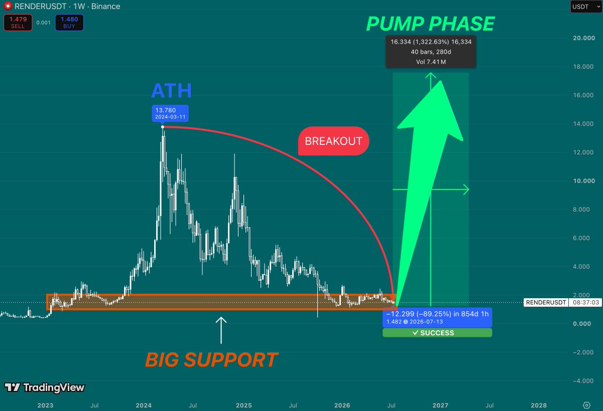
$RENDER is sitting on one of its strongest historical support zones. This area has already acted as a major accumulation range. Buyers defended this level multiple times. That significantly increases its importance. The long-term downtrend has also compressed volatility. Markets rarely stay compressed forever. Once resistance breaks, momentum usually accelerates. The first objective is reclaiming the previous trend structure. After that, attention shifts toward the former ATH around $14. That would represent roughly 1,300% upside from current levels. Strong support combined with a breakout often creates the best risk-to-reward setups. History shows that the biggest rallies usually begin from periods of maximum pessimism.
etherealist tweet media
English
2
7
29
1.4K
etherealist
etherealist@etherealist999·
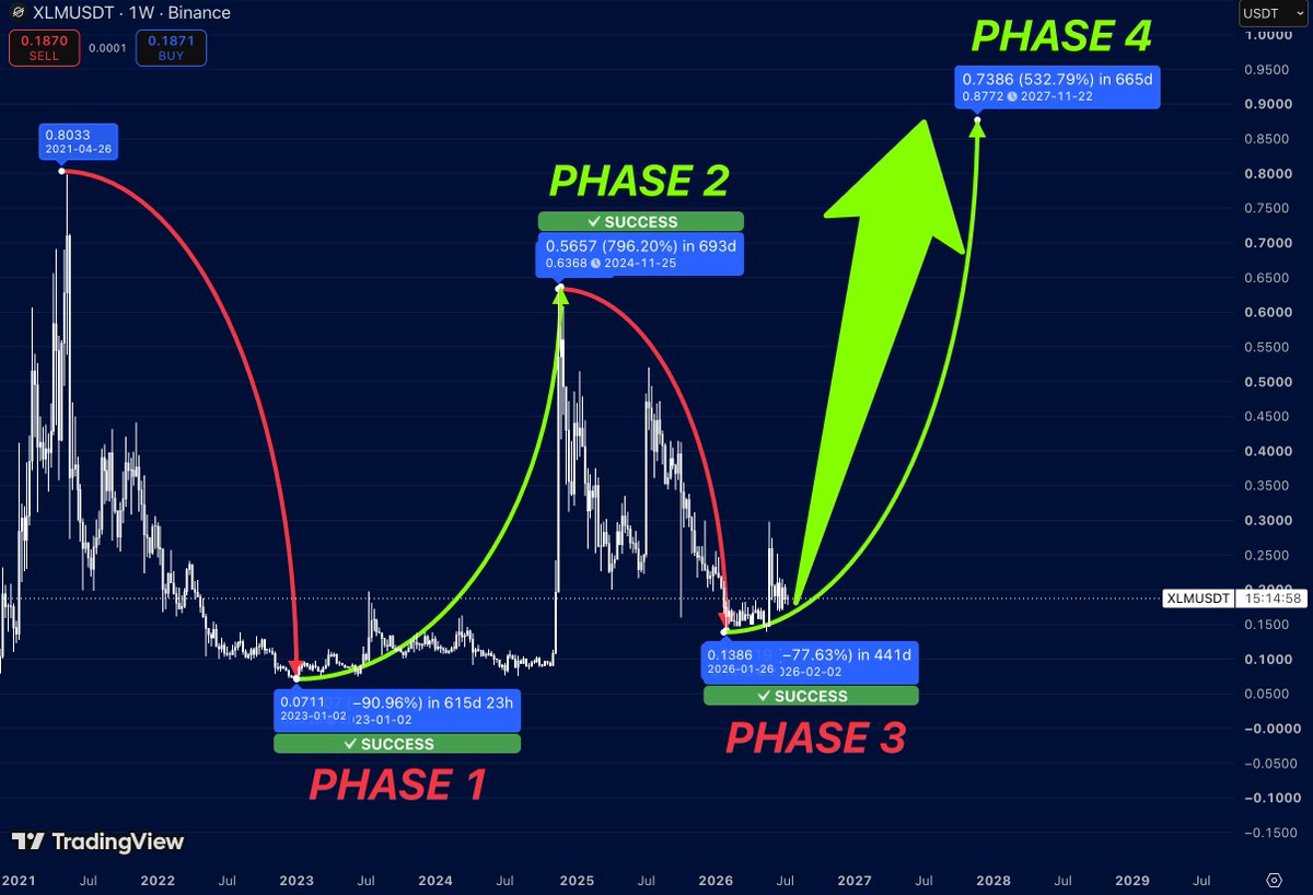
$XLM continues to repeat the same long-term cycle. Every major rally has started only after a long accumulation period. First comes a deep correction. Then months of sideways price action. And only after that does the explosive expansion begin. We’ve already seen this pattern play out twice. Phase 1 ended with a massive rally of nearly 800%. Phase 2 delivered another explosive move after the market finished accumulating. Right now, Stellar appears to be entering Phase 3. Price has once again spent many months building a base while volatility continues to compress. Historically, this has been the exact environment where XLM begins its strongest trends. If the cycle repeats one more time, the next expansion could push the price toward the $0.90 region. That would represent roughly 500%+ upside from current levels. The biggest moves usually start when most participants believe nothing is happening
etherealist tweet media
English
0
1
7
470
etherealist
etherealist@etherealist999·
$FET HAS BEEN UNDER SELLER CONTROL FOR MORE THAN A YEAR. Every rally ended the same way. Lower highs. More selling. More fear. The descending trendline on the chart tells that entire story. But trends don’t last forever. Right now, $FET is sitting exactly where long-term trends usually begin to change. The selling pressure that controlled the market since 2024 is fading, volatility has collapsed, and price is building a base instead of making new lows. That’s often what accumulation looks like before a larger move starts. Markets rarely explode straight from the top. They spend months making people lose interest first. Quiet price action… Low expectations… And almost nobody paying attention anymore. That’s exactly when new trends tend to be born. If buyers manage to reclaim this structure and finally break the multi-year downtrend the market enters a completely different phase. The conversation shifts from “Can it survive?” to “How high can it actually go?” Previous cycles have shown that once long-term resistance finally breaks momentum can accelerate much faster than most expect. If history starts repeating once again, a move toward a new all-time high wouldn’t look unrealistic anymore
etherealist tweet media
English
2
16
106
5.5K
etherealist
etherealist@etherealist999·
$SUI HAS DONE THIS THREE TIMES BEFORE Every major rally started the same way. A long accumulation. Then an explosive move. Followed by a deep correction that convinced almost everyone the trend was over. And then… another leg higher. Pump 1 delivered over 440%. Pump 2 exploded nearly 1,000%. Pump 3 was smaller, but still added more than 150% before rolling over. Different sizes. Same cycle. Right now, $SUI is back at the same type of base where previous rallies began. Price has spent months cooling off while volatility disappeared. That’s usually where the market gets bored. And boredom is often where the biggest opportunities are created. If history rhymes one more time, the next expansion could become Pump 4. It doesn’t have to repeat the exact percentages. It just needs to repeat the structure. And so far… that’s exactly what the chart is doing.
etherealist tweet media
English
2
19
104
4.2K
etherealist
etherealist@etherealist999·
$ZEC IS SHOWING STRENGTH AFTER COMPLETING ITS FVG RETEST. $ZEC has already filled the major Fair Value Gap (FVG) created during the previous impulsive move. That imbalance has now been mitigated, and price is reacting exactly where buyers would be expected to step in. Instead of breaking lower, $ZEC has reclaimed momentum and is pushing back toward the recent highs. This kind of price action often marks the transition from accumulation into expansion. As long as the reclaimed structure holds the probability of continuation remains in favor of the bulls. The recent recovery also confirms that demand continues to absorb selling pressure on pullbacks. If momentum continues building from here $ZEC could enter a much stronger impulsive leg. A breakout above the current range would likely trigger fresh buying interest and open the door for a much larger trend continuation. In that scenario, a move of 300%+ from current levels is no longer unrealistic if the broader crypto market remains bullish.
etherealist tweet media
English
0
0
3
260
etherealist
etherealist@etherealist999·
$NEAR IS SETTING UP FOR A MAJOR MOVE. $NEAR has returned to one of the most important zones on the chart. This is where previous expansions started. The first target sits around $9. That’s the first major resistance from the last cycle. A clean breakout there opens the door to $13. That level was once a key support before the market collapsed. Reclaiming it would be a strong bullish signal. The final target sits near $20. That’s where $NEAR printed its previous cycle high. From current prices, that represents roughly 1,080% upside. The structure is simple. Reclaim one level. Then the next. And repeat.
etherealist tweet media
English
5
23
109
5K
etherealist
etherealist@etherealist999·
$LUNC JUST PRINTED ITS FIRST REAL BUY SIGNAL IN MONTHS. For over a year, every rally in $LUNC ended the same way. Sellers stepped in at the descending trendline and pushed price back down. The chart rejected that resistance again and again, creating a clear sequence of lower highs. But something has finally changed. Instead of another rejection, $LUNC is now holding its strongest support zone while showing the first meaningful reversal from the lows. That shifts the focus toward a potential trend break. If bulls manage to reclaim the long-term resistance, the entire market structure could flip in their favor. From there, the next phase could target a move of more than 700% from the current range. Nothing is guaranteed in crypto. But after months of constant selling pressure, $LUNC is finally giving traders a reason to pay attention again.
etherealist tweet media
English
3
21
144
5.2K
etherealist
etherealist@etherealist999·
$XLM IS ENTERING THE NEXT PHASE… AND THE LAST TWO LOOK VERY FAMILIAR. This chart isn’t just showing random pumps. It shows a repeating cycle. Expansion. Correction. Expansion again. Phase 1 delivered an explosive rally of more than 2,600%. After that came a deep correction. That reset the trend before the next move. Phase 3 repeated the pattern. Another strong impulse. Another extended cooldown. Now $XLM appears to be building from another major low. The structure looks very similar to previous cycle bottoms. If the pattern continues, this could be the beginning of Phase 5. That doesn’t mean history must repeat. But markets often move in recognizable cycles. Right now $XLM is trying to transition from accumulation into expansion. If buyers keep control, the next leg could become the strongest move of this cycle. Worth keeping on the watchlist.
etherealist tweet media
English
0
6
15
820
etherealist
etherealist@etherealist999·
$SUI may be repeating the move that started its biggest rally. The chart has shown this before. A long correction. Strong support. Then an explosive breakout. The first reversal from this support launched $SUI into a massive uptrend. Price climbed for months. Buyers stayed in control. Momentum accelerated with every breakout. Today, $SUI is testing that same support zone again. The market has already defended it once. Sellers continue to lose momentum. That creates the conditions for another expansion. If history repeats, the next leg could become the second major impulse of this cycle. A move toward $6 would represent nearly 2,000% upside from current levels. Sometimes the strongest trends begin from the exact same level twice
etherealist tweet media
English
0
1
4
215
etherealist
etherealist@etherealist999·
Everyone is waiting for AI to explode again. But almost nobody is watching $WLD. That’s usually when the best setups appear. The chart has already gone through a brutal correction. More than 96% from its ATH. Most weak hands are already gone. Expectations are near zero. That’s exactly how long-term bottoms are often formed. The selling pressure has been fading for months. Volatility is drying up. Price is building a base instead of making new lows. That’s the first thing I look for before a major reversal. If $WLD breaks out of this accumulation, the market structure changes completely. Buyers regain control. Momentum returns. Attention follows. The first major target is reclaiming the previous ATH. After that, $12+ becomes a realistic objective. From current levels, that would represent nearly 4,000% upside. The biggest opportunities usually don’t look exciting while they’re being built. They only become obvious after everyone starts chasing the move. 🚀
etherealist tweet media
English
0
8
33
1.8K
etherealist
etherealist@etherealist999·
Every major $NEAR rally started exactly like this. A long period of accumulation. Almost no volatility. Most traders lose interest there. Then the expansion begins. The first cycle delivered over 1,100%. The second rally gained more than 700%. Now price is sitting in a very similar structure again. The current base looks almost identical. Buyers continue defending the same zone. That’s exactly what you want before a breakout. History doesn’t repeat perfectly. But it often rhymes. If the pattern plays out once again, $NEAR could be preparing for another major expansion.
etherealist tweet media
English
1
8
44
1.9K
etherealist
etherealist@etherealist999·
Not every breakout starts with strong momentum. Some begin with smart money quietly buying while everyone else loses interest. That’s exactly what stands out on $AERO. The chart shows two major demand zones. Both were followed by powerful impulsive rallies once buyers stepped in. Today… $AERO is trading inside that same type of order block for the second time. That’s why this area deserves attention. If history rhymes, the first major objective sits around $1.20. Beyond that… a move toward $2.35 would represent roughly a 610% gain from current levels. Will price react the same way again? Nobody can know. But when an asset revisits a demand zone that previously launched its biggest move… it’s usually a chart worth keeping on your watchlist. $AERO 👀
etherealist tweet media
English
1
9
17
1.3K
etherealist
etherealist@etherealist999·
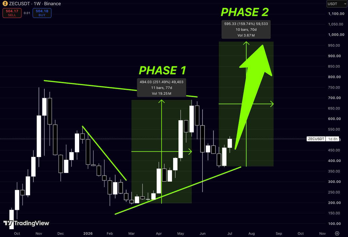
Everyone remembers $ZEC for its explosive moves. What many traders miss… is that strong trends often unfold in phases. Not all at once. The first expansion catches the market’s attention. The second is where momentum usually accelerates. That’s exactly what this chart is starting to resemble. Phase 1 delivered more than 250% in just a few months. After that move, price didn’t collapse. It pulled back… held a higher low… and started building a new base. Now $ZEC is testing that structure again. If buyers remain in control, the next expansion could target the $950–1,000 region. That’s where the projected second phase begins to align. Markets rarely move in a straight line. There will be pullbacks. There will be volatility. But when an asset starts printing higher lows after a major impulse… it’s usually a sign that the trend may not be finished yet.
etherealist tweet media
English
1
4
15
1.3K