G I Ξ G Ξ Ɍ

5.4K posts

G I Ξ G Ξ Ɍ banner
G I Ξ G Ξ Ɍ

G I Ξ G Ξ Ɍ

@gieger

Co-founder & Director of UX at UX TEAM. I post mostly about #ux #ui #usability #webdesign #software #apps #mobile #startups #vc #tech #creative #art #music #nj

East Hanover, NJ Katılım Aralık 2008
1.4K Takip Edilen1.1K Takipçiler
G I Ξ G Ξ Ɍ
G I Ξ G Ξ Ɍ@gieger·
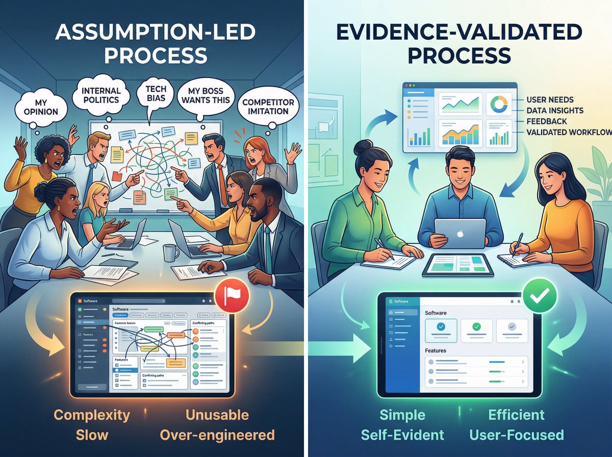
Most legacy modernization efforts fail for one reason: They start with technology instead of evidence. Companies jump into rebuilding systems before answering basic questions: • How do users actually work today? • Which workflows are broken? • Which features are even being used? So they spend millions rebuilding systems… Only to recreate the same inefficiencies. With AI accelerating development, this problem is getting worse. Faster builds Same bad decisions That’s why modernization needs to start with validated UX. I shared more in this DesignRush article: news.designrush.com/tech-debt-lega…
English
0
0
0
7
G I Ξ G Ξ Ɍ retweetledi
Claude
Claude@claudeai·
Introducing Claude Design by Anthropic Labs: make prototypes, slides, and one-pagers by talking to Claude. Powered by Claude Opus 4.7, our most capable vision model. Available in research preview on the Pro, Max, Team, and Enterprise plans, rolling out throughout the day.
English
4.1K
15.1K
148.7K
63.5M
G I Ξ G Ξ Ɍ
G I Ξ G Ξ Ɍ@gieger·
Incredible pencil drawing by @KeeganHall.
Joe Pompliano@JoePompliano

Rory McIlroy commissioned this pencil drawing after last year's Masters Tournament. The artist (@KeeganHall) provided context on Reddit: • Spent 6+ months working on it • Estimates 600-800+ total hours • Worked on it 6-7 days each week • Uses a Pentel Graphgear mechanical pencil Hall says this piece was incredibly challenging because so much detail went into such a small area. For context, the original is smaller than 30x22, so each face in the crowd is essentially a quarter of the size of a fingernail. This is the second piece he has done for Rory.

English
0
0
0
11
G I Ξ G Ξ Ɍ retweetledi
The White House
The White House@WhiteHouse·
EARTHSET. April 6, 2026. Humanity, from the other side. First photo from the far side of the Moon. Captured from Orion as Earth dips beyond the lunar horizon. Photo: NASA
The White House tweet media
English
2.7K
17.3K
98.3K
5.6M
G I Ξ G Ξ Ɍ
G I Ξ G Ξ Ɍ@gieger·
Incredible.
Mario Nawfal@MarioNawfal

🚨 Neuralink patient #3 Brad (ALS) just got his REAL voice back, thanks to Neuralink + ElevenLabs cloning. His family can finally hear him again! Warm, familiar, full of life. No more robotic sound. Just him. This is the most beautiful side of AI.

English
0
0
0
13
G I Ξ G Ξ Ɍ
G I Ξ G Ξ Ɍ@gieger·
Many companies still treat UX as something that happens after development. Even with AI-assisted development, the cost of getting the UX wrong far outweighs the cost of getting it right. Here's what typically happens: → Product requirements are written internally → Engineering + AI builds the features → UX is brought in to “make it look better” By that point, the most important decisions have already been made. AI can dramatically speed up development - but it does not validate whether you are building the right thing. Good UX does not start with screen designs. It starts with understanding: ✓ how users actually work ✓ what decisions they are trying to make ✓ what information they need at each step When UX research happens early, teams avoid building features users never asked for. Because building the wrong thing faster is not progress. In enterprise software, it is just a faster way to waste millions.
G I Ξ G Ξ Ɍ tweet media
English
0
0
1
15
G I Ξ G Ξ Ɍ
G I Ξ G Ξ Ɍ@gieger·
Most software problems are not engineering problems. 🧑🏻‍💻 They are assumption problems. 🚩 Too often, product teams make decisions based on opinions, internal politics, and technology preferences when they should be focused on: → What users actually need → What workflows should be more efficient → What features really matter most That is how software becomes overly complex, slow, unusable, over-engineered, and expensive to maintain. The best enterprise teams I work with do something different. They validate decisions with real evidence before they design a single screen. Then, they test and refine the evidence-based design BEFORE they develop it. When design decisions are grounded in evidence, the software becomes more self-evident to the people using it. Like it or not, to your users, the user experience IS the product.
G I Ξ G Ξ Ɍ tweet media
English
0
0
0
53
G I Ξ G Ξ Ɍ
G I Ξ G Ξ Ɍ@gieger·
NJ blizzard dumped about 16" - 20" of snow overnight. It was brutal to shovel, but it sure looks pretty. #NJ #BLIZZARD
English
0
0
0
394
G I Ξ G Ξ Ɍ
G I Ξ G Ξ Ɍ@gieger·
BTW, here is an example of a better way to send a verification code. The code is on its own line with no period at the end of it, and the font size is big and easy to highlight.
G I Ξ G Ξ Ɍ tweet media
English
0
0
0
12
G I Ξ G Ξ Ɍ
G I Ξ G Ξ Ɍ@gieger·
Here's another example of a bad UX that has nothing to do with a UI. ⬇ A few years ago, one of our clients saw a dramatic reduction in IT support tickets after we uncovered this one simple design flaw. It wasn't a confusing interface or an overcomplex workflow. It was an email verification code. Just like the one in the attached image. Can you spot the flaw? Luckily, we did — and the fix was so simple. Here's what was happening: → Users received their verification code → They copied the code → They pasted the code → The code didn't work This put users in an endless loop of frustration because they would request a new code, and the same thing would happen again and again. Then, they would call the help desk or open a support ticket. What was the flaw? The verification code ended with a period. That's it. When users copied the code, they highlighted the period by mistake. Just like I did in the attached image. Then, when they pasted the code, they included the period, and the code didn't work. To be clear. This is not a user error. This is a design flaw. And, it's a simple design flaw that can be easily fixed or avoided. Have you experienced this same flaw?
G I Ξ G Ξ Ɍ tweet media
English
1
0
0
20