
Sushrut
148 posts


Sushrut
@glean_ux
Sharing my thoughts as a designer, content creator & aspiring startup founder 🏄♂️
Bengaluru, India Katılım Kasım 2022
18 Takip Edilen101 Takipçiler
@VishalMane7810 Yes they are pretty much the same. Product designers were traditionally for physical products. Hence UX hi designers call themselves digital product designers nowadays.
English

Good UX by HealthifyMe:
One of the most fitting use cases of AI image recognition: Food logging.
Shazam for food! (iykyk)
Loved how the onboarding teaches how to make the most of it.
Plus, the analysis helps understand your nutrition & correct course accordingly.
#uxuibytes
English
Good UX by HealthifyMe:
From simple text to automation, you can log your foods just by typing what you ate. This reduces the user friction and could motivate the users to be consistent.
Maybe voice to take it to another level.
#uxuibytes
English
Good UX by HealthifyMe:
No user likes to wait for something to load, however at times it is inevitable.
But even a simple motion graphic can make the wait more delightful. The use of relevant icons and informative copy makes the UX more fun.
#uxuibytes
English
Good UX from HealthifyMe:
A common confusion users have when tracking calories is adding the qty. Measuring foods is a task, especially when you need it in grams.
However, they’ve shown images of household items that people use, making it relatable and easy to pick.
#uxuibytes
English
Good UX Eg. (ft Scapia)
We all find onboarding forms boring, and the team at Scapia have tried to make it more delightful.
For DOB they’ve used copy: When’s your Happy Birthday?
This small copy change adds delight to the UX.
#uxuibytes

English
Good UX (ft Open Table)
On a restaurant booking app, users often want to discover places through specific dishes.
Instead of browsing menus, they can search for a dish and instantly see restaurants with reviews mentioning it.
Saves time and effort.
#uxuibytes
English
Good UX (ft. Open Table)
“How to solve for discovery”
The categories such as ‘Outdoor dining’, ‘Mothers day’ etc + contextual text within cards, is a great way of helping a user browse through varied restaurants.
The UX involved simple scroll and swipes.
#uxuibytes
English
Good UX (ft. Open Table)
When you open search for ‘lunch’ options it shows you restaurants and suggests timings around lunch, changes when you search for ‘dinner’.
These subtle points are what make a seamless experience. ⚡️
#uxuibytes
English
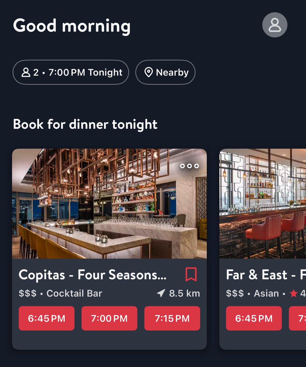
Good UX Eg. (ft. Open Table)
Based on the context above ‘7:00pm’ and Nearby, this restaurant booking app shows restaurants with slots that are relevant to my need.
These time slots upfront takes user directly to checkout which is designed to increase conversions.
#uxuibytes
English
1. Write down the purpose of the experience/page
2. List user actions
3. List must haves and elements to help achieve user actions
4. Sketch rough ideas (while referring inspiration)
5. Iterate
6. Digitise into UI in Figma
👆This is my process at a fast-paced startup
#ux
English
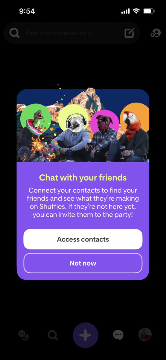
Good UX Eg. (ft. Shuffles)
The value of Shuffles (a collage app) increases if your friends are a part of it.
The below modal clearly explains the benefit of doing so, while covering the case if they aren’t members. The graphic also conveys the msg, in a collage.
#uxuibytes #ui
English