Goblin 🍉

1.2K posts

Goblin 🍉 banner
Goblin 🍉

Goblin 🍉

@goblingamedev

Pixel Artist — Working on Ichorous with @Mattstov — 🚫NFT/GEN-AI DNI, ZIONISTS DNI🚫
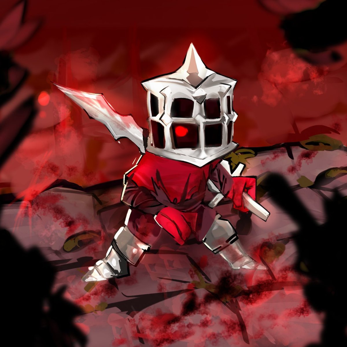
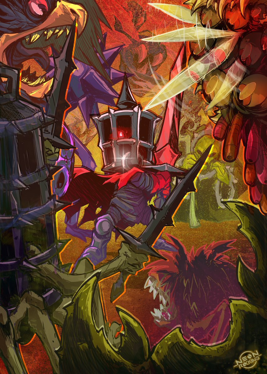
FREE PALESTINE 🇵🇸🇵🇸🇵🇸 Katılım Eylül 2019
752 Takip Edilen2.8K Takipçiler
Goblin 🍉 retweetledi
🩸 Mattstov - KICKSTARTER SOON 🩸
The curse cold-blooded gives enemies ice armor! Until you break it, they will take reduced damage!
English
2
32
216
6.2K
Goblin 🍉 retweetledi
Goblin 🍉
Goblin 🍉@goblingamedev·
@SocksNGames Actually we might add a different intro all together. Also it isn’t an eldritch creature, just a person heavily twisted by the influence of Ichor (the magic blood you see all over the walls) hence why we might do something different with the intro, but it’s all up in the air atm.
English
1
0
23
4.4K
SocksGlows
SocksGlows@SocksNGames·
@goblingamedev i like the rest of the newer one better EXCEPT the opening animation. something about the eldritch entity being restrained by chains midair looks kinda cooler than chains on the ground idk. it looks so cool
English
1
0
41
5.2K
I AM EVIL
I AM EVIL@realbraingenius·
@goblingamedev This is rly cool looking but please at least have an option to turn the screen shake down/off cause it makes me extremely motion sick.
English
1
0
16
790
Goblin 🍉 retweetledi
Goblin 🍉
Goblin 🍉@goblingamedev·
1 month of development VS 4 months of development
English
57
316
4.3K
234.2K
Goblin 🍉
Goblin 🍉@goblingamedev·
@caseysguts That was the issue that made us change the design, but we also wanted something a little more interesting than a hooded face
English
0
0
1
413
Casey's Guts (COMMS OPEN)
Casey's Guts (COMMS OPEN)@caseysguts·
@goblingamedev I really like the player characters new design. Solid red could get lost in some environments but the added cage gives good contrast and tells a bit more of a story. Great work?
English
1
0
2
540
Goblin 🍉
Goblin 🍉@goblingamedev·
@browndwarf6 Yes we did! It was made for a game jam and it remained reasonably popular for a long time since then so we decided to keep working on it
English
0
0
1
292
MadamAdam
MadamAdam@browndwarf6·
@goblingamedev wait did you make like this small boss rush game that was free on itch? I thought your footage looked somewhat familiar
English
1
0
1
362
Goblin 🍉
Goblin 🍉@goblingamedev·
@Ctge33 Been working on much more than just a single boss room! Just had a lot of improvement in my art skills between development periods
English
0
0
0
223
Goblin 🍉
Goblin 🍉@goblingamedev·
@rodrigokiller It is indeed optional! Only on by default because they can effect gameplay (such as blood spilt and certain items triggering)
English
1
0
1
286
Killer
Killer@rodrigokiller·
@goblingamedev awesome work. congrats. but if possible don't use damage numbers or at least make it an option thanks
English
1
0
1
319
Goblin 🍉
Goblin 🍉@goblingamedev·
@Finnian76341296 Complete accident! Tho the comparisons are flattering and ig fitting considering the genre of the game. The idea for this boss was basically “what if someone had a morning star for a face” and then the idea of the spikes coming out of his eyeballs came afterwards.
English
0
0
4
425
ARKTOS
ARKTOS@Finnian76341296·
@goblingamedev Ngl, that looks a lot like the character "Eyes" from Nuclear Throne. Was there some inspiration there?
English
1
0
2
528
Goblin 🍉
Goblin 🍉@goblingamedev·
@kit_ogurtsov Contrast will be tweaked, it seems to be the biggest suggestion so far (tho i’ll say it doesn’t seem to effect gameplay from what i’ve seen) camera shake is completely adjustable and damage numbers are toggleable, they’re on by default because it effects some in game interactions
English
1
0
2
375
Kit Ogurtsov ☦️
Kit Ogurtsov ☦️@kit_ogurtsov·
@goblingamedev Older version is cleaner and reads better visually. New one has too much details (= noise) and not enough contrast. Also, remove the godawful camera shake, it is nauseating. And why in the world would you add damage numbers?
English
2
0
4
516
Goblin 🍉
Goblin 🍉@goblingamedev·
@steven_nikolic Camera shake is completely adjustable, and it might be compounding when paired with camera movement which we are still tweaking.
English
0
0
1
278
Steven Nikolic
Steven Nikolic@steven_nikolic·
@goblingamedev Visuals look great. Combat looks pretty good. The only thing to ditch is that camera shake. I get the desire to use it but it should signal something BIG happened. If it’s constant it doesn’t signal anything and just gets nauseating.
English
1
0
1
333
Goblin 🍉
Goblin 🍉@goblingamedev·
@I_am_Error1981 The old version was made for a game jam we entered into as a break from making a NES game, so yeah i’m sure there’s some of that creeping through. Since then we’ve pushed it towards a more grounded and gritty style
English
0
0
2
560
I am Error (The FNAF phase is kicking in)
@goblingamedev Newer one looks visually impressive while the old one looks more close to the NES' expected output Not a total match but it definitely seems more like the 8-bit era than the bottom one It really does depend on what style you're going for though honestly
English
1
0
3
741
Goblin 🍉
Goblin 🍉@goblingamedev·
@GrapeApe9D Even tho the new version is duller overall, it’s in service to the new’s more grounded art style, and to let us use more vibrant colours on the things that need it
English
3
0
51
6.9K
daniel
daniel@GrapeApe9D·
@goblingamedev First time I've ever seen this game. Newer footage looks very detailed which gives it more personality, and animations look more vivid. But I feel like there's too much detail. In the old version, there's more contrast between tones. The ground looks greener, the blood bloodier
English
1
0
156
7.8K
Goblin 🍉
Goblin 🍉@goblingamedev·
@BackseatSakurai We’ve decided since the old version to go with a more grounded style and a stricter colour palette, but I kept the new bricks green-ish as a nod to the old, just not as intense
English
0
0
1
183
Backseat Sakurai
Backseat Sakurai@BackseatSakurai·
@goblingamedev Player sprite is way better in the new one, I think the colors of everything else in the OG are better though. Specifically the greenness of the walls is missed. Either way it looks great.
English
1
0
4
243
Goblin 🍉
Goblin 🍉@goblingamedev·
@ItsNix030 Tiles being too bright seems to be a common opinion so that will likely be tweaked in the future, along side adding more ambient stuff. Also I think what you call the burst effect is the flash from the player being damaged, that’s still in the game
English
1
0
0
227
Nix
Nix@ItsNix030·
@goblingamedev Old one is more ambient, for example the white in the new one messes with the vibe. Additionally, the occasional burst effect the old one has (critical hits? damage threshold? I don't know what triggers it) is REALLY cool. New one isn't bad, though.
English
1
0
5
303
Goblin 🍉
Goblin 🍉@goblingamedev·
@BlazeDillon That's basically the idea! obv I can never change ppls subjective preference for a simpler/less grimey look, but that's just not the direction the game is going anymore and if I can improve things along the way while sticking to the vision then I'm happier for it
English
1
0
2
81
Blaze Lightcap | IndieDev
Blaze Lightcap | IndieDev@BlazeDillon·
@goblingamedev In that case, my suggestion would be to just try to sift through the subjective stuff to find some anything actionable to incorporate into the new (which seems like what this thread is for) but overall, who cares when it comes to style preference, do what you're passionate about!
English
1
0
2
76
Goblin 🍉
Goblin 🍉@goblingamedev·
@Lucas_Seb_Dev I appreciate ur enthusiasm :) and don't worry not much will change either way, I just wanted to know what gripes ppl have (excluding ppls subjective preferences which I could never change) and hopefully improve on them how I can
English
0
0
0
22
Lucas Sebastian
Lucas Sebastian@Lucas_Seb_Dev·
@goblingamedev this aint even a small upgrade either you can feel the love and care oosing out of every pixel
English
1
0
0
23