Sabitlenmiş Tweet
株式会社アイエンター【公式】
1.8K posts


株式会社アイエンター【公式】
@ienter_official
株式会社アイエンターの企業公式アカウントです。 #IT企業 #DXコンサル #AI #システム開発 #先端技術 #マリンテック 最先端技術で「楽しむを世界へ」発信するアイエンターの最新情報から社内の様子まで広くお届けします!
東京、大阪、福岡、札幌、北見、仙台、沖縄、横浜 Katılım Şubat 2021
4.1K Takip Edilen4.2K Takipçiler
こんにちは!
今日は SafariのブックマークをChromeに引き継ぐ方法 をご紹介します✨
ブラウザを変えたとき、
「ブックマークを全部移し直すのが面倒…」と感じたことはありませんか?
実は、意外と簡単にまとめて移行できるんです!
まずは Safari側の操作 から👇
① Safariのウィンドウを選択した状態で、
「ファイル」→「ブラウズデータを書き出す」
② 次の画面で 「ブックマークのみ」 を選択して書き出し
③ 書き出されたファイルを 解凍 します📂
続いて Chrome側の操作👇
④ Chromeのウィンドウを選択し、
「Chrome」→「ブックマークと設定をインポート」
⑤ 解凍したフォルダ内にある HTMLファイル を選択すればOK🚀
取り込んだあとは、
Chromeの ブックマークマネージャー で整理しましょう!
フォルダ内の項目をまとめて移動したいときは、
Shiftキーで複数選択 → ドラッグ すると一括で移動できます👌
ブラウザ移行がグッと楽になるので、ぜひ試してみてください!
#企業公式つぶやき部
#企業公式相互フォロー
#企業公式さんと繋がりたい

日本語
\登壇情報/
オンライン開催の「採用業務のAI導入、失敗しない選択肢〜11社のプロが最短成果につながるノウハウを一挙公開〜」に弊社社員が登壇します!
採用業務における面接工程をAIが代行する面接ツール「AI RECOMEN」をご紹介☺️
AI面接活用による採用プロセス最適化について実例をご紹介します。
日程:2026年4月16日(木)
講演時間:13時40分~14時00分
▼詳しくはこちら▼
i-enter.co.jp/news/detail/26…
日本語
おはようございます
Cluadeがまた新しいサービスを!!!
昨年もすごかったですが、2026年Cladudeの進化が止まらないですね
昨年で十分色々なAIが登場したと思いましたが
まだまだ陳腐化することなく驚きの連続です
さて、どんなことができるのか触って、検証してみたいと思います!
#企業公式つぶやき部 #生成AI
Claude@claudeai
Introducing Claude Managed Agents: everything you need to build and deploy agents at scale. It pairs an agent harness tuned for performance with production infrastructure, so you can go from prototype to launch in days. Now in public beta on the Claude Platform.
日本語
おもしろいサービスが盛り上がっております
その名も「嘘ペディア」
生成AIで架空のWikipediaっぽいページが作成できるみたいです!!
デザイン面の作り込みに作者のこだわりを感じますね!
生成AIでこうしたおもしろいサービスがたくさん出てくるのは良いですね
便利だけではなく、体験にフォーカスしたモノが増えたら楽しいなと思います
皆さんの作成した記事も紹介してみてください!
#AIサービス #企業公式つぶやき部

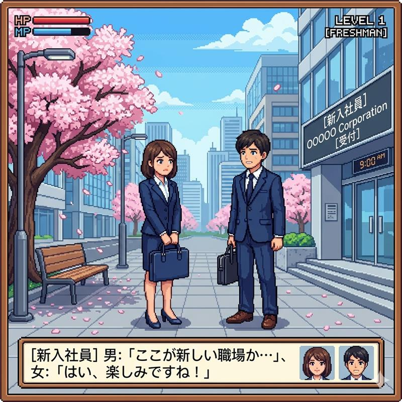
日本語
おはようございます!
本日は4/1新年度!
新入社員の皆様が入社されます!
またエイプリルフールということで
どっちをメインに投稿するか悩みますね
今回は新入社員の皆様イメージでイラスト作成ー!
#企業公式 #入社
日本語
こんにちは!火曜担当です♪
本日が年度の最終日なことに気づきました...😶🌫️
年々、1年の流れが早く感じております。。
本日の東京はあいにくの雨ですが、
桜もいつの間にか満開でお花見日和ですね🌸
明日からは各企業で新卒の方が入社されるかと思います!
晴れやかな気持ちでお出迎えしましょう~☺️
本日ご紹介を予定していた
【社内イベント・サークル活動】は次回にご紹介いたします~🙌
#企業公式つぶやき部
#企業公式相互フォロー
#新入社員

日本語
【AIの未来を変える「MCP」とは?】
生成AI(ClaudeやChatGPTなど)が、ただ話すだけじゃなく「実際に動く」ようになるための共通規格
それがMCP(Model Context Protocol)です。
これまでAIは自分の知識だけで答えを出していましたが、現実の仕事では
・会社の最新データを見たい
・PCのファイルを読み込みたい
・SlackやSalesforceを操作したい
そんな時に、毎回専用のコードを書く必要がありました。めちゃくちゃ面倒…。
MCPはこの問題を解決!
一度MCP対応のツールを作れば、どのAIでも簡単に繋げられるようになります。
■仕組み
1. AI(ホスト)が指示
2. MCPクライアントが橋渡し
3. MCPサーバーが実際のファイルやツールに安全にアクセス
これでAIが「エージェント」として本格的に働けるようになるんです!
■メリット
✅ 開発が劇的に楽になる
✅ AIの能力が爆上がり
✅ セキュリティも標準化
✅ 一度作れば複数のAIで再利用可能
2026年現在、MCPは急速に広がっていて、GitHub連携やローカルファイル操作、さらにはインタラクティブなUIまで対応が進んでいます。
まさに「AIを現実世界と繋ぐ鍵」
これからMCP対応ツールが増えれば、AIがあなたのPCや業務システムを自然に手伝ってくれる時代が来ます!
Claude Desktopなどで試してみるのがおすすめです🔥
#企業公式つぶやき部 #年度末 #MCP

日本語
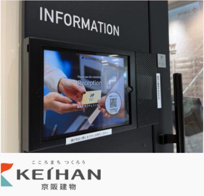
こんにちは!月曜担当です!
突然ですが、
皆様の受付はどのようなスタイルですか?
・電話で呼び出し?
・インターホン?
・有人受付?
・iPad受付?
実はこの「受付」、地味に会社の第一印象を左右するポイントなんです👀
そして明後日から新年度🌸
「今年こそ整えたいな…」と思っている方も多いのでは?
そんな方におすすめなのが、
iPad受付システム「I-FACE」です!
(弊社の完全自社開発製品です!)
✔ 簡単に使える
✔ 見た目がスタイリッシュ
✔ 最短10営業日で導入可能
おかげさまで
導入社数2,300社/提供歴14年/解約率2.8%と、多くの企業様にご利用いただいています!
「ちょっと気になるかも…」という方はぜひ👇
i-face-reception.com
他社iPad受付システムからの乗り換えももちろん歓迎です!(実績あり)
新年度のスタート、受付から変えてみませんか?😊
日本語
桜が見ごろになってきたので
ローポリで作ってみました!
週末晴れるならお花見に行きたいところです
(無理そうならAIで桜作って我慢しようかと笑)
プロンプト記載しておくので是非作ってみてください!
では後半!頑張っていきましょう!
■プロンプト
A lineless, softly rendered low-poly 3D scene based on the structure of image_1.png, but with all black linework removed. Object boundaries are defined by clean, soft-edge color field transitions. The central geometric sakura tree on its floating island is sharply in focus and crystal clear, highlighting its pink facets and detailed branches. The entire floating island configuration, river, bridge, and vegetation are all present but rendered with a luminous, softer finish. The depth of field is shallow: the cluster of foreground blocky clouds is significantly and softly blurred. The background blocky clouds and distant floating islands are also softly blurred and enveloped in a widespread, pervasive, atmospheric haze (soft fog), creating a dreamlike quality. The overall lighting is diffused and soft. The color palette is composed of muted pastel pinks, softer sky blues, gentle greens, and warm beiges. The perspective is a medium shot to emphasize the central tree within its misty environment.
#企業公式つぶやき部 #nanobanana

日本語
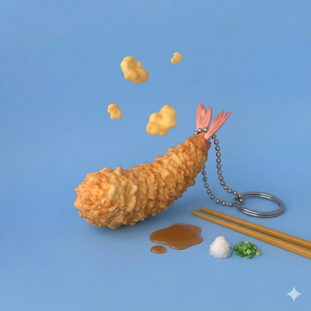
おはようございます!
本日は #食品サンプルの日 だそうです
Geminiで食品サンプルを作成しました👍
イメージとしてはblenderで作った感ですね
ちょっと天ぷら食べたくなってきました😍
本日も頑張っていきましょう!
#企業公式が朝の挨拶を言い合う
日本語
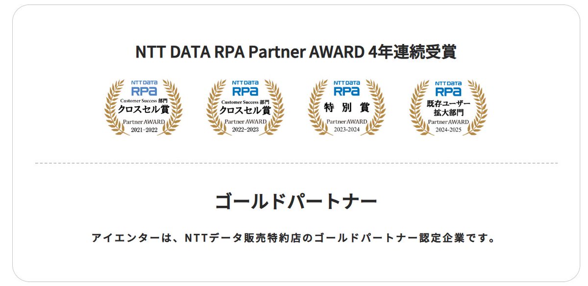
こんにちは!水曜日担当です。
今日はRPAツールであるWinActorの強みをサクッと紹介します💡
➀API連携が難しい環境でも対応可能になる
・画面操作(クリック/入力)で対応
・画像認識で柔軟に処理
つまり「システム改修なし」で導入できるケースが多いです!
➁NTTグループが開発した純国産でサポート充実
・日本語UIで学習コストが低い
・現場での運用のしやすさ
使い続け安い!
アイエンターは4年連続NTT DATA RPA Partner AWARDを受賞しているゴールドパートナーです🏆
導入支援や研修・トレーニング等を行っているためWinActorにご興味のある方はぜひご検討ください!😊
#企業公式つぶやき部
#企業公式相互フォロー
#企業公式さんと繋がりたい
日本語
■Pattern 5
Typography-First — 文字で魅せるミニマリスト
こんな時に:ひとつの強いメッセージを届けたい、情報量が少ない、SNSシェア用
Typography-first poster design. Let text do all the visual heavy lifting.
Background: pure white or soft warm white.
ONE accent color only (deep ink blue or bold terracotta) — used exclusively for the hero number/stat.
Layout: oversized primary number or phrase as full-bleed visual anchor (takes up 40%+ of vertical space).
Supporting text: clean small sans-serif, maximum 3 bullet points.
Strict rules: NO icons. NO illustrations. NO charts. NO decorative elements.
Every element must justify its existence.
Aesthetic reference: Bloomberg Businessweek cover, Penguin Books modern cover design.
White space ratio: 40% minimum.

日本語
NotebookLMを使って図解を作成している方必見!
「なんかどうしてもAIで作った感がいなめない」
「もっと別パターン試してみたいけどプロンプトわからない」
そんな方へ向けて5パターン作りました
コピペで使えますので是非社内外で使ってみてください!
#noteboooklm #生成AI #企業公式
日本語
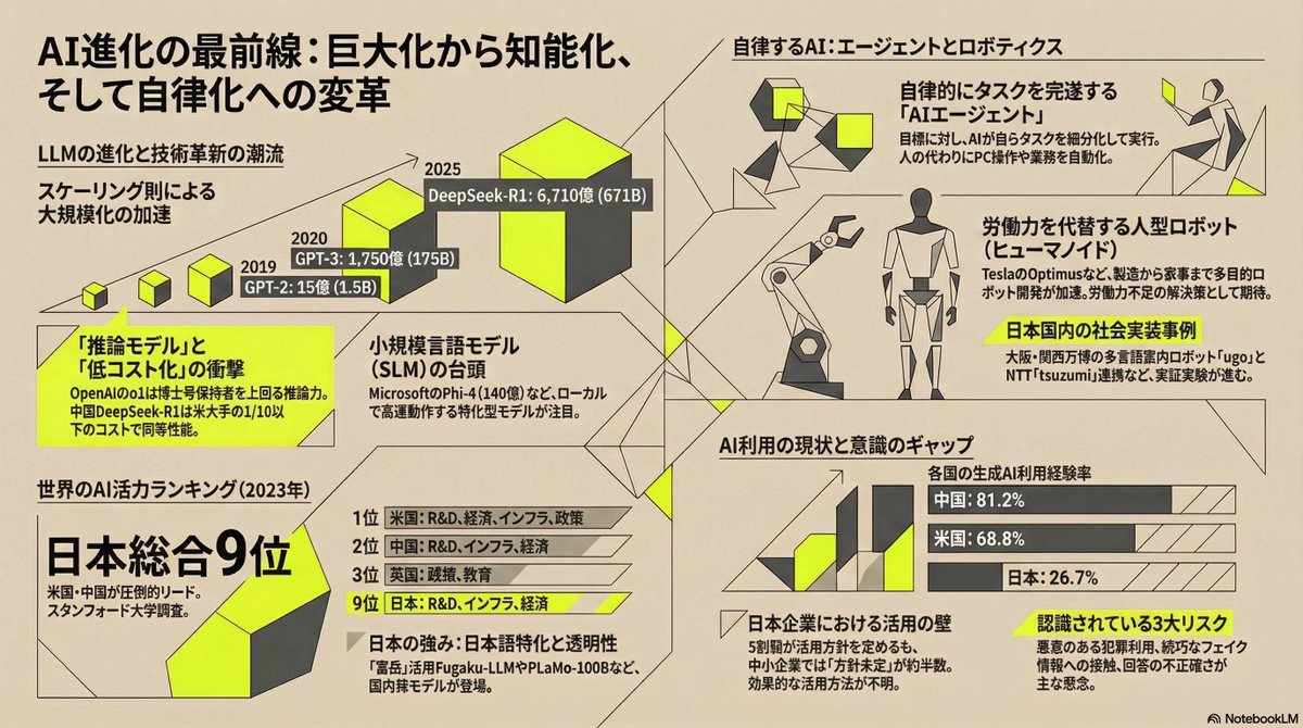
■Pattern 4
Dark Mode Dashboard — C-Suite / テックカンファレンス向け
こんな時に:データ可視化、プレゼン資料、暗い背景で映えさせたい
Corporate dark mode dashboard aesthetic.
Background: deep near-black (#1A1A1A).
Primary text: pure white (#FFFFFF).
Accent highlight: electric cyan (#00D4FF) — used only for key data points and CTAs.
Secondary accent: warm amber (#FFC800) for warnings or secondary stats.
Typography: clean sans-serif, monospace font for all numbers and data values.
Layout: card-based grid structure with subtle glowing borders on key metrics.
Include: data source annotations, methodology footnotes in small muted text.
Icons: minimal line icons only. NO filled decorative shapes.
Feel: authoritative, technical, C-suite presentation ready.
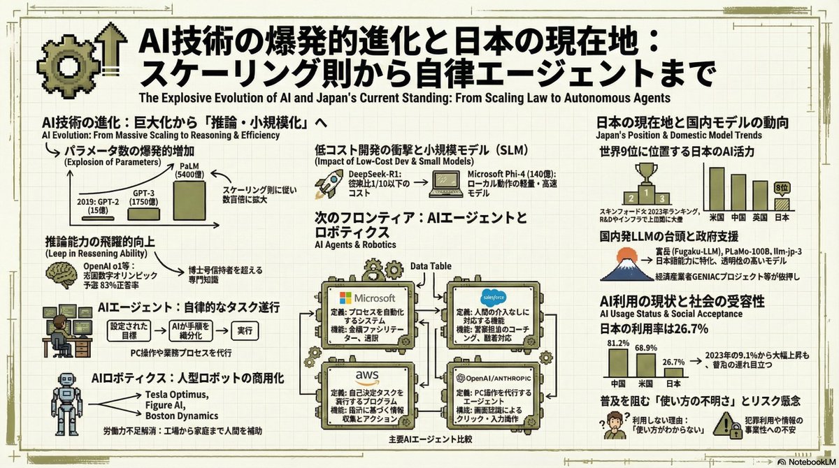
日本語
■Pattern 3
Neo-Retro Dev — エンジニアリングノートブック風
こんな時に:テック系コンテンツ、開発・スタートアップ文脈、LinkedInでバズらせたい
Neo-retro engineering notebook aesthetic.
Background: light cream off-white with subtle square grid (engineering paper feel).
Grid lines very faint — never distracting.
Typography: bold heavy condensed sans-serif headlines in black. Small clean English sub-labels under Japanese main titles.
Hierarchy: huge bold headline blocks → medium sub-titles → small captions.
Accent colors: limited to 2 — deep black and one muted primary (olive green or worn orange).
Icon style: pixel-art inspired flat icons. Annotated arrow callouts.
Mood: confident, slightly rebellious. Feels like annotated engineering notes, NOT corporate PPT.
日本語
■Pattern 2
Constructivist / Avant-Garde — 知的前衛スタイル
こんな時に:思想・哲学・社会テーマ、「頭が良さそうに見せたい」文脈
Constructivist / Avant-Garde visual aesthetic.
Background: warm matte beige (#E0E0D0), paper-like texture feel.
Text: charcoal gray (#333333) — never pure black.
Accent: neon yellow (#DFFF00) for geometric shapes only — used sparingly.
Line work: ultra-thin architectural draft lines (0.5pt weight).
Typography: mix of bold serif (Bodoni feel) for headlines and clean Helvetica for body.
Numbers: typewriter-style font.
Layout: asymmetric grid with strong diagonal tension.
NO centered alignment. NO round decorative shapes.
日本語
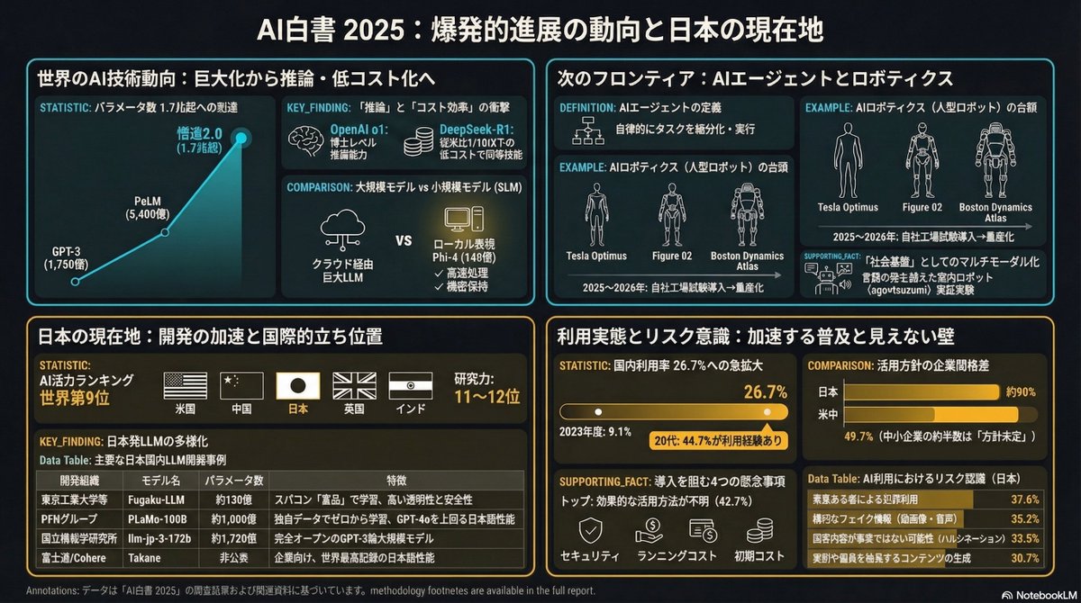
■Pattern 1
Data Journalism Style — NYT / The Economist風
こんな時に:数値データが豊富、調査結果・統計を格調高く見せたい
Data journalism aesthetic inspired by The Economist or NYT Graphics.
Color palette: off-white background (#F7F5F0), deep charcoal text (#1C1C1C), single bold accent (deep red #C0392B or ink blue #1A3A5C).
Typography hierarchy: oversized pull-quote stat as hero element, small caps section labels, body in tight editorial spacing.
Layout: left-aligned column structure. Data callouts in bordered boxes.
Rules: NO decorative icons. Every visual element must carry information. 30% whitespace minimum.

日本語
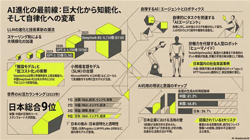
■元データ
令和7年版情報通信白書 ーAI の爆発的な進展の動向ー
soumu.go.jp/johotsusintoke…
日本語