isabel

74 posts

isabel banner
isabel

isabel

@isabe11una

creative in maryland

united states Katılım Ağustos 2025
18 Takip Edilen1 Takipçiler
isabel
isabel@isabe11una·
@kmsap2 everybody shut up! new amado post ☝️ i love this concept so much
English
1
0
1
49
amado
amado@kmsap2·
A playful footer I designed for Honest Stock Co.
amado tweet media
English
10
0
26
914
isabel
isabel@isabe11una·
@kmsap2 exactly! let them cook! ☝️
English
1
0
1
32
amado
amado@kmsap2·
When collaborating with others, sometimes the most powerful contribution a partner can make is knowing when to step back and let others work.
English
1
0
6
213
isabel
isabel@isabe11una·
@kmsap2 i love when you share your creative work! it’s so inspiring
English
0
0
1
28
amado
amado@kmsap2·
Rick Rubin talks about creativity as a flowing river that must be shared to stay replenished, and I couldn't agree more... Perfectionism just blocks your flow, and true growth only comes from closing chapters of work and moving on. If you hoard your ideas, stagnation is the only outcome for you. Sharing your work lets new material pass through you. Each piece we create is just a snapshot of who we are at that moment and it is meant to be released, not held back.
English
1
0
4
347
isabel
isabel@isabe11una·
@kmsap2 i love this so much!
English
1
0
1
24
amado
amado@kmsap2·
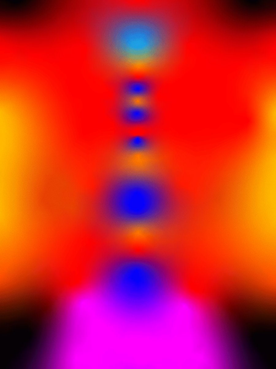
I would say my main goal when I'm creating something new is simply to be as raw as I can. I'll see something I like, and I just try and make my own version. it could be simple, like this time it was nothing more than text behind a silhouette and that was all I started with. I want my designs to feel rough, almost mistreated, like if it was a digital a la prima painting where it's placed once, drawn on once, and left alone. No overworking. No polishing. I want texture, I want grit. I want there to be soul in the work.
amado tweet media
English
1
0
10
351
isabel
isabel@isabe11una·
@kmsap2 impossible to pick a favorite but i think this one is crawling to the top of my list 🙂‍↕️
English
1
0
1
20
amado
amado@kmsap2·
There's something special about starting a piece carefully and then allowing yourself to destroy it. It's freeing, and it helps shape it into something completely unexpected. I've been using this as an opportunity to practice breaking the rules so I can discover something new.
amado tweet media
English
2
0
6
306
isabel
isabel@isabe11una·
@kmsap2 this is amazing! i want this on my coffee table
English
1
0
1
23
amado
amado@kmsap2·
Usually the mockups I make are flat, so today I pushed myself to practice distorting and warping images on a mockup with raised pages. I've also been thinking about how intimidating making my own mockups used to feel. I think I would've settled with paying for templates if I hadn't forced myself to learn. It's hard but it's completely changed how I present my work. Always choose the harder path.
amado tweet media
English
2
0
7
305
isabel
isabel@isabe11una·
@kmsap2 never misses! ☝️
English
1
0
1
20
amado
amado@kmsap2·
a fashion booklet photos by Systemic
amado tweet media
English
1
0
6
277
amado
amado@kmsap2·
front + back design for a book on material and texture wanted that old, used, distressed look
amado tweet media
English
2
0
9
312
isabel
isabel@isabe11una·
@kmsap2 you’re so talented!
English
0
0
1
48
amado
amado@kmsap2·
cover design for a fashion lookbook
amado tweet media
English
1
0
8
264
isabel
isabel@isabe11una·
@kmsap2 send me the location! i’m in there ☝️
English
1
0
1
36
amado
amado@kmsap2·
An exhibition poster for the gallery. Had a lot of fun making this one.
amado tweet media
English
2
0
7
240
isabel
isabel@isabe11una·
@kmsap2 wish this was real so I could see it in person.
English
1
0
1
26
amado
amado@kmsap2·
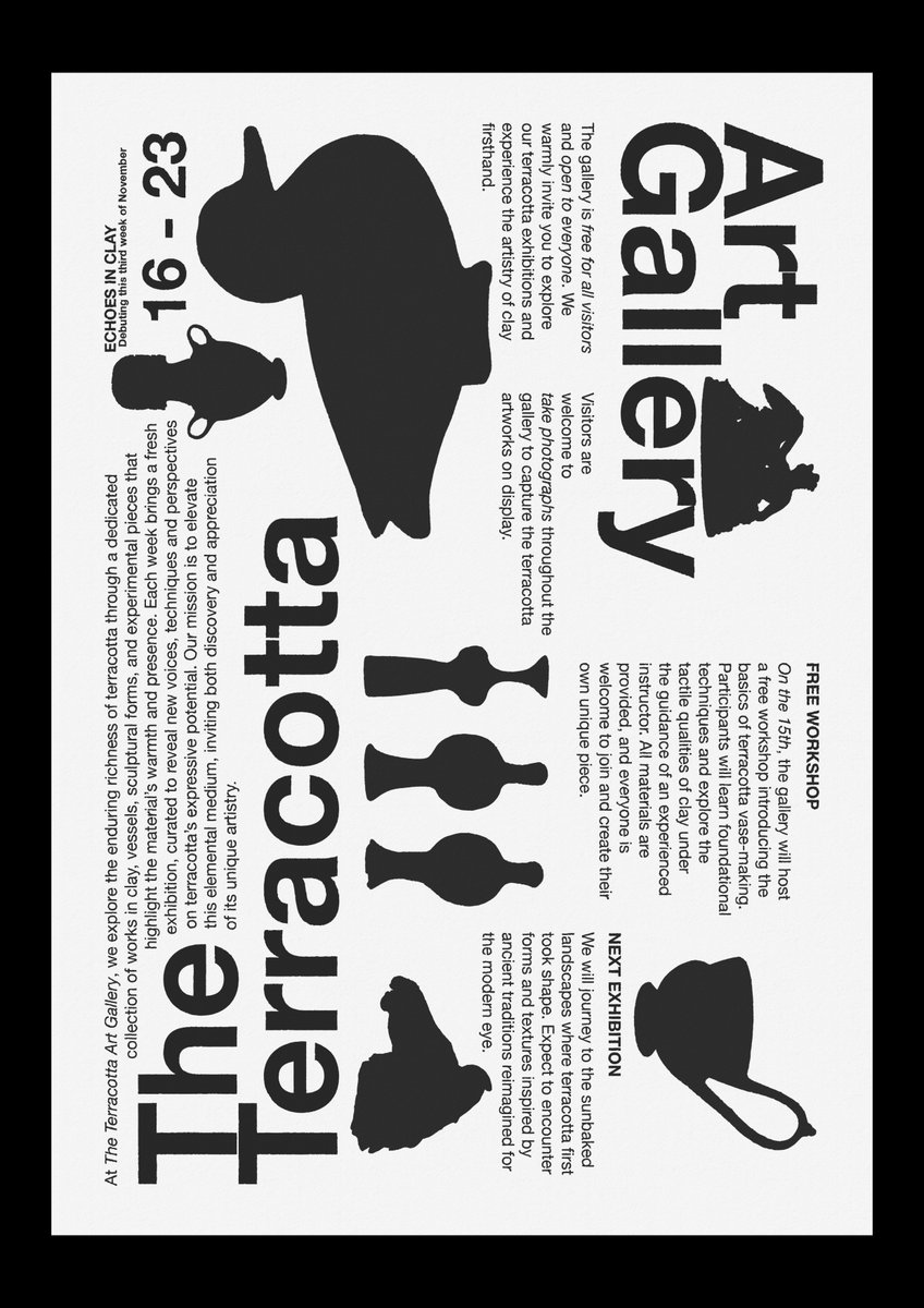
I designed a poster/handout to inform visitors about a new exhibition at the gallery. I liked the idea of darkening the artwork so it encourages people to visit and see it in person. The layout is divided into four columns and two rows, so that you can rotate it and read from either direction.
amado tweet media
English
4
0
11
271
isabel
isabel@isabe11una·
@kmsap2 I love how it looks straight out of a book!
English
1
0
1
27
amado
amado@kmsap2·
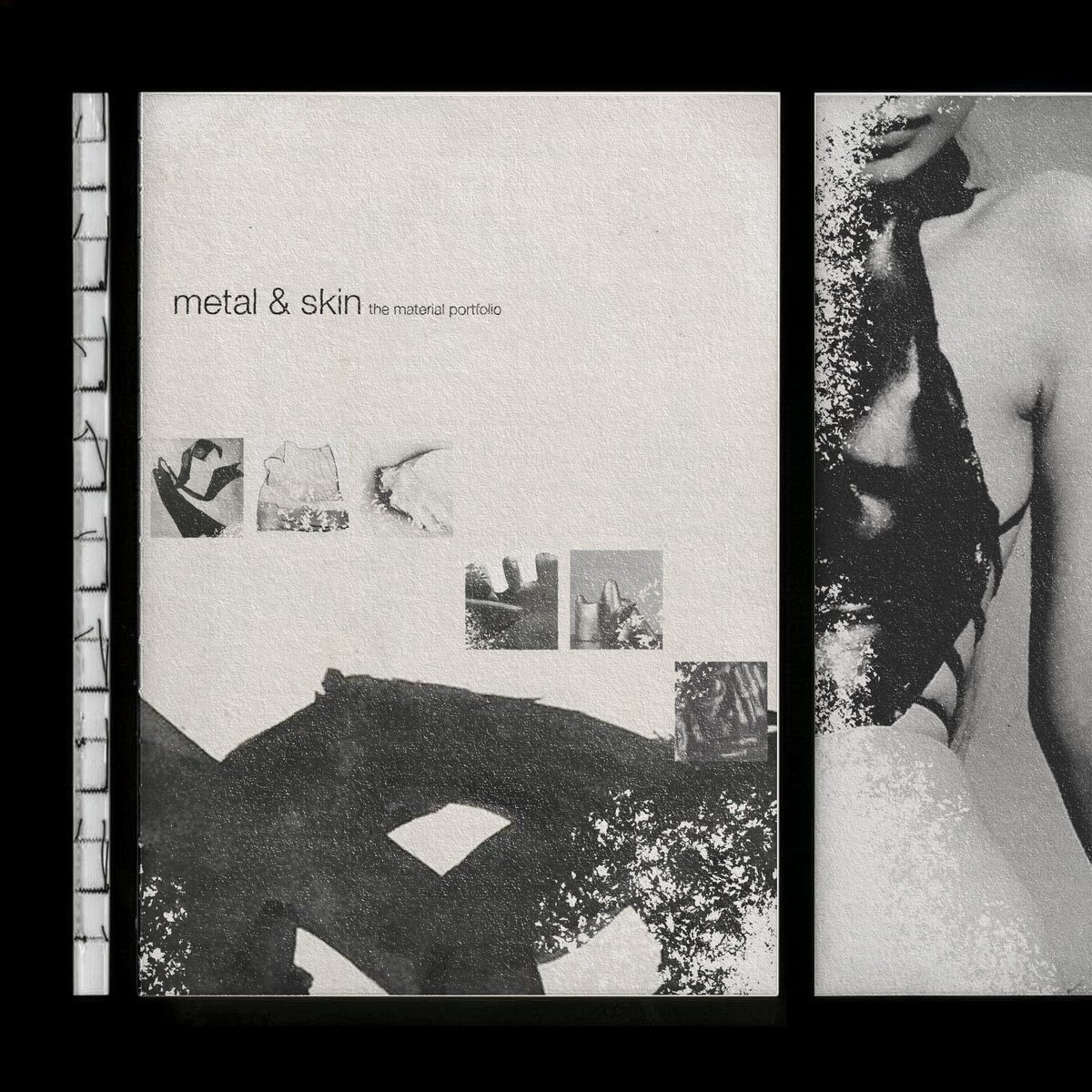
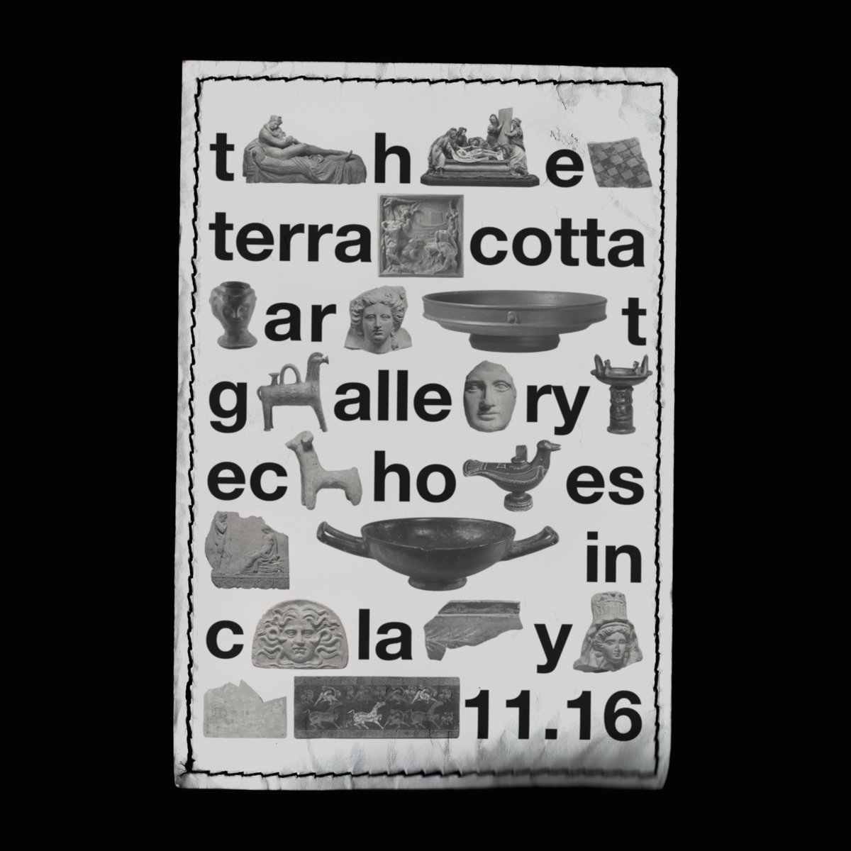
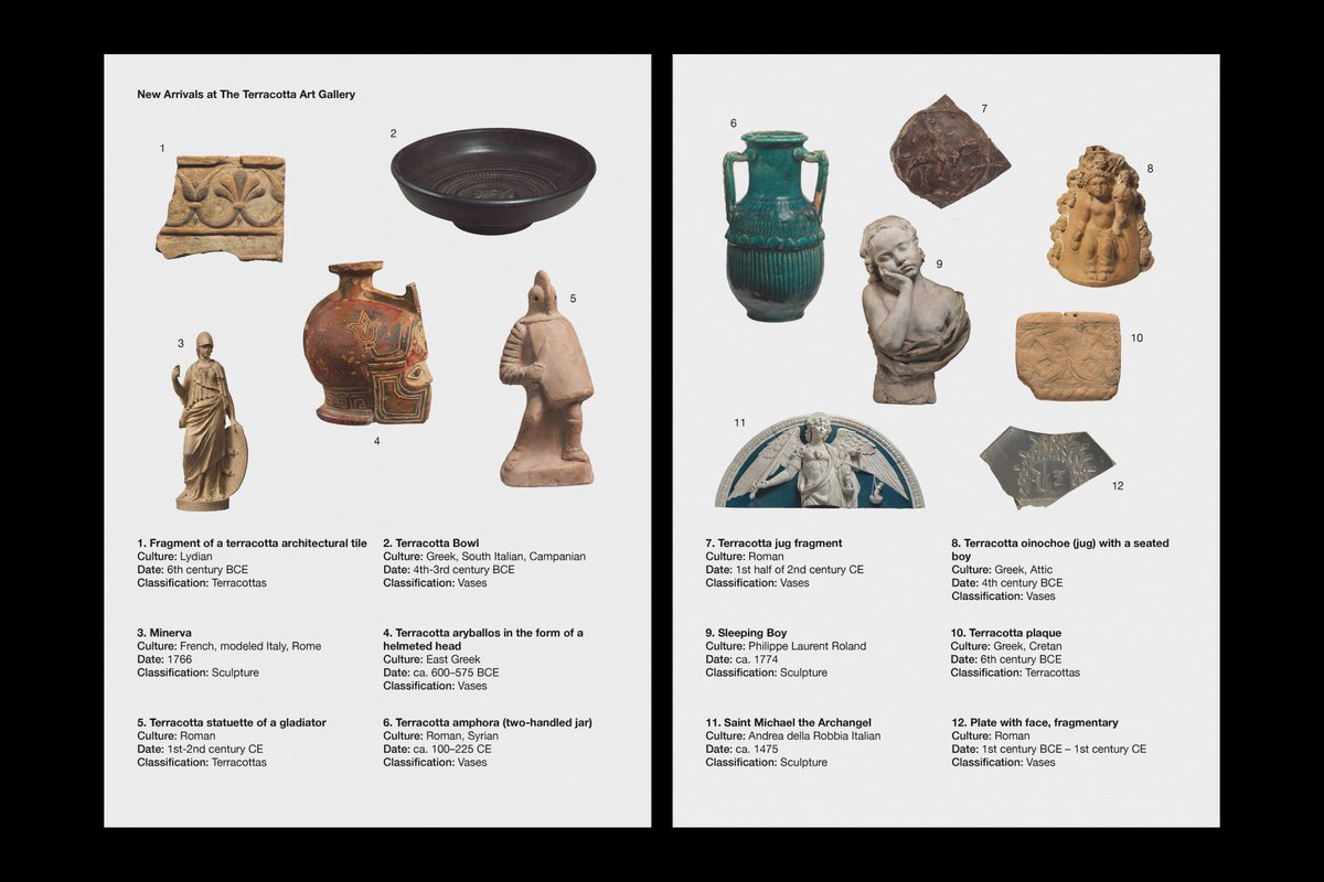
I'm developing a visual brand for an art gallery concept centered around terracotta as part of my portfolio. This piece is a catalog spread featuring new arrivals at The Terracotta Art Gallery. I'll be sharing more designs as I continue building out this project. This is just the first of many.
amado tweet media
English
2
0
12
252
isabel
isabel@isabe11una·
@kmsap2 post more stuff like this! this looks so clean and raw
English
0
0
1
37
amado
amado@kmsap2·
Anybody who is looking for a cheap way to paint without buying panels to paint on I suggest moleskine art sketchbooks. Just rip out as many pages as you need, you don’t need to prime them or anything.
amado tweet media
English
2
0
11
315
isabel
isabel@isabe11una·
@kmsap2 king of not gatekeeping 🫵
English
1
0
1
29
amado
amado@kmsap2·
just found a good resource for scans of rare, often expensive magazines and books. archivepdf
amado tweet media
English
2
0
7
351
isabel
isabel@isabe11una·
@kmsap2 i love this mindset
English
0
0
1
43
amado
amado@kmsap2·
I know what excellent work looks like but my abilities are still too far behind. I’m not rushing it though. I’ll keep on showing up. I’ll keep on making.
English
4
0
14
314
isabel
isabel@isabe11una·
@kmsap2 this is my kind of art 💯
English
1
0
1
28
amado
amado@kmsap2·
amado tweet media
ZXX
1
0
5
225
isabel
isabel@isabe11una·
@kmsap2 great advice! always feel so inspired reading your tweets
English
0
0
1
17
amado
amado@kmsap2·
On choosing a color palette for your designs as an artist or designer. When picking a color palette you need to think about the emotion you’re trying to convey and also the space your design will live in. That could be, a digital screen, print, or even a physical space like a wall. Start with picking a key color and then add colors that are next to it on the color wheel, opposite from it, or lighter or darker tints of that color. Always make sure to test your colors on different screens, on light and dark modes, and keep in mind your colors will look different digital than in print. Try documenting the palette. Create a system with your primary colors, your secondary and accent colors, any neutral and background tones, and include specifics like ratios/hex codes. Every color is a good color, experiment as much as possible. You’d be surprised the amount of interesting combinations you could come up with. Keep your palette small. Don’t overdo it by adding a ton of colors, the fewer the better.
English
1
0
4
264
amado
amado@kmsap2·
playing around with some more gradients in illustrator
amado tweet media
English
3
0
11
376
isabel
isabel@isabe11una·
@kmsap2 i love this! what inspired you?
English
1
0
1
26
amado
amado@kmsap2·
melting apart
amado tweet media
English
1
0
9
271
amado
amado@kmsap2·
Nerding out on some typography this morning.
amado tweet media
English
1
0
5
209