isoletters

1.8K posts

isoletters banner
isoletters

isoletters

@isoletters

Letter pics, collected by @isoglosse | Licence: CC BY-NC-SA 2.0

Deutschland Katılım Eylül 2017
238 Takip Edilen914 Takipçiler
isoletters
isoletters@isoletters·
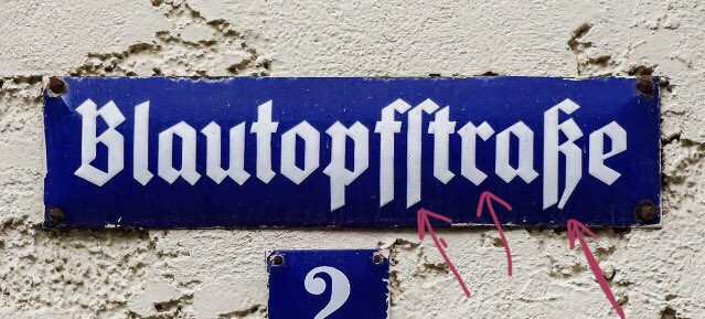
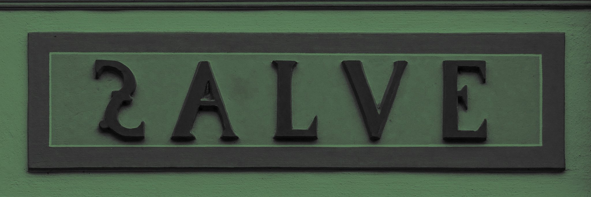
This used to be the sign of a shopping arcade in Munich 🇩🇪 Does it look a tad old-fashioned? Yes, it does – but I think that it is lovely nonetheless, with all of its exuberant swashes. In 2018/2019, these letters were replaced by a sign using a nondescript all-caps sans.
isoletters tweet media
English
0
0
1
0
isoletters
isoletters@isoletters·
This butcher’s shop in Reims 🇫🇷 has two typefaces on display: The red on white one is Britannic (whose cheeky ‘g’ flag I had never noticed before). The white on red one looks like some version of Albertus – but there are many versions, and I can’t put my finger on this one.
isoletters tweet media
English
0
1
7
0
isoletters
isoletters@isoletters·
I have posted additional pictures from Mannheim 🇩🇪 on my Flickr. The collection includes street name plates and other signs. Flickr may not be the place where pictures get most views, but it is the best place I am aware of for archiving pictures. flickr.com/photos/isolett…
English
0
0
2
0
isoletters
isoletters@isoletters·
Street name plates are good. Street name plates with small explanatory plates are even better. Here we get to see the same style (more or less) in two optical sizes and, for one of the sizes, in two widths. Interestingly, the bowl of ‘a’ hovers above the baseline in all variants.
isoletters tweet media
English
1
0
7
0
isoletters
isoletters@isoletters·
The sign above has a sibling – and I have shown it here more than three years ago 👇 I like both signs (and next time I visit, I will check if there are any additional signs in that style) – but I admit that they may not be the best fit for a building in the Art Nouveau style.
isoletters@isoletters

Squarish stuff from the City of Squares (@quadratestadt), albeit a few steps outside the grid. This sign may be based on an existing typeface, but it is evident from the ligatures and the way the letters fit into their context that we are looking at custom(ised) letters.

English
0
0
0
0
isoletters
isoletters@isoletters·
This sign is part of the Rosengarten Congress Centre in the @quadratestadt of Mannheim 🇩🇪 The building was designed by Bruno Schmitz and erected in 1900–1903. The letters were probably added later. They remind me of typefaces like Futura Schlagzeile/Display (released in 1932).
isoletters tweet media
English
3
0
3
0
isoletters
isoletters@isoletters·
I recently passed by this sign again and still liked it, so I think I have to post it now. It is a classic tradesperson’s sign, not age-old, but maybe a few decades (judging by the style and the condition). ‘JB’ ligatures are rare, so it is nice to see two instances of this one.
isoletters tweet media
English
2
0
4
0
isoletters
isoletters@isoletters·
@freedolinski To be honest, I like the angled orientation better than the more horizontal one. It looks more dynamic. Harmonising the orientation would have made sense, but I did not perceive it as an issue.
English
0
0
1
0
Fogelvrei
Fogelvrei@freedolinski·
@isoletters Alas, the sign on the wall was installed with a wrong angle
English
1
0
0
0
isoletters
isoletters@isoletters·
– You will never be able to fit ‘Fondazione Ettore Pomarici-Santomasi’ on that sign. – Hold my beer … The ultra-condensed sans-serif caps may seem like a picket fence, but the ultra-curly script is more like a soft duvet. Just sink into it. (Oh, did you see the handmade ‘ì’?)
isoletters tweet media
English
1
2
9
0
isoletters
isoletters@isoletters·
Not sure if they sell any interesting books – but the signage on their shop is surely worth a look. We have one M with the centre vertex on the baseline – and one with a raised vertex. We have some letters with vertical stress – and one with horizontal stress. Who needs books?!
isoletters tweet media
English
0
1
4
0
isoletters
isoletters@isoletters·
Vereniging De Harmonie, a club in the city of Groningen 🇳🇱, was founded in 1840, but moved into a new building in 1967. The sign may be from around that time. Anyway, I love it – as I love most three-dimensional lettering. It is also nice to compare the large and small letters.
isoletters tweet media
English
0
2
9
0
isoletters
isoletters@isoletters·
I took the information about the shop from a charming video posted by @aznachrichten. It shows a walk through the street where the shop was located with a local. If you would like to practice your understanding of Rhenish Franconian dialects, start here: youtu.be/FMeGvot9baQ
YouTube video
YouTube
English
0
0
1
0
isoletters
isoletters@isoletters·
‘Mandel’ is the German word for ‘almond’. ‘Amandel’ is the Dutch word for ‘almond’. Yeah, I am easily amused, but I smiled. Adam Mandel and his wife ran a bike shop in Alzey 🇩🇪 The letters are geometric and low-waisted – a simple, yet beautiful example of a classic shop sign.
isoletters tweet media
English
1
5
24
0
isoletters
isoletters@isoletters·
If you know your way around the south of Germany, you can make a reasonable guess about the location of this street name plate. The letter style is as simple as it gets in blackletter – with blunt diagonal stroke endings. The Clarendonesque (house?) number is a nice contrast.
isoletters tweet media
English
4
1
12
0
isoletters
isoletters@isoletters·
Whence the town’s name? The river Blau, a left tributary of the Danube, has its source there – or more specifically in the karst spring of Blautopf, which is basically a remarkably blue lake. The name of the river may or may not be related to the colour adjective ‘blau’ (blue).
isoletters tweet media
English
2
0
1
0
isoletters
isoletters@isoletters·
The street name ‘Blautopfstraße’ is not unique in Germany. In fact, there are two such streets: One is in Stuttgart. And the one above is indeed in Blaubeuren near Ulm (spot on, @Sparrersway). The picture below shows a sign that I saw at the train station of the town.
isoletters tweet media
English
2
1
4
0
isoletters
isoletters@isoletters·
@sminkypinky76 @chrpistorius That’s interesting, given that they are in the most predictable part of a street name sign. But of course, these are the letters that deviate most from roman type.
English
0
0
0
0