Hi #Datafam, created a two-player Snakes and Ladders game in @tableau..
Do give it a try and would appreciate your feedback..
tabsoft.co/3ROXOKH
Thank you, @FlerlageKev for the buttons..
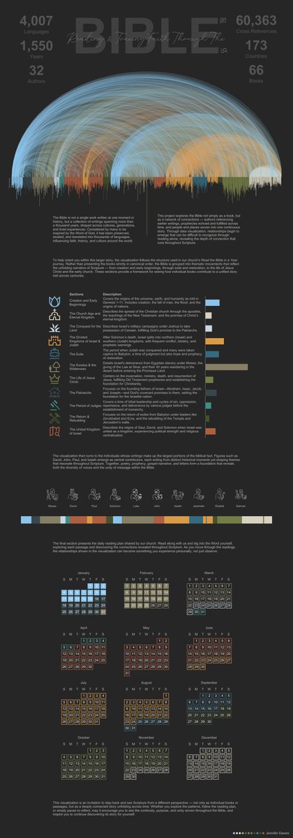
This year, I’ve been tracing faith through the Bible — studying Scripture, exploring historical context, and connecting themes across time. Reading & Tracing Faith Through the Bible is part reflection, part study, and I’ll keep building on it all year. #datafam#tableau@tableaupublic
Viz: lnkd.in/eu5vdvuP
Plan: lnkd.in/eqRVqgTJ
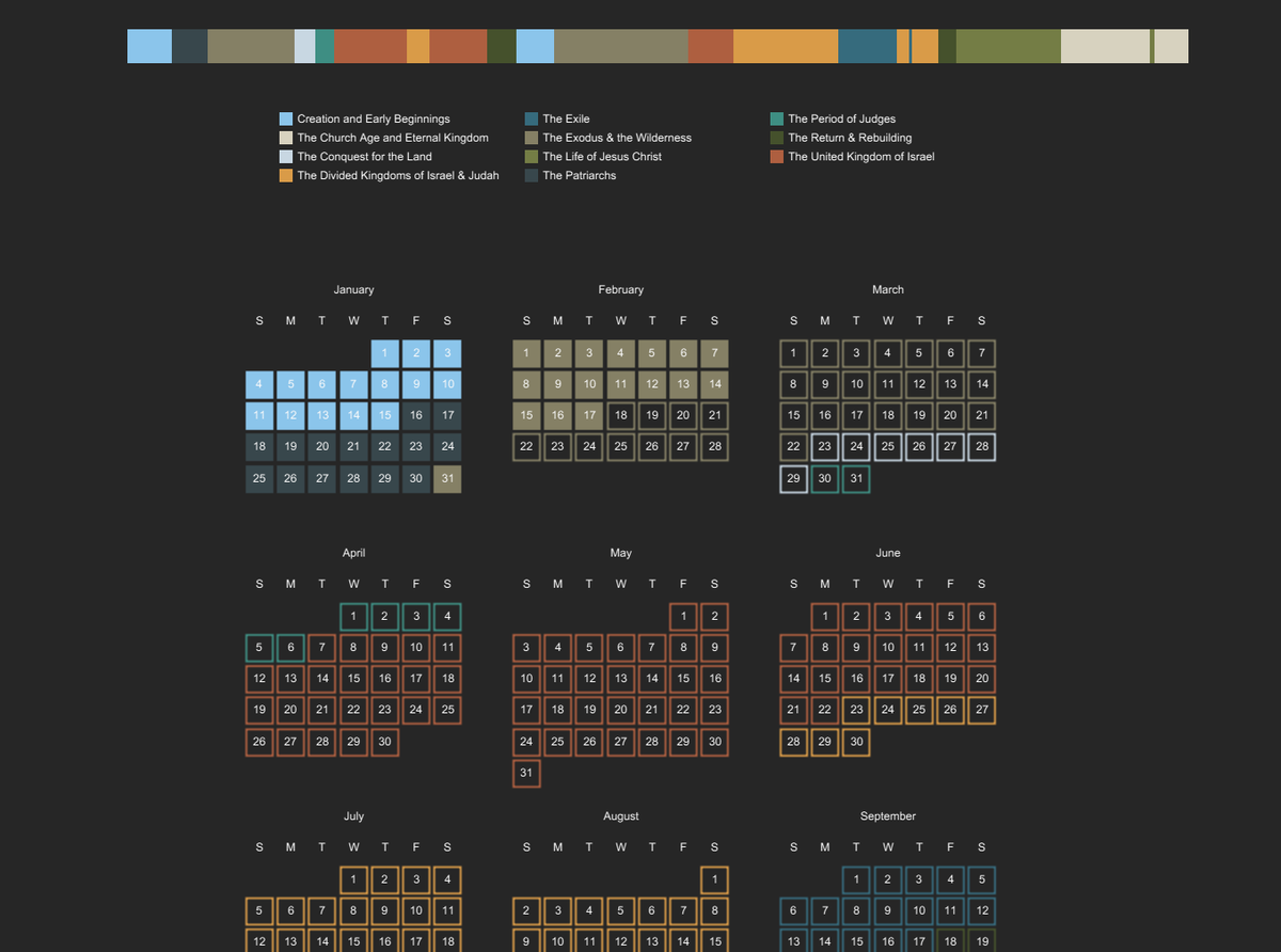
Explore this #VizOfTheDay by @ta___kaya to see how a single dataset can be visualized a hundred different ways—from bars to radials to waffles and beyond.
Check out the viz. tabsoft.co/4tYckTx
Hi @datavizfairy, your vizzes are beautiful. I am planning a session on Advanced Data Visualization at my workplace and would love to showcase your work, with full credit to you. Please let me know if you are okay with this. I could not find another way to reach you. Thank you!
I wanted to explore food consumption patterns in India and across the globe, and how religion may influence veg and non-veg choices. I had planned to build this at a wider scale for #IronViz but missed it due to other commitments. Hope you like this!
Viz: tinyurl.com/ys4kt4uh
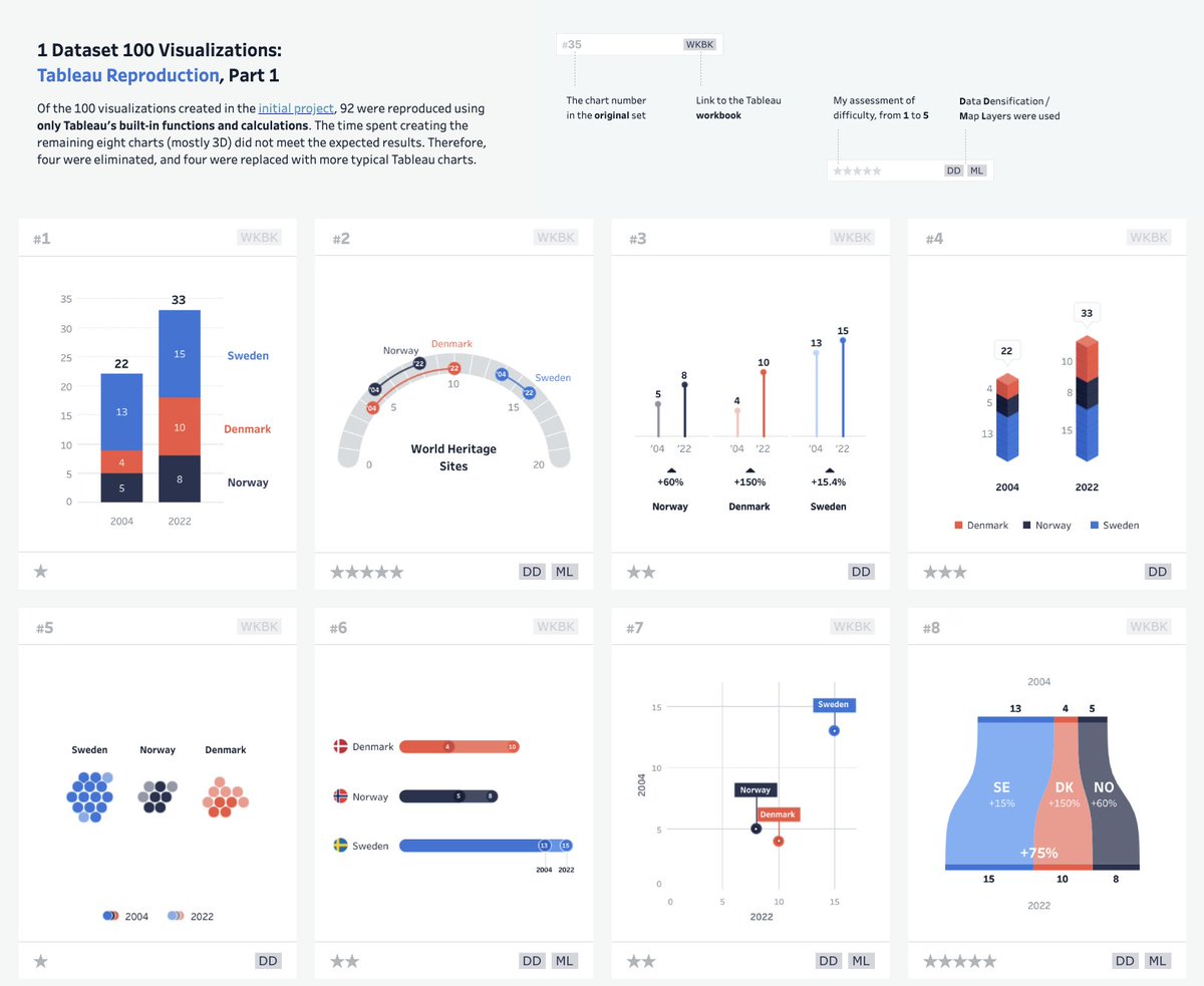
New Viz: The Tonnetz
The Tonnetz is a geometric diagram developed by mathematician Leonhard Euler in 1739 that visualizes the profound connection between math and music. Check out the interactive @tableaupublic visualization below.
Link: public.tableau.com/app/profile/br…
I’ve just launched my LinkedIn Services Page
I specialize in helping businesses and professionals transform data into clarity and results. From interactive dashboards in Tableau, Power BI & Excel to data cleaning, transformation, and analytics in SQL & Python,
New Viz #Datafam
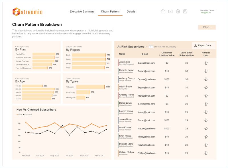
A Purpose-built Dashboard for GTM teams to turn disorganized sales pipelines into strategic assets, enabling real-time decisions, optimizing resources, accelerating deals, and aligning sales with market demands to drive revenue.
public.tableau.com/app/profile/mi…
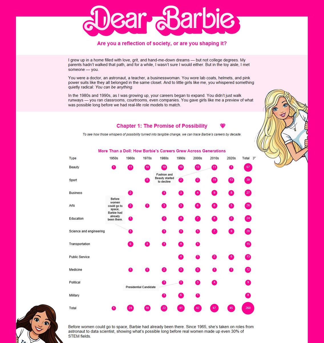
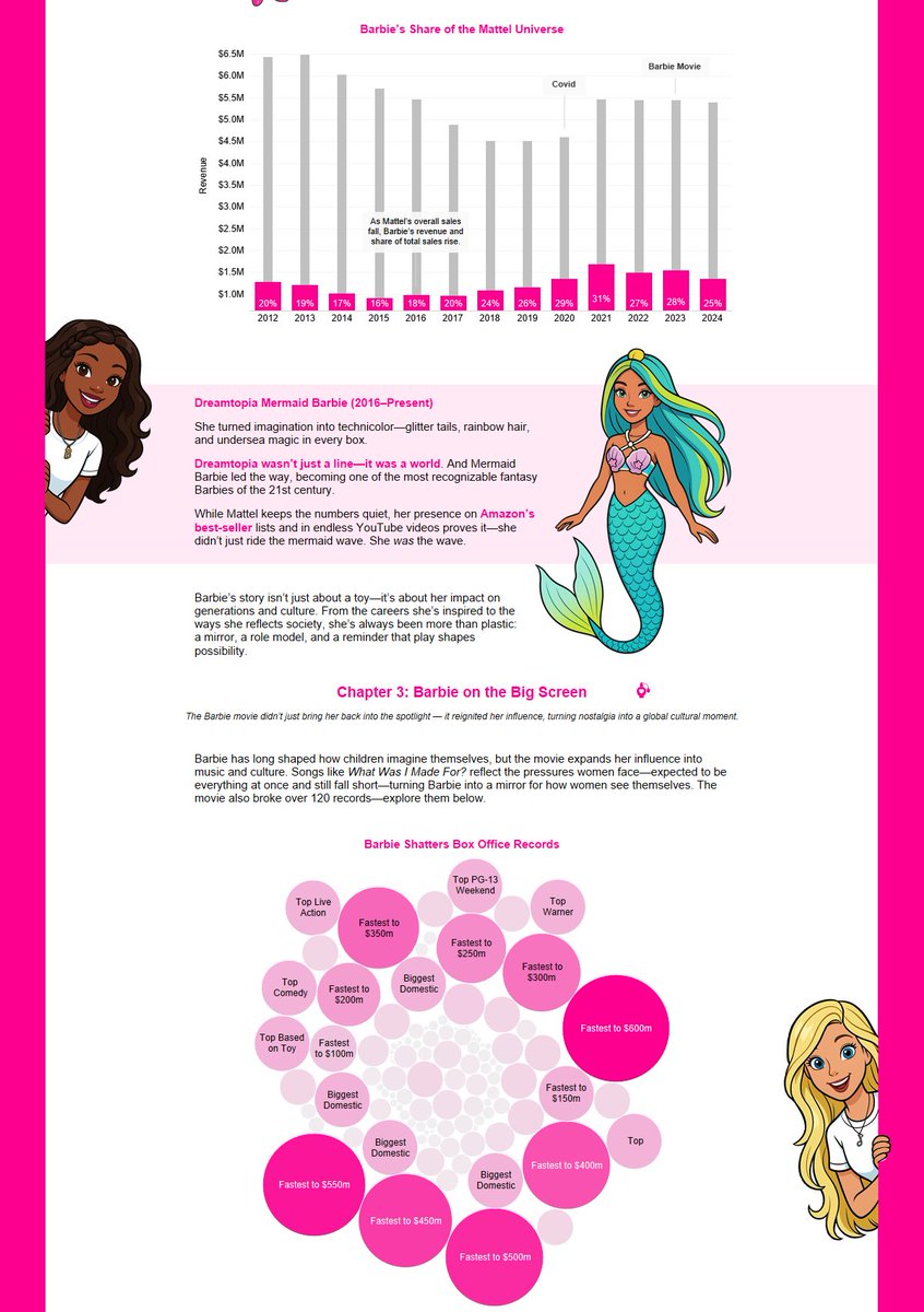
My open love letter to Barbie is here. 💖
Dear Barbie—the heart of my recent Viz in Process series—is ready to share!
This project explores Barbie’s journey from the toy aisle to the big screen, her record-breaking movie, and the way she’s reflected the possibilities and pressures women face for generations. From astronaut to data scientist, Barbie has been imagining “what we were made for” long before the rest of the world caught up.
See the full story, the music, the numbers, and the love behind the viz. 💌
#DataViz#Tableau#VizInProcess#DearBarbie#StorytellingWithData#datafam
Link: public.tableau.com/app/profile/je…
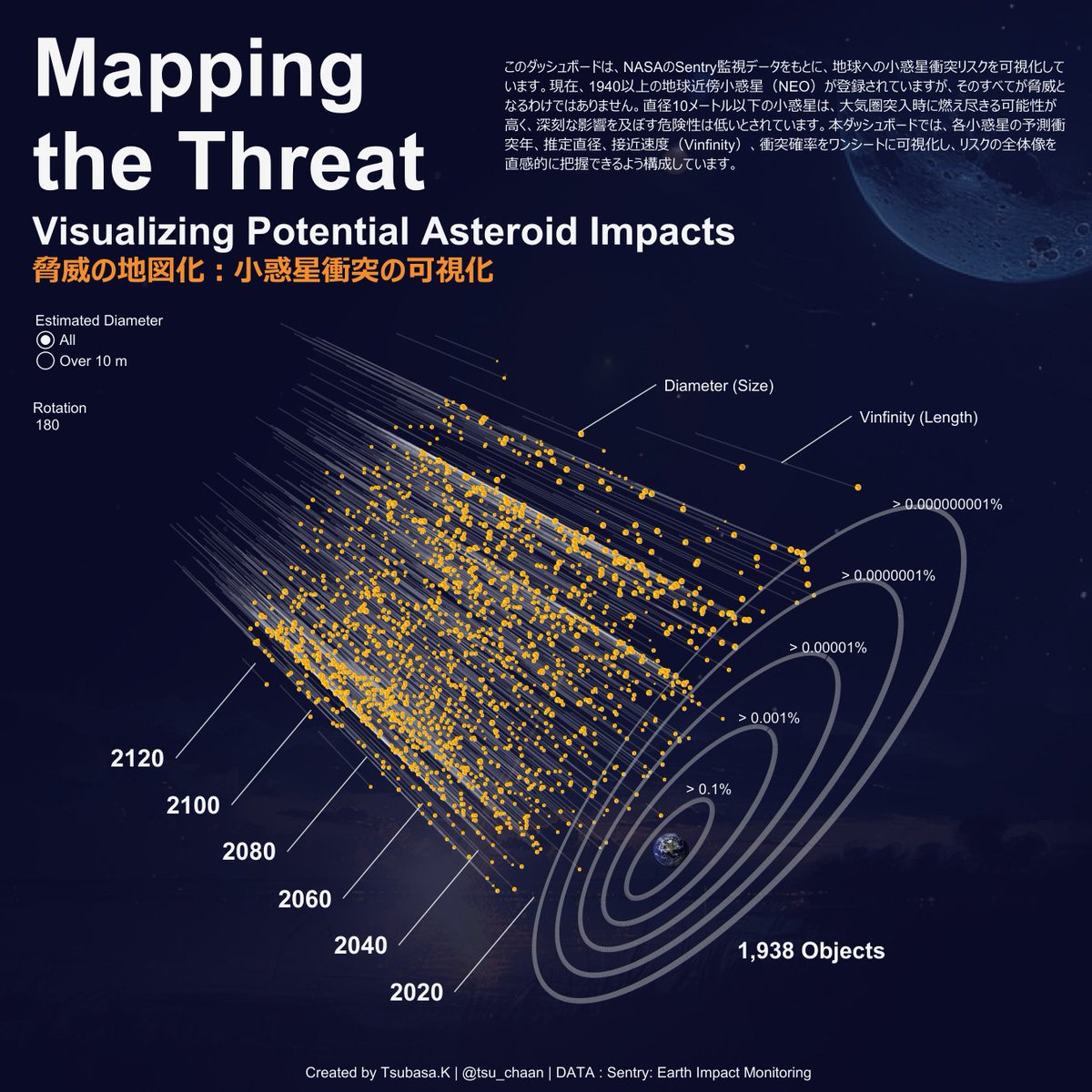
Explore this #VizOfTheDay by @tsu_chaan, featuring spatial functions and map layers to visualize the risk of potential asteroid impacts on Earth.
tabsoft.co/453HOfx
I used a custom font that isn’t supported on Tableau Public. I thought I would change it but didn’t since it fits well with the MI theme.
Download the workbook to see it as designed, with the right font and animations.
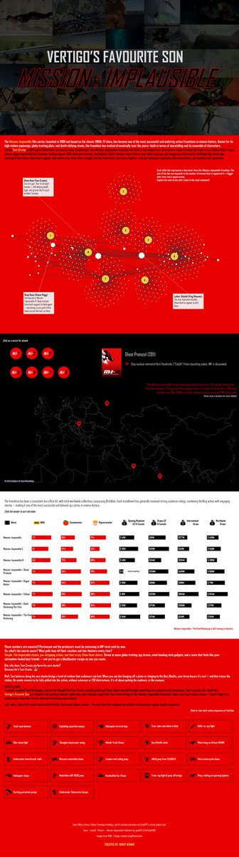
Hi DataFam.. After watching The Final Reckoning, I created a dashboard capturing all the MI movies, their key characters, box office collections, ratings, mission locations, and memorable stunts.
Explore the viz: tinyurl.com/4safef74
Would love to hear your thoughts! :)
This #VizOfTheDay by @Naeto__ offers critical insights into an emergency department's vital activities, featuring a KPI overview, patient data, and doctor rosters. Explore this business dashboard.
tabsoft.co/4joTQp0
✨New Viz ✨
Finally finished my Book Club Viz!! 📚 A big thank you to @vizwithdan for helping me get over my creative block!
If you're interested in what books we've been reading, check out the viz here:
🔗tinyurl.com/53fhsvj2 via @tableaupublic
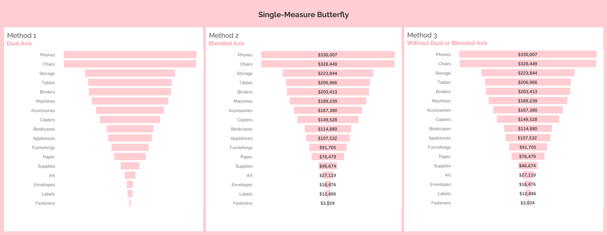
Hi #DataFam, Just dropped a quick guide on creating a single-measure butterfly chart in @tableau - no dual axis needed!
Clean, simple, and effective for comparisons.
Check it out: tinyurl.com/4v39kfht
Feedback is welcome. :)
#Tableau#ButterflyChart