Kirk Weber

7K posts

Kirk Weber banner
Kirk Weber

Kirk Weber

@kirkweber

K–12 data storyteller helping schools move from reporting to action. Assessment & MTSS strategist | Data Storytelling for Schools

Troy, MI Katılım Nisan 2009
516 Takip Edilen356 Takipçiler
Kirk Weber
Kirk Weber@kirkweber·
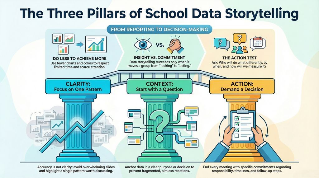
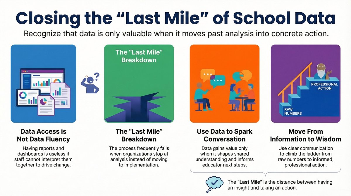
Most school data works like a Norman door. You pull… when you should push. Nothing is broken. But the design leads you to do the wrong thing. 
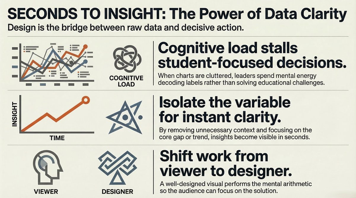
If you have to explain your chart, it’s not working. 
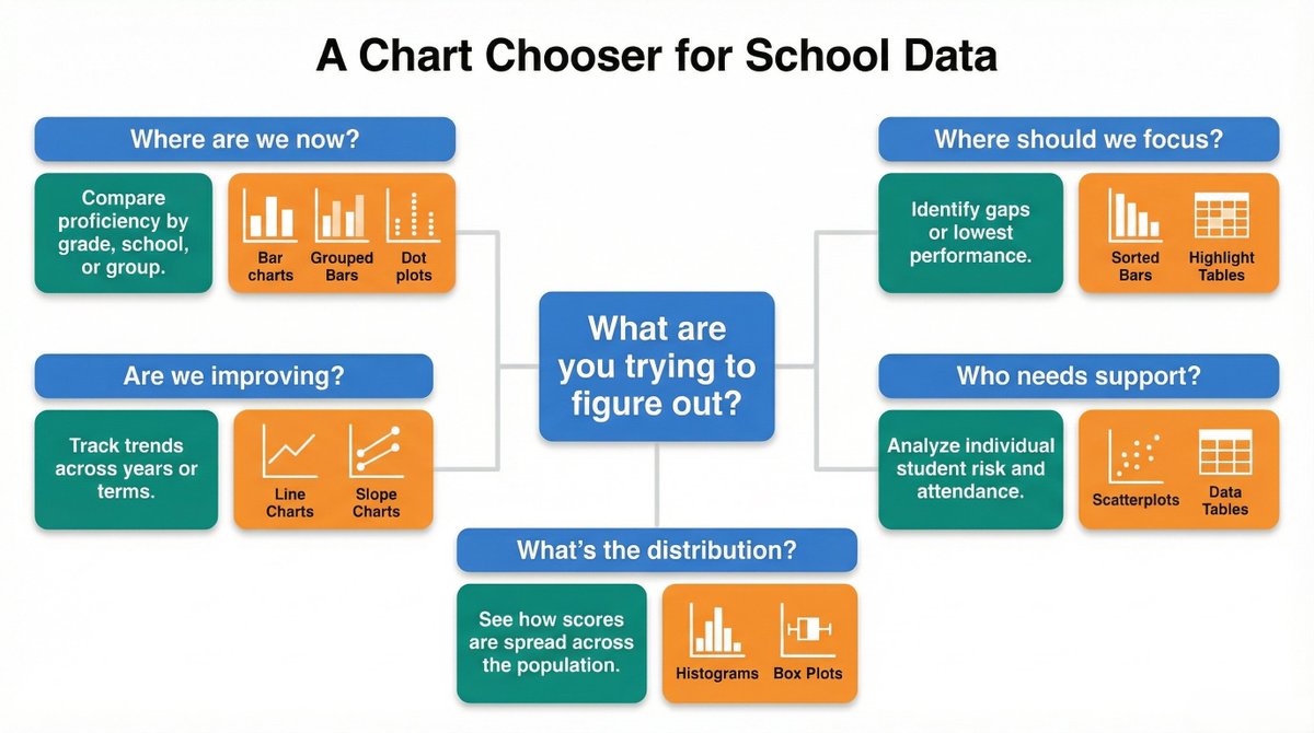
I break this down and share a chart chooser for schools: tinyurl.com/bdhuwjjj
Kirk Weber tweet media
English
0
1
1
17
Kirk Weber
Kirk Weber@kirkweber·
Some of the most common charts in schools are also the most misread. • A big segment isn’t always the biggest problem. • A dip isn’t always failure. • A score isn’t as precise as it looks. I break down 5 examples and what to watch for: …tastorytellingforschools.substack.com/p/the-5-charts…
Kirk Weber tweet media
English
0
0
1
9
Kirk Weber
Kirk Weber@kirkweber·
Stop using red, yellow, and green in your school data. If everything is highlighted, nothing is. Color should focus attention, not compete for it. Gray for context. One color for action. I break this down in my latest article: tinyurl.com/zv69mmfc
Kirk Weber tweet media
English
0
0
0
10
Kirk Weber
Kirk Weber@kirkweber·
The chart isn’t the hard part. Trusting it is. Most school data work happens before the visualization ever exists. Here’s what it actually takes to trust a school data chart: tinyurl.com/23s89dzs
Kirk Weber tweet media
English
0
1
1
16
Kirk Weber
Kirk Weber@kirkweber·
Most school data charts have a clarity problem. Most school data meetings have a meaning problem. C.R.A.P. fixes the first. G.A.S.P. fixes the second. Glance. Annotate. Structure. People. That’s the difference between seeing data… and using it. Link: tinyurl.com/2p4wnn3h
Kirk Weber tweet media
English
0
0
0
20
Kirk Weber
Kirk Weber@kirkweber·
Most school data charts don’t fail because of bad data. They fail because they make the audience do the work. Clear charts reveal the insight in seconds. New article on cognitive load + school data visualization: tinyurl.com/bdfh2sac
Kirk Weber tweet media
English
0
0
0
10
Kirk Weber retweetledi
Steve Magness
Steve Magness@stevemagness·
In 2008, 62% of teachers said they were very satisfied with their job. In 2022, that dropped to 12%. We've got a serious problem brewing in education...
Steve Magness tweet media
English
771
1.8K
10.9K
2.1M
Kirk Weber retweetledi
Kirk Weber
Kirk Weber@kirkweber·
When @WoodardColin visualized persistent poverty—defined as a poverty rate of 20% or higher for four consecutive periods—the regional disparities across the U.S. are striking. "Persistent poverty varies massively across U.S. regions" nationhoodlab.org/persistent-pov…
English
0
0
0
10
Kirk Weber
Kirk Weber@kirkweber·
Most attendance tables show every number. But they hide the story. Three simple visuals can reveal what chronic absenteeism data is really saying. "What Your Attendance Table Isn’t Showing You" Article: tinyurl.com/2888htzh
Kirk Weber tweet media
English
0
0
0
20
Kirk Weber retweetledi
Datawrapper
Datawrapper@Datawrapper·
Just starting out with Datawrapper, or curious about whether it's the right tool for your project or work? You can still join us for our intro webinar! 📚 It's happening today at 1pm EDT/6pm CET. You can register here 👇 streamyard.com/watch/YvRWy8YV…
English
0
2
12
973
Kirk Weber retweetledi
Datawrapper
Datawrapper@Datawrapper·
Women, war, and wealth, while polarizing topics, each play a significant role in current events. 📢 🌍 The data vis in this week's Dispatch demonstrates their widespread impact. Discover these and much more on our blog: 👇 datawrapper.de/blog/data-vis-…
Datawrapper tweet mediaDatawrapper tweet mediaDatawrapper tweet mediaDatawrapper tweet media
English
0
2
7
749
Kirk Weber
Kirk Weber@kirkweber·
Most school data meetings don’t fail because of bad data. They fail because the conversation never leads to a decision. The slides look great. Everyone nods. A month later, the same charts appear again. Why this happens: bit.ly/4sEBS6Y
Kirk Weber tweet media
English
0
0
1
12
Kirk Weber
Kirk Weber@kirkweber·
Schools don’t have a data problem. They have a "last mile" problem. Getting data is easy. Turning it into decisions is the hard part. Full article here: bit.ly/3PjZfUI
Kirk Weber tweet media
English
0
0
0
9
Kirk Weber
Kirk Weber@kirkweber·
Totals are not movement. If we care about how students shift between performance levels, we need visuals that show flow. New article on earning complexity in school data work: bit.ly/4cltyEb
English
0
0
0
14
Kirk Weber
Kirk Weber@kirkweber·
Snapshot data tells us where we are. It does not tell us why we are there or what to change next. That is the difference between reporting and improvement. More here: "Beyond the Snapshot" bit.ly/3NdreVv
English
0
0
0
16
Kirk Weber
Kirk Weber@kirkweber·
I just launched a new Substack: Data Storytelling for Schools. My first two pieces: • Beyond the Snapshot • Don’t Show Them the Board Slides If you work in K–12 and use data to drive decisions, this is for you. Clarity. Context. Action. …tastorytellingforschools.substack.com
English
0
0
0
18