Sabitlenmiş Tweet

I'm excited to introduce Gist, a new app that makes it easy to shorten articles with AI.
gist-app.com
English
Kyle Halevi
2.9K posts

@kylehalevi
Human Interface Design


Who else misses live Apple events? 🫠
hate it or love it, liquid Glass adds a new vibe to UI

MacBook Neo “Life is just better with a Mac”


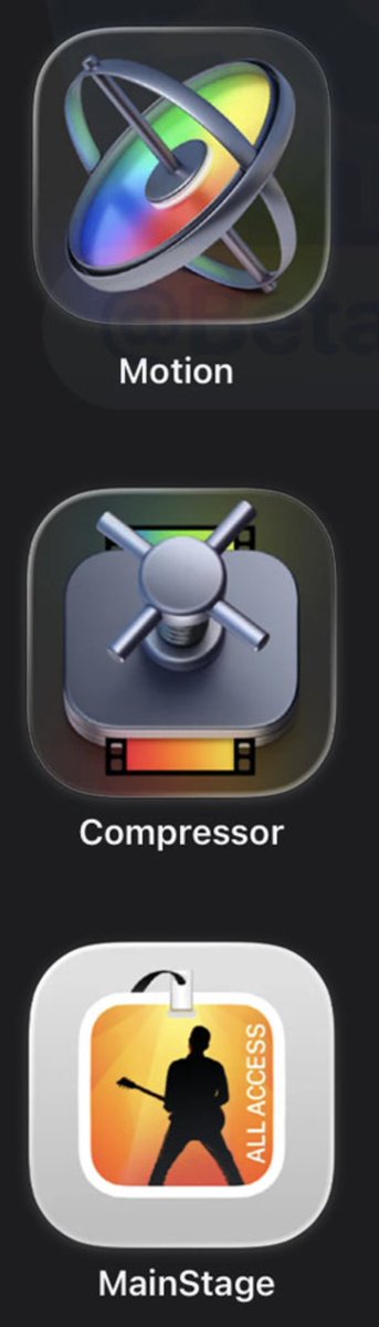
Which set feels like a well-crafted, professional, premium app suite?


Apple refreshes creative app icons like Final Cut Pro, Logic Pro, Pixelmator Pro, and more with the all-new Apple Creator Studio subscription.


@jitl terrible regression on macOS


BREAKING: Apple interface design chief Alan Dye is leaving the iPhone maker to become the Chief Design Officer at Meta in a blockbuster coup for the social networking giant. bloomberg.com/news/articles/…

the very last Apple product to use the old Garamond font? picture is of an official Apple 128GB DDR4 memory kit (2x64GB) for 2019 Xeon Mac Pro