Lost Type Co-op

2.7K posts

Lost Type Co-op banner
Lost Type Co-op

Lost Type Co-op

@losttypecoop

A collaborative digital type foundry. Brought to you by @RileyCran and friends.

Katılım Şubat 2011
135 Takip Edilen10.5K Takipçiler
Lost Type Co-op retweetledi
Riley Cran
Riley Cran@rileycran·
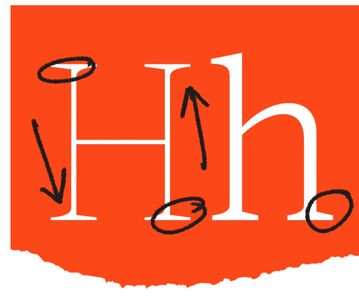
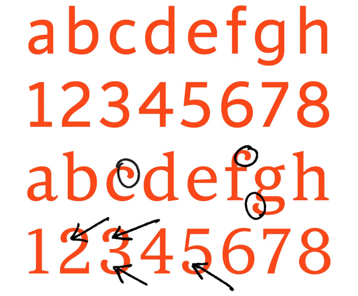
It turns out that this is one of those pesky optical illusions. Let’s abstract this to circles/squares for a moment. This circle looks much smaller than this square, right? And yet, they match exactly in height and width.
English
1
1
65
0
Lost Type Co-op retweetledi
Riley Cran
Riley Cran@rileycran·
The same illusion happens with spacing. For instance, the squares and circles below have literally identical margins between them. But it appears that there is much more space surrounding the circles.
English
1
3
66
0
Lost Type Co-op retweetledi
Riley Cran
Riley Cran@rileycran·
When you adjust ‘tracking’ (also called letter-spacing in CSS), you are modifying the amount of air in between the letters, by adding or subtracting from all margins equally. This is sometimes done for aesthetic reasons, for instance.
English
1
3
49
0
Lost Type Co-op retweetledi
Riley Cran
Riley Cran@rileycran·
Just as there are counterforms within letters, we can also observe the shapes of the space in between letters. All of these negative shapes need to be balanced, and spacing is a huge part of how we achieve this.
English
1
2
57
0
Lost Type Co-op retweetledi
Riley Cran
Riley Cran@rileycran·
What exactly is kerning? What is spacing? How are they different? Let’s talk about it! THREAD 🧵:
English
41
770
2.9K
0
Lost Type Co-op retweetledi
Federico Claudi
Federico Claudi@Federico_claudi·
Who thought bold fonts could be such a fascinating rabbit hole ! This the kind of stuff I’m on Twitter for: learn about a fascinating topic I never spent more than a minute thinking about from someone that dedicated hundreds of hours to it
Riley Cran@rileycran

A recent #fontSunday topic of ‘bold headlines’ made me want to talk about bold letters a bit. THREAD:

English
1
6
14
0
Lost Type Co-op retweetledi
Riley Cran
Riley Cran@rileycran·
At that extreme of weight, the extenders get a bit shorter, to emphasize the way the words set like a BRICK. The lowercase ‘i’ actually gets shorter just so that the ‘dot’ can fit comfortably in relation to the ascender height.
English
1
3
39
0
Lost Type Co-op retweetledi
Riley Cran
Riley Cran@rileycran·
Weight also impacts spacing. The spacing of a given weight of a typeface is connected to the amount of space trapped inside the letters. So as the ‘air’ is removed from the counterforms, the amount of space between letters is similarly reduced to maintain balance and rhythm.
English
2
7
56
0
Lost Type Co-op retweetledi
Riley Cran
Riley Cran@rileycran·
As letters get bolder, the differentiation between thick and thin (also called contrast) tends to increase. This is primarily to allow the counterforms to be as large as possible, despite the extra weight, because we rely so heavily on counterforms for reading.
English
1
5
56
0
Lost Type Co-op retweetledi
Riley Cran
Riley Cran@rileycran·
A recent #fontSunday topic of ‘bold headlines’ made me want to talk about bold letters a bit. THREAD:
English
11
106
570
0
Lost Type Co-op retweetledi
Riley Cran
Riley Cran@rileycran·
One way to visualize the importance of counterforms is a 'blur test.' Adrian Frutiger did tests like this in the 1970s when designing his eponymous typeface (originally for a French airport). See how one set of drawings is easier to distinguish, in these harsh conditions of blur?
English
2
5
27
0
Lost Type Co-op retweetledi
Riley Cran
Riley Cran@rileycran·
By drawing different counter shapes, I can make many letters appear without changing the positive shape at all. This is shown here to illustrate the importance of the counterforms, and how they impact our perception of letter shapes.
English
1
1
15
0
Lost Type Co-op retweetledi
Riley Cran
Riley Cran@rileycran·
NEW 🧵: Did you know we only started mixing Sans and Serif typefaces in the last 200 years? One genre is much older than the other. Let’s discuss the birth of sans serif typefaces. I’ll use @lettermatic_abc fonts for some visuals: Parclo Sans & Serif. lettermatic.com/fonts
English
2
32
127
0
Lost Type Co-op retweetledi
Riley Cran
Riley Cran@rileycran·
If you're interested in how fonts are made, I wrote a case study about making a matching pair of typefaces (Sans and Serif). 🔤 lettermatic.com/custom/root-in…
Riley Cran tweet mediaRiley Cran tweet mediaRiley Cran tweet media
English
1
19
108
0
Lost Type Co-op retweetledi
Riley Cran
Riley Cran@rileycran·
The fonts even ended up in Time Square! Photos via @Patrick_Torres !
Riley Cran tweet mediaRiley Cran tweet media
English
0
4
18
0
Lost Type Co-op retweetledi
Riley Cran
Riley Cran@rileycran·
Today I would like to do a thread about 'counterforms.' They are a critical building block of typeface design... but what are they? How do they work? I'll also talk about how I thought of the counterforms in Really Sans.
English
11
69
265
0