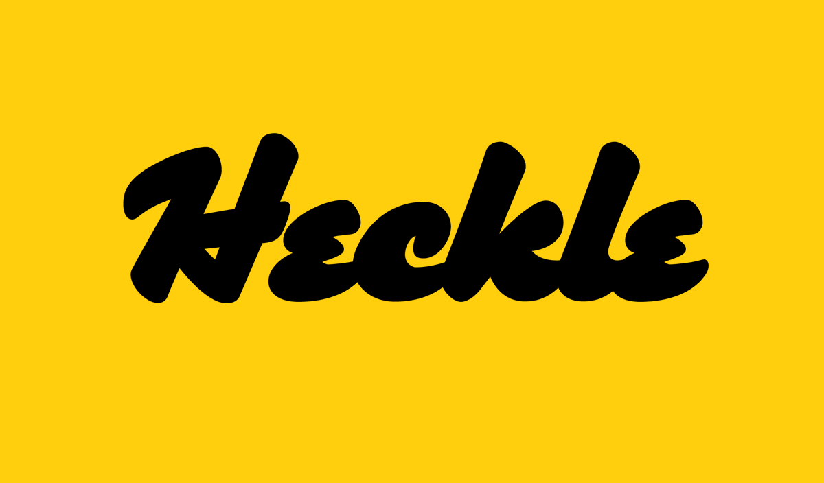
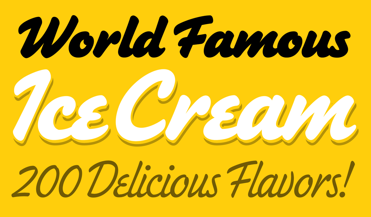
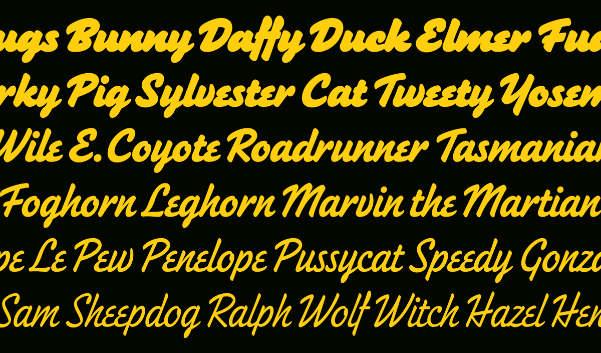
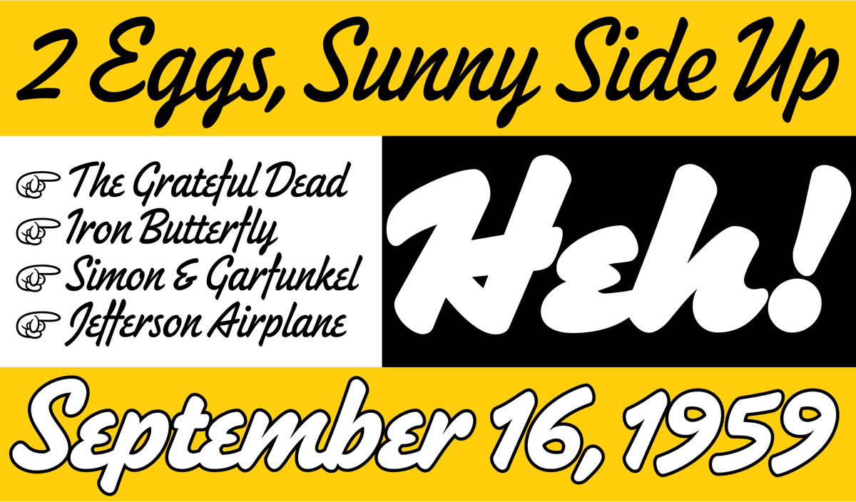
Mark Simonson Studio
3K posts

Mark Simonson Studio
@marksimonson
Typeface designer and font developer.
St. Paul, Minnesota Katılım Nisan 2008
166 Takip Edilen6.3K Takipçiler

Fifty years ago this month is when my interest in type design began... marksimonson.com/notebook/view/…

English

My Bookmania (Light Italic) and Etna (Bold Italic and Condensed) showed up for a couple of seconds in tonight's episode of #Pluribus ... (I hope this isn't a spoiler...)


English
Mark Simonson Studio retweetledi

More vintage modern goodness from @marksimonson today!
Vintage because I get phototypesetting vibes.
Modern because it is ripe for the serif trend happening right now.
Mark Simonson Studio@marksimonson
New! Hardcover is an elegant serif typeface intended for display use. It was one of my earliest typeface ideas, dating back to a sketch I did in 1978, inspired by the slick lettering I’d seen on mass-market book covers. More info here: marksimonson.com/notebook/view/… And here: marksimonson.com/fonts/view/har…
English

@marksimonson Love the flares and that it saw release. Beautiful typeface!
English

New! Hardcover is an elegant serif typeface intended for display use. It was one of my earliest typeface ideas, dating back to a sketch I did in 1978, inspired by the slick lettering I’d seen on mass-market book covers.
More info here: marksimonson.com/notebook/view/…
And here: marksimonson.com/fonts/view/har…


English

A few weeks ago, I did a talk for the Type Tuesday group in Minneapolis about the backstory behind Douglas F. Jones' Skin & Bones typeface and my revival of it. If you'd like to see the talk, I put it on YouTube: youtube.com/watch?v=jDAG7t…

YouTube
English

My entire font library is now available on Typographer!
typographer.com @TypographerApp
English

Mark Simonson Studio at 25: It didn't start out as a digital type foundry... marksimonson.com/notebook/view/…

English

Mark Simonson’s Proxima Nova is now 20 years old.
We love the Proxima Nova superfamily and recommend it as a go-to workhorse sans serif and for web fonts, of course!
🎉 Happy birthday, Proxima Nova!
fonts.ilovetypography.com/superfamily/Pr…

English

The growth and popularity of Proxima Nova in the last twenty years is beyond my wildest, most optimistic expectations when I released it in 2005. I feel incredibly lucky and grateful to everyone who has helped along the way, and especially to all the designers who decided that it was the best font for the job. marksimonson.com/notebook/view/…

English

The story of my latest typeface, Synergy, goes back to a couple of sketches in 1981. Read more here: bit.ly/3FimrO5

English

Synergy is a new sans serif I’ve created. It’s a simplified grotesque with a clean, modern appearance. Suitable for display and text with its open shapes, matching italics, small caps, and a wide range of weights. bit.ly/3QLGszo


English

@AndreiRobu Some licenses stipulate that, but not mine
English

@marksimonson Do they need a license for that? Showing your typeface on screen.
English

I've been rewatching season 1 of Severance and spotted my Acme Gothic on a band poster. It's only there for a split second, but it caught my eye, of course. The name is obscured, but thanks to a little research, I discovered that it's "ABRUMPO" (latin for "separated") fronting for "Fissureman."

English


