Michaeljpeg
29 posts


@michaeljpeg Если отличие только в цвете, то второй более привлекателен к глазу.
Первый какой то темный.
А так по анимации хорошие.
Русский
GIF
GIF
English

English

@crumbraven Yeah, you are probably right, I was thinking the same. Gonna try to fix it
English

@michaeljpeg 1 is the correct physics re the arms bouncing matching his gait. 2 looks nice but the cadence of his arms is off. can we get the visual effect of 2 with the proper bounce of 1?
English

@michaeljpeg Something about this Lil guy is terrifying
Woodcrest, CA 🇺🇸 English


@michaeljpeg I think 1 is better because the arms moving less makes the rest of the moments stand out more.
English

Am I the only one who uses a single Aseprite file for everything?
English

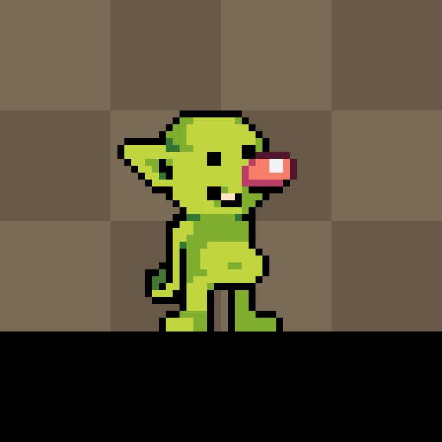
@WeVennStudios Thanks! I actually didn't do any silhouette passes for this one. I just started sketching and this little guy happened. Here's a static version
English

@michaeljpeg Love this... silly pixel guy energy... which silhouette pass clicked?
English
Michaeljpeg retweetledi

A brave knight.
A cursed dungeon.
A nightmare made just for you...
DUNGEON LURKER – Exclusively for the Eclipse System 32!
#TheMIX #SummerGameFest
English
Michaeljpeg retweetledi

Michaeljpeg retweetledi