Miha

9 posts

Miha banner
Miha

Miha

@mihacodes

I build what your business needs: websites, web apps, and AI integrations. You brief me, and I'll ship it.

Katılım Aralık 2022
7 Takip Edilen5 Takipçiler
Miha
Miha@mihacodes·
Two years doing Web, one year on Upwork. Hit Top Rated Plus this week. Joining the platform meant starting from scratch even though I'd been doing this for a year already. No reviews, no profile history. First few proposals went nowhere. Eventually something landed, and I just tried not to blow it. 
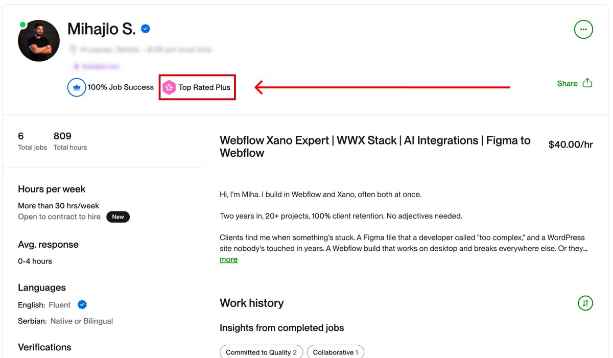
100% job success. 6 clients. 809 hours. All of them came back for more. I do Webflow, Xano, and AI integrations. A lot of the projects I pick up got dropped somewhere else or nobody wanted to touch them. I don't mind that kind of work. Thanks to everyone who took a chance, on Upwork and off. Wouldn't have a track record without you.
Miha tweet media
English
1
0
4
29
Miha
Miha@mihacodes·
@Shizolm Great! Saw you have plenty of quality work here, keep it up!
English
0
0
0
7
Chisom: Webflow Developer
A cool way to list out your cards, powered by GSAP ScrollTrigger. Built in Webflow. P.S. I build cool shii. Hire me today.
English
10
10
61
2K
Miha
Miha@mihacodes·
Your website is losing clients before they read a single word. Three seconds on mobile. That's about how long most decision-makers give you before they're somewhere else. I just hit 100 on desktop and 95 on mobile on my portfolio. Still actively building it out, but performance is one of those things I can't treat as a finishing touch. What I actually did: self-hosted fonts so the browser isn't calling Google's API on every load, pure CSS animations instead of GSAP (where we could swap it), AVIF for every image, SVG logos embedded directly in the HTML rather than pulled from a CDN, and a proper audit of every JS file that had to stay on the page. Defer what can wait, cut what can't justify being there. None of it is exotic. It's mostly just the stuff that gets skipped when a project is moving fast. A slow site costs you, clients you'll never know about. Someone found you, gave it a few seconds, and left. That visit just doesn't show up anywhere useful. Drop a comment or DM if you want to know where yours stands. Happy to take a free look.
Miha tweet media
English
1
0
4
34
Miha retweetledi
Cheng Lou
Cheng Lou@_chenglou·
My dear front-end developers (and anyone who’s interested in the future of interfaces): I have crawled through depths of hell to bring you, for the foreseeable years, one of the more important foundational pieces of UI engineering (if not in implementation then certainly at least in concept): Fast, accurate and comprehensive userland text measurement algorithm in pure TypeScript, usable for laying out entire web pages without CSS, bypassing DOM measurements and reflow
English
1.3K
8.3K
65.1K
23.6M
Miha
Miha@mihacodes·
Most Webflow developers still build CTA buttons the wrong way. Here's a 2-minute fix that actually helps with accessibility. The mistake: using a Button element with generic text like "See more" or "Learn more." Screen readers announce these labels out loud. If a page has 5 buttons all saying "Learn more," a blind user has no way to tell them apart. The fix: use a Link Block instead. Inside it, add two elements: 1. The visible label ("Learn more") 2. A hidden paragraph with a descriptive label ("Learn more about our services and what we offer.") The paragraph is invisible on screen, but screen readers pick it up and read it aloud. How to set it up in Webflow: 1. Add a link block 2. Add your visible text block inside 3. Add a paragraph with your descriptive text 4. Give it a class like "sr_only" ( screen reader only ) 5. Add this to your global CSS: .sr_only { position: absolute; width: 1px; height: 1px; padding: 0; overflow: hidden; clip: rect(0,0,0,0); white-space: nowrap; border: 0; } Done. Sighted users see the short label, screen reader users hear the full one. Save this for your next Webflow project.
Miha tweet media
English
0
0
0
13
Miha
Miha@mihacodes·
Most Webflow developers still build CTA buttons the wrong way. Here's a 2-minute fix that actually helps with accessibility. The mistake: using a Button element with generic text like "See more" or "Learn more." Screen readers announce these labels out loud. If a page has 5 buttons all saying "Learn more," a blind user has no way to tell them apart. The fix: use a Link Block instead. Inside it, add two elements: 1. The visible label ("Learn more") 2. A hidden paragraph with a descriptive label ("Learn more about our services and what we offer.") The paragraph is invisible on screen, but screen readers pick it up and read it aloud. How to set it up in Webflow: 1. Add a link block 2. Add your visible text block inside 3. Add a paragraph with your descriptive text 4. Give it a class like "sr_only" ( screen reader only ) 5. Add this to your global CSS: .sr_only { position: absolute; width: 1px; height: 1px; padding: 0; overflow: hidden; clip: rect(0,0,0,0); white-space: nowrap; border: 0; } Done. Sighted users see the short label, screen reader users hear the full one. Save this for your next Webflow project.
Miha tweet media
English
0
0
0
8
Miha
Miha@mihacodes·
Most Web developers still build CTA buttons the wrong way. Here's a 2-minute fix that actually helps with accessibility. The mistake: using a Button element with generic text like "See more" or "Learn more." Screen readers announce these labels out loud. If a page has 5 buttons all saying "Learn more," a blind user has no way to tell them apart. The fix: use a Link Block instead. Inside it, add two elements: 1. The visible label ("Learn more") 2. A hidden paragraph with a descriptive label ("Learn more about our services and what we offer.") The paragraph is invisible on screen, but screen readers pick it up and read it aloud. How to set it up in Web: 1. Add a link block 2. Add your visible text block inside 3. Add a paragraph with your descriptive text 4. Give it a class like "sr_only" ( screen reader only ) 5. Add this to your global CSS: .sr_only { position: absolute; width: 1px; height: 1px; padding: 0; overflow: hidden; clip: rect(0,0,0,0); white-space: nowrap; border: 0; } Done. Sighted users see the short label, screen reader users hear the full one. Save this for your next project.
Miha tweet media
English
2
0
5
23
Miha
Miha@mihacodes·
Most Webflow developers still build CTA buttons the wrong way. Here's a 2-minute fix that actually helps with accessibility. The mistake: using a Button element with generic text like "See more" or "Learn more." Screen readers announce these labels out loud. If a page has 5 buttons all saying "Learn more," a blind user has no way to tell them apart. The fix: use a Link Block instead. Inside it, add two elements: 1. The visible label ("Learn more") 2. A hidden paragraph with a descriptive label ("Learn more about our services and what we offer.") The paragraph is invisible on screen, but screen readers pick it up and read it aloud. How to set it up in Webflow: 1. Add a link block 2. Add your visible text block inside 3. Add a paragraph with your descriptive text 4. Give it a class like "sr_only" ( screen reader only ) 5. Add this to your global CSS: .sr_only { position: absolute; width: 1px; height: 1px; padding: 0; overflow: hidden; clip: rect(0,0,0,0); white-space: nowrap; border: 0; } Done. Sighted users see the short label, screen reader users hear the full one. Save this for your next Webflow project.
Miha tweet media
English
0
0
0
10