@Lintappreciator We don’t know each other, & I’d rather u not make assumptions about my understanding of context. You’re judging me without knowing how I work or who I work with, just as I don’t know who u are. Still, I’m speaking to u respectfully without claiming you simply don’t understand. Bb
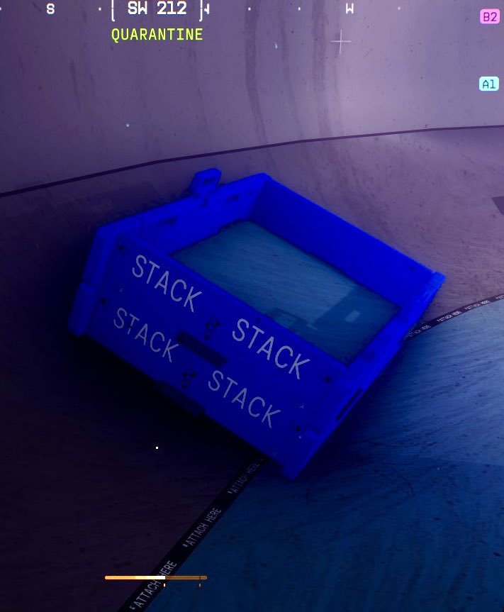
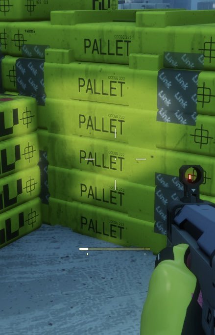
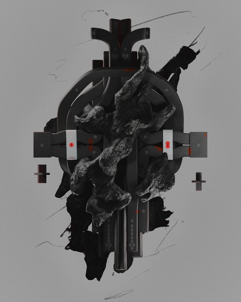
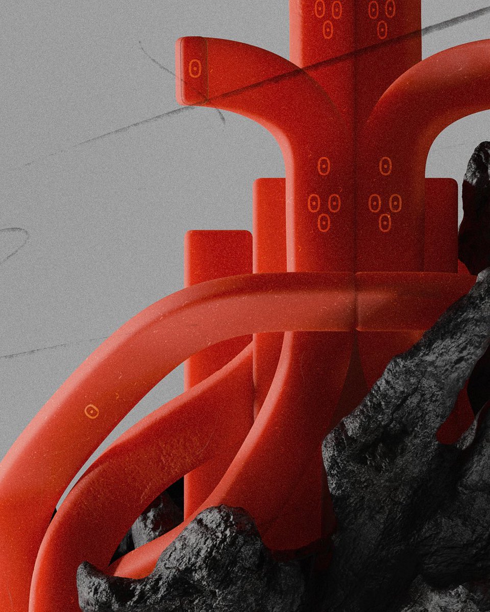
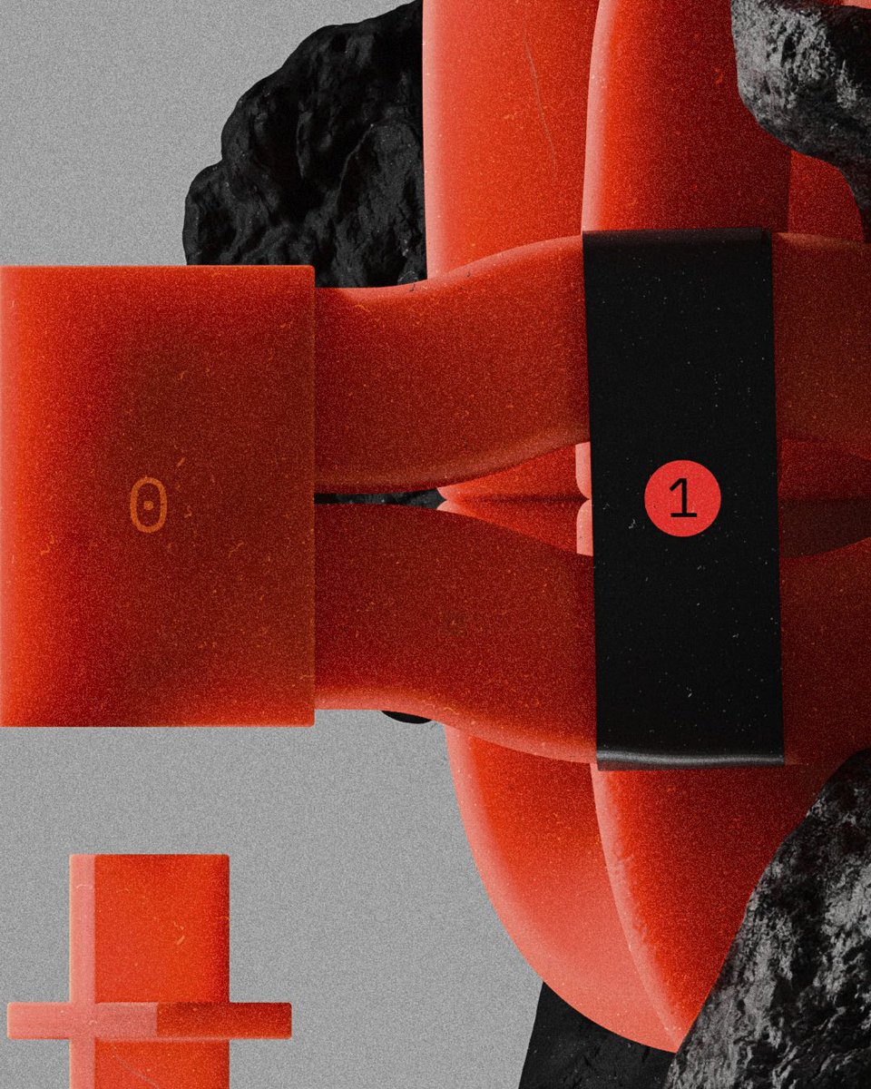
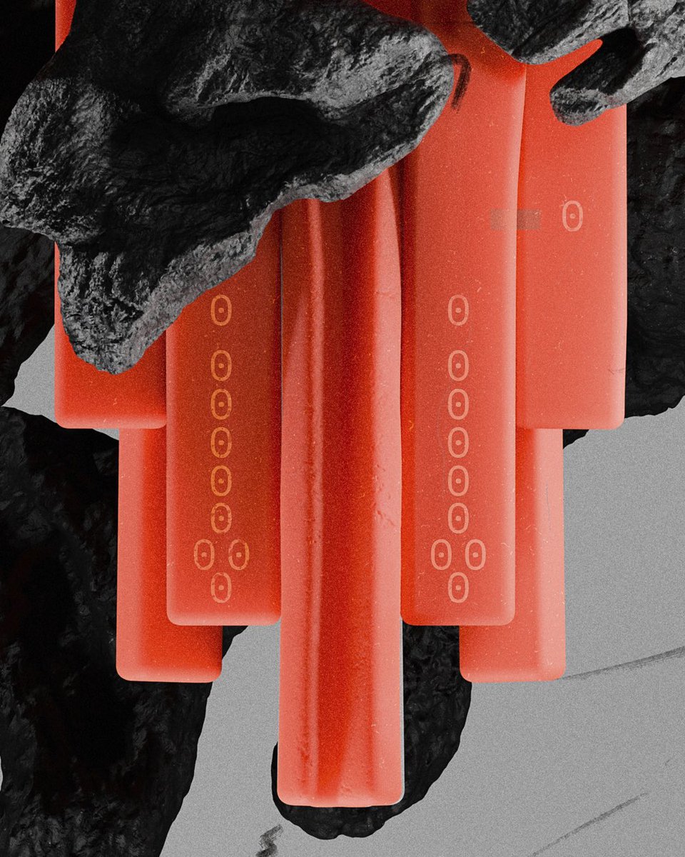
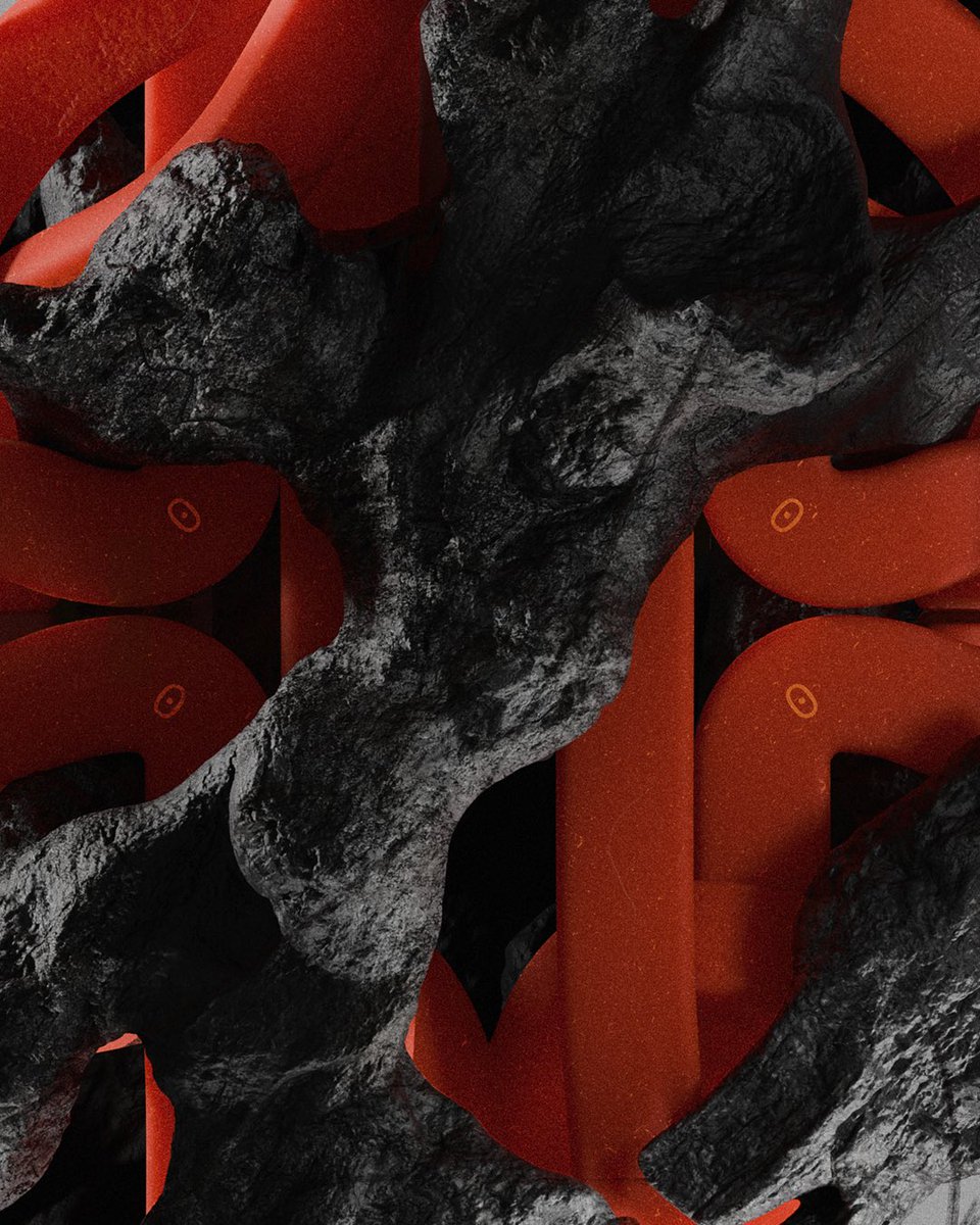
I don’t know if it’s a coincidence or an intentional nod, but I like to think the environmental labels in Marathon (on crates, bags, stacks, etc) are an homage to Virgil Abloh’s legacy.
Small clarification: my point isnt really about O-W or graphic design itself. What I like is that MRTN lets me see all kinds of cultural links that touched our lives at different moments.Thats what pulls it out of the vacuum of “just a game” & makes it feel connected to smth lrgr
@Lintappreciator I understand where your tirade is coming from, but my point was never really about graphic design itself or real inventing. It was about a cultural moment he tapped into exceptionally well. And it wasn’t just an echo chamber either, the numbers backed it up.
@Lintappreciator We could go on about this for a long time and bring up all kinds of examples and references, from Heron Preston’s orange tag to early Demna and his use of poor post-Soviet 90s oversized adidas suits aesthetics. But honestly, I’d rather not. I am not a fanboy of Abloh
@fixedhillcross I think you miss the point a bit. Markings and abbreviations, absolutely. But not in the literal “BOX” on a box or “BAG” on a bag way. And yeah, I’m around prod all the time. Wood, metal, packaging, actual factory envs
@keepitzeroabove Oh yeah, definitely, but the approach shouldn’t feel conventionally merch-driven. More emphasis on quality, interesting design ideas and no logomania. It would be blast
@milkpack Do you understand how much money bungie would make if they start dropping GOOD merch based on items in the game? Backpacks inspired by the packs you can equip in the game, good decent posters, shirts, even socks, figures, faction merch, Clothes that look like the character skins
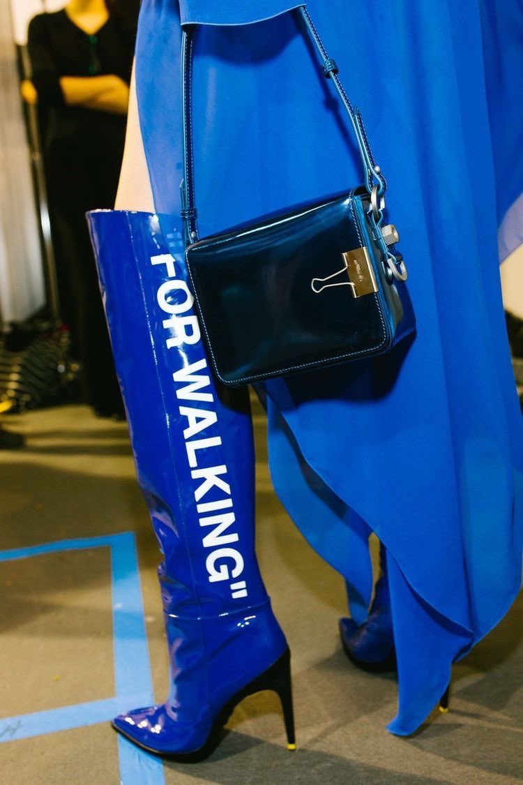
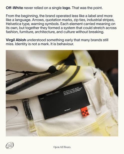
@milkpack off white adopted what was already the norm for utility items and applied it to clothes that’s why it was a novelty, entirely possible they were inspired by him but factory items have had what they are and how to use them written in plain English forever
@Tys1474554 I get what you mean. And overall, you actually pointed out the most important thing: context. The same visual style can be perceived very differently depending on the setting and the time. For some Helvetica is a transporation only design
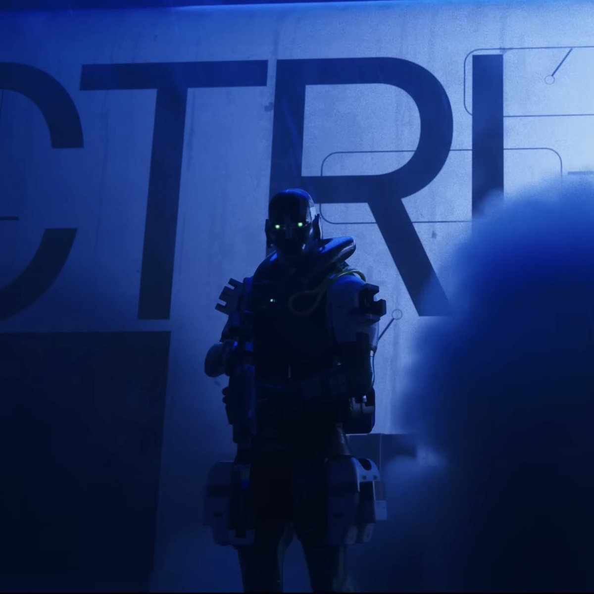
@milkpack Yeahh true could be but doubt it cause it’s such a Sci fi /cyberpunk type of aesthetic. Or for this particular setting in Marathon it’s like that mainly cause it’s like 3D printed computer made materials for quick colonizing worlds. wish I had a good memory to show examples
@Rabit_115 I wouldn’t simplify it that much. I’d say Off-White’s graphic language itself is also a strong reflection & extension of a certain era that Marathon is referencing, & pushing forward too. & again,I’m speaking here not about graphic design in first place, but about culture overall
@Tys1474554 Yeah, absolutely. I’m not really talking about something radically new in graphic design that was made by Abloh, but more about cultural influence during a certain period