Sabitlenmiş Tweet

UI Prep 8.0 is Live!!! 🎉
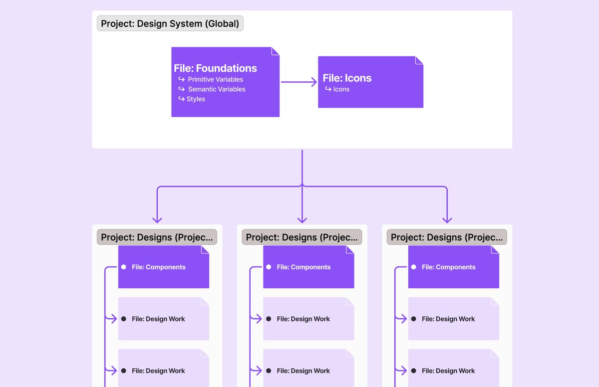
The UI Prep Design System has been completely rebuilt to include all updates from Config23! Including...
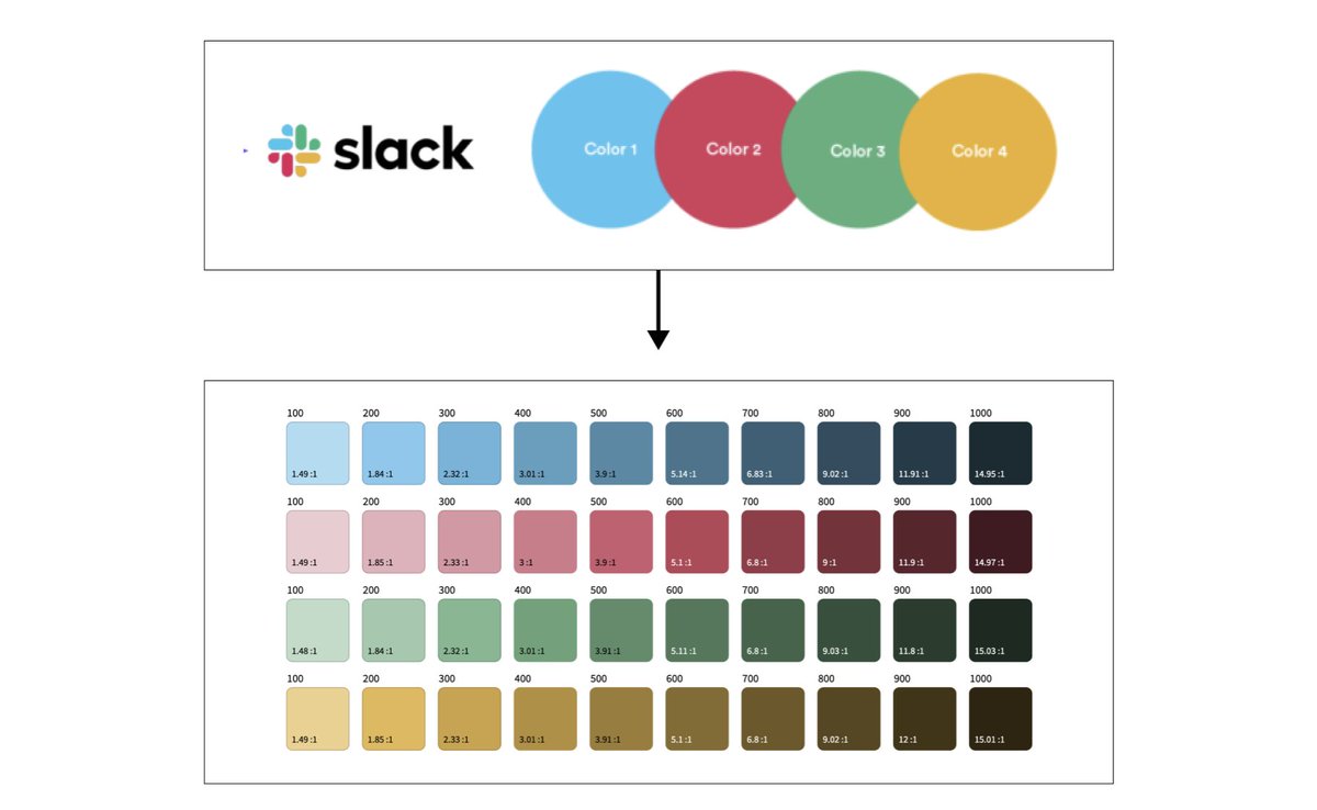
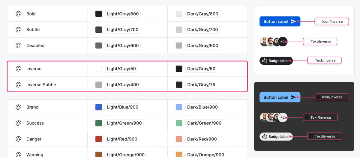
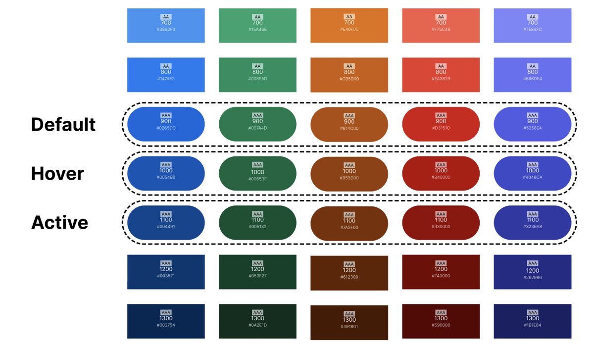
✨ Color Variables
✨ Light & Dark Mode
✨ Number Variables
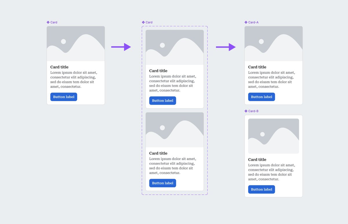
✨ Auto Layout (Max/Min/Wrap)

English
Molly Hellmuth Tsacudakis
2.3K posts

@molly_hellmuth
Teaching what I know about Figma & Design Systems Newsletter https://t.co/MyENQXKwWG Course https://t.co/mS04Tlbs2r