Sabitlenmiş Tweet
l
621 posts


I use Claude to build winning Meta ad creative from scratch.
I put together my Meta Creative Research Vault (below)
Claude is BY FAR the best tool for extracting angles, writing hooks, and briefing creators.
I use my customer data combined with my prompts to go from zero to a full creative brief in under an hour.
My prompts replace an entire research team.
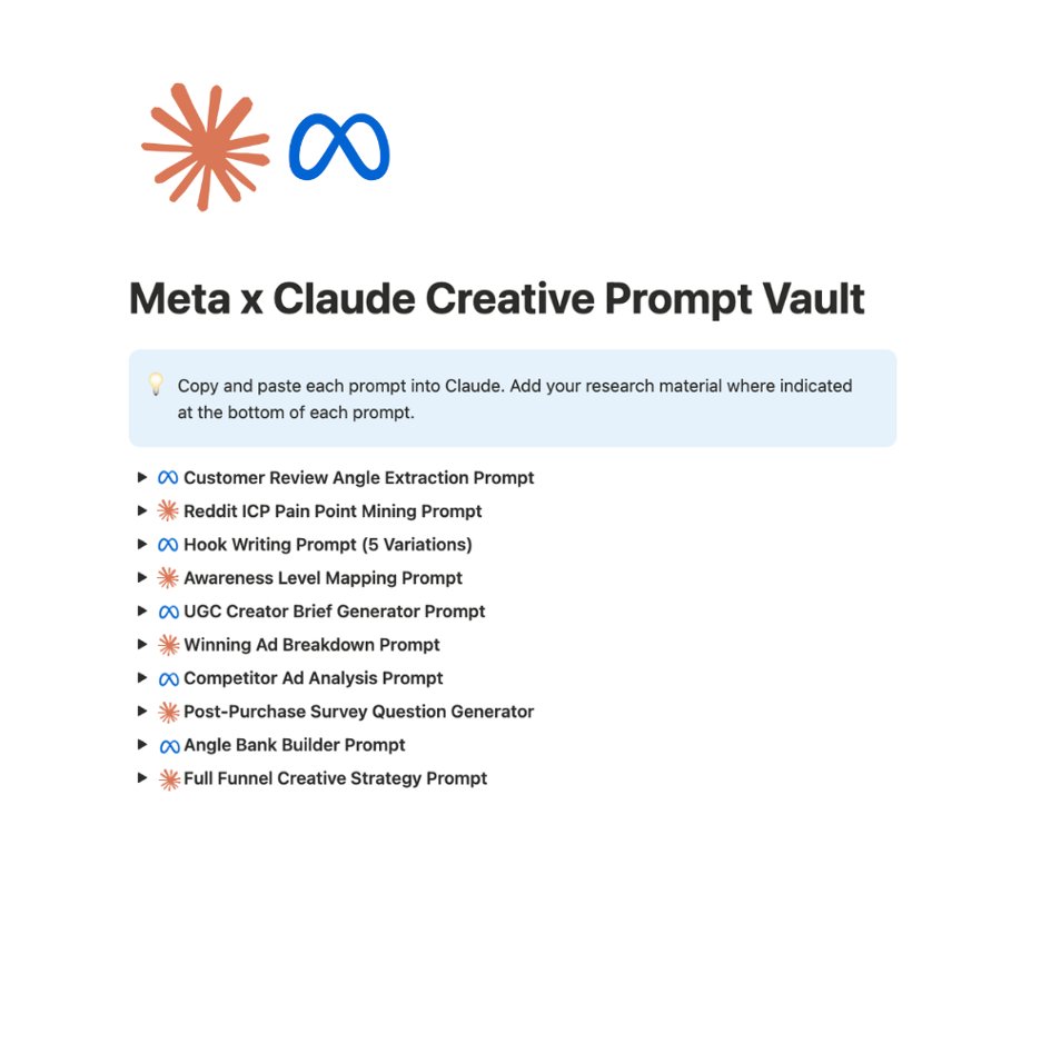
I compiled ALL my Claude prompts into one vault:
● Customer Review Angle Extraction Prompt
● Reddit ICP Pain Point Mining Prompt
● Hook Writing Prompt (5 variations from one angle)
● Awareness Level Mapping Prompt
● UGC Creator Brief Generator Prompt
● Winning Ad Breakdown Prompt
● Competitor Ad Analysis Prompt
● Post-Purchase Survey Question Generator
● Angle Bank Builder Prompt
● Full Funnel Creative Strategy Prompt
Want access?
→ Comment "Meta"
→ Follow me and I'll DM you the vault
English

A brand went from 1.2% to 6% CVR without touching their ads.
Your store gets 4 types of visitors:
→ The one who's never heard of you.
→ The one who knows the problem but not you.
→ The one comparing you to 3 other brands.
→ The one with their card out.
You're sending all of them to the same page.
That's not a traffic problem. That's a page problem.
@jurni__ai matches every visitor to the page they actually need - in minutes.
Comment "LEVELS" and I'll show you all 4. (must be following)

English


$100k MRR idea:
build an openclaw + arcads automation that clones UGC hooks from tiktok videos with 1M+ views
comment any emoji and i’ll send you the entire workflow
English


90% of ecom brands running Facebook ads are getting f*cked by Zuck
Not breaking even. They're getting f*cked.
So I put together the exact benchmarks by niche, the 5 reasons your ads are failing, and how to fix each one.
RT + comment "ADS" and I'll send it.
(follow so I can DM)
GIF
English


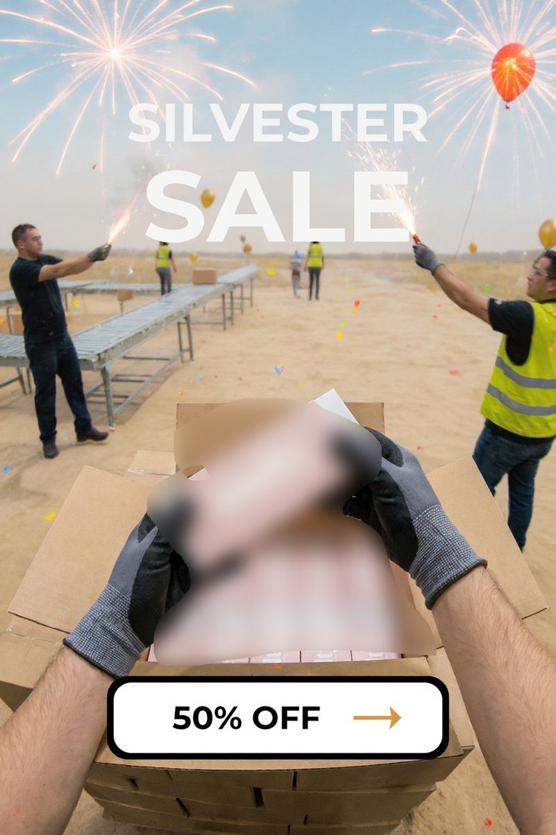
$220k+ brands don’t begin with “make an ad”
They begin with “what would someone casually post today”
Then the product slips into that moment
One frame
real-life context
soft curiosity
single idea
So it registers as content before it registers as marketing
Most static ads lose because they look engineered
Feed-native ads win because they feel honest
I broke down the layout patterns behind these quiet winners and how to recreate them across niches
No fluff
Only repeatable structures
Put it into a short guide
rt + comment “scenes” and I’ll send it
(follow for dm)
English

$2.3M unlocked by flipping one beauty ad angle
most beauty ads educate
ingredients, routines, reassurance
this one did the opposite
it showed the future first
not glow
not hydration
the cost of doing nothing
delay → damage
ignoring it → accumulation
“i’ll start later” → regret
no product lecture
no calming explanations
no aggressive CTA
the ad didn’t convince, it surfaced a fear that was already there
i broke down the exact structure behind these beauty-scare ads
what they show first
what they never explain
and why they convert faster
rt + comment “beauty” and i’ll send it
(follow for dm)
English

7.2x ROAS didn’t come from better targeting or clever tricks
it came from ads that didn’t feel like ads at all
most pet creatives try to explain materials, features, benefits, reasons to buy
this one stayed quiet on purpose
it looked like a normal moment in someone’s feed
a dog on the floor
nothing staged
nothing pushed
no pitch, no urgency, no artificial hooks
people watched because it felt real
they stayed because their guard never went up
organic-looking ads don’t interrupt attention
they borrow it
and that’s why they convert
i broke down how these native creatives are structured and scaled
rt + comment “native” and i’ll send it
(follow for dm)
English

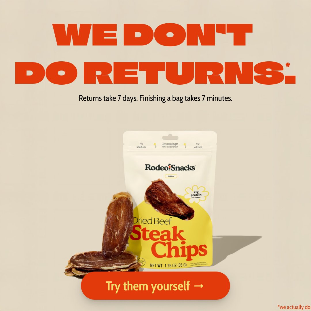
$100k+ brands don’t guess how to design static ads
they follow a repeatable layout system
contrast hierarchy and message clarity
so the ad explains itself in under a second
most static ads fail because they look generic
this guide breaks down how top brands structure visuals
to feel premium modern and trustworthy
no design theory
just frameworks you can reuse for every creative
i turned the full system into a short guide
rt + comment “static” and i’ll send it
(follow for dm)
English
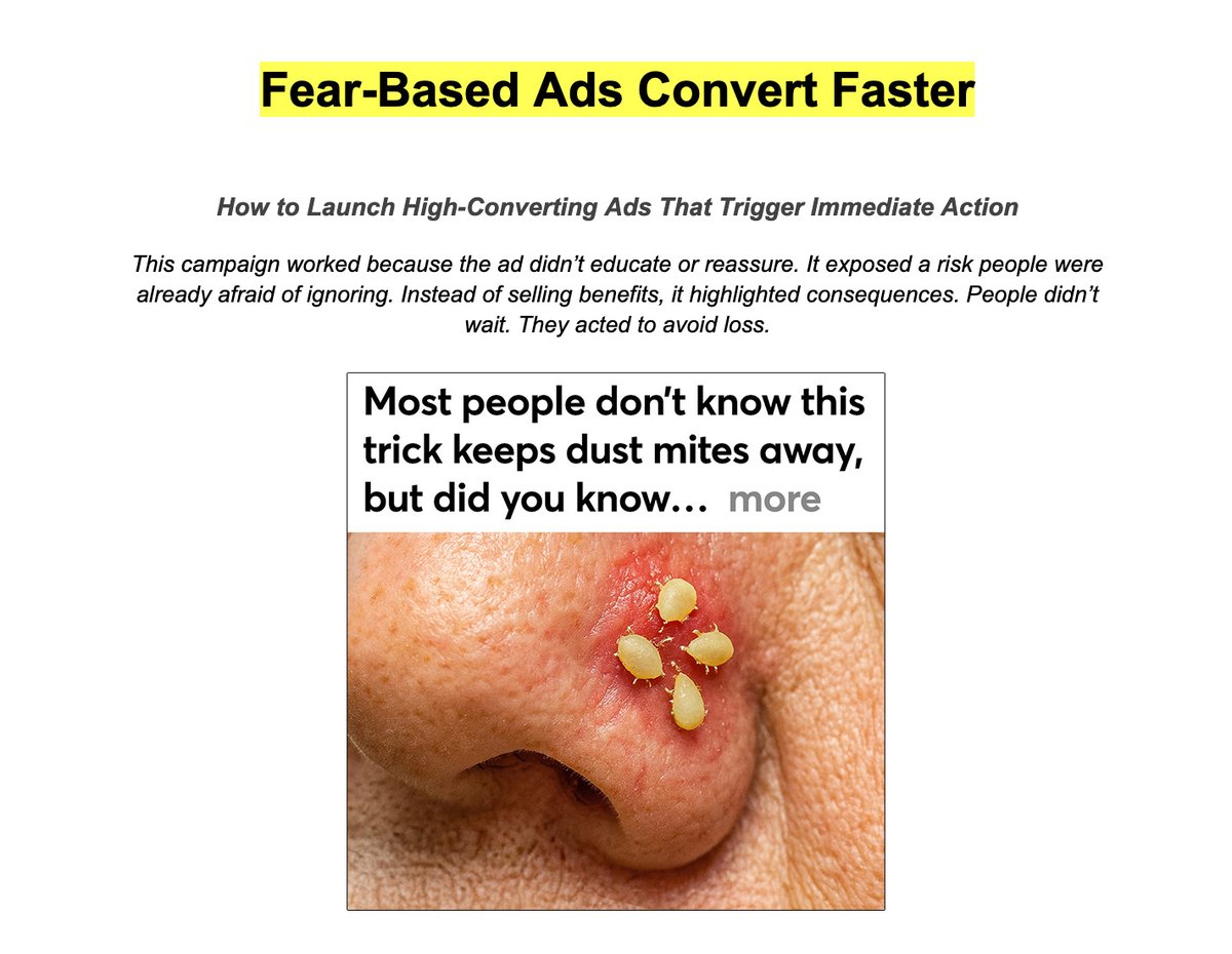
$250k+ campaigns start with images people can’t unsee
this ad doesn’t educate or calm you down
it shows a skin problem most people already fear
and forces an immediate reaction
most ads sell benefits
this one highlights the consequence of ignoring it
→ no hype
→ no explanations
→ just visual risk and a clear fix
that’s why fear-based ads convert faster
people act to avoid loss, not to learn
i wrote a short breakdown on how to structure ads like this
and reuse the same logic for any offer
rt + comment “fear” and i’ll send it
(follow for dm)
English

I tested 290 different ad hooks.
The winners all shared one thing: a cognitive dissonance pattern.
I need to tell you about the most expensive sentence I ever wrote.
“Tired of razors that don’t work?”
$4,200 in spend.
340,000 impressions.
2,100 clicks.
7 sales.
Same product.
Same audience.
Same budget.
My competitor ran:
“Your razor works fine.
Here’s why you still need a new one.”
They did $28,000 in revenue.
That sentence alone forced me into a 9-month testing spiral.
I stopped testing full ads.
I tested only hooks.
290 of them.
Across multiple products and affiliate offers.
Tracked CTR, CVR, CPA, scroll depth, and conversion quality.
Here’s what surprised me:
Most hooks clustered between 0.8%–1.9% CTR.
Basically noise.
But a small group — about 9% — consistently outperformed:
→ 4–5x higher CTR
→ 3x better conversion quality
→ lower CPA at scale
They weren’t louder.
They weren’t more clever.
They all did the same thing.
They challenged a belief the buyer already held — in the first sentence.
That mental friction forces attention.
And if done correctly, it funnels directly into the offer.
Done wrong?
You get clicks and no buyers.
I mapped:
→ the exact belief patterns that convert
→ when dissonance works vs kills CVR
→ which markets it works in (and which it doesn’t)
→ how to avoid “high CTR / low revenue” traps
I turned it into a document + hook database specifically for performance & affiliate use.
If you want it:
→ follow
→ like
→ comment DISSONANCE
I’ll send it.
(And yes — if your ads get clicks but don’t convert, this is probably why.)
English