Evil Rabbit 🏳️‍⚧️ (NSFW DNI!!!!!!!)

1.1K posts

Evil Rabbit 🏳️‍⚧️ (NSFW DNI!!!!!!!) banner
Evil Rabbit 🏳️‍⚧️ (NSFW DNI!!!!!!!)

Evil Rabbit 🏳️‍⚧️ (NSFW DNI!!!!!!!)

@neroxenee

❤ Single and struggling mother of 0 fully back in june (including a formal statement) roblox developer & idk aka transgendernoli / puwgatory

she/her Katılım Kasım 2025
260 Takip Edilen1.1K Takipçiler
dat
dat@dat1nubiy·
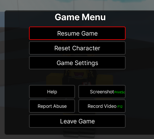
@neroxenee mm, as most of the replies said, the red n black ui color scheme is extremely overdone for retro styled uis, rather than that though, you could probably try looking at other old roblox games and try basing it off those instead!
English
1
0
0
74
Andreww
Andreww@Andy_1s_dandy·
@neroxenee I like how it mimics old 2013 UI but i'd really like if you took some inspo from the more aero aspects of old roblox design, but im personally just a big fan of that look. If you wanna keep it simplistic, I'd say stylize the outlines a bit, like add a gradient or smth.
English
1
0
1
6
heyallscotthere
heyallscotthere@heyallscotth3re·
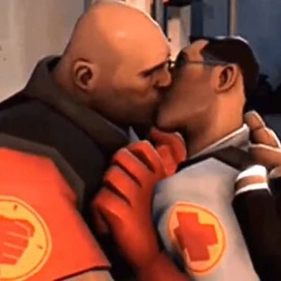
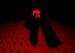
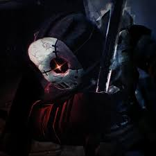
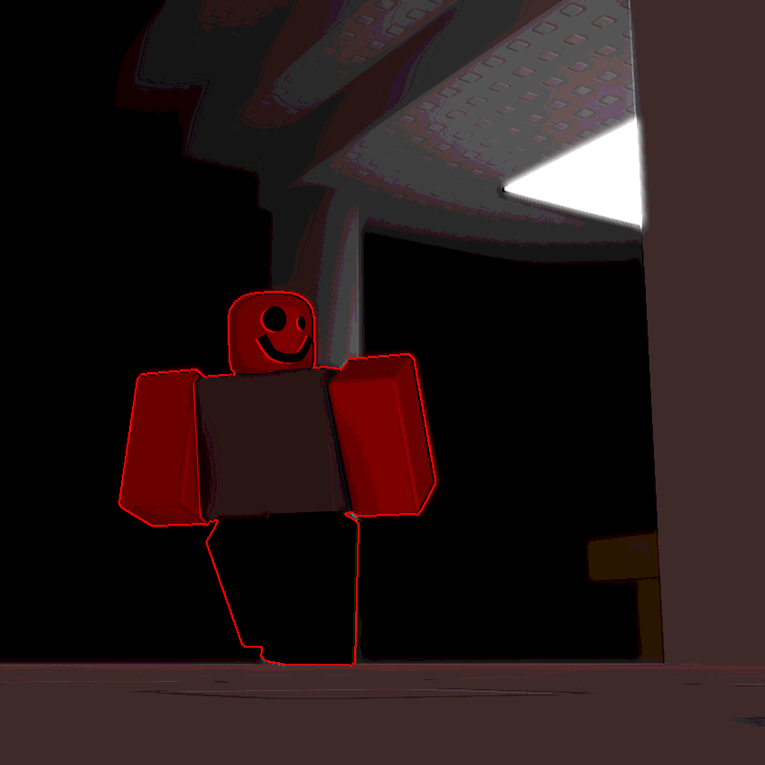
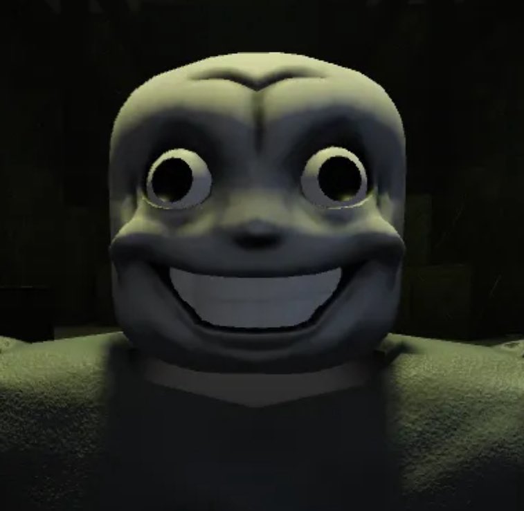
@neroxenee a good would you rather is who would you rather get jumped by in an alley from these 4 also love the im talking to you pfp
English
1
0
2
544
weedgela, weedrary chainsmoker
@neroxenee if you're trying to style your ui like old roblox then maybe don't use tweenservice? that wasn't a thing until 2017, just a thought, idk
English
1
0
1
150
Jacky 🎃(SUSSED AT 16.8K)
Jacky 🎃(SUSSED AT 16.8K)@JackysCornField·
Am i the only one having this issue where twitter just kills any tweet I reply to
Jacky 🎃(SUSSED AT 16.8K) tweet media
English
7
0
53
692
tuff opticus
tuff opticus@Iordminos·
@neroxenee corners are too rounded, feel like there should be a highlight on hover instead of a size increase, icons feel a little boring
English
2
0
3
234
Evil Rabbit 🏳️‍⚧️ (NSFW DNI!!!!!!!)
@michimoomo i will b experimenting with ui and stuff, however its just that the red and black UI matches the games artstyle direction as well as the yk, normal graphics that u see rn however i will be doing stuff thats more than the red n black ui! no worries
English
0
0
5
233
ella boingy
ella boingy@michimoomo·
@neroxenee i feel like the red and black thing is a bit overdone, you should choose some unique colors and font!!!
English
1
0
13
484
Evil Rabbit 🏳️‍⚧️ (NSFW DNI!!!!!!!)
@DesiredNov_a honestly the red and black UI is just apart of the retro UI style, so youll have to use it alot sometimes, it helps that "retro" feel or wtv, doesn't mean youre limited to it though, so i see what you mean also ya i will fix that, ty :-)
English
0
0
1
104
StellarNova
StellarNova@DesiredNov_a·
@neroxenee I feel like the red/black UI is a bit repetitive among some asyms. Also the image and text could also be moved left a little since the settings and statistics texts are oddly close to the edge. I'm not sure what to say other than that though.
English
1
0
2
131
Evil Rabbit 🏳️‍⚧️ (NSFW DNI!!!!!!!)
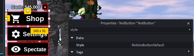
@plybot_ the UI takes inspiration from 2013 roblox's UI the c00lgui colorscheme is a built in roblox feature under the styles property for textbuttons (there is also an alternative gray color scheme which i will make use of later on) also yes, i was aming for the retro/BIAST style a bit!
Evil Rabbit 🏳️‍⚧️ (NSFW DNI!!!!!!!) tweet mediaEvil Rabbit 🏳️‍⚧️ (NSFW DNI!!!!!!!) tweet media
English
1
0
4
216
hailey
hailey@plybot_·
@neroxenee This reminds me of BIAST's UI but also alot of Retro esque Asymslops.. i Think a more unique Colourscheme could Make the game stand out alot more.. The c00lgui Colours have kinda just been.. Done to death..>? also Why is vast There.
English
1
0
2
206
Mauve
Mauve@Mauve_RBLX·
@neroxenee slacker 👀👀👀👀👀
English
1
0
1
1.1K
khris khros
khris khros@khris_khros·
@neroxenee Get jx1 outta here, he’s not a crackhead he’s more sophisticated like a chain smoker that can’t stop drinking hard liquor
English
1
0
58
3K