
Nexvyn
155 posts


This is kinda wild
We’re moving from “build a website” to literally spinning up an entire business from one prompt
name, branding, site, SEO, marketing…
all handled in one place
Feels less like a website builder and more like an AI business operator
GIF
Freename@freename
A full business, launched in the time it takes an espresso to cool. By the time the cup is empty, the brand is live, the site is up, the first post is out, the business is already showing up in search. Freename AI does all of it in one place.
English
Nexvyn retweetledi
@vansh1029 @marsihq @vansh1029bhai, I already commented the same thing there, but he said I tagged you. If someone tags you, does that mean they can copy your project? What’s that logic.
x.com/nexvyn/status/…
Nexvyn@nexvyn
@marsihq It is a direct copy of @vansh1029’s project, with no changes except the color. check this out asciistudio.space/landing
English

I think there’s a difference between taking inspiration and blatantly copying a project. @marsihq
I was okay with that part but then milking it like you spent weeks building it and asking for stars that’s crazy.
You just asked claude: "Copy this site and change the color"
(It really hurts when you make a website landing page with soo much love and spend so much time on it..)
English
@marsihq It is a direct copy of @vansh1029’s project, with no changes except the color. check this out asciistudio.space/landing
English
Nexvyn retweetledi
Slider with dual variants: compact precision + comfortable selection.
Spring-snapped motion, track fill, range support, and pip-based steps.
using @motiondotdev
English
Image stack with wheel and touch navigation.
Spring-based motion, progressive blur transitions.
using @motiondotdev
English
3D button with a hollow base, dot indicator, and spring-based press feedback.
<motion.button
animate={isPressed ? { y: -18, x: 8, rotateZ: -14 } : { y: 0, x: 0, rotateZ: 0 }}
transition={{ type: "spring", stiffness: 300, damping: 14, mass: 0.9 }}
/>
@motiondotdev
English
Try recreating this temperature slider.
@motiondotdev
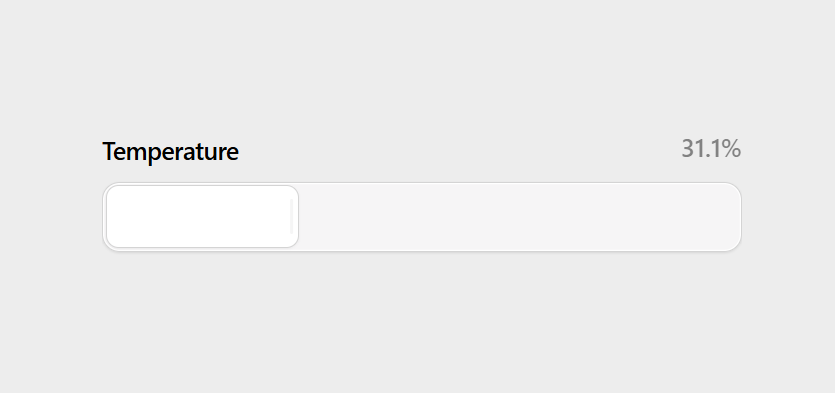
Tiago Alexandrino@tfalexandrino
Temperature slider 💅
English


Recreate image reveal effects using CSS clip-path.
.reveal {
clip-path: inset(0 100% 0 0);
animation: show-image 1s linear forwards;
}
.particle {
opacity: 0;
animation: particle-spark forwards cubic-bezier(0.25, 1, 0.5, 1);
}
Simple setup, smooth reveal animation.@mannupaaji
Manu Arora@mannupaaji
Create image reveal effects with CSS 𝚌𝚕𝚒𝚙-𝚙𝚊𝚝𝚑 .𝚛𝚎𝚟𝚎𝚊𝚕 { 𝚌𝚕𝚒𝚙-𝚙𝚊𝚝𝚑: 𝚒𝚗𝚜𝚎𝚝(𝟶 𝟷𝟶𝟶% 𝟶 𝟶); 𝚊𝚗𝚒𝚖𝚊𝚝𝚒𝚘𝚗: 𝚜𝚑𝚘𝚠-𝚒𝚖𝚊𝚐𝚎 𝟷𝚜 𝚏𝚘𝚛𝚠𝚊𝚛𝚍𝚜 𝚕𝚒𝚗𝚎𝚊𝚛; } @𝚔𝚎𝚢𝚏𝚛𝚊𝚖𝚎𝚜 𝚜𝚑𝚘𝚠-𝚒𝚖𝚊𝚐𝚎 { 𝚝𝚘 { 𝚌𝚕𝚒𝚙-𝚙𝚊𝚝𝚑: 𝚒𝚗𝚜𝚎𝚝(𝟶 𝟶 𝟶 𝟶); } } Perfect for reveal effects, easy to implement
English
If you spend hours listening to podcasts, try @DeepcastStudio
Deepcast is a podcast player built for serious listeners
Combining best in class playback technology with refined audio controls to deliver an unmatched podcast experience
get Desktop app: deepcast.studio
English