
baev
425 posts

baev
@notbaev
designing brands & digital experiences | building https://t.co/KeEr4KWT76
templates → Katılım Temmuz 2014
214 Takip Edilen112 Takipçiler

Giveaway 🎉
My 6th template is live on framer marketplace, its priced at $99and is about 165 hours of work.
I am giving it away for free all you have to do is:
01. Comment "Vizer"
02. Repost
No need to follow but Make sure your dm are open or I can't send you the link.
English


Now seems like the right time to do another #FramerChallenge, right?
English

If you are building @framer templates, this data is gold.
See which categories pull the most views.
Understand how top creators price their work.
Spot trends early and choose your next template with confidence.
Make decisions based on demand, not guesswork.
Like and repost to share this with other creators.
No need to follow me, but if you do, you will catch more useful drops like this.
English

English


Design Review - 11
This UI card looks visually good at first glance. However, it’s a bit unclear what context it belongs to. It’s hard to tell whether this card is designed for a mobile app, a SaaS dashboard, or something else, which makes the intent of the component less clear.
One detail that caught my attention is the arrow button on the top right. It feels a bit too close to the main card area, and adding more padding could improve the overall UI consistency and spacing.
I also noticed that some of the icons appear slightly small, and there may be a minor color contrast issue that could affect readability.
Overall, the visual direction is nice, but a few spacing and clarity improvements could make the design stronger.
Source: Pinterest.

English

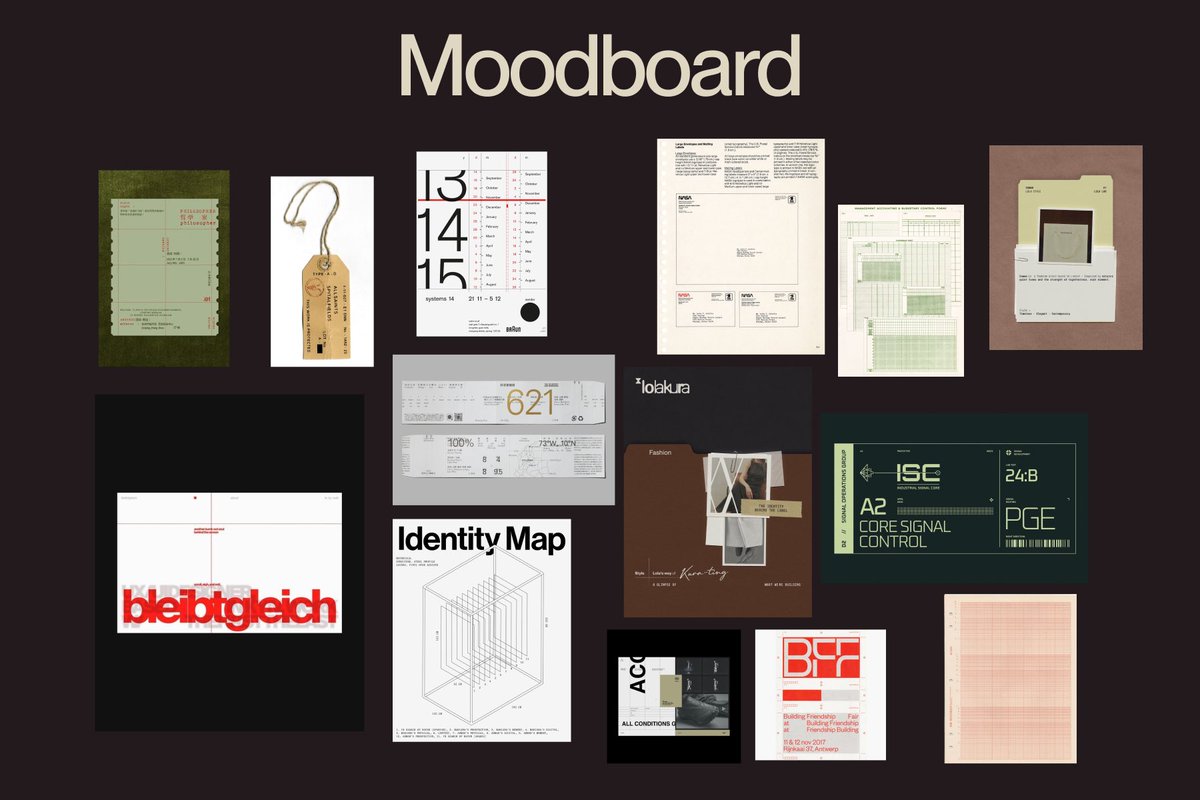
Moodboard for a new project mixing digital references and real world references
English

a section that explains itself as you scroll.
an animated headline sets the first impression while the services text block stays fixed on the left to keep the message clear and focused.
with each scroll step the content shifts through subtle triggers connected to the imagery on the right creating a smooth story driven flow.
English

