OH no Type Co
4.9K posts
OH no Type Co
@OHnoTypeCo
Oakland based type foundry specializing in unique, custom fonts.. Run by @jamestedmondson.
San Francisco Katılım Eylül 2014
536 Takip Edilen16K Takipçiler

@OHnoTypeCo I've got a question if y'all wanna hit up the DMs....? 🧐
English
@BMooreCreativ @DylanNowak @sportslogosnet @ToddRadom It’s never been a publicly accessible font. One person digitized a (shoddy) version of it at some point, but then that was taken down and essentially scrubbed from the internet. It’s been on my type design bucket list to do an Ohno version of it for years.
English

I've been unsuccessful in my search. So I'm reverting to the holy trinity for help.
@sportslogosnet
@ToddRadom
@BMooreCreativ
Does anyone know what font is used on this classic hat line?
I kinda want to make a spoof hat of my own and would prefer to use the legit font.

English

There is no better feeling in the world than finding the perfect brand font 🔥 (somehow always from @OHnoTypeCo)
Sharing some 💣 stuff soon
English
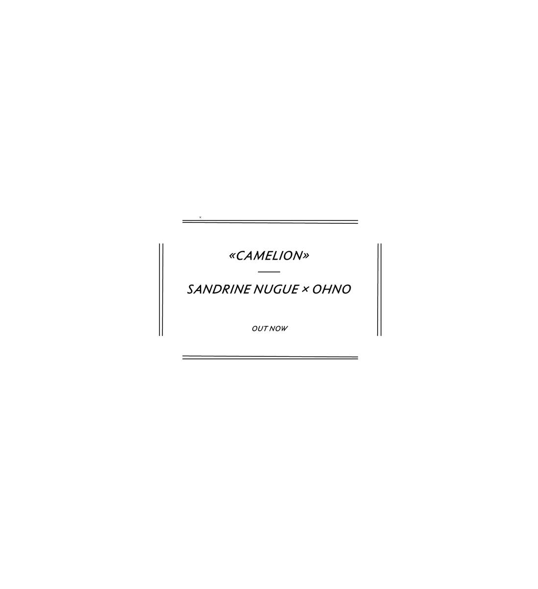
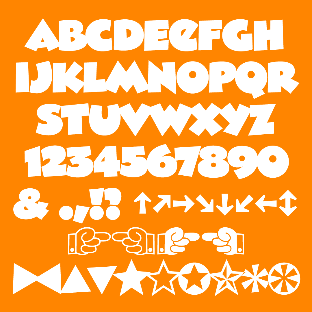
We are thrilled to show you Camelion by @SNugue, available on our site today. ohnotype.co/fonts/camelion
English


@marksimonson Haha maybe not. I was thinking of @commercialtype’s Marian, H&FJ’s Leviathan/ Ziggurat/ Saracen/ Acropolis, and something else that I forgot.
English

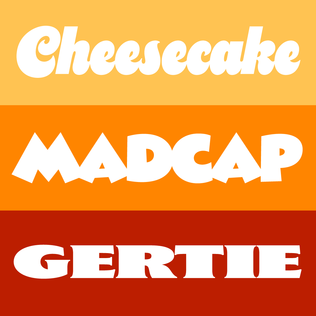
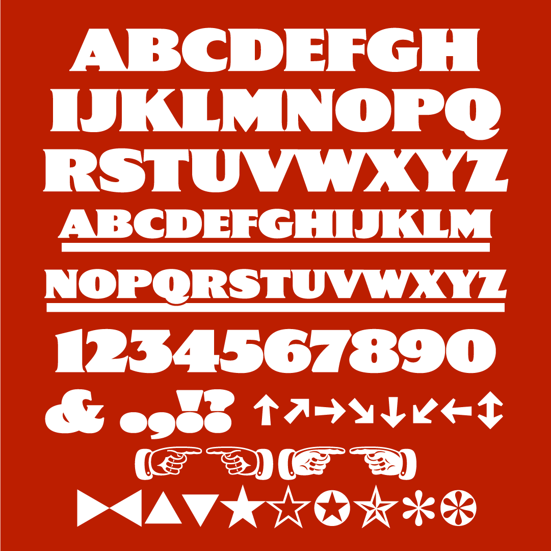
Three new heavyweight display fonts: Cheesecake, Madcap, and Gertie! marksimonson.com/notebook/view/…
English

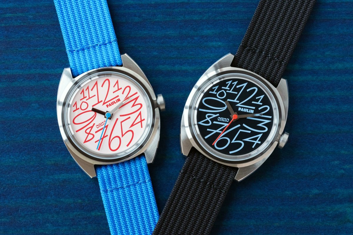
Paulin x OH no watch looks awesome. Seriously tempting me. James' rocket continues to climb paulinwatches.com/blogs/news/a-c…

English
@rileyj_s @longodesignsinc Also, MKBHD *has* built a lot from scratch. Unrelated, but a ton of other reviewers all had the same points. He catching the flack basically for the clickbait title and being the best tech reviewer.
English

@longodesignsinc I hear you.
I do think there’s somethings that are blown out of proportion.
The review wasn’t unreasonable and praised a lot of what Humane had made.
English
The MKBHD vs. Humane.
There's a lot you can say about it.
But in the end, Humane made a bold (and brave) attempt in new developing territory and MKBHD delivered a good critique full of great insights for Humane to take note of.
Both ends have their place and intentionalities in what they've done and both are respectable for it.
English
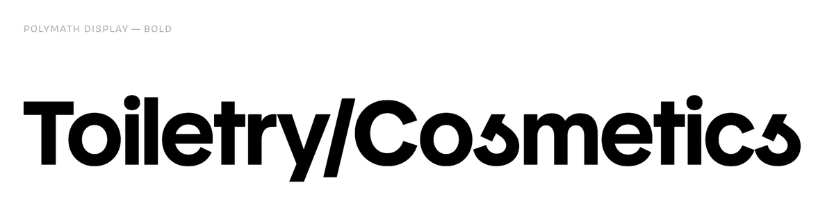
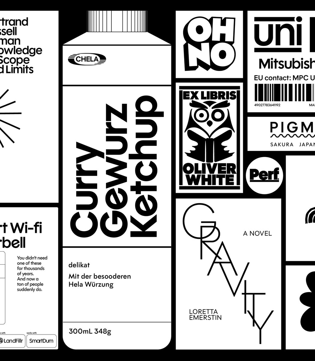
@katylcowan @creativeboom @OHnoTypeCo just cooked up this feast of a font-family.
ohnotype.co/fonts/polymath

English
OH no Type Co retweetledi

@somefinetweets @OHnoTypeCo this one is giving hammer & sickle
overall, don’t love since I feel like the connection from letterform to letterform feels off (need some alts in there) as if you were writing hybrid cursive/manuscript
also drop it lowwww (the curve a bit below the baseline)
Austin, TX 🇺🇸 English
OH no Type Co retweetledi

@sophshepherd this is because letters are the worst part of design
English


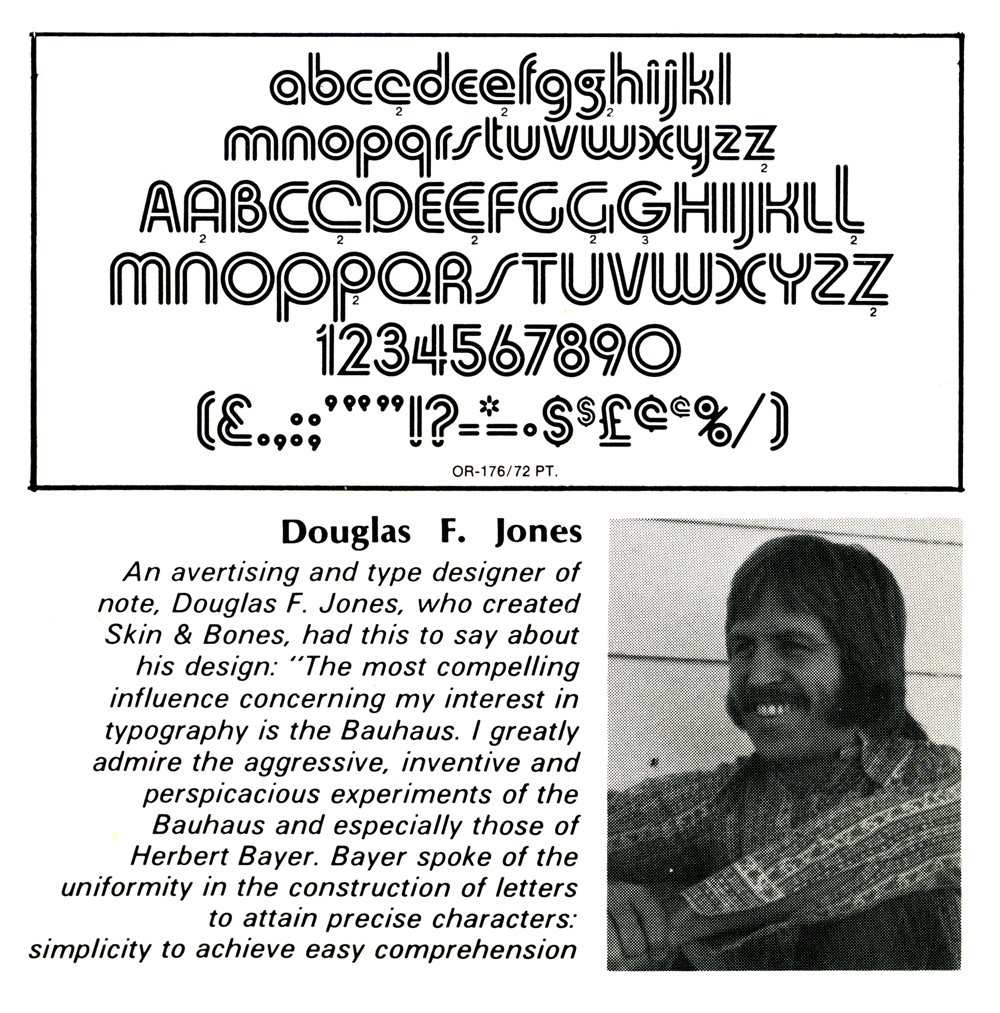
I've just posted an interview with the designer of the old VGC typeface Skin & Bones, Douglas F. Jones: marksimonson.com/notebook/view/…
English
@kyleread It’s not insane! But it’s definitely harder than it should be. Making something perfectly square was super frustrating for me when I started. Good tools make it easier, but those are pricey!
English

@EvaSilvertant you're totally right. need to add more alts! Real reason is it's a slippery slope, and I only like the F ¯\_(ツ)_/¯
English

@OHnoTypeCo Amazingly versatile design! I love the art nouveau flair.
I’m curious, why no high-waisted 'E' to go along with 'F'? And wouldn’t one expect a high-waisted B/G/H/R as well?
English