Sabitlenmiş Tweet
Shardul
8K posts


Shardul
@pracosm
🖋️ UX Designer ⚗️ Freelancer (when I get to be) 🪴 Nurturing Aakar Labs · https://t.co/9YLf6Cfcbo 🧭 Mumbai | Bengaluru
Mumbai | Bengaluru Katılım Mayıs 2019
400 Takip Edilen789 Takipçiler

@iShailesh_K @caleb_friesen @emSoumik An application stack on top could be so cool! Especially for navigation
English

Thank you @caleb_friesen , and @pracosm , we are working on Securio, a wearable that gives you real time AQI, and each of this Securio will act as a data node giving hyperlocal intelligence. Securio, is under patent with design and architecture and it designed to identify real time AQI around you along with biological indexes.
English
Wow this is amazing!
We worked on a project that uses AQI data to guide people through better routes.
Honestly, we got left behind when it came to the actual data side of things… looks like we need to pick this up again. @emSoumik
Nithin Kamath@Nithin0dha
Good air, clean water, and food are fundamental to a good life. In that sense, they should be treated as fundamental rights. But air quality has been steadily degrading, and it's not really part of the mainstream conversation. That needs to change. Right now, if you look at the site (link in comments), everything looks green. But as we get closer to the end of the year, things will start looking much worse. Solving air pollution is hard, but the first step is simple: people need to know what they're breathing. Right now, that's not possible. India does collect air quality data, but it's either locked away, too broad to tell you anything about your locality, or just not published at all. There's no single place a citizen can go to get a clear, neighbourhood-level picture. So we set out to fix that. Today, we're launching an open, pan-India air quality platform, built in partnership with leading organisations in the field. The goal: give citizens, schools, local governments, and communities direct access to the data that affects their daily lives. At @RainmatterOrg , we've been committed to keeping this conversation alive, and this platform is our attempt at making that happen. All the data on the site is free and open, so others can build on top of it.
English

English


@pracosm The color palette of your zonal flags reminds me of Japanese prefecture flags,such diversity

English


We made it to the top 5, spoke to the ADI juror, who said this is out of their hands. Officials this competition has no end as it nver existed, but was spoken of like an insane opportunity for design students
If something like this gets revealed and you are told to keep your mouth shut its obvious one will be mad. That's all this tweet is, a vent
English
We worked for a month for this, got no response, no prize money distributed, article revealed the logo directly, another mentioned CKP students made the logo as an academic project. No mention of the competition.
Basically we worked for nothing. Let a 20 year old vent a little 😂
English


@JayPrashanth A sarcastic PSA? Sure I'm singing a completely different tune, it that case
English
@pracosm In your other posts, you talked about learning and all that. Here, you're singing a completely different tune. 😀
English


@caleb_friesen @pracosm Right is way more aesthetic, and relatable to people. Left one looks like some Chinese logo!
English
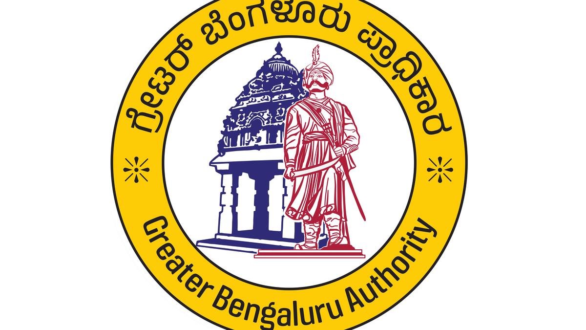
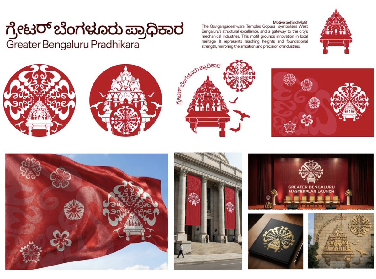
Greater Bengaluru Authority had a logo competition.
Left: design submitted by @pracosm.
Right: the design that won.

Shardul@pracosm
I was part of the Greater Bengaluru Authority (GBA) logo competition. We went through 2 rounds, built a full identity system, and (last we heard) made top 5. They just announced the final logos. This is what we submitted vs what got selected 👇
English
@Imdhirajkumaar Hand drawn then vectorised in illustrator, compiled in figma
English

@caleb_friesen Just adding this here!
x.com/pracosm/status…
Shardul@pracosm
@sharbat_c Yep, agreed. We're students, the whole point was to explore the canvas. We also started with fairly simple floral designs but were then asked to make them more intricate with multiple motifs, hence these designs. Round 1 submissions 👇
English

@pracosm GBA simply chose simplicity, your design is good but it looks a little over designed and a little chaotic, nevermind, great attempt👍
English


I actually like the direction GBA chose. You've done a fabulous job no doubt, but it leans more toward a corporate identity than a public facing government one.
For a government body, recognition has to be instant and inclusive. Not everyone reads symbolism or design intent. Many wouldn't understand it.
There are many people who rely on quick visuals like color, shape, and simplicity. Senior citizens, people with limited literacy, or those unfamiliar with design should still be able to identify it at a glance!
GBA logos are simpler, faster to process, and more accessible to the broader public.
Again, both logos have its own merits, but for governance, clarity often has to win over complexity. :)
English
@neilmukti these are all requirements from their end, we didnt want to make 3 variants. This isnt our original design, we had to rework to match their feedback
English

@pracosm If they didn’t want variations for reasons, they could have just gone with this monolithic mark. Goes hard 🔥

English